 @snapping.turtle
Bored Logos
I ought to write the date here because "yesterday" would be confusing. So today is July 9, year 2021 and yesterday I finally made an avatar to be used here and in noise too. I already mentioned it in noise, I'm pretty proud of it. It's been for quite a while that I wanted to have one for myself. I wanted one that looked cute and playful. I actually searched some cute pngs in Google. But of course, this platform is all about original content. Unless not yours, you have to give credit to the owner properly. I found one cute turtle in one of those platforms. But I am too lazy to copy-paste the attribution. I even asked myself if I also need to paste it on all my articles. To prevent myself from the hassle, I created one myself. It might looked like a drawing by an elementary kid, but that's exactly what I had in mind. Back to the topic in relevance to making my avatar and signature. I remembered that I made some logo out of boredom. I ought to tell the story on how it had become to make this a three-minute article somehow. January of this year, I had to see my OB for my monthly checkup (I was preggy at that time). It was a difficult pregnancy, I had a condition called placenta previa. In layman's term, I bleed when stressed or when my baby made sudden movements inside the womb. If you have a constant appointment with a doctor, you know that they are always late. Not ten minutes late, not thirty minutes late, but two to three hours late. It is understandable though. They might be handling an emergency situation, doing their rounds, or taking a quick nap to be able to handle another set of gore. I am a very understanding person, so I understand. But my situation is not very understanding. I noticed that I bleed when I sit for a very long time, or when I think too much, the baby moves. To distract myself on those waiting moments, I took my phone and made nonsense doodles. After some time I made themed doodles to make it looked like I have a mission. A mission to tame my index finger not to be so horrible in drawing. So here we are, may I present to you the logos (supposed to be) that was made out of boredom. They're not bored though, I hope they're not.

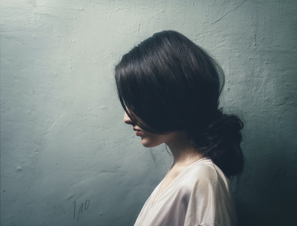
**Bored Question Mark** The theme of this one was supposed for educational sites of some sort. Like a questionaire or a website that handles examinations, or anything that pertains question. It would sit perfectly on the left corner of the header. But then again, those four dots are questionable itself. I can't think of a meaning for it.
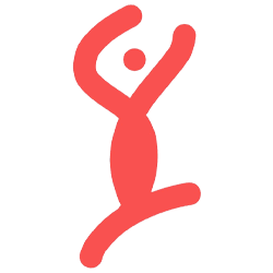
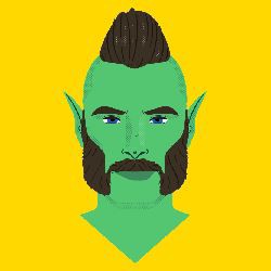
**Bored Dancer** I don't even know if this looks like a dancer or just some guy waving jelly arms. The theme for this one is supposed to be some sort of ballet dancing institution. I love ballet, but I don't do ballet. From what I understand, ballet is all about tiptoe and legs. This one doesn't even have legs, how can this tiptoe?
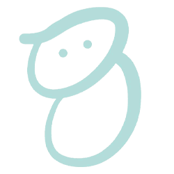
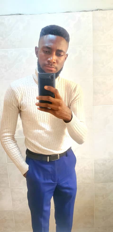
**Bored Baby** As I was sitting in the waiting area, I noticed that their logo doesn't look that good. Okay, this is just between you and me; don't tell anyone. Bored as I am, I thought of making a better one somehow. Not that I'm going to sell it to them. I just made it to pass time. And also, it would be rude for me to...you know? I'm not good in sales talking. But the logo, turned out cute, right?
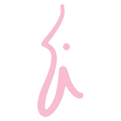
**Bored Random** Like the title, it's random. I don't even know what this looks like. The letter i is just apparent there because I had this nagging feeling to add a dot in the middle. It looked like a head, but also looked like an i. But whatever, translation is in the eye of the beholder. So there we are, I hope you enjoyed the tour. Until next time. **P.S.** I am not a logo creator or some sort of image illustrator. As I said, I made those out of boredom. *** If you enjoyed this article, you might also want to check out my other writings. My High Maintenance Babies https://read.cash/@snapping.turtle/my-high-maintenance-babies-4d41359c Drown Into Eyes https://read.cash/@snapping.turtle/drown-into-eyes-78bf5805 I do not snap https://read.cash/@snapping.turtle/i-do-not-snap-b7a892fb I am also going to drop my noise link here. If you want to make noise with me, snappingturtle at your service. https://noise.cash/u/snappingturtle
8 comments
I like these bored logos of yours especially the bored dancer. :)
Hahaha I never thought that someone would actually like it. Thank you for stopping by.
Eh. Haha. I'm telling you, it's good. No problem! :)
You should really develop your talent. Btw, here's my take on the question doodle. As one asks the question, it becomes less and less of a question because it's answered...so the issue becomes smaller and the dot gets smaller.
Thank you for dropping by. Although I tried before to learn how to draw, until now I really wished I can draw LOL. But I get demotivated everytime I see my sibling's drawing. I can never be as good as him, so I stopped hahaha. He is an animator btw. Nice interpretation on the bored question mark. It all make sense. The more the question is answered, the smaller the dot would become.
Don't compare. If it inspires and motivates you to be better, then a little comparison is good. But if it detracts from your passion and interest, then find inspiration instead of comparisons.
I like the babu logo hahaha. It's so cute 😍
Hahaha thank you for liking it. I find it cute too.