Elements of Design: Understanding 7 Basic Elements of Design
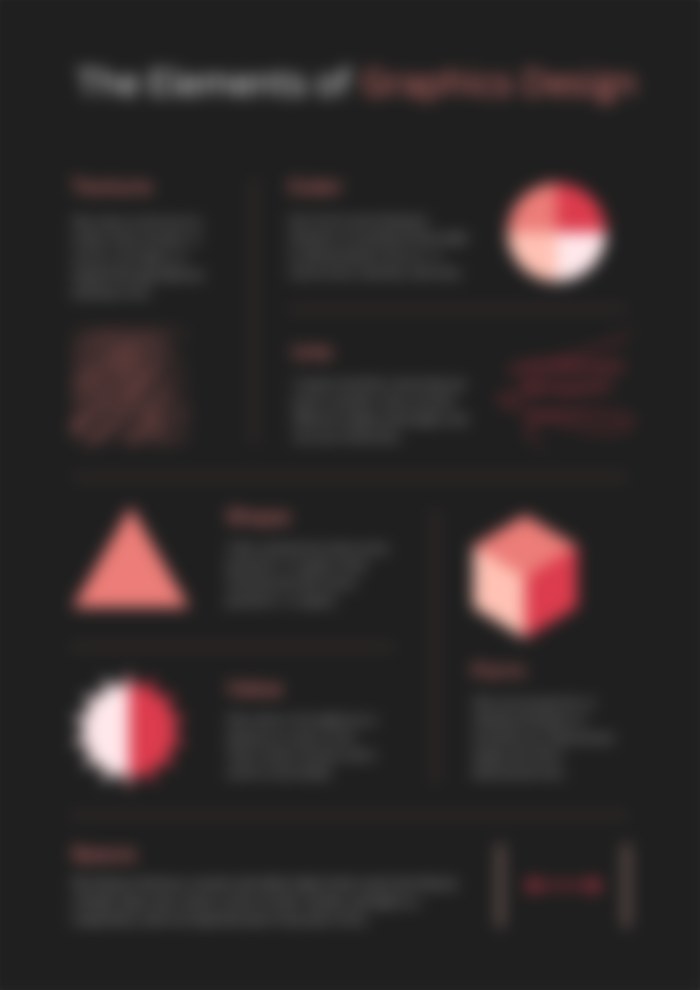
Graphic design elements are the fundamental aspect (or building blocks) of any visual design. They include colors, lines, textures, space, etc. All these elements work together to create a unified look and feel for your final product and are critical to successful visual communication. In this course, we'll explore 7 fundamental elements of graphic design, and explain how they contribute to effective visual communication.

Graphic design is the process of creating visual designs. It includes the creation of images, text, and other visual elements that tell stories and convey information. Graphic designers use their creativity to create effective visual communications for a variety of purposes. Graphic designers create the look and feel of websites, apps, logos, packaging, etc., using their skills of design elements (colors, lines, texture, space, etc) and design principles (balance, contrast, hierarchy, alignment, etc). They also ensure that a piece of art has a strong brand identity, creating visuals that convey value and meaning. Graphic design isn't just about aesthetics; it also requires a deep understanding of psychology, marketing, user experience, and other areas of study.
When it comes to graphic design, one of the first things that you need to know is how to effectively use the basic elements of design in your project. You'll find that these elements are used across all types of design, whether it's a logo, print, or web-based.
1. Color
The most important element is color. Color is what makes a design stand out and draw attention to itself. It's crucial to use colors that are highly visible and understood by your target audience.
Color is the property of light by which we perceive things. When we view something, our eyes take in different wavelengths of light and use the receptors at the back of the eye to convert those wavelengths into electrical signals. These signals then reach the brain where we ultimately perceive them as colors. In terms of graphic design, the term is often used to refer to all aspects of visual communication, including typefaces, illustrations, photographs, paintings, designs, etc. However, the color theory focuses mainly on what people think about color, e.g., its nature (what does it look like?), how it affects us emotionally, and how we apply it to design.
Colors can be used to highlight certain aspects or help you focus on a particular part of a design. Different colors can create entirely different moods. When designing a project, make sure you choose colors that complement each other. To be a good designer, you have to learn how to use colors to create effective visual communication for any target audience.
2. Line
Line is another important part of graphic design because it adds structure and rhythm to your designs. Line is the path that an object follows, its outline, and helps us organize information. Lines can be curved or straight depending on what you're trying to accomplish with them; but generally speaking consist of two parts: the outline and the fill. Straight lines create a sense of direction and stability while curved lines create an impression of depth and movement. Outlines are boundaries of an item that define its shape, such as the sides of letters, the borders of a figure, and the outer limits of a landscape. Fills are the portions of outlines that are either transparent or filled with the background color. We use lines to draw boundaries, define objects, and create symmetry. Lines can also be used to separate components.
3. Shape
Shapes are another key element of graphic design because they allow you to create interesting compositions by combining shapes together into new ones with different properties like size differences between lines/objects, etc. Shape refers to how objects look when viewed from different angles or how they are grouped to communicate meaning; examples include circles, triangles, and squares. In graphic design, basic shapes have two main dimensions - width and height. When we view an object, our brain processes the image and creates a mental representation of what we see.
4. Space
Space is another important aspect of graphic design because it can create the illusion of depth in your design. Space refers to the arrangement of shapes in a composition. A piece of art or design may not necessarily have all shapes arranged in some kind of order; rather, it simply uses space to place the shapes within the composition. Space may be divided into two types – positive space and negative space.
The positive space is the subject or the area of interest in the design or art. Negative space is the area surrounding the subject or in between multiple subjects. - Vecteezy
Use negative space to draw attention to important elements in your designs.
5. Form
Form is another important aspect of graphic design because it helps establish hierarchy within your designs. Form is the way an object appears physically. Form uses perspective or shading techniques to transform two-dimensional images into three-dimensional ones. Think of a circle as a bowl, an oval as a banana, a box as a cube, etc. Aspects of the form include size, weight, volume, mass, position, proportion, movement, motion, dimension, and distance between points.
6. Value
Value refers to the intensity of the color. It is the amount of light reflected or absorbed by an object. Light reflected by an object falls on another surface, causing the second surface to become brighter than it would if no reflection had occurred. Conversely, light absorbed by an object causes it to appear darker than it would without absorption. Value creates contrast and it's used to create depth.
7. Texture
Texture is the surface feel of an object. It arises from tiny irregularities in a material's microstructure, such as differences in grain size or density. Smooth surfaces feel soft and gentle to the touch. Rough surfaces are hard and bumpy. Textures help us grasp the world around us. They allow us to determine what types of experiences we may encounter.
Closing Thoughts
Design elements are basic graphical building blocks of a design, which are used and incorporated into different design styles. Being familiar with basic graphic design elements is vital to a designer's success. Understanding how they work together can make or break a piece of work. Now you should have a good understanding of the basic graphic design elements and their importance. In the end, it is up to you to decide how important these elements are for your designs and what kind of value they provide.

Wow, I'm glad I lookup this article. So glad to finally have a graphic design friend😊😊