Shipwreck treasures (tempera painting)
Hi friends!
This was one of the tasks for the art contest on Golos.
the theme was dedicate by a see and everything connected with it.
If anyone remembers my old drawing Lighthouse of Cape Town, it was made for the same competition. https://golos.id/goldvoice/@gerdananeis/risuem-vmeste-morskaya-tematika-sokrovishcha-zatonuvshikh-korableij?invite=gerdananeis https://hive.blog/art/@daring-celt/the-lighthouse-of-cape-town
I wanted to draw a treasure chest at the bottom of the ocean.
With all the surrounding environment
Sketch
Art materials I chose: a set of tempera paints, watercolor paper "torchon", water and three brushes.
For the base, the sea day, I take paints - blue FC, emerald green, sometimes I add white (the light, according to my plan, will fall from the top right)
This is the water layer.
I mix yellow cadmium and light ocher to the sandy layer.
I put a little more white on the foreground.
The sunken ship in the background and seaweed on it I paint with ultramarine, burnt sienna with the addition of gas soot.
I make the masts with the same mix, but more transparent.
Slightly blurring the clear contours, because the ship, although well lit, is in the background.
I paint the stones in the front right corner with the same mix, but more deep.
To draw the chest, I mix iron red, burnt sienna and ocher.
I add blue FC to the darkened areas, and cadmium yellow to the lighter ones.
I paint the iron elements with a mixture of blue FC and natural sienna.
I paint the highlights with pure yellow cadmium.
And now dessert!
Gold - natural sienna, iron red and cadmium yellow.
In the most illuminated places - yellow cadmium without impurities.
I use the same shades to make three bars of gold bars at the left corner of the chest.
For the strands of the rarest pink pearls hanging from the front side of the chest, I mix iron red, whitewash and a drop of blue FC for the shadows.
I paint individual gems with pure colors with the addition of white on the most illuminated edges and edges.
Using the same colors as the bulk of the gold, I draw a jug stuck in the sand in the background.
Algae are painted with a mixture of blue FC, emerald green and light ocher.
The large speckled rapana at the right corner of the chest is a mixture of already used colors, with white highlights in the lightest areas.
Small details remained - goldfish, a crab with a stale pearl in the right claw, anemones on stones, a few gold coins that have fallen on the sand. A purely intuitive improvisation in the use of paints has already started ...
Finally, here and there I clarified the shadows, added white air bubbles to the living inhabitants of the underwater treasury and highlights on individual jewelry.
This is how my second drawing from the marine adventure series turned out!
I hope that I managed to create the mood inherent in sea adventures.
Have a positive and creative day!
Regards
Portrait of a Caucasian Shepherd Dog (pastel) - https://read.cash/@daring-celt/portrait-of-a-caucasian-shepherd-dog-pastel-0fe59750
#art #drawing #tutorial #Readcash
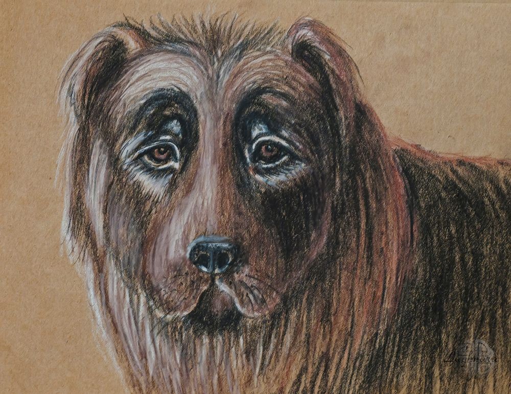
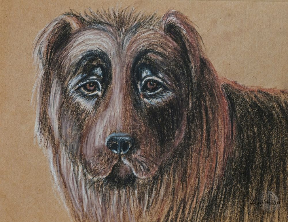
Portrait of a Caucasian Shepherd Dog (pastel)
Hi friends!
Sometime I wanted to portray a Caucasian Shepherd Dog.
Why him?
An incredibly difficult drawing object for me!
But I love unattainable goals!
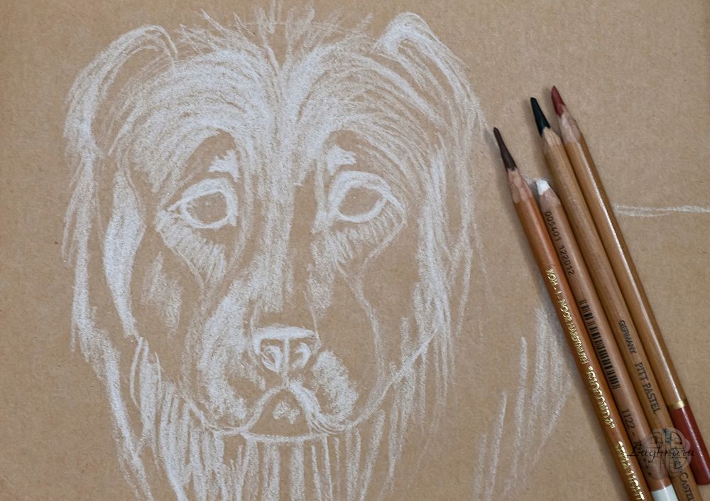
For work this time, I chose tinted paper for sketches and limited myself to four colors - chalk, charcoal, sanguine and sepia.
It seemed to me that such a palette would be most suitable for the image of this dog.
Yes, our dog named Baron was be a model for drawing https://img-fotki.yandex.ru/get/202385/16432181.e/0_165745_74f84b07_orig
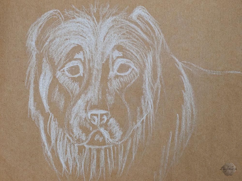
So, I made a contour sketch of the shepherd's head with chalk.
This time I started working with the lightest color, because you can't draw with chalk on top of a strokes with charcoal.
I also laid out the lightest areas. I guided for myself that the light will fall from the top left and slightly in front.
Then she began to introduce midtones.
I worked with sepia on the more illuminated part, and walked sanguine along the contour of the shaded area - I made a semblance of contour. Somewhere I painted over the area completely, somewhere I applied separate strokes, imitating randomly protruding hairs of wool.
Well, the last step was to put coal into operation.
I strengthened the shadows, painted the details - eyes, nose, mustache, highlighted individual strands of wool on the shirt front and painted over part of the body.
Yes, it was very difficult to draw a shaggy dog with a strange expression on its face.
But I hope I did it!
Have a nice and creative day for all!
Regards
How to draw with acrylic paints in botanic illustration style - https://read.cash/@daring-celt/honeysuckle-holly-euonymus-mixed-media-painting-5bcc8695
#art #drawing #tutorial #Readcash
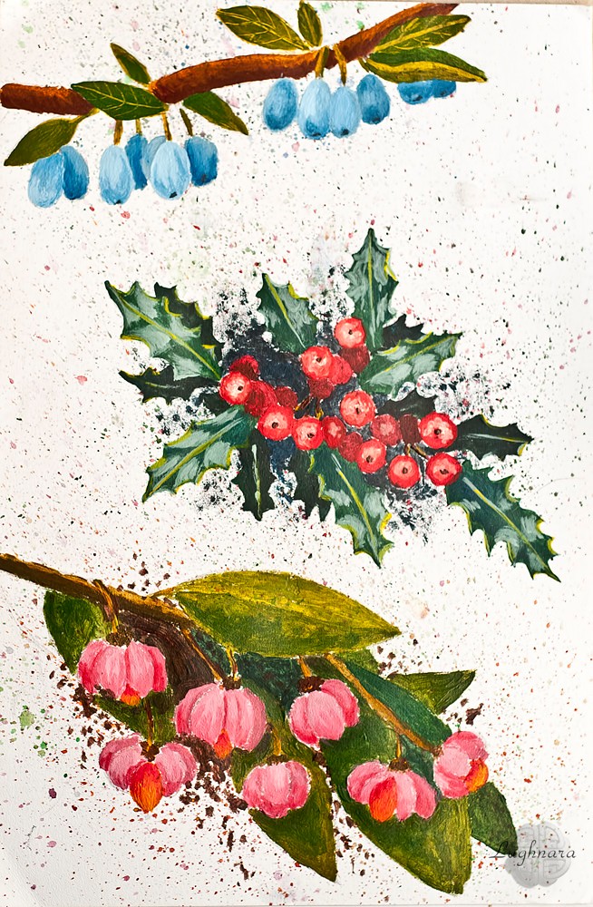
Honeysuckle, holly, euonymus (mixed media painting)
Hi friends!
It was an attempt to create a botanical illustration with acrylic.
But in fact, just a selection of different plants with berries.
After all, berries are be not only edible, did you know?
In fact it was an art contest on Golos with "Berries" theme https://golos.id/goldvoice/@gerdananeis/risuem-vmestetema-yagody-zhimolostx-padub-beresklet?invite=gerdananeis
This time I decided to try to paint in a new technique - apply a splash with watercolors.
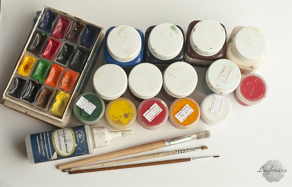
Therefore, to my usual materials for painting - acrylic paints and synthetic brushes - I added a set of watercolor paints
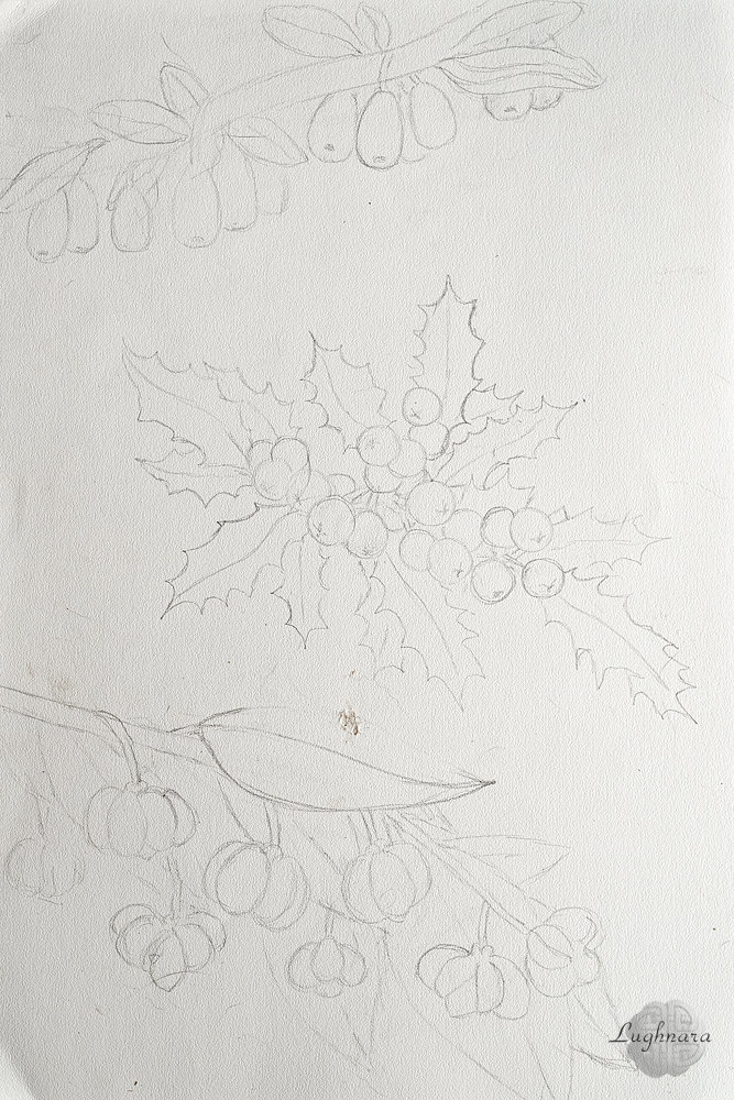
Sketch (mix of internet photos)
I dilute watercolors with water and spray them with paints that roughly correspond to the general color scheme of each berry composition.
Let the spray dry.
I begin to introduce color into the drawing.
Honeysuckle first.
It has unusual berries, with a bluish bloom, like blueberries, and leaves with clear light veins.
I decided to paint the latter in two layers - first I put a light base with a mix of yellow and grassy green paint.
Then, when the first layer was dry, I added a darker color on top - grassy green with blue-green, and then scratched the veins on the fresh paint with a toothpick.
The berries themselves are painted with a mix of blue, gray and ultramarine paints.
The branch is yellow-brown.
Next comes the holly.
His berries, of course, are inedible, but how beautiful they look together with carved leaves in Christmas wreaths!
Its leaves are of an unusual shape, with many sharp tips, and also shiny, as if glossy.
I make the basis for them with a mix of blue-green and ultramarine, plus a little black (the farthest leaves).
And for the gloss, I add ivory to the blue-green.
In some places I paint the middle veins and edges in bright yellow.
For the berries, I take a mix of carmine and brown (background) and bright red for those in the foreground.
Holly berries are matte, so I apply highlights on them with a mix of bright red with a drop of ivory.
And tint the middle a little with a dark color (a mix of blue black and brown) to further emphasize the brightness of the red berries.
And finally, the most unusual berry from my set is euonymus.
Also inedible (even poisonous), but nevertheless fantastically beautiful!
Imagine that decorative lanterns are growing on the branches - pink-red opening four-leaf boxes on branches with a bright orange core.
And with huge leaves, which in themselves serve as a great background for berries.
For the leaves and branches I take almost the same colors as for the honeysuckle.
And for lantern berries - burgundy, carmine, brown, bright red, white and canary yellow.
In some places I darken the background behind the berries with a mixture of blue-green and burgundy.
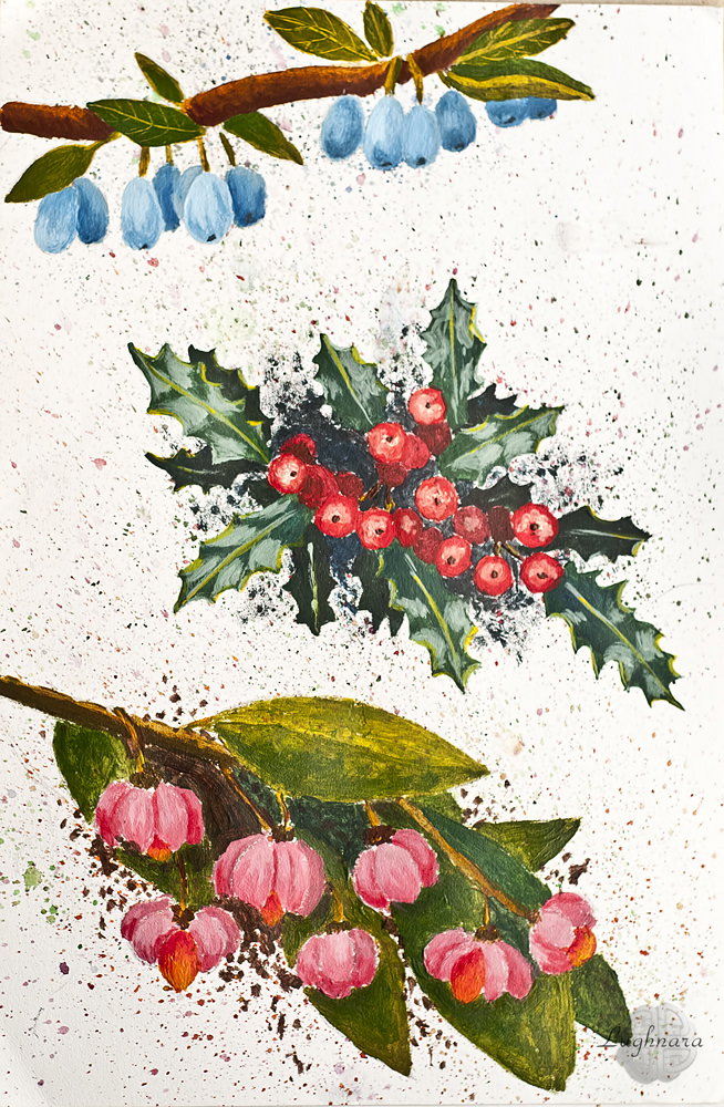
And here is such a botanical illustration turned out.
In the same style, I made another illustration - with rowan and olive, only with tempera paints on tinted paper
Have a nice and creative day!
Regards
Gera
A window to the Autumn with tempera paintings - https://read.cash/@daring-celt/a-window-to-the-autumn-tempera-painting-96e9b208
#art #drawing #tutorial #Readcash
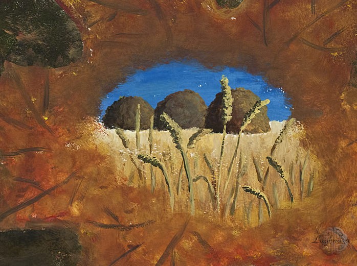
A Window to the Autumn (tempera painting)
Hi friends!
The story of this drawing was inspired by my friend's collage https://ic.pics.livejournal.com/daring_celt/21759813/541217/541217_original.jpg
I saw an interesting technique in this - to make a leaf of a tree a frame for an autumn landscape
I needed for my work tempera paints, a watercolor paper "torchon", a brush number 3 and ... a piece of a sponge for washing dishes
Sketch
I start the painting from the main part - from the landscape.
For the sky, I take a mix of blue FC and white with a drop of yellow cadmium, for hay heaps - a mix of burnt sienna with a drop of gas soot (for the shadow side), a mix of natural sienna with ocher (medium tone) and pure yellow ocher - for the highlight side.
For the field, I mix ocher with whitewash, prescribing the most distant plan with it. Closer to the foreground, I add more ocher and in some places I apply stripes of natural sienna.
For the background, I mix a lot of earthy shades - a mixture of green FC with yellow cadmium and ocher, then I take pure burnt sienna, natural sienna, a little blue FC and gas soot.
I cut off a piece that is convenient for use from the sponge, alternately I dip it in different colors and create such a spontaneously motley background.
For the leaf, on the contrary, I take the brightest colors - three shades of yellow paints, iron red, cadmium red, a drop of ultramarine.
I outline the contours with a brush and also fill the middle of the sheet with a sponge. Closer to the edge of the central picture, I make the paint very much diluted to create a collage effect.
With the darkest shade, I draw the veins on the sheet.
Also, with spontaneous individual strokes, I apply the remnants of bright colors to the background in order to better fit the sheet into it.
Well, the very last and painstaking details are the ears of corn.
I paint the light parts with a mixture of yellow cadmium with a drop of lemon and white, and the shadows with a mixture of burnt sienna with a drop of blue FC.
I make the distant ears of corn less contrasting and not detailed, adding more natural sienna.
Here is my mystical autumn leaf!
I hope you like my drawing idea too.
Thanks for your attention and have a joyful day!
Regards
Stained glass effect with wax crayons - https://read.cash/@daring-celt/stained-glass-effect-with-wax-crayons-d64ac014
#art #drawing #tutorial #Readcash
Stained glass effect with wax crayons
Hi friends!
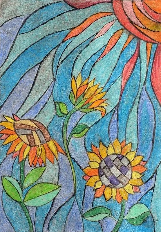
Once I found on the Internet a beautiful picture of flowers in the form of a stained glass. And I decided to repeat this effect on paper using the same wax crayons that I used to create the ancient fresco. https://read.cash/@daring-celt/crackle-effect-with-wax-crayons-fresco-imitation-207db977
Wax crayons are the most suitable tool for creating stained glass effect on paper.
Is not it so?
For a base I needed a very thick paper with a smooth surface, for example, for drawings of architectural projects
After a few trial sketches, a suitable sketch was chosen - sunflowers in the sun.
If you are not sure and are afraid to ruin your future masterpiece, you can find on the same Pinterest a suitable b / w contour drawing of the finished stained glass, of which there are many on boards with patterns for coloring.
I drew by hand and got this picture.
Then I start to fill each area with a different crayon color.
Draw near the pencil borders with especially strong pressure.
As you know, sunflowers are yellow in color, therefore, in order not to get confused in colors, we will make the sun in red shades.
I had to work hard over the middle of the flowers so that their fragments would not merge later with the stained glass lintels.
I fill in the rest of the space between the flowers and the sun with cool blue-violet shades.
Let's not forget about the leaves!
Here is such a colorful picture I got!
Next, I take a thin and hard object, wooden or plastic (*but not sharp, so as not to tear the paper!*), In this case it was the opposite end of a sulfur match (you can also use the opposite end of an art brush).
And I strongly scratch the painted surface with this tool exactly along the pencil lines.
I wanted to first fill the drawing with dark gouache, and then rinse with water, but I found out that the paint is completely washed off the sheet, and I need the scratched grooves to be painted over.
Had to use a thin synthetic brush and an ink.
This time it looks like a real stained glass!
Another variant
Try it!
It is very exciting))
Have a nice and creative day to all!
Regards
Ancient fresco imitation with wax crayons -https://read.cash/@daring-celt/crackle-effect-with-wax-crayons-fresco-imitation-207db977
#art #drawing #tutorial #Readcash
Crackle effect with wax crayons. Fresco imitation
Hi friends!
I wrote this tutorial for the art community on Golos.
At one time, I experimented a lot with different art materials and therefore decided to share my ideas with other drawing lovers.
Few professional artists consider wax crayons as serious tools.
Of course, It is difficult to create a large painting canvas with their help, but they can help to realize original design ideas.
Like the one I'll tell you about in this tutorial https://golos.id/vp-painting/@vp-painting/imitaciya-freski-na-bumage-effekt-krakle-voskovymi-melkami?invite=gerdananeis
For work, I needed a set of colored wax crayons, a sheet of printer paper and poster (or art) gouache with synthetic brush.
**The crackle** or **craquelure effect** (*from the French craquelure - "cracks"*) appeared many centuries ago. It was first used in practice by glass blowers on the Venetian island of Murano. It was they who began to decorate glass items with a network of small cracks, similar to frosty patterns. Much later, the crackle effect was adopted for the manufacture of ceramics.
Nowadays, it is a very fashionable technique for decorating handmade products by masters working in decoupage technique.
Many of us have probably seen (live in museums or on reproductions) old frescoes: colorful miniatures, cracked from time to time.
It is such a fresco, or rather an imitation of it, that we are going to create today.
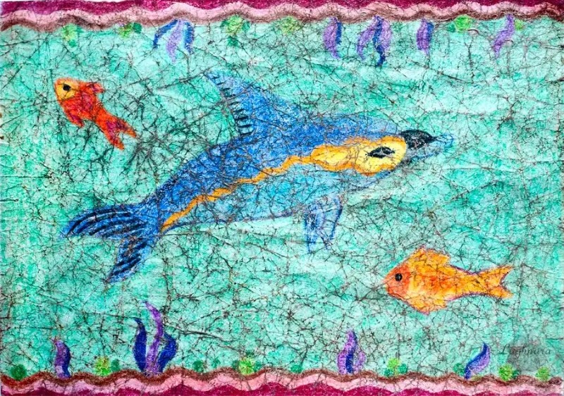
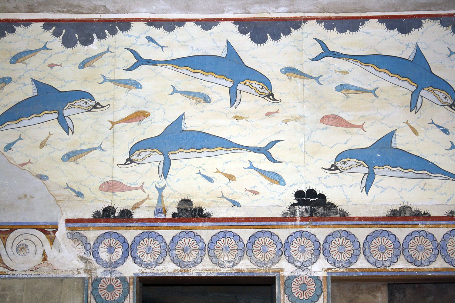
I chose a fragment of Minoan painting - dolphins, as a reference https://knossoslab.ru/images/fresco/393.jpg
Create a sketch
I decided that the main character would be one dolphin plus two fish and border ornaments with algae above and below.
The objects should be large enough not to get "lost" in the finished work.
Matching colors. Something like this:
Paint over the background color too. Quite intense, preferably without gaps. At the last stage, you will understand why.
And colorful borders, of cause!
At this stage, do not rush, it is better to paint with short strokes.
The result is such a piece of the sea, which was once painted on some (possibly ceramic) surface ...
... and which we will crackle now!
Very carefully, so as not to tear the picture, we begin to crease the paper sheet, starting from the edges. We crush thoroughly!
And now we take gouache, a synthetic brush and begin to paint over the picture thickly. I took the color of umber - not very dark and not very light.
Why exactly gouache?
This paint is opaque (as opposed to watercolors) and can be easily washed off with water without damaging the painted surface of the paper (as opposed to acrylic or tempera).
I painted over almost the entire picture, leaving only the fish eyes so that the cracks don't go through them.
Finally, a moment of magic comes!
When the gouache layer is completely dry, rinse it off with water.
From personal experience, I will say that it is best to wet the picture and stick it evenly, without bubbles, with the back side on the bathroom wall and turn on the shower at a low pressure. If the paper is secured in this way, it will not tear, and the paint will be washed off without hindrance. But do not pour water for too long, otherwise the colored pieces of paper will begin to flake off and also wash off along with the paint.
Let the rest of the water drain completely, then remove the still wet picture and iron it with a weakly heated iron between two thick clean sheets of paper.
And here it is, a real old fresco with cracks!
I hope my English speaking friends will also appreciate this artistic technique.
Thanks for your attention!
Regards
Still life in dutch style with acrylic painting - https://read.cash/@daring-celt/still-life-in-dutch-style-acrylic-painting-47661cc3
#art #drawing #tutorial #Readcash
Still life in dutch style (acrylic painting)
Hi friends!
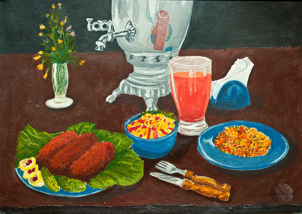
Today I want to tell & show you haw I painted this picture which I named "Russian still life in Dutch style". The article of drawing says about my intention to make a picture stylized as old Dutch painters.
The original of tutorial written for Golos https://golos.id/goldvoice/@gerdananeis/khud-konkurs-vkusnyie-fantazii-russkiij-natyurmort-v-gollandskom-stile-vne-konkursa?invite=gerdananeis
For reference I chose my own photo of country summer lunch.
It's set of materials I painted: acrylic paints, synthetic brushes & medium for acrylic paints (to make their more wet on the paper). https://ic.pics.livejournal.com/daring_celt/21759813/528799/528799_original.jpg
Sketch
As can be seen from the reference, the photo shows a white tablecloth and a light background.
I made them dark, mixing black and brown paint.
Then I added some colors of brown are scarlet and canary yellow colors what a background was be not so smooth.
Yes, in process of drawing I slightly "lowered"a horizon line.
I start my painting with the most difficult subjects - from a bouquet of flowers in a transparent vase and from the main dining dish - fish cutlets with fresh vegetables.
I used two green shades & bright yellow for painting a foliage; gray, ivory & heavily diluted grassy green - for glass.
Cutlets I painted with brown, scarlet and two shades of yellow.
For a cucumbers I chose grassy and light yellow paints, for lemon circles are light yellow and gray.
Then I painted a dinner's dishes with mix of cobalt blue & gray.
The samovar (*a vessel for making Russian tea*), unfortunately, is not an old copper one, but a modern one from nickel-plated alloys.
Gray, black and ivory colors were great for it.
Then I painted a shadows on dishes with mix of cobalt blue & brown - those parts that are closer to a table.
I apply glare in ivory color to have a matte gloss effect on porcelain.
Tomato juice is drawn with a mix of scarlet with two shades of yellow, a glass - with colors of gray, ivory and brown diluted with medium.
With the same colors as the juice and dishes, I draw a reflection in a side of the samovar's surface.
Above it is slightly I glazed with a very diluted gray to dim the brightness.
At the same stage, I put shadows under each object - with mix of brown and cobalt blue.
Finally strokes: in the right plate are slices of fried potatoes with a green onion (scarlet, green, two shades of yellow and brown), wooden handles at tableware (yellow and brown), salad in the central cup (scarlet, two yellow and green), yellow and pink - little flowers.
And burgundy-red cranberry droplets in lemon slices.
I correct the contours of objects, and here is the result!
I hope you like my painting tutorials.
Maybe it will inspire someone to take brushes and paints too
Have a nice day!
Regards
How to draw an ice-cream with acrylic paints - https://read.cash/@daring-celt/ice-cream-in-crystal-ice-cream-bowl-acrylic-painting-0169ab85
#art #drawing #tutorial #Readcash
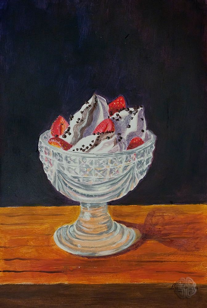
Ice cream in crystal ice-cream bowl (acrylic painting)
Hi friends!
Today I want to talk & show you haw I painted this picture to the next art contest to Golos.
Contest's theme was named **Freshness**.
Who can resist the portion of a delicious creamy chocolate ice cream, decorated with fresh strawberries and sprinkled with chocolate chips?
Especially if there is a terrible heat outdoors... https://golos.io/vp-painting/@vp-painting/start-dolgozhdannogo-khudozhestvennogo-konkursa-risuem-vmeste
I chose this my photo as a reference.
I think, it's very successful due to the beautiful pronounced light and shade and glare on the bowl. https://cdn.publish0x.com/prod/fs/images/918530fadf9ef28dfa6c5f2a429f66d739610bf0a84408dd57f5740e7cded269.jpg
Materials: some colors of acrylic paints, two brushes - №12 (bristle) & № 6 (synthetic), acrylic medium and watercolor paper with fine-grained texture.
Сonstruction sketch (with more clear table surface)
I mixed ultramarine and burgundy paint to make background, trying to make it uneven with lighter and darker (shadow) sides.
Light falls on the left (sunny, warm), so a shadows will be cold ...
For wooden surfaces I mixed brown, scarlet and canary-yellow paints.
Foreground has made it more saturated and dark than a background.
In some places I painted stripes imitating a fibers of a tree with heavily diluted brown paint.
And since the paint is thick, it also scratched a light fibers on the wet layers with an other end of the brush.
The next step was an imitation of transparency on a bowl.
To do this, I very much spread a paints with which I painted a background and a wooden surface, and put them on a corresponding parts of a bowl, casting a bet on a pattern of a crystal grooves.
Then I outlined a shadows on the creamy hills of ice cream (made them light lilac, closer to blue).
While very weak.
Acrylic - opaque paint, never late to strengthen the details ...
The time to paint a main delicacy!
I mixed brown and ivory and painted chocolate pieces of ice cream.
Shade of my brown paint is cold, so I added it more in a shadow and less to a lighted areas.
Then I painted berries with red (light areas - with a mix of yellow, and added some burgundy to dark ones) and dot with yellow color - these are seeds.
Don't forgot about the bowl! In some places I put red spots, where strawberries should lie behind a glass.
And, finally, the most difficult step - crystal ice-cream bowl and its facets.
I thought very long time, with what color to draw crystal?
Finally, by mixing white with a drop of ultramarine and an even smaller drop of black, I found a suitable steel shade, which, being strongly diluted by a medium, produced colors more or less similar to glass edges.
Saw to the ref, first I did a darkest edges.
Moreover, on a influxes of a base of the bowl, a darkest areas were on an illuminated side, and on the bowl itself - on a contrary, there were more dark edges on the right - these are a refracting and reflective properties of glass.
And then I painted absolutely intuitive!
Small edges in a middle i painted in accordance with a lighting, a closer to a light edge, a lighter gray shade was chosen; on a shadow side added more sharp dark edges.
On both sides I just put some chaotic points, because there a drawing is the most distant from the viewer and therefore fuzzy.
I also added red-yellow reflexes from a wooden surface to a lower part of the bowl and their a little to a small upper edges.
**Important**: when drawing objects with complex lighting it is necessary to look at the picture from a distance from time to time - this way you can better see all the flaws or the most successful places!
Used to this technique, I saw that a shadows on an ice cream were too sharp here and there.
And also the fact that a bottom of the base does not have a volume.
I made a shadows on an ice cream softer with a slightly diluted white paint and a drop of yellow.
Finally, small details remained - a crumb of chocolate for ice cream (painted with brown and sometimes black).
Adding tone on an ice cream bowl, touching up a shadow, if necessary; glare on strawberries that came to light, and all a bright places - on ice cream, on chocolates (all the same mix of white + yellow in varying degrees of concentration).
And the drop shadow from the bowl, certainly!
Here I switched on my imagination, because in the photo it is cropped.
I chose the same mix of ultramarine and burgundy, added warm shades (wood color) and drew a translucent shadow, repeating a contours of the bowl in a future, darker at the base and then fading.
Here I got a creamy chocolate-strawberry-crystal freshness!)))
Many thanks for attention to my tutorials!
Have a nice lucky and creative day!
Regards
How to draw grey seagull with acrylic paint - https://read.cash/@daring-celt/gray-seagull-acrylic-painting-618633bb
#art #drawing #tutorial #Readcash
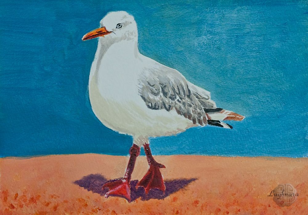
Gray Seagull (acrylic painting)
Hi friends!
Today I tell you how I drew this picture - gray seagull proudly walking in the sand.
I made this drawing on Russian platform Golos to one art contest.
I live far from sea but I very like seagulls, but I live far from sea, because I use a ref from internet in my work. https://golos.id/ru--risuemvmeste/@gerdananeis/risuem-vmeste-etap-5zhivotnye-i-pticy-serebristaya-chaika-akril?invite=gerdananeis https://animalreader.ru/wp-content/uploads/2014/02/chajki_1_1.jpeg
Sketch by pencil
Materials which I used: watercolor paper, some colors of acrylic paints, three brushes different sizes.
A, yes... and medium for acrylic paints.
I started my drawing with paint bucket of background.
The sea behind the seagull I painted with a mix of blue and grass green, above it is more green, below it is more blue.
On a lighted side of the seagull, I maked the background a bit darker. In order to highlight the bird even better add blue (cobalt).
The sand is obtained by mix the colors of red and canary yellow.
I prescribe the foreground with this mixture, and the back one with ivory added to make it lighter and less contrast, according to the tonal perspective.
Then I painted most intense details of the seagull - beak, legs, wings, feathers on the tail.
Outlines areas where there will be shadows.
In next step I mixed a white paint with a bit gray and drew a shadow around the eyes and under the beak. Darker gray with the addition of black highlight some feathers on a wings.
Further, I added a bit of gray to ivory to painting shadows at a bottom of the abdomen (it is warmer because it's reflexes from a sand).
I drew a visible eye and a shadow of an eyelid of another eye.
Finally, some little details - to correct a shadows on the wings, on a legs, to trace an eye, a glare on tip of a beak. I Added some large pebbles or lumps of sand in a foreground
And, of course, the falling shadow under a seagull's legs is a contrast and short one, because the day is sunny and a bird is practically under direct rays of sun.
And since the shadows in the drawing turned out to be mostly warm, I make it a mix of red and cobalt, closer to warm violet.
So nice walking seagull I did))
So nice walking seagull I did))
Thanks a lot for your visit and donations))
Have a nice day!
Regards
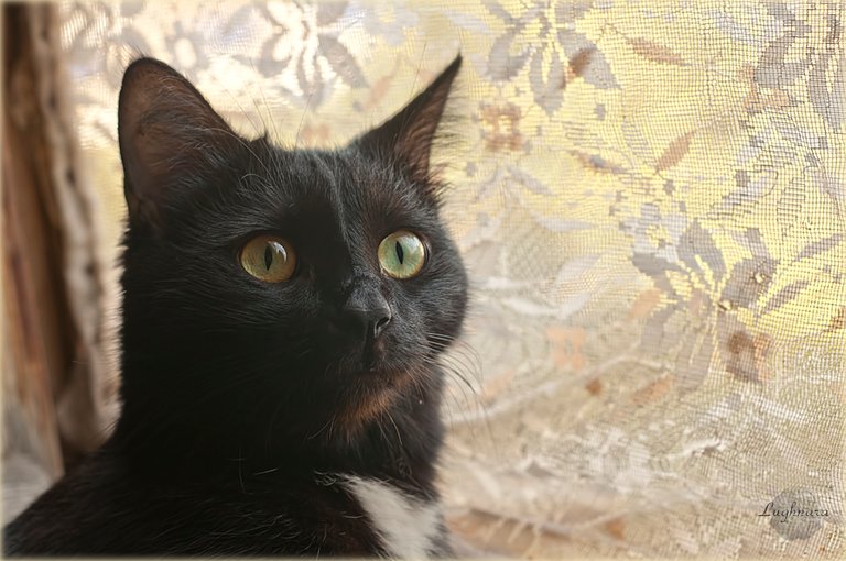
How to draw a black cat on black paper...
My new tutorial on Read.cash - https://read.cash/@daring-celt/mickey-cats-pastel-portrait-9c0e7207
#art #cats #tutorial #Readcash
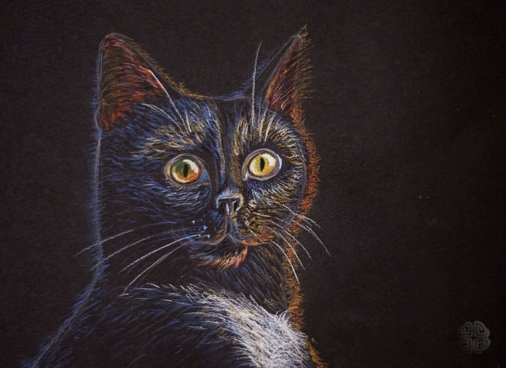
Mickey (cat's pastel portrait)
Hi friends!
Today I tell & show you haw I drew portrait of one of my cat named Mickey.
I drew it to art contest on Golos https://golos.io/ru--risuemvmeste/@gerdananeis/risuem-vmesteetap-5-zhivotnye-i-pticy-mikki-portret-pastelyu
He is very photogenic, but not very plodding, because he had to use the reference (my owner photo) https://images.hive.blog/768x0/https://cdn.steemitimages.com/DQmShkmcvX36mKeYH4HKsTVXhc5i31o5gkYhoAqkNY8c9XX/%D0%9C%D0%B8%D0%BA%D0%BA%D0%B8%20%D0%BD%D0%B0%20%D0%BE%D0%BA%D0%BD%D0%B5_2.jpg
For my work I used black paper Canson "MI-TEINTES" and some pastel pencils Faber-Castell - they have a nice color range, near to a natural tones.
To begin with, I sketched the outlines of the model in neutral grey color.
Then I chose a suitable color palette.
Main color of lighting I decided to make it warm, and a backlight must be cold.
For the Mickey's eyes I took two green shades and white for highlights (in finally, a black pencil was added to correct certain moments).
I started my drawing with a brightest, lighted areas (yellow and ocher in places), then colored a shadows in blue, highlighting the individual hairs falling into a light.
Then I outlined a color of inner part of the ears - they are thin and well pass a light, it's necessary to depict them as if translucent.
Separate small strokes I drew a contours of a wool to separate the cat from background (in a photo, unlike this picture, Mickey sits against the background of a lighted window, and a contrast between he and a background is distinct).
Also I outlined the whiskers and highlights on the nose.
Well, finally I got to Mickey's eyes.
Mickey has a very beautiful green-gold eyes, glowing, as a pearl.
I wanted to convey this glow in the picture as accurately as possible.
One of eyes fell into the shadow, & I painted over it with a light green and with the addition of dark emerald green.
Second eye , in a light area, I drew with golden shades (yellow + white + light green and a drop of ocher).
With black pencil I highlighted pupils.
In order, for cat's eyes looked alive and wet, I caused glare on the iris, tear channel and lower eyelid with white color.
I also drew an inner part of an ears - I added dark and light hairs, and traced cat's whiskers and eyebrows more clearly.
Well, the last stage I drew a white shirtfront of cat.
Then I wanted to add more ocher to a lighting so that a color of an auricles was more reasonable.
And on the contrary, I slightly smeared a blue strokes - a little bit, at the outermost borders.
Then I made the most illuminated fragments of fur with white and in some places accentuated shadows with individual black strokes (for example, on the lower jaw and on the nose).
And so I got a pastel portrait of a cat (*with some sharpen & color correction of camera's white balance*)
I hope you'll like this picture and tutorial
Many thanks for your attention!
Regards
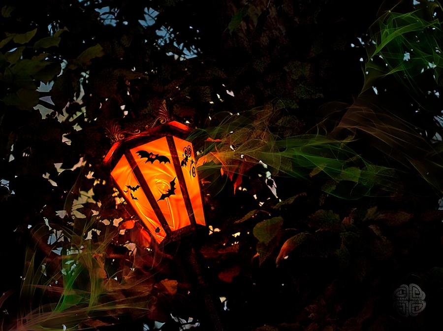
The mysticism of Autumn is sometimes found even in the light of ordinary city lanterns...
#photography #autumn #art
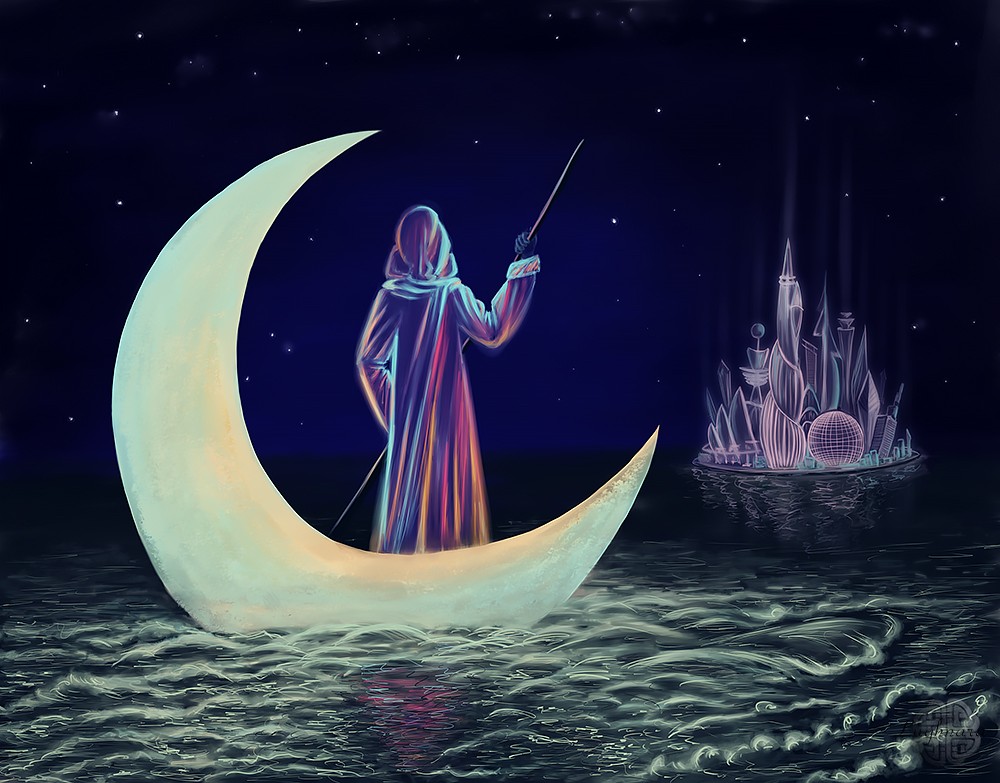
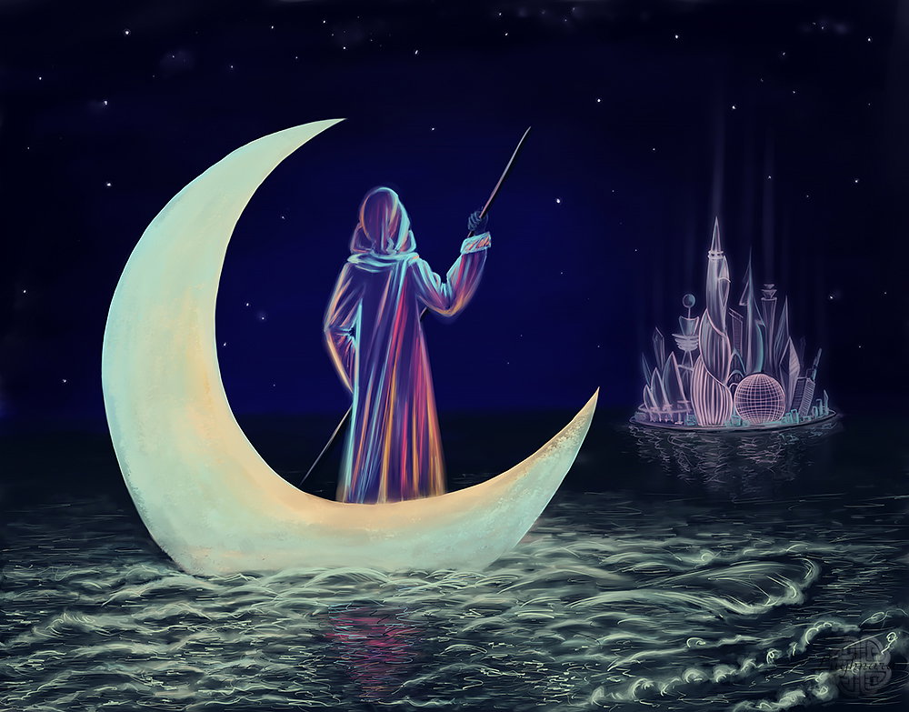
Moon Ghost, drawing to Halloween
https://read.cash/@daring-celt/digital-art-2019-moon-ghost-d4c51eeb
#art #digital #tutorial #Readcash
Digital art_2019. Moon Ghost
Hi friends!
On the eve of Halloween, I remembered my old drawing of mystical mood
Please don't ask me where I get such strange stories from - no artist will tell you about!))))
But an idea of drawing is a return one wandering moon ghost to his home, to ghost sity...
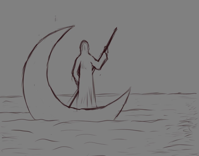
Sketch
*Sure I drew without one specific reference, only looked on some different photos to real draw a see and fantasy buildings*
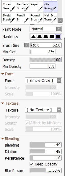
Drawing in **Paint Tool SAI 2**
Choosing base colors of background and a moon
On this step I draw with **Old Rough** (to fill big areas)
and **Oil Brist 2** (*to blend a different colors)*
Then I sketched a silhouettes of ghost and far coast.
Working with a moon ghost and with a city.
To draw clean lines, I use **Ink Pen**
Details
Adding more stars on the sky, highlights from city and waves (with copy and blurred a copied layer)
Finally, I refine individual waves and highlights on buildings.
I also paint a colored reflection of a ghost in the water.
And made a color correction and sharping in **Photoshop**
Happy Halloween to everyone who observes this holiday!
Regards
Gera
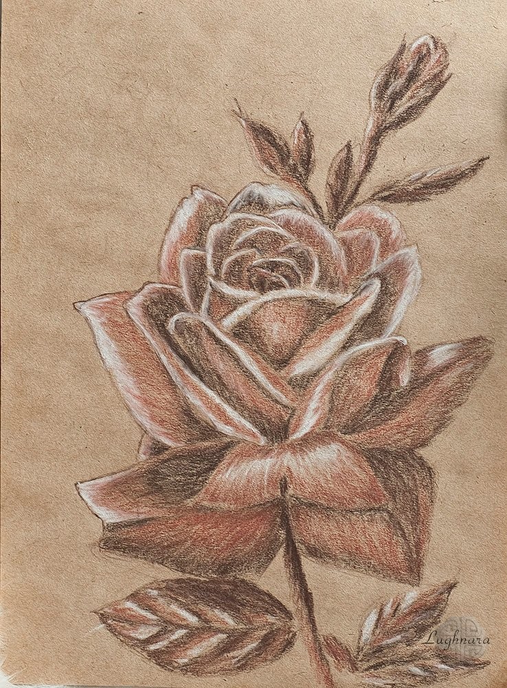
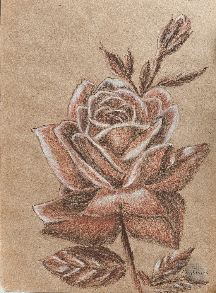
Drawing Rose in grisaille technique
https://read.cash/@daring-celt/grisaille-rose-graphics-bcf79143
#art #drawing #tutorial #Readcash
Grisaille rose (graphics)
Hi friends!
I'm a digital artist, but sometimes, if I'm in the mood, I return to traditional pencils and paints.
Today it occurred to me: if photographers consider b / w roses to be quite a good creative solution, then why not draw it in monochrome?
I don't think it will look worse ...
There is an idea, it's up to you to sit down and draw!)))
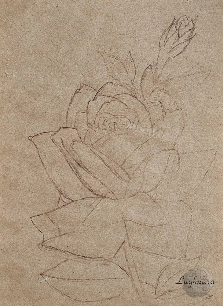
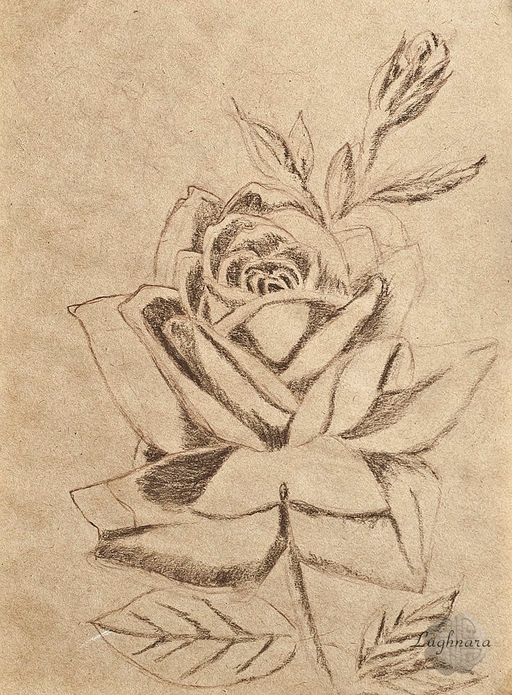
Sketch and stages (*drawn from several of my own photos*)
I chose a composition for a long time - I wanted to add a bud to the rose, but I did not immediately find a good place for it.
First I put shadows in dark sepia pencil
Then I make a color transition with a light sepia
The lightest areas (glare, veins, petals in the light) - with chalk.
I paint over the rest of the flower with sanguine.
In some places, I slightly emphasize the shadows and outlines with a charcoal pencil.
Result and materials I used
I hope my idea inspires you to create your own original artworks!
Have a nice and creative day!
Regards
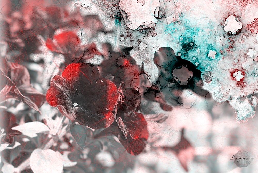
Autumn plays strange games, then imagines itself in summer, then says that it is winter.
Nature is forced to accept the rules of the game.
And flowers also try themselves in other roles ...
#photography #nature #art
It's not digital, its real live materials
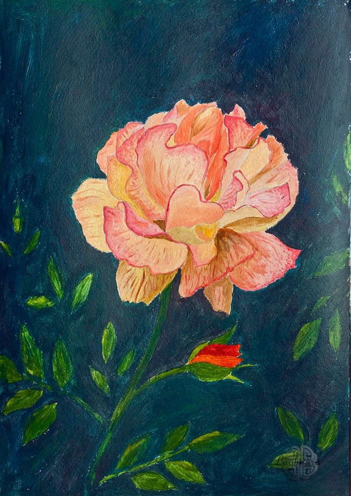
How to draw a fiery rose with acrylic paints
https://read.cash/@daring-celt/fiery-rose-acrylic-painting-6ec0dcab
#art #nature #tutorial #Readcash
Fiery rose (acrylic painting)
Hi friends!
While Winter hasn't yet come into its own, I want to succumb to the Autumn mood and draw something appropriate.
Sometime I saw very beautiful rose in blog of my friendin on Golos.
I wonted to draw it.
I didn't want to make a realistic flower, but a stylized one. https://images.hive.blog/DQmektUEKXj1bfncRzmTyuaq8o3DDfvvHBo2KhpYMCSavRP/P5272551%20(2).jpeg
I chose for my work some acrylic paints, three synthetic brushes of different sizes and medium for acrylic paints (paint drying retarder).
A draw a sketch on watercolor paper.
It is very dense and acrylic fits perfectly on it
For the petals I chose canary yellow, carmine and bordeaux paints. Somewhere in loghtest areas I added a white in different colors
To make a drop shadows more deep I mixed an ocher and ultramarine a little
For leaves - herbal green, emerald and lemon yellow.
To highlight the light flower, I made the background very dark with a mix of ultramarine and emerald paints.
Yes, this is what I wanted to get as a result!
I hope you liked my drawing too)
Wish everyone warm and positive autumn evenings!
Regards
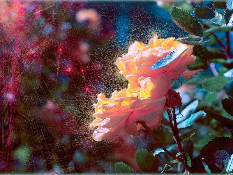
Autumn catches a roses by a spyderweb of rays of Sun...
#photography #nature #art
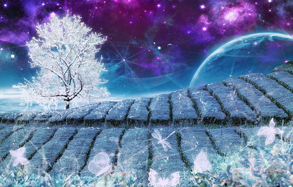
On the Edge of the Earth (digital photomontage)
My new tutorial on read.cash - https://read.cash/@daring-celt/on-the-edge-of-the-earth-digital-photomontage-7c988645
#art #digital #tutorial #Readcash
On the Edge of the Earth (digital photomontage)
Hi friends!
Sometime I wont to rest from drawing and choose another job.
At example, making a photomontage.
It's very fascinating process too!
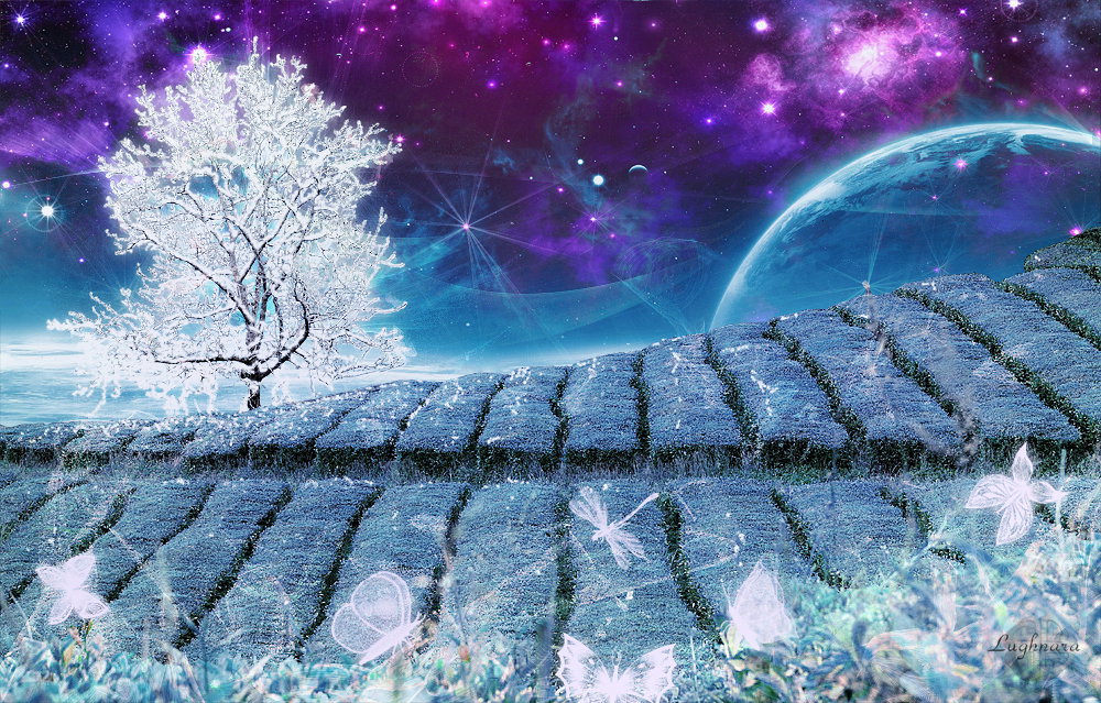
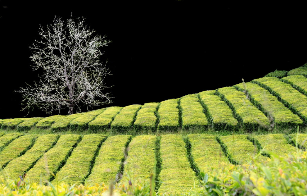
As a basis, I took a free photo from Pixabay https://pixabay.com/ru/photos/teaf%C3%B6ld-%D0%B3%D1%80%D0%B8%D0%BD-%D0%BF%D0%BB%D0%B0%D0%BD%D1%82%D0%B0%D1%86%D0%B8%D0%B8-%D1%87%D0%B0%D0%B9-%D0%BF%D0%B5%D0%B9%D0%B7%D0%B0%D0%B6-4594431/
I started with delete a background
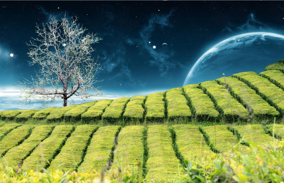
Then I found on NASA's site some beautiful images of cosmic scenes and paste one of their as a back.
The moon and a stars I drew with brush tool (*of course, I making a digital collages in Adobe Photoshop, it's a best program for this work*)
In next step I making a color correction with adjustment layer **Hue/ Saturation**
Then I did set one of basic brushes to drew a hoarfrost on branches (on new layer)
Then I added one cosmic image to make a sky more beautiful and colorful
Some snowflakes I placed on a earth, thick under the tree.
It already turned out beautifully!
But I still didn't like a blades of grass in the foreground, they also needed to be decorated.
I maked so: open new file with the same size as my work and lunch a wonderful plugin **Corel ParticleShop**
If you don't know, it's toll can created wonderful shining patterns other forms.
I drew a pattern what liked me, save it in separate layer and then drag it in my work
That's what happened!
It seemed to me that it was too saturated and I changed blend mode of pattern to **Soft Light**
Now I decided to add a shine on a frost branches.
I copy a layer with hoerfrost, blur it with **Gaussian blur** , set a bland mode as **Lighten** and replace it under original layer.
Finally, I chose a brush in a form of fantasy butterflies, chose white color and drew with it on foreground.
The last steps remained - more color correction and sharpness.
All is ready!
Many thanks to all who visit, comment and donate my digital tutorials!
Have a nice and creative day!
Be healthy!
Regards
 @daring-celt