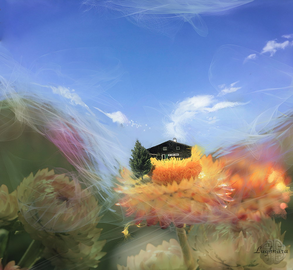
Flying House (photomontage)
Hi my friends!
I again changed the type of creativity for a while.
Contests are held at one of the sites where you need to make your own scene from a given photo.
Sometimes I like a source, an idea comes up and I entry.
Like this time
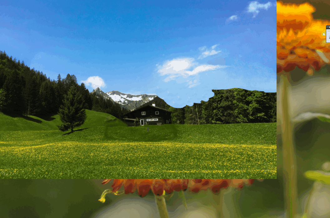
It was a source photo for work https://images.ecency.com/p/3DLAmCsuTe3ba2VJAE1ZhN2oVhekeqoshg9DUnSyUd2Cnt4YtUMpZp3sK6eorvaUHfy6othmapEmejs8SMtdCWkNZAosyurhDc2FbGoohvciLX1zuE4GTZi4xHq2QZXhbKaa8eEhJzjFnU9Fc4kyqBvKCUWSk14.webp?format=webp&mode=fit
And some my own photo of flowers
First I put the photo in one working file
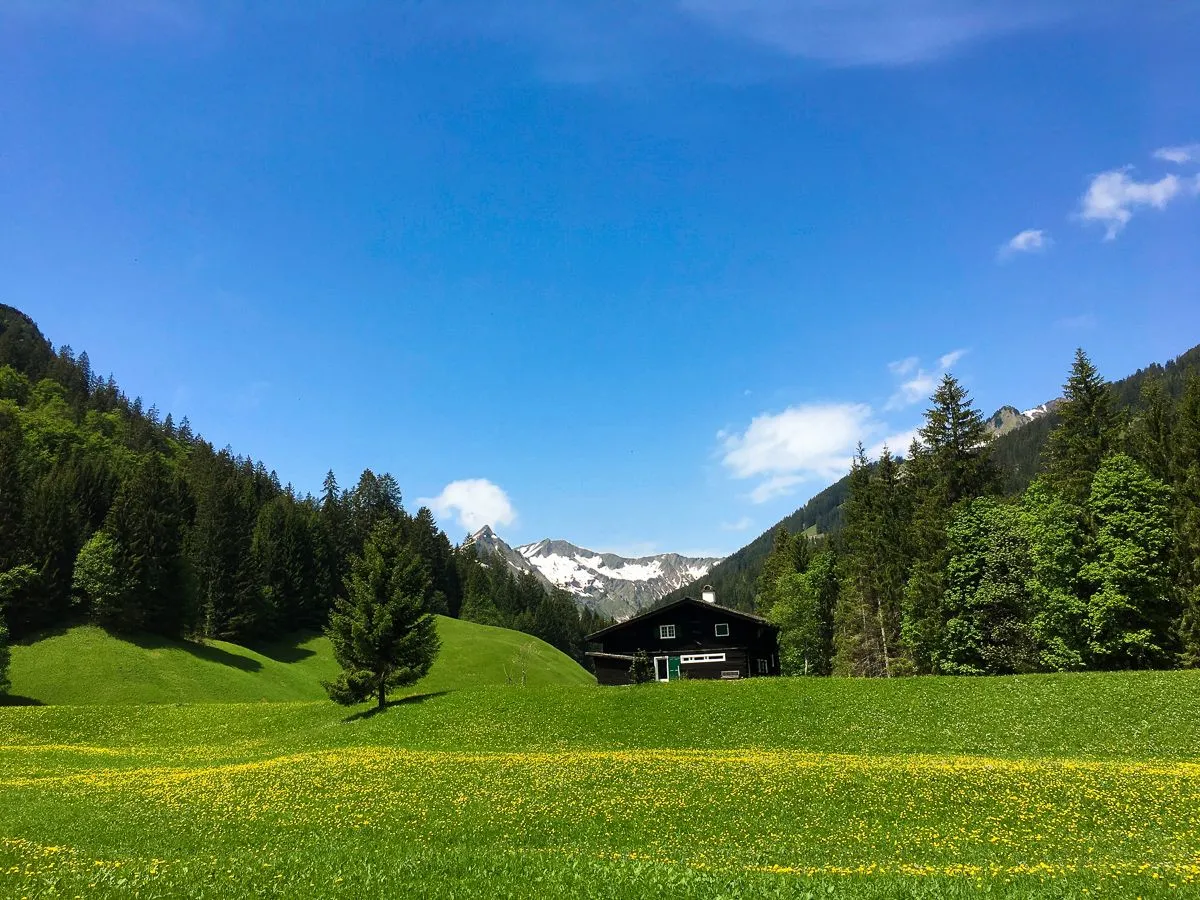
Then with the help of a layer mask (*yes, I worked in* ***Photoshop****, of course*) I hid part of the source, leaving only the house and the sky
I liked the lonely tree on the left and decided to highlight it separately.
Yes, the drop shadow had to be drawn by hand
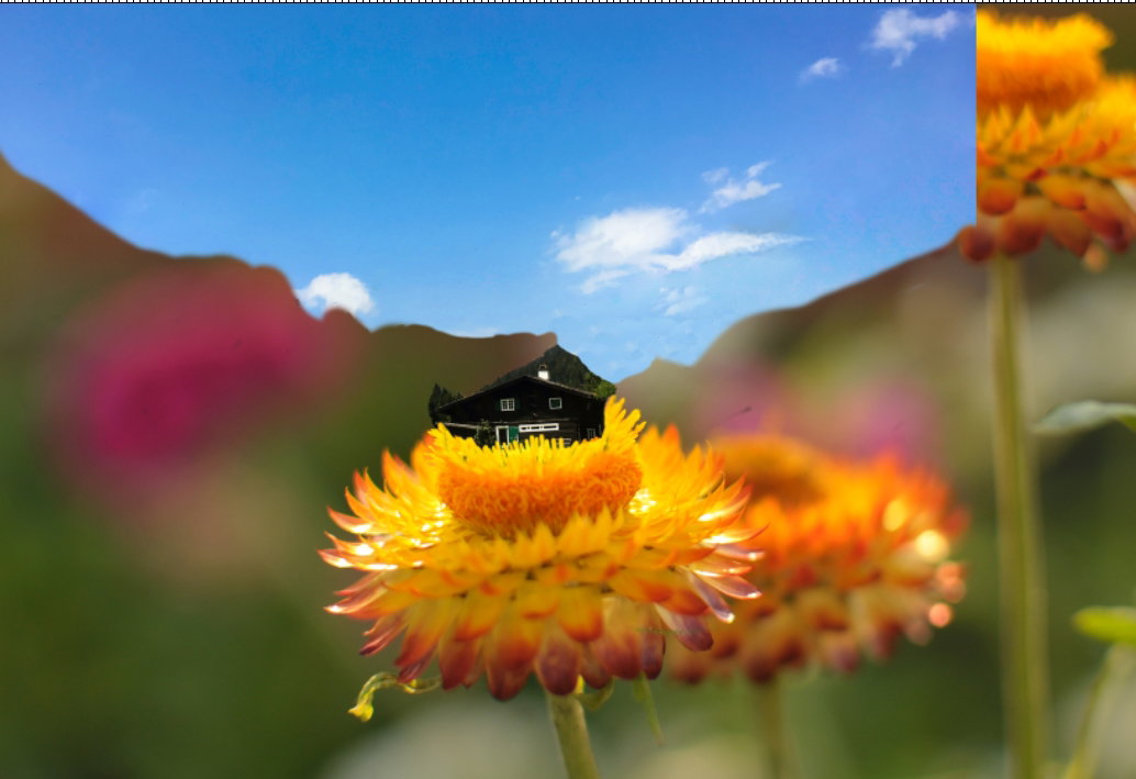
Then, with the help of a brush and **Clone Stamp** tool, I painted the sky
Crop the picture and drawing a guidelines strokes with blue color
And now the magic begins! Why I Love Digital Programs!
I make another snapshot and opening it in **Corel ParticleShop** (it's special plugin from Corel corpotation which allows you to draw particles in Photoshop with brushes from the latest versions of **Corel Painter**)
Chose a brushes and drawing a ornament, save as alone stroke and replace it in artwork
Add one more layer with flower and blur it with **Gaussian blur**
Some finally color correction with adjustment layer **Channel mixer**
I hope you like my idea and someone wants to do the same
With Love...
Wallaby (colored pencil art)
Hi my friends!
Among artists on the Internet there is such a popular entertainment - art challenges.
Drawings on a given topic every day.
I sometimes try to participate in them, but there is not always enough free time.
This May the theme is "rare animals".
I don't know, maybe I can draw at least five drawings in a month.
Today the first animal - which is called a wallaby/
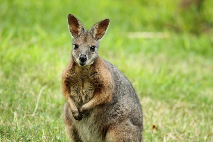
These are animals that look like kangaroos but are smaller.
I have never seen them in real life, so I looked at the photo https://7factov.ru/wp-content/uploads/2019/05/2a195194-716x477.jpg
I decided to start this challenge with simple tools - colored pencils.
Sketch
I start with a medium gray tone, gradually adding dark gray and brown shadows, inside the ears and in the eye sockets.
I detail the muzzle with black color, draw the eyes and nose
Next, I draw the body of the animal.
On the belly of the Walabi, the hair is longer than on the back.
I show this with the appropriate strokes of the pencils.
I try to keep light and shadows...
The upper part of the body, in the region of the chest and neck, is very short and stiff.
I paint with short strokes in different directions to create the effect of stiff, tousled hairs.
Well, the final step is the background.
With several shades of green, I create the natural environment for the animal
Yes, with the first drawing of the challenge, I think I did it!
With Love...
Memories of winter (charcoal pencils drawing)
Hi my friends!
Spring this year is very capricious, with sudden changes in weather. Sometimes very hot weather, sometimes very cold.
Just today another stage of cold.
And I remembered how I drew a snow-covered forest...
Yes, more recently it was like this - a lot of black and white and not a drop of greenery
I really like some graphic materials - charcoal, chalk, sanguine and sepia in pencil.
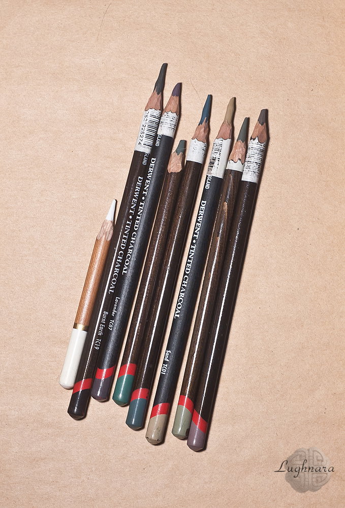
Or tone charcoal pencils as in this artwork
The most suitable tools for graphic drawing techniques!
Reference (by my friend from Golos) https://images.golos.today/0x0/https://steemitimages.com/0x0/https://sun9-11.userapi.com/hPyZzfKV8ITU1JgGOkAwwYuPDg-tOS83GSZkHg/06oV70kIWA4.jpg
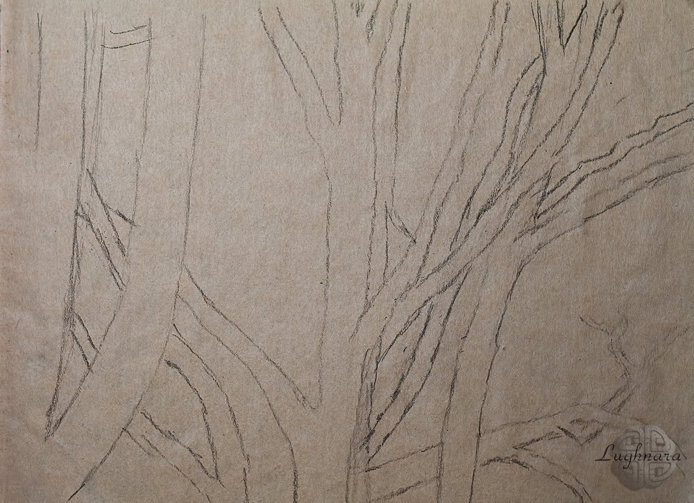
Sketch with neutral color pencil
Charcoal pencils should be handled carefully - they are very soft, and it is easy to smudge the entire drawing.
So I start shading from the left side.
For the trunks in the foreground I take white and two brown colors, and for the background - ocher and one of the shades of green
I continue to work on the long and medium shot. I make the trees in the middle ground lighter than the tree in the foreground.
With separate vertical strokes I outline distant individual thin trees
I add two more shades of green to the work to paint the grass patches at the bottom of the picture.
The upper part will be in yellow and light brown shades, as the grass areas only on the ground
In the same way, I fill the space behind the middle tree, varying the colors.
I do not forget to apply the texture of the bark to thick trunks. I draw thinner branches in two colors - white and black.
So I gradually move throughout the drawing from left to right, covering the finished fragments of the work with a piece of paper so as not to smear the strokes
Final touches - more white on the trunks and slightly blurring the background.
I like this silent winter forest!
With Love...
The Window in Gloxinia (oil painting)
Hi my friends!
Thinking about drawing spring flowers, I saw an interesting photo on the Internet - a window entwined with gloxinia flowers.
I decided that I like this story!
Oil paints here would be the most suitable material.
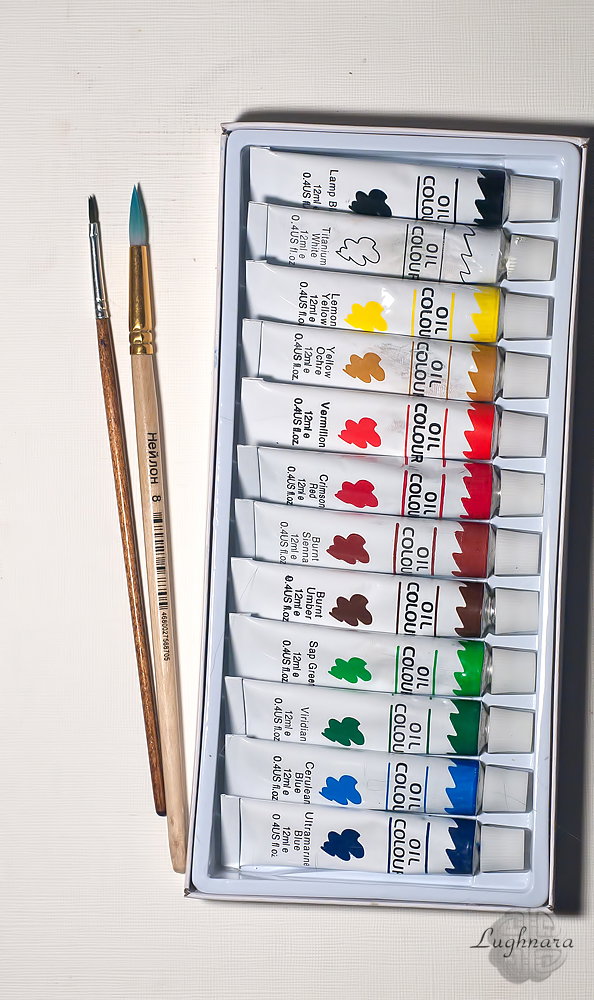
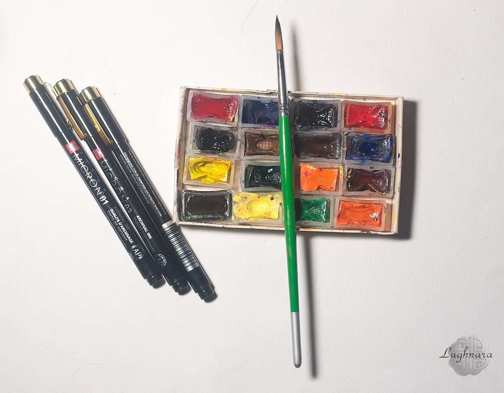
Today I used a new set from Germany
And two synthetic brushes of cause!
Instead of canvas, I use special paper for oil and acrylic.
I changed the shape of the window because I don't like the sharp corners that don't work well with the delicate clusters of flowers.
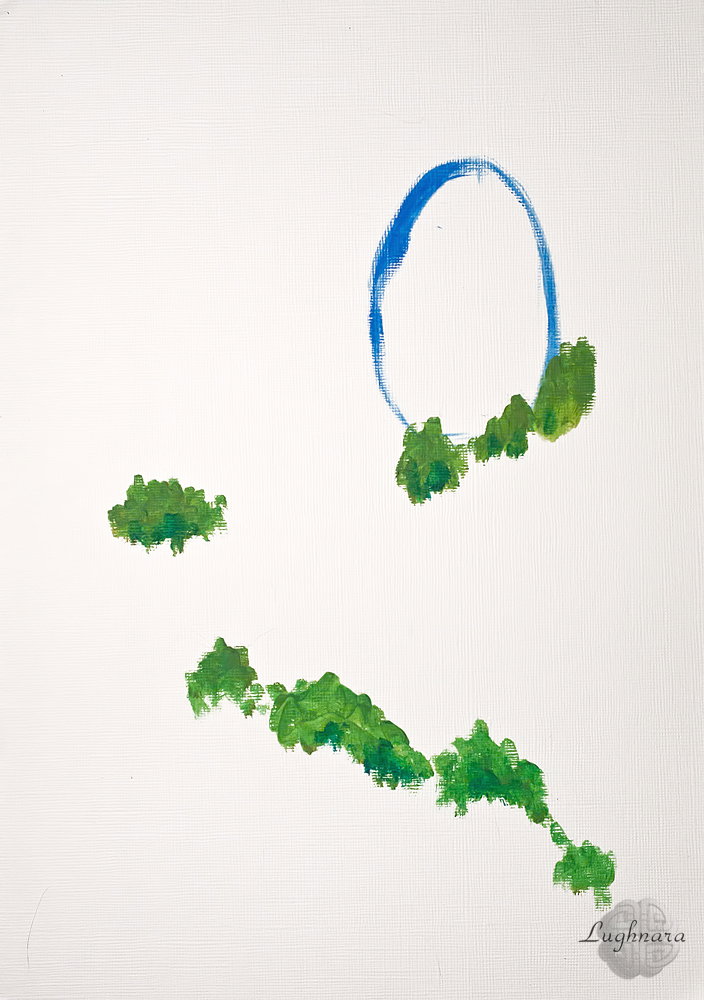
And outlined the line of plants
I start from the background.
This is a jagged old textured wall.
To write it, I mixed red vermilion, yellow ocher, whitewash.
I added viridan green here and there in some areas to get a neutral taupe color, reminiscent of a concrete surface.
The window, according to my plan, will be the same main element as the gloxinia branch.
Therefore, I take saturated colors for her - grassy green and cerulean blue.
In order to draw glass, I take ultramarine and a mixture of green and ocher - as if a reflection of the sky and greener.
With a mix of the same colors, I draw a falling shadow from the window on the wall.
In order to draw clusters of gloxinia, I make several mix of colors - vermilion red, ceruleum blue, ultramarine, crimson red and white.
Distant clusters will be colder tones, lilac, and those closer to the viewer will be lavender.
For a dark trunk, I take burnt umber and ultramarine.
At this step, I decided to work with the texture of the wall - I added more texture, detailed a fragment of brickwork, somewhere I smoothed out sharp color transitions more.
Made the lower part of the wall, near the flowers, darker
Small details remained - glare on the window, on the trunk of the plant and on the flowers
I make clusters of flowers more voluminous.
I form a more realistic green over them - using the same green and ocher (I add ultramarine in the shadows).
Here and there I make deeper drop shadows from the plant on the wall and shade the window from the flower greens.
Here is such a new picture with a spring mood I got today!
With Love...
Crocus in the snow (watercolor art)
Hi my friends!
I don't know why but spring inspires watercolor painting.
We have the first spring flowers blooming, and this is another opportunity to draw.
Today I'm painting the primrose again, one of the most courageous and enduring flowers that grows right out of snowdrifts!
These are crocuses
For this drawing, I again used watercolor paints and table salt, as in my previous lesson. https://read.cash/@daring-celt/pasque-flower-watercolor-art-c703bd56
But this time I decided to change the drawing technique a little.
So... The beginning, as usual - I make the paper wet and first draw the area of the ground where the crocus will grow from.
Here I took a mix of ocher, sienna and cobalt
Then I mix cobalt and ultramarine and paint over the background completely.
And while the paper is still damp, I sprinkle salt on the bottom of the drawing to imitate grains of loose spring snow.
In some places I even add water drops to make the blur more natural and unpredictable.
I left the drawing for almost a whole day, so that the paper completely dried out.
The dried salt created an interesting texture.
I partially removed it, and left it in places to draw directly on it.
To begin with, I put dark shadows on the ground, then with a few thin strokes in green I painted the leaves.
In order to paint the petals of the flower, I mixed ultramarine, cobalt carmine and purple in places (closer to the stem).
I painted individual petals that are spaced far apart so the colors don't mix.
This is called the fill technique.
I give the paper time to dry and finish painting the rest of the petals.
I leave a free area for the core.
For the core, I needed yellow and orange colors
It remains only to add shadows to the snow and the flower
And now a brave flower emerged from the snow towards spring!
With Love...
Pasque-flower (watercolor art)
Hi my friends!
This is another spring primrose - a flower with fluff on the leaves and the stem.
I decided that watercolor paints and ... ordinary table salt would be best for his drawing.
And I also need masking liquid and a synthetic brush
I found beautiful photo as a reference https://www.pinterest.ru/pin/632826185149627574/
I apply masking liquid to the area where the flower will be depicted.
Then I mix the blue tones - ultramarine, cobalt and violet and paint the background.
At the bottom of the drawing, I paint some stripes with ocher mixed with cadmium red and yellow.
And I cover this lower area of picture with salt while the paper is still wet
I mixing cadmium green yellow and some red to paint the stem of the flower and part of the leaves.
I also apply a new colorful layer to the top of the drawing to make the background more complex and colorful.
For this I needed the same ultramarine, cobalt and red ocher.
I also draw shadows from snowdrifts, where the flower gr
I remove the masking fluid from the leaf area and paint thin strokes with the same paint mixture as for the stem.
I immediately sprinkle these wet touches with salt.
When the paper dries, I remove the salt and use a darker green color to finish the shadows on the leaves.
And I also draw a shadow from a flower - a mix of ultramarine and green
To paint the flower I use cadmium yellow, gold, cadmium orange and cadmium red.
Then, in the second layer, I add green and red ocher in the shade, and lemon cadmium on the most illuminated parts.
I also sprinkle it with salt.
When the paper is completely dry, I remove the salt and add some shadows to the petals and some additional foliage in the background.
The result is such a sunny portrait of a flower that has made its way out from under the snow!
I hope that this drawing will add a good spring mood to you!
With Love...
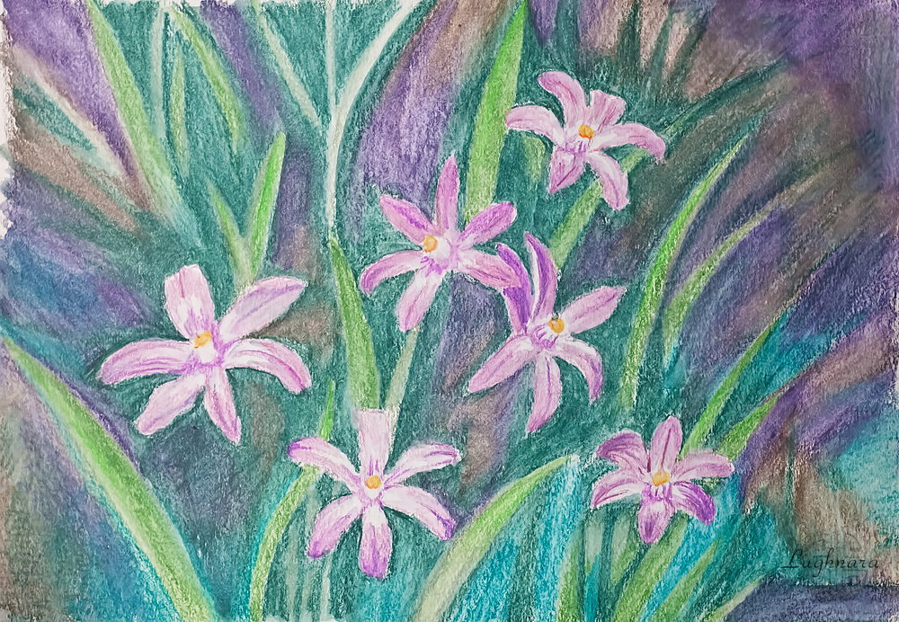
Chionodoxa (watercolor pencils)
Hi my friends!
Looking through photographs of flowers, I thought about what kind of art material would be useful for this or that flower.
Chionodoxa is one of the charming spring primroses.
I once drew it in digital https://read.cash/@daring-celt/digital-art-2021-chionodoxa-fa3031d2
Now I want to draw it using traditional materials
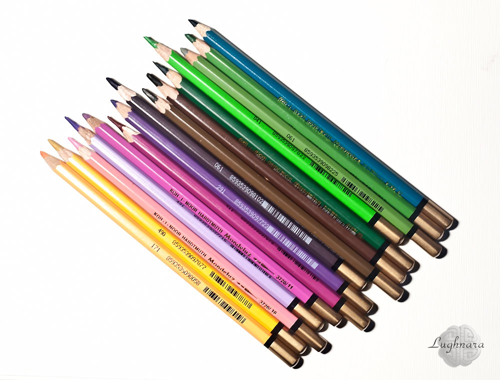
I decided that watercolor pencils would be the best way to depict these flowers.
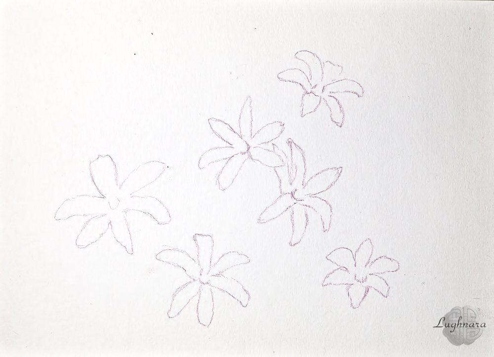
Sketching flowers with a medium tone pencil
Sketch of green grass
I start to pick up background colors with different shades of green
I continue to fill the background with color, using dark tones, not only greens, but also browns and dark purples to create depth of space.
Now the time about drawing a flowers!
They should contrast with the darkness and greenery in the background.
For their image, I left a few light pink and lilac tones.
When the drawing is ready, I start washing with water.
This must be done very carefully, without mixing colors.
I blur the flowers from the middle to the edges of the petals and wash the brush each time.
I wash the grass in the direction of its growth
When the paper dries, the drawing looks like this.
Bright pink flowers that look like stars on a dark background
Pretty picturesque, right?
With Love...
Pines and flowers (watercolor art)
Hi my friends!
Today I've another watercolor spring landscape
I use my own photo as a reference. https://ic.pics.livejournal.com/daring_celt/21759813/679388/679388_original.jpg
I liked these two pine trees, illuminated by the sun.
I decided to change the plot a bit, add dynamics and more details that characterize spring
I start work from the background, this is the sky and the earth somewhere near the horizon.
For the sky I mix cobalt blue and ultramarine, and for the earth I add ocher.
I leave the lower right corner partially unpainted, there will be remains of snow
With the same paints, with a thicker composition, I draw trees in the background.
Somewhere I add more blue, somewhere more ocher. Closer to the ground on the trunks I add natural sienna.
I deepen the shadows in the ravine where the snow lies
For the image of a hill where pines grow, I take cadmium yellow, ocher red cadmium orange and the same ultramarine (for the shadow side)
So... To create clouds in the sky, I use this method - I apply drops of pure water to the sky area so that the paint is slightly washed out.
Then I create the shape of the clouds with a clean dry brush.
I make shadows on the clouds with the same mix of cobalt and ultramarine
When the paper dries, quite realistic clouds are obtained.
Now the pines.
They will be slightly tilted, as if from the wind.
It looks very nice and dynamic.
For the image of trunks, I take yellow ocher, red ocher and natural umber.
And for crowns I mix grass green, yellow-green, ocher and cadmium yellow.
Secret: to keep the green from being too saturated, I add a drop of cadmium red to it to achieve a natural green color.
To make the hill beautiful and blooming like spring, I add different tones to its different areas - somewhere pure cadmium, somewhere cadmium with orange, somewhere more red, somewhere brown.
This is a completely intuitive process.
For green areas, I mix cadmium yellow and grass green colors.
**Secret**: *to keep the green from being too saturated, I add a drop of cadmium red to it to achieve a natural green color*.
I also add ultramarine to the shady sides of pines and drop shadows from them.
I also add shadows under the trees near the distant forest and near the snow in the ravine
And finally, the most fascinating drawing technique is spraying.
I dip the end of a flat brush in white gouache and lightly tap it against the other brush so that the splatter falls onto the paper.
**Important****:** s*o that the splashes fall on the area that I need, I cover other parts of the work with pieces of paper.*
In the same way, I spray a green watercolor mix on the pine crown area to increase the dynamics of the drawing.
And I add more a flowers another colors on the hill by individual strokes of a round brush.
Here is such a windy and bright spring landscape I got today!
With Love...
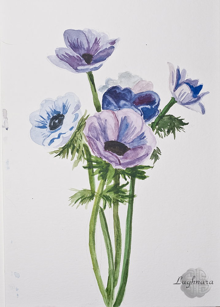
Anemones (watercolor art)
Hi my friends!
Today I wanted to try the technique of watercolor in a dry way.
Of course, the whole beauty of watercolor is in its transparency and fluidity, but nevertheless, it can be painted in different ways.
It is always interesting for me to use all the possibilities of this or that artistic material.
I found an amazing bouquet of spring flowers that I thought would fit my idea.
I used my usual material - a set of watercolors and a synthetic brush
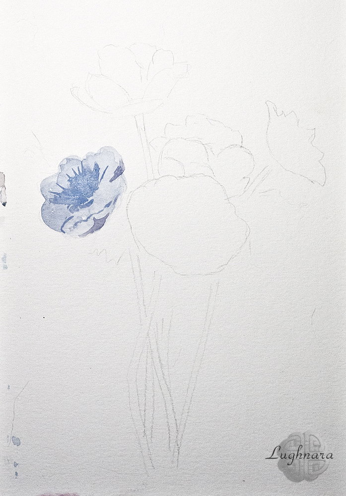
With very light strokes of a pencil, I sketch out a sketch of my future painting and start work.
For the first flower, I mix ultramarine and carmine to get a light lilac tone.
This flower is practically all over the light, so I paint over it entirely with the first coat of paint.
And then I add thicker shadows, closer to the core
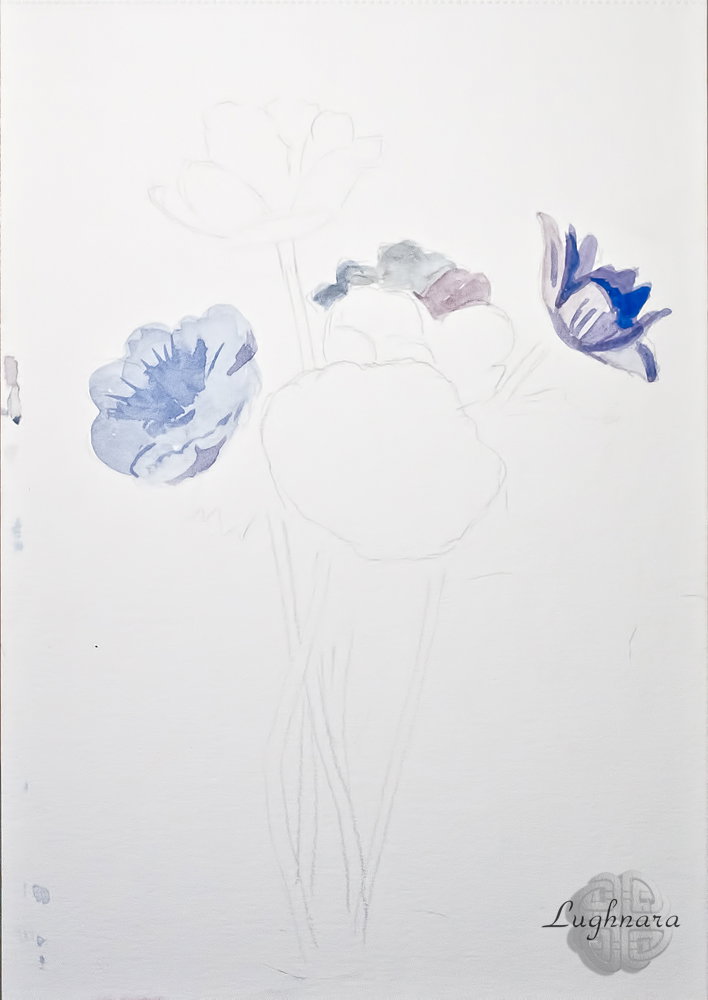
For the furthest flower, I mix ultramarine and ocher to create a bluish grey.
I make colored shadows for him, because the play of light on the petals.
For the right flower, I mix ultramarine, cobalt and carmine.
I draw shadow areas with very thick aquamarine
I paint the largest flower with the same paints, adding either more blue shades, or more red ones, so that beautiful colored shadows on the petals also turn out.
To draw a dark core, I mix ultramarine and burnt umber
I try to draw flowers first, which are far apart so that the colors do not mix.
I draw the top flower in the same way as the largest flower.
A flower in the middle of the bouquet. which is completely in the shade, I paint with almost undiluted water a mix of ultramarine and cobalt with a small admixture of kraplak red
It turns out a very deep purple color.
Now stems.
For those elements that are most exposed to the sun, I mix ocher and grass green. Somewhere else I add cadmium yellow.
I paint the shadow sides with green mixed with ocher and a drop of red kraplak to get a pleasant herbal shade, closer to khaki
I let the paper dry and draw the leaves with short and thin strokes.
I use the same color mixes.
And at the very last stage, I enhance the shadows on the leaves in some places with a mixture of green ocher and ultramarine.
I also darken the stems at the base of the flowers with this mixture, on the right (shadow) side and at the very bottom
Here is such a spring bouquet I got on this April!
Today I give it to everyone who loves flowers, who rejoices in spring and is simply in love with life!
With Love...
What is reflected in a drop of water? (pastel painting)
Hi my friends!
Once I was deciding what to draw for a contest dedicated to spring and, looking at my photos, suddenly something interesting!
I was photographing raindrops close-up and noticed that one of them reflected the surrounding landscape
I thought it was creative enough to draw!
My usual art materials for this drawing - pastel pencils "CretaColor" and "Derwent", plus pastel paper "Mi-Teintes" gray-blue
The composition will be something like this - in the foreground a branch with a drop throwing out leaves, in the back - the outlines of the reflected landscape (my country house)
I start the drawing from the most important element, from drawing the reflected landscape - this will be the house and the branches of a tree growing nearby.
I also draw chiaroscuro on the branch with several shades of brown.
I add open buds and blossoming leaves to the branch, so that it is clear that in the picture it is spring, and not another season
Now the background.
Above is part of the roof of the house and the upper branches of the trees, and below are just dark tones.
I detail the bark on the branch.
I smear all the dark areas and branches of the "real" tree, showing the back focus effect.
And with white color I draw the outline of the drop.
This is my personal take on spring!
Regards
Spring water (watercolor painting)
Hi my friends!
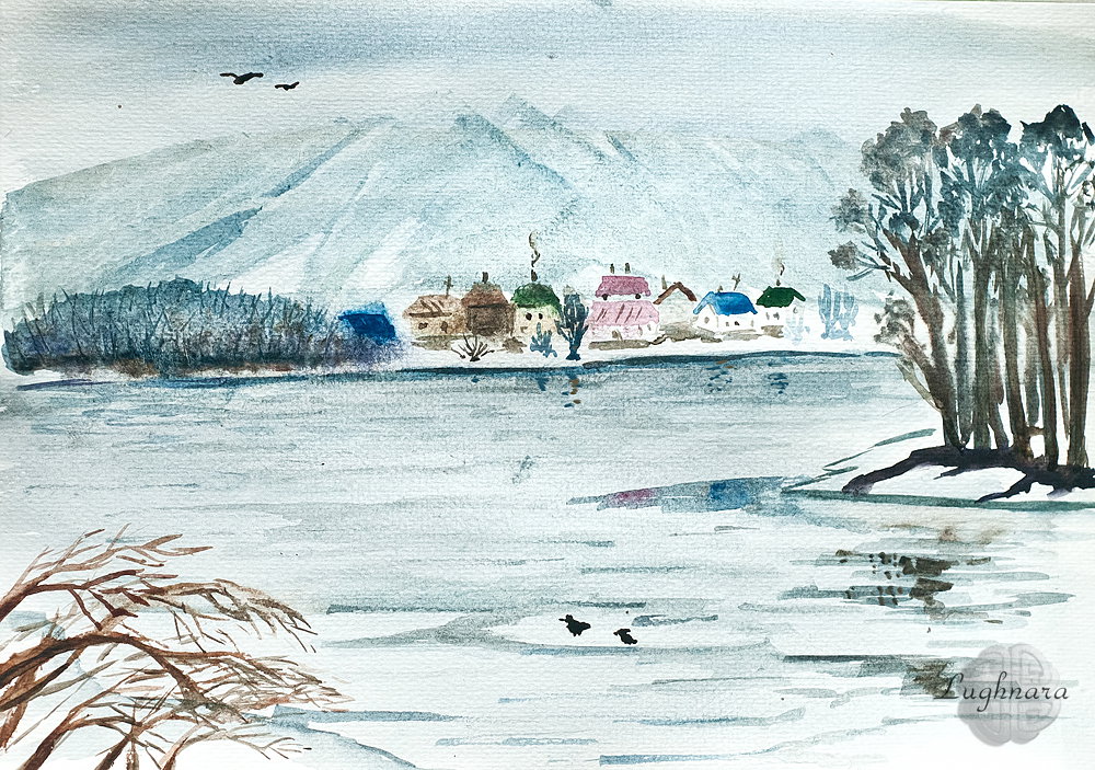
Spring is the best time to paint watercolor landscapes, I think.
Whether it's sunny or overcast, the view is consistently attractive, pastel with some contrasting details.
In my collection of spring photos, there was such a shot from a spring river https://ic.pics.livejournal.com/daring_celt/21759813/678345/678345_original.jpg
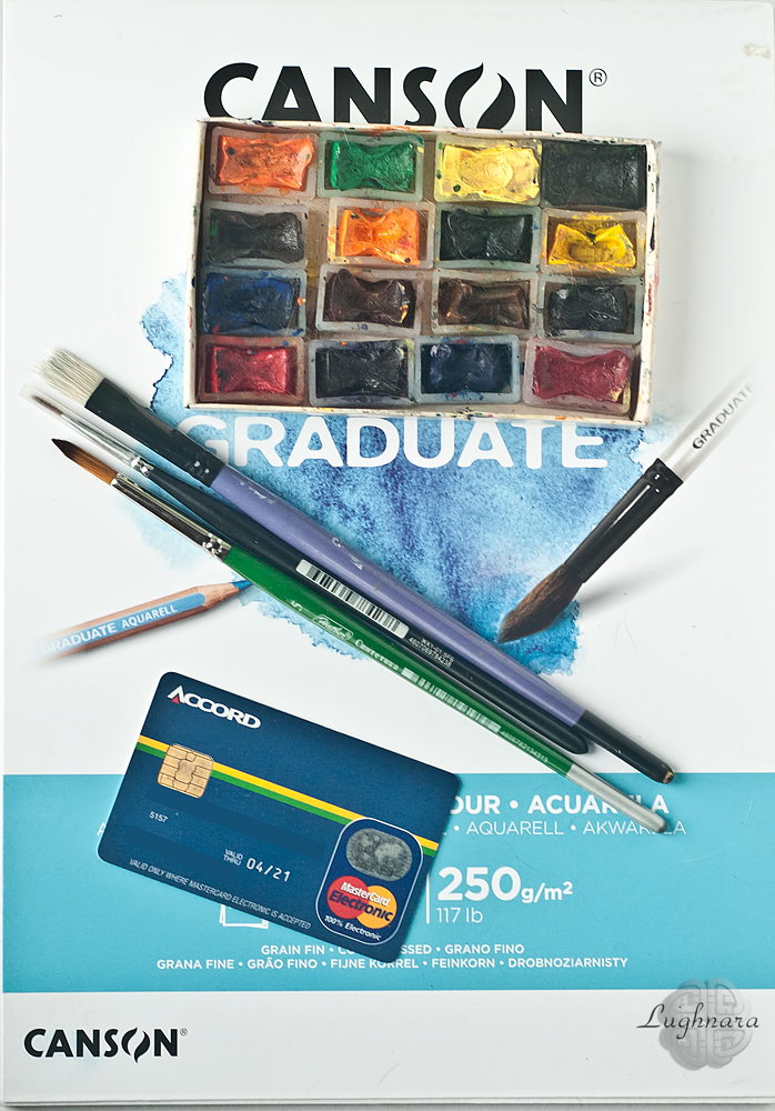
My materials for work are a set of watercolors, three synthetic brushes and Canson watercolor paper.
And yes, I also need usual plastic card
I modified it a little to make it look more attractive for a watercolor painting and got to work
I mix ultramarine and ocher to set the main tone of the picture.
The sky and water are about the same color.
In the water area, I add cobalt blue to make the color slightly different.
Here I am using a large brush.
For the mountains, I mix cobalt, ultramarine and red ocher, make a horizontal stroke with a brush, then take a plastic card and use its edge to make diagonal strokes from top to bottom.
It turns out the structure of the mountains, where snow has been preserved in some areas
With a mix of cobalt and red ocher, I paint a group of trees in the middle ground.
The tops of the crowns are more blue, and closer to the ground are warm shades.
I make the shadows under the trees very dark, with a mix of ultramarine and burnt umber
While the paper is still damp, I draw distant trees and houses on the far shore.
They are very far away and I do not need clear silhouettes, let everything blur.
For trees I take the same mix of cobalt and red ocher, highly diluted with water, and for houses - ocher, burnt sienna, carmine and ultramarine
I add dark tones to distant trees closer to the roots.
Cotton paper allows you to make multilayer glazing.
Then, with a mix of cobalt and red ocher, using a medium brush, I make horizontal strokes, imitating glimpses of water from under the ice.
In some places I draw reflections from trees and houses
Here I designate the area of the near coast
Before the paper is dry, I apply another artistic technique: with the sharp back end of a small brush, I scratch the area of distant trees to create texture.
This looks very interesting!
Now it's time to do the foreground!
I mix yellow and red ocher to paint the branches.
This is the closest plan to the viewer, so I paint them with warm colors.
And when the paper is completely dry, I take a small brush and paint windows and chimneys in houses with burnt umber.
And with the previously used mixtures, I draw shadows and trees next to the houses.
I also enhance the shadows from nearby ice floes and on the trees in the foreground
The picture is almost ready!
I am correcting the reflections from the trees in the water, in some places amplifying the shadows on the slopes of the mountains and also adding birds to the nearby ice floe and in the sky.
How do you like this fresh breath of spring?
With Love...
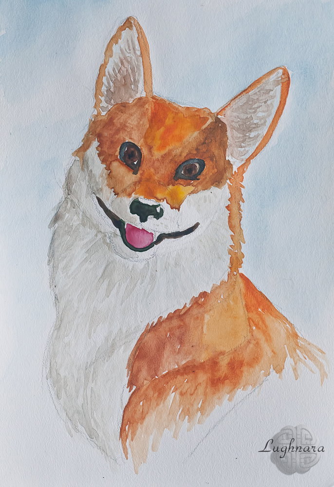
Corgi dog (watercolor painting)
Hi my friends!
I rarely paint with watercolors because I don't always have the right paper.
It so happened that I came across a photo of a dog taken by my Livejournal friend.
I wanted to paint it with watercolors https://ic.pics.livejournal.com/daring_celt/21759813/677898/677898_original.jpg
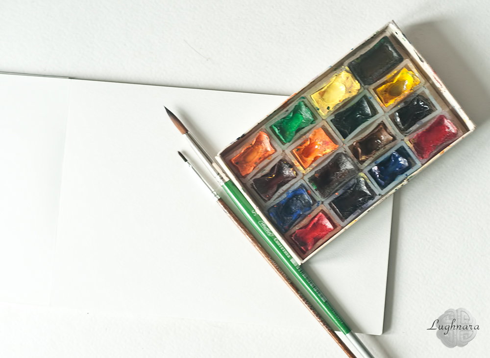
This is my watercolor set.
Yes, I had good Fabriano cotton paper in stock.
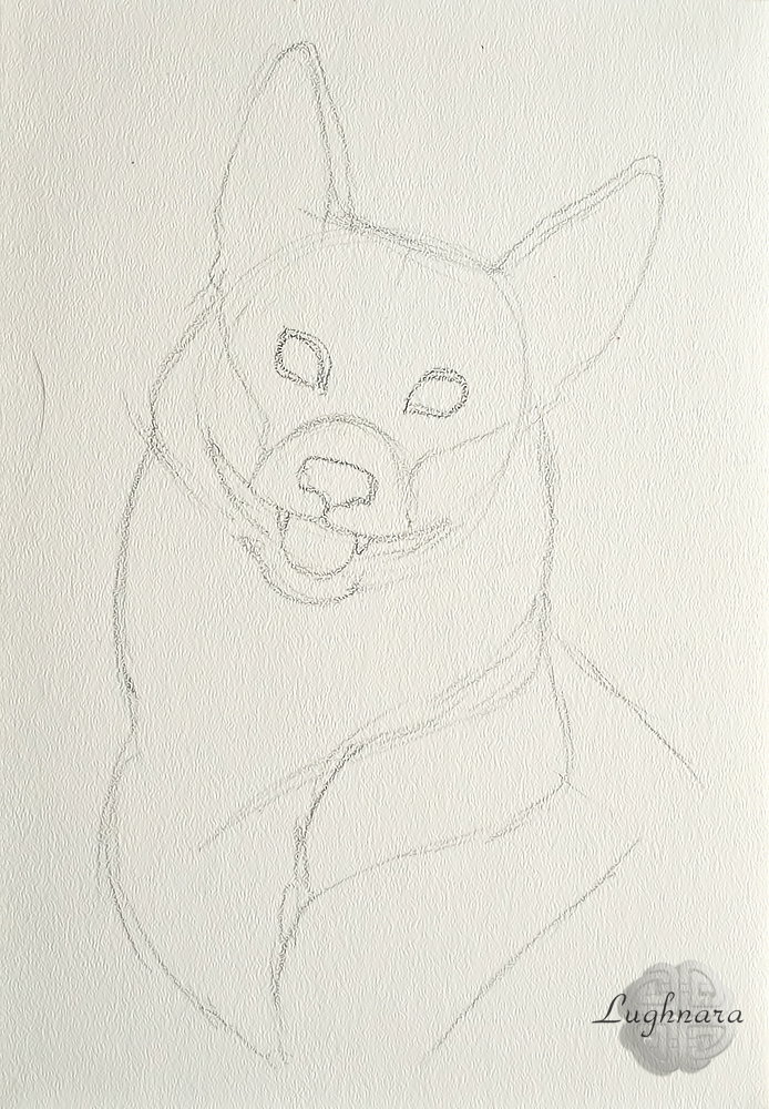
Sketch
I wet the paper around the dog and mixed the cobalt with the ultramarine - I like to paint with complex shades of color
To paint over the light colors of the coat, I mixed light ocher and ultramarine - this combination gives a gray color with a hint of steel.
For reddish coats, I mixed cadmium yellow, ocher red, and a little bit of ultramarine here and there to make the rich color a little softer.
Those areas where the shadow fell, I made darker (added sienna), and in the illuminated places - a golden orange color.
I painted the nose, eye and mouth rims with burnt umber, the eyes with sienna, and the tongue with carmine.
I don't know how realistic the corgi portrait turned out to be, but my friend (who photographed the dog) loved it
Here is such a smiling and positive dog turned out!
With love...
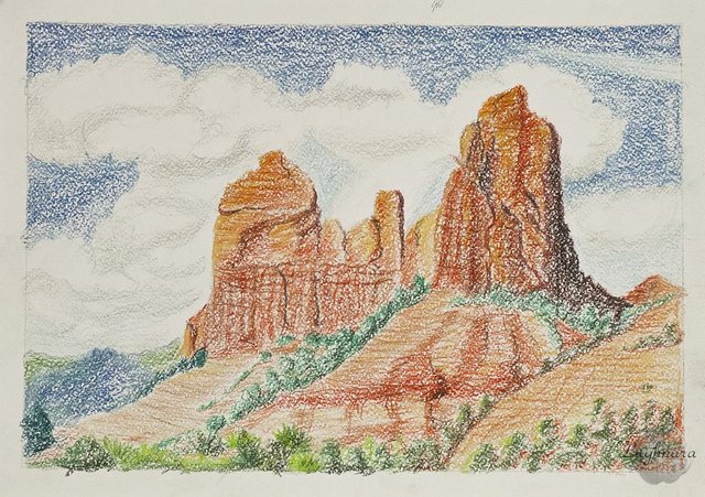
Red Mountains (vox pastel crayons)
Hi my friends!
Sometime I like to looking different beautiful landscapes on photo.
It's amazing Inspiring views!
I wanted to paint one of those landscapes.
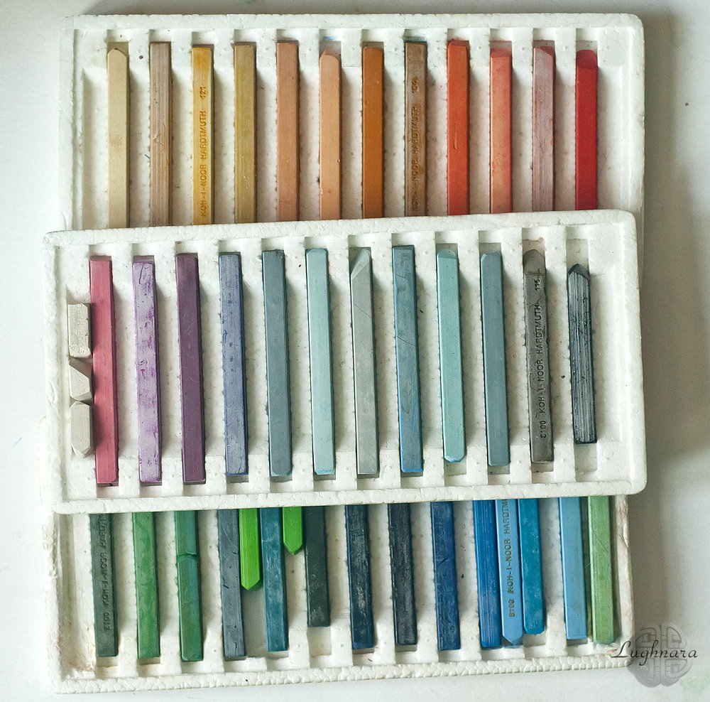
I had only watercolor paper & some sets of artist's oil chalks but this fact couldn't prevent me to paint lovely picture.
Before starting to draw, I looked at a few suitable photos and chose a scape that I liked.
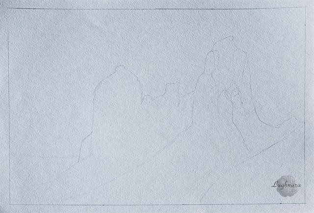
Making a sketch.
Then I choose for sky some shades of blue.
Upper area should be painted more saturation, that a part of the sky near the earth.
I leave some areas for clouds.
Shadows of clouds should be painted light grey color.
The forest in the background painting dark blue emerald colors.
Poor plants in front of the mountains I paint in different shades of green.
As the sunlight on a ref falls on the left, on the right I draw the shadows in dark green khaki colors & highlights in yellow green.
To draw the mountains I choose a few chalks red and yellow shades.
Sometimes I paint very deep shadows on a rocks in dark brown & black.
Top of rocks painting in red and terracotta, sunlit left side - yellow cadmium.
To create a mountain's struсture I draw some red & brown stripes
Only the foreground of the earth remains unpainted.
I choose some sand pastel colors of chalks for it.
Some where I draw red stripes, on sunlit left side too.
So, it's my picture is ready!
With Love...
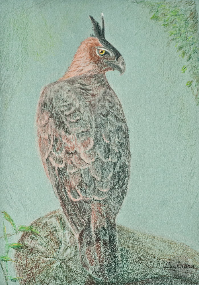
The Predatory bird (colored pencils)
Hi ьн friends!
Today I have a drawing of bird.
Honestly, I don’t know what kind of breed it is, but judging by the beak, it is one of the predators.
I liked this bird I use as a reference https://sun9-13.userapi.com/impg/gZsu6tgPqqd-XRNCuJuIVl7xcjtxc6Cypd4fLA/LVaWcN_Jm0A.jpg?size=441x661&quality=96&sign=d3f041638d4b6c485763483102c155c7&type=album
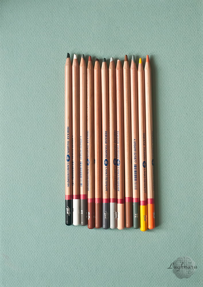
I used a set of professional colored pencils (some brown and gray shades) and tone paper for pastel painting
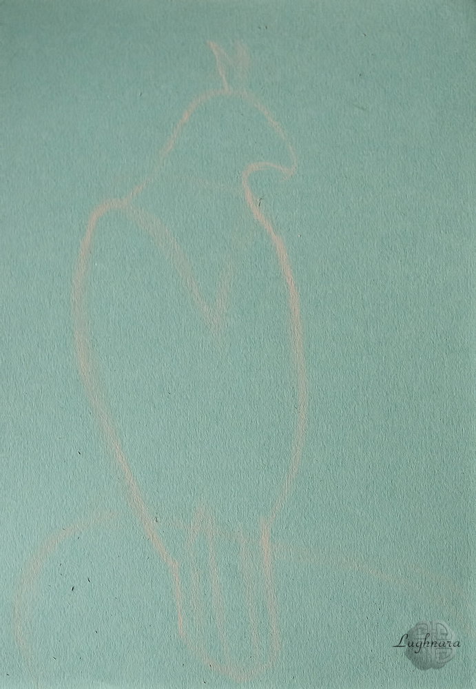
Sketch with light color pencil
I started in pencil with the most difficult part, the bird's head and eyes.
On the left side of the head, there are the most light feathers, and closer to the beak, the feathers darken.
I draw individual feathers in dark gray and in some places in black.
The bird's eye is drawn in yellow and orange for a sense of liveliness.
I continue to work with bird plumage.
On the top of the wings, I applied a thin layer of blue for highlighting.
In other places, I outline the tips of the feathers in pink-beige.
The right side of the bird is more in shadow due to its angle.
Using the example of a bird's tail, I select shades to realistically draw colorful feathers
Remained plumage on the body of the bird.
On the left side, I paint more in warm colors, adding brown tints, and the feathers on the right side are dark brown and in dark gray shades.
Under individual feathers, I make dark shadows to emphasize the volume.
Well, the last element is a piece of dry wood on which a bird sits. For him, I had to take a few pencils of green shades.
I also decided to add some greenery to the background to spice up the surroundings of the bird.
I finish the greens on the background in the upper right corner, and in other places I just make a few strokes with green shades.
Here's a my new drawing bird of bird!
With Love...
Digital art_2020. The Protuberance. Flowers of Space
Hi my friends!
It's my art work to another art contest
Recently, I like to draw on the theme of space and at the moment in my digital sketches there are several such stories.
I hope I will show you all of them soon...
And this drawing was born like that...
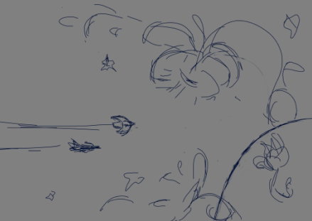
Sketch in **Paint Tool SAI 2**
In my imagination, it was a meeting of spaceships with a planet that was a living creature, therefore she sent huge flowers towards the guests.
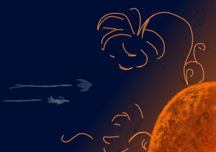
First, I create outer space and a fiery planet.
she and her dwellings should stand out brightly against the background of dark space
Then I create a colored glow in the places where the flowers will be placed.
At the same stage, I draw the silhouettes of ships and the relief surface of the planet
With a thin textured brush, I draw the outlines of the fantastic flowers themselves and flashes of fire - I don’t know what it is, maybe it’s also vegetation, or maybe the atmosphere
Spaceships
I enhance the outlines of the flowers, add a golden glow to them
On last step I opened my work in Photoshop and drew a back of space with stars brushes, make a stronger shine for "flowers" (with layer styles) and add some textures to planet surface.
This is all I got
I hope you enjoy my drawing in a new genre
With Love...
Digital art_2019. A chocolate castle.
Hi my friends!
Spring is in the air and Easter is coming soon.
On this occasion, I have a suitable drawing symbolizing this holiday.
Sketch in **Photoshop**
I wanted to draw a several chocolate eggs beautifully decorated for the holiday.
Color palette
Base colors
Background with texture brush
I start drawing details.
An openwork white chocolate egg will be home to an Easter Bunny
Chocolate decor
Easter Bunny at home
White chocolate rose
Then I wanted to add one of eggs a dragon skin texture like I looked on many pictures
I think I done alike something)))))
Fallen rose
Drop shadows
In finnaly step I drew last detail to holiday mood - transparent curtain with laces.
And it will be possible to say: Happy Easter!
With Love...
Blossom in Mountains (watercolor art)
Hi my friends!
The second month of the calendar spring has come, but there is still no spring...
But if there is no spring outside the window, the artist can create it on canvas
The Magic!
This wonderful photo was my reference now https://sun9-22.userapi.com/impg/Hf_qzwGvStCFTYGfO_nmOK-04vueQ6M6y0D4HQ/MHDNHimN3ZY.jpg?size=564x1002&quality=96&sign=69041947e70ba068520c1e63ed97ac10&type=album
I liked these fragile branches with delicate flowers against a pastel sunset - this is the perfect subject for watercolor!
As usual, my set of watercolors and three watercolor pencils as an auxiliary material
I start by moistening a sheet of watercolor paper with water, leaving a dry place for the solar circle
I take a mixture of colors of cadmium yellow and carmine and paint over the sky
So... I add some cobalt in sky mix and paint a back mountain.
It should also be very light, pastel.
I paint the front mountain with a mix of cobalt and ultramarine and at the very bottom I add a little more burnt sienna to make the color darker
Now it's time for the main characters - flowers!
To depict them on a dark background, I add drops of water in this place and blur the paint to white paper.
In other areas, I simply add drops of carmine paint with highly diluted water.
Somewhere I will have separate flowers, and somewhere whole groups
When the paper gets dry, I paint flowers.
I let the first layer dry and with a mixture of carmine and ultramarine I apply the shadows and folds of the petals
And the very last step is to add golden clouds near the solar circle (with the help of cadmium yellow) and branches on which flowers grow.
I used watercolor pencils for this.
I make the lower thick branches darker, and the upper ones light lilac.
And in some places I add folds of petals and stamens on flowers with a crimson color pencil
I don't know what kind of flowers it is, I think it's sakura, but it's still very attractive!
I want to draw a lot of spring flowers so that spring will come soon)))
With Love...
Spring pine forest (watercolor pencils)
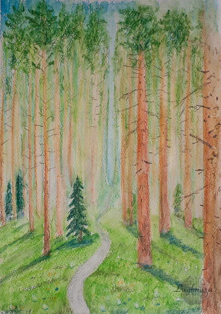
Hi my friends!
Sometimes the story requires the selection of certain tools.
I saw the photo of my friend from Golos and immediately understand how it can be portrayed. https://images.golos.today/0x0/https://steemitimages.com/0x0/https://i.imgur.com/1B1ZXWc.jpg
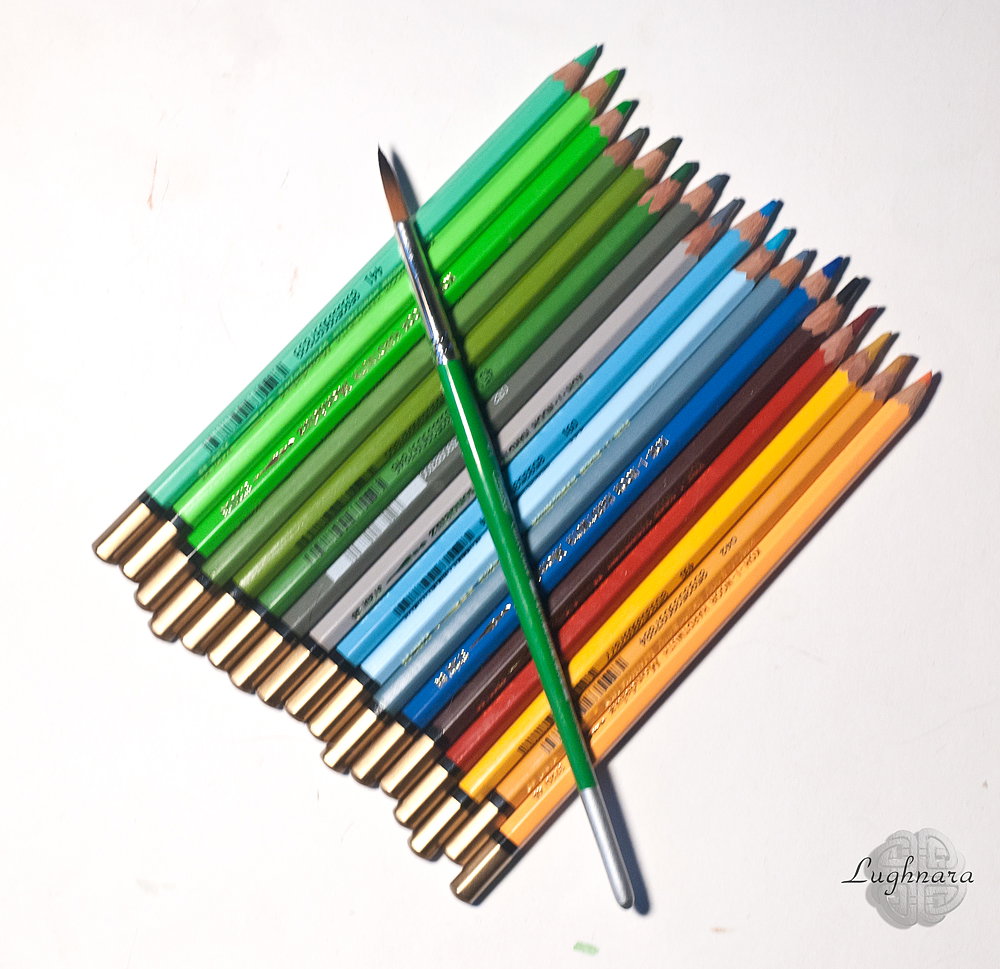
Under these delightful pine trees, soft graphics of watercolor pencils suggested themselves.
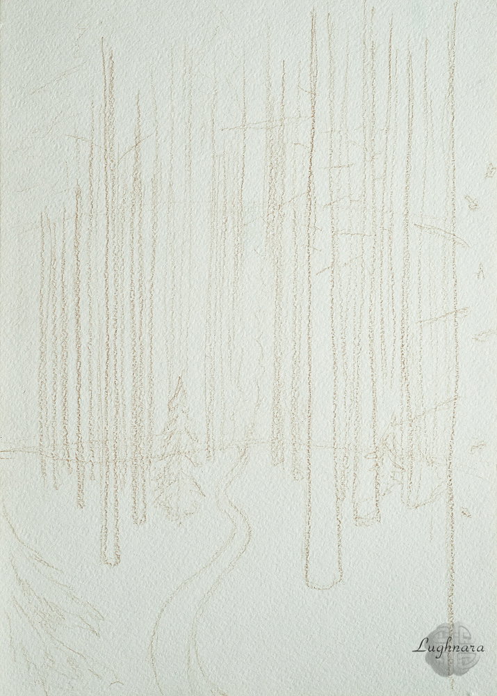
Sketch
I am gaining a distant plan with the lightest colors.
For the sky I take two blue shades, the closer to the ground, the lighter
I draw pine trunks with warm brown colors, in contrast to the cold greenery of the forest.
Gradually fill the entire area of the drawing.
the foreground of the forest is brighter and more saturated, the shadows are cold
I outline the crowns of trees and other vegetation
So, the picture is painted over, it's time to show the true possibilities of watercolor pencils.
I start the wash with vertical strokes, carefully, trying not to mix the colors.
I also blur the ground area vertically, but with short strokes so as not to smear the shadows.
In the last step, I draw individual branches with a dark brown pencil and add a few flowers to the foreground
This is how an autumn photo turned into a spring drawing!
Spring this year is very strange, but it's still spring.
And I hope that the natural cycle will move on its own
With Love...
Park in Pulkovo (watercolor painting)
Hi friends!
Sometimes photos of my friends inspire me.
Once I saw my friend from Golos have an amazing photo that she took while walking in the city park https://images.golos.today/0x0/https://steemitimages.com/0x0/https://i.imgur.com/3mvRkDb.jpg
These are the materials that I used for this drawing - a set of watercolors, a synthetic brush and masking fluid from Sennelier
For this drawing, I decided to use Canson cotton watercolor paper.
I apply masking fluid to areas of churches - I want them to shine white against an overcast sky.
Then, when the liquid is dry, I wet the sheet of paper on both sides.
On next step I mix ultramarine and ocher, this combination of colors gives a pleasant gray-blue color, similar to the color of rain clouds.
To paint the water I mix cobalt and ocher and some dark green.
Immediately, before the paper is dry, I draw reflections of buildings and trees in the water.
To draw the right bank, I take grass green, red ocher and cadmium orange.
I also add cadmium yellow and dark green to the trees.
I add birds to the water with burnt sienna
To paint the left bank, I mix grass green and some cadmium red to create a mild swampy shade.
I paint the forest in the background with the same colors that I took for the trees, but more transparent
When the paints are completely dry, I erase the masking fluid and paint the domes and roofs, windows and shadows on the churches.
I also add a bridge between the shores and birds in the sky with a mix of ultramarine and burnt umber
Here is such a picture with a melancholy mood turned out.
I liked drawing on cotton paper.
The colors are rich and vibrant!
It so pleasant to draw!
Autumn and spring are similar in many ways - a kind of state of uncertainty, or transition.
These are the seasons of dramatic change. And may all these changes be for the better!
With Love...
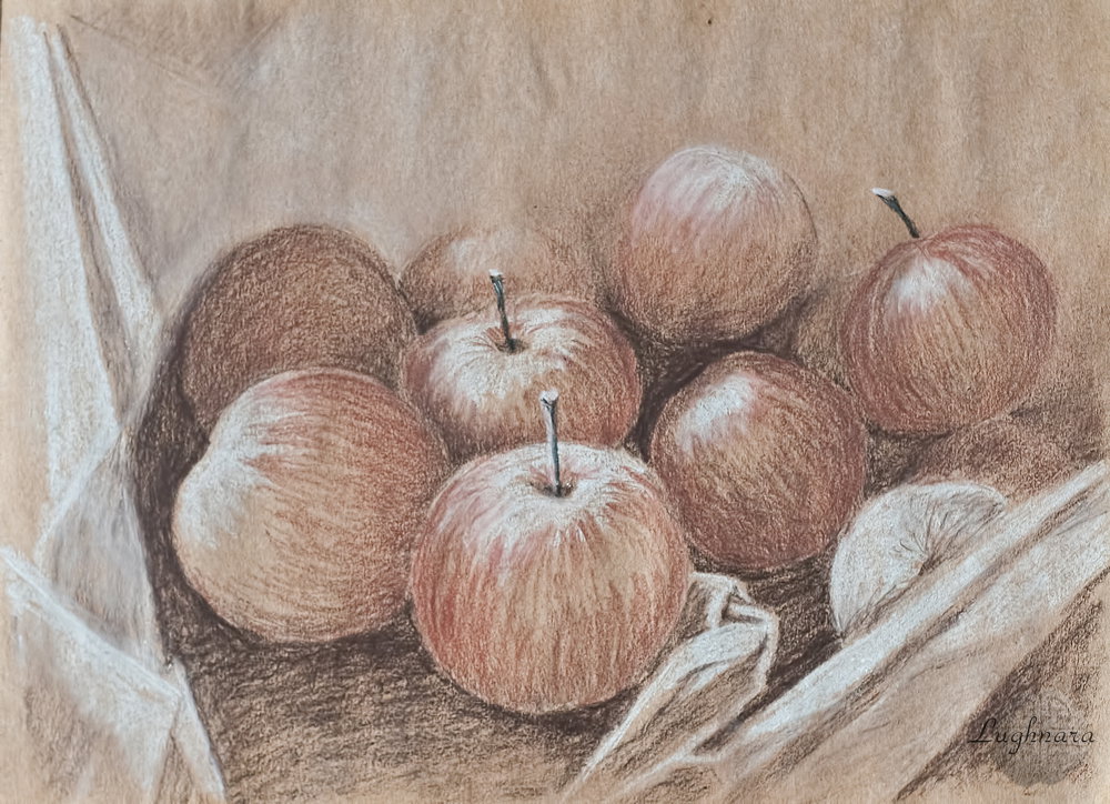
Red Apples (graphic drawing)
Hi my friends!
When I get tired of digital painting, I pick up traditional art materials again.
Recently I like to experiment with pencils or use mixed media.
This grisaille drawing is made in just four tones.
I also like this - drawing with a limited color range and on tone craft paper
I used a photo of my friendin from Golos as a reference https://images.golos.today/0x0/https://steemitimages.com/0x0/https://i.postimg.cc/gkyLwWJd/4-1.jpg
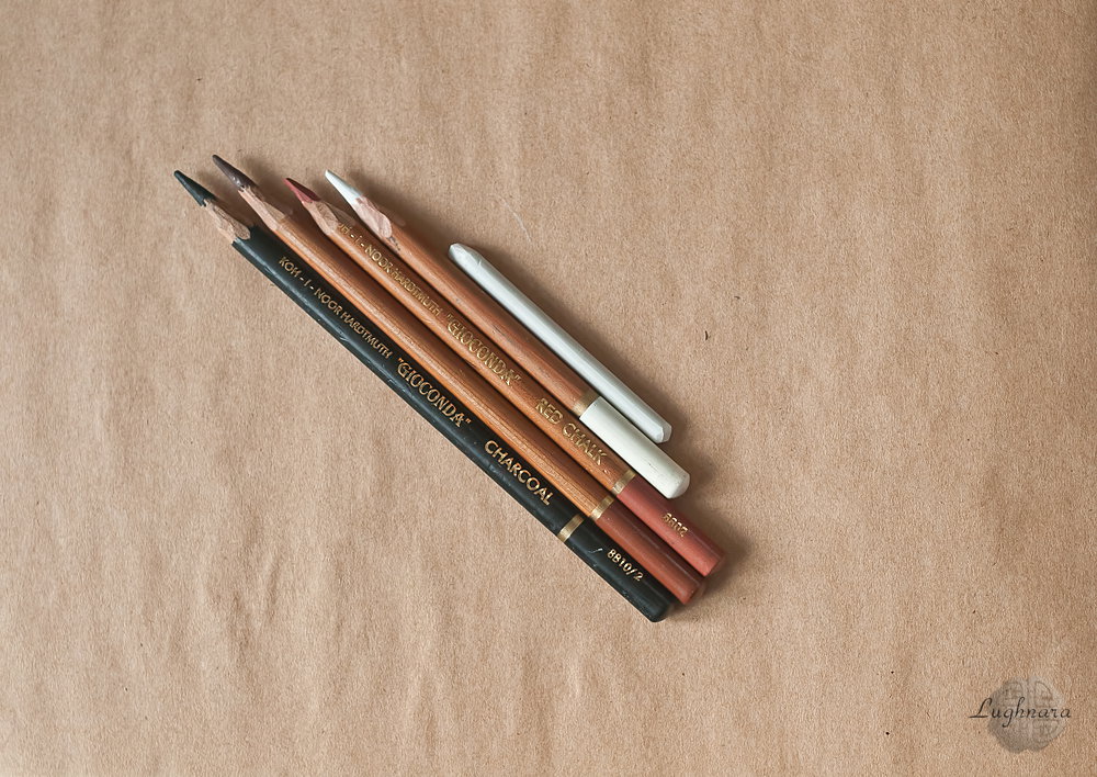
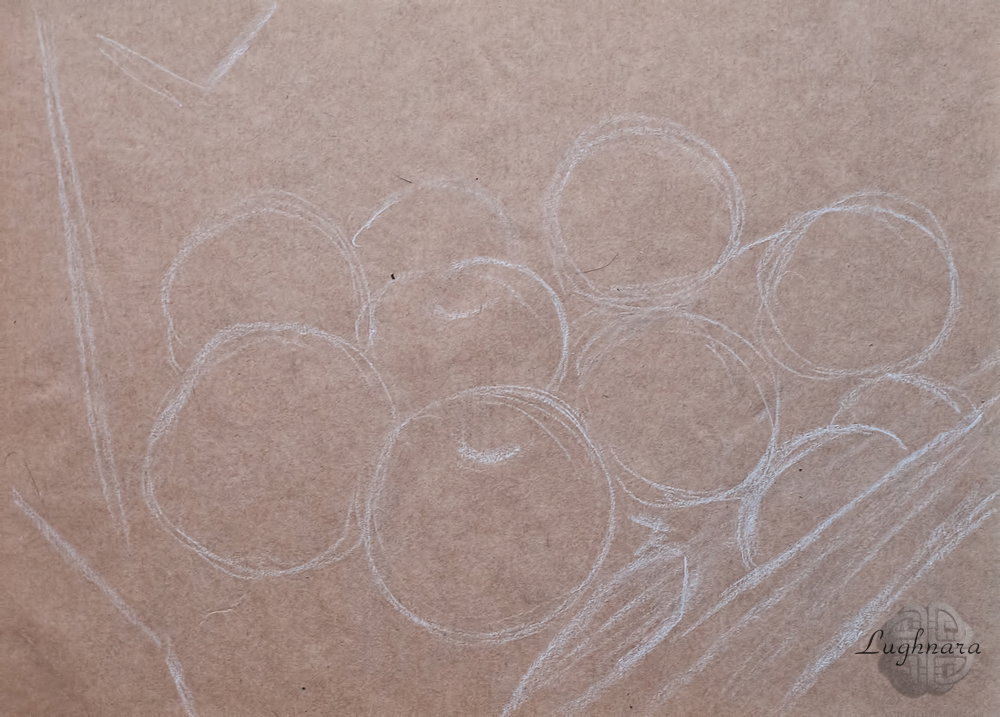
I started the drawing with a chalk sketch.
applied the contours of apples and the folds of the newspaper on which they are placed
Then I draw the lightest areas with the same chalk pencil.
In such graphic drawings, it is best to paint the darkest areas as the next step.
I do this with a charcoal pencil.
I need to work with it carefully, because its strokes are easily smeared
And now I take red chalk and make to an apples a realistic look
Already getting an attractive picture!
There are details that I draw in sepia in pencil.
These are medium tones of apple peel in the shade, cuttings and individual folds of paper.
Here is such an appetizing picture, evoking memories of summer and garden harvest, I got it!
Thanks to everyone who comes to my blog and watches my lessons!
With Love...
The Door (watercolor graphite pencil)
Hi my friends!
I keep experimenting with my art materials.
Have you ever heard of watercolor pencils?
For sure, yes.
How about a watercolor graphite pencil?
Yes, there is such a pencil in nature!
This painting was created using such a pencil and some charcoal tone pencils as a supporting material.
The reference https://i.pinimg.com/564x/b4/91/09/b49109071701c525f2d3cd14ee4fa014.jpg
Materials
Sketch
I draw the middle tone with a watercolor graphite pencil.
I'm not detailing yet, I'm just sketching out some dark areas on the door and on the stairs
When the entire area of the picture is painted over, I start washing with water.
I blur the lightest areas without texture very carefully.
So that the dark tones do not mix with the light ones, I blur each area separately with a clean brush.
While the paper is still wet, I detail specific areas to enhance the tone.
Before the paper is dry, I detail certain areas to enhance the tone - correct the texture of the brick wall, deepen the shadows on the right wall where the large stones lie, thicken the vegetation at the roots
I do the second stage of washing on the darkest areas.
especially on the falling shadows and the shady sides of the stones in the wall
Well, the very last step, when the picture is almost ready, I again emphasize the darkest areas - these are the door boards and cracks in the wall
And I tinted the door and walls a little more, where moss grows with charcoal pencils.
The tint is not very visible, but it is there)))
It turned out soft graphics, which I wanted to see
Many thanks for your attention!
With Love...
Spring reflection (pastel pencils)
Hi my friends!
I have one story that is the most suitable now, when spring is on the street
It's another my traditional art drawing tutoria publised on Golos.
This is reflected in a spring puddle that I found interesting for image. https://golos.io/goldvoice/@gerdananeis/variacziya-vesennego-peijzazha-v-luzhakh-otrazhaetsya-pastelx
In this case I chose for work a set of pastel pencils & pastel tone paper (sand color).
For this picture I used my own photo https://i.imgur.com/tO3TILi.jpg
I started my draw without sketch with applying base colors.
Two parts of scene were a earth & all the rest was water.
I decided to draw a puddle by dark blue color with some blue gray in lightest areas (it's assumed that a light of sun falled somewhere ahead, i.e. on top of the picture).
In the middle of scene I leaved a few unpainted areas, then with a light gray and blue I created shapeless spots - these will be clouds reflected in water.
In a few shades of yellow and brown, and of red and light gray in some places I draw an asphalt gravel in the upper right unpainting piece.
Some big stones were visible in water.
Then I added some gray pink color and light rust color (glow of the setting sun) in a clouds and detalized a contours of their.
I smeared a strokes on the water area, add a added yellow tint to it — a reflex from the asphalt, and again blended.
With the same shades of yellow and brown (and black and light gray in some places) I painted a second section of asphalt - in the lower left corner.
Now the reflection of the trees.
The farthest and thinnest branches I drew with black and with dark brown - thicker in the near plan.
Somewhere in the middle of the clouds I add a blue-gray color to make a volume.
And smear in center too.
I hope this drawing will put you in the mood for spring.
With Love...
Forest cat (pastel painting)
Hi my friends!
Drawing living persons has always been problematic for me.
But nevertheless, I continue my experiments in their image.
I found this adorable cat on Pinterest.
He is probably pet, but since he was in the middle of the forest, I called my drawing like this https://www.pinterest.ru/pin/511369732701016132/
My art materials for this work - two set of pastel crayons and pastel pencils
I use blue gray pastel paper Canson Mi-Teintes
For light areas of wool, I picked up neutral pastel shades of cold and warm tones.
In some places I outlined dark spots in brown, where the coat changes shade
In the process of work, I decided to turn the cat in front of the viewer so that a picture differed from the reference
I add other tones and blend the strokes to create the effect of fluffy long hair.
To draw the cat's eyes, ears and individual parts of the muzzle, as usual, I use pastel pencils.
Then I paint the background with blue and green colors.
And also the tree on which the cat is sitting, for him I took several shades of brown, green and ocher
I heavily blend the background near the cat fur.
And I also draw individual strands of wool and hairs with light crayon and pencil so that the figure of the character is clearer
And here is a forest cat sitting on a tree, waiting for prey.
Or he just went out for a walk in the woods
I hope you'll like this nice animal too))
With Love...
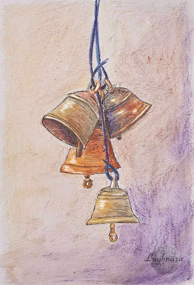
The Bells (mix-media drawing)
Hi my friends!
Today I wanted to know how Sakura pens would behave in combination with watercolor pencils.
I chose a simple story for the image - a bunch of copper bells (I think, for religious purposes) https://www.pinterest.ru/pin/657384876868209490/
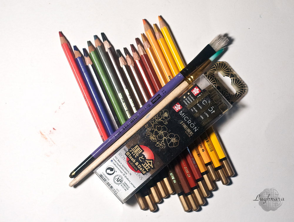
These are my artwork materials - watercolor pencils Mondeluz (I chose some colors from set I need), two synthetic brushes and set of gel pens Sakura
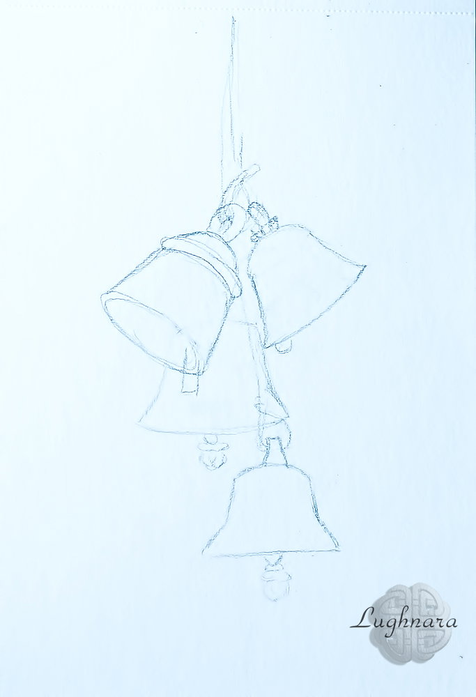
Sketch
Yes, I use Fabriano paper for mix-media
First, I select the color for the background - brown tones, ocher and a little yellow-orange on the left, from where the light will fall
The bells, according to my plan, will be of mixed colors - somewhere yellow, somewhere red-brown.
I apply strokes in separate areas, alternating colors.
Somewhere I add green and gray-green.
I take the string on which the bells hang, blue and light blue from the illuminated side
I want to achieve such an effect that the bells look like old copper that has turned green from time to time.
The light and the shadow fall unevenly on each of them, this must also be monitored
Now that the whole drawing is completely filled in, it's time to take water and create a watercolor effect using brushes.
I use with a large flat brush for the background, carefully bypassing objects
Oops... here I found that the dark brown turned out to be dark purple, but this is even better, because there are also blue tones in the drawing.
When the background is dry, I take a round brush with a thin tip and do a watercolor wash for the bells.
The most important thing here is not to mix the shades so that confusion does not occur.
It is better to start blurring a new area with a clean, water-washed brush.
To refine the contours or enhance the color spot, I paint directly on the wet paper.
Sometimes I wait for the area to dry before applying the desired color again.
In particular, I had to darken the bell in the background more.
And when the drawing is completely ready and dry, I take one of Sakura gel pens with an average diameter of the rod (0.35 mm) and outline the contours of the bells, texture a little and glue where I enhance the shadows.
Yes, I also had to take white chalk and apply bright highlights to those places where the shape of the object makes a bend.
Now it is clear that this is indeed metal, and not some other material!
Yes, I liked this combination of art materials too!
True, pens refuse to write on wet paper, but this is fixable.
I hope, you'll like my new drawing)
With Love...
Digital art_2019. Squash Dragon
Hi my friends!
Once, at an art contest, they asked the theme of the image of the Vegetable Dragon
Reading a title of theme, I immediately imaged a little cute dragon living in squash, as at home.
Sketch in Photoshop
Choosing color palette
The background will be medium tones, between yellow and green.
Then I add greenery and squash flowers
And the squash itself, a cozy house for the dragon
I sketch the character in color - for him I left the most saturated colors
I detail the picture - light and shadows on the leaves, on the zucchini, fill the interior of the house with color, select the texture of the earth
Well, revive the character too
I think he can't do without stairs either.
In the last step, I slightly adjust the overall color scheme.
Finishing strokes - dragon scales, hearts and flowers and a more realistic ground texture
This positive and kind dragon has such a cozy house
With Love...
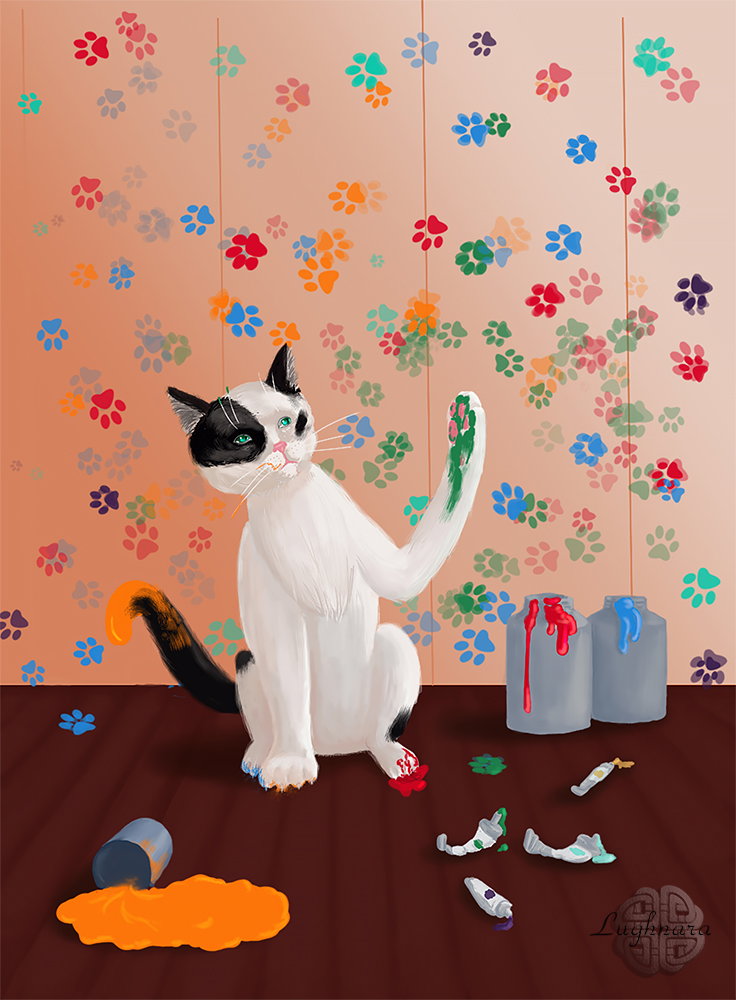
Digital art_2019. Pet Artist
Hi friends!
Yes, it's my another drawing on old art contest
I choose this story remembering my own photomontage art with a kitten who painted a tiger (*picture below post*).
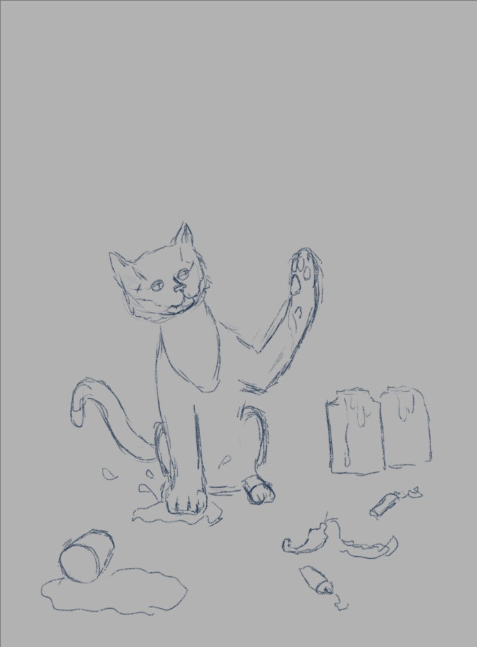
Sketch
I draw in **Sketchbook Pro**
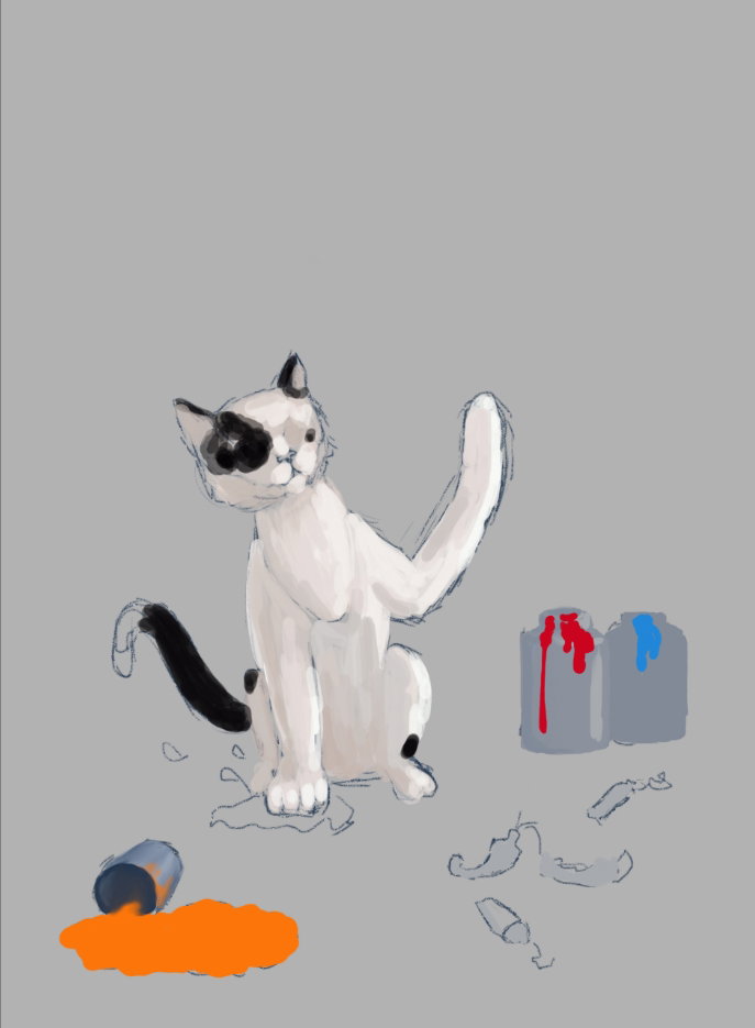
Selection of a color palette
Drawing an interior where the artist creates
I finish the cat and add details - tubes of paints and paint spots on the cat's fur
Now ... it's time to show what he painted.
Wow!
This is a masterpiece of wall painting!
I want to show haw cat can draw, because I need create a new brush as feline footprint.
Replace a directions of cat's look
Some color correction in **Photoshop** & it's ready drawing!
Reference (and inspiration) of art.
I hope those of you who have a cat at home will remember the pranks of their pet and smile
With Love...
Digital art_2022. The crows and sea buckthorn
Hi my friends!
Today I've another spring drawing.
But, you say, berries are autumn.
And I will answer that sometimes dry berries remain on the branches until the new season.
Therefore, crows can feast on them in the spring
I use for this artwork a photo for my friend from Golos as a reference https://i.imgur.com/Xminb54.jpg
Sketch in **Paint Tool SAI 2**
Choosing a color palette
For background I use a brush from form String M to make texture stroke and good color blending
Sketching a trees and a birds in this step
With light and dark shades of gray I draw highlights and shadows and add volume to the birds
Details for trees
The right tree is further than the left one, I paint it with lighter brown colors.
And a more detailed drawing of the raven plumage (with **Oil Brist 2** brush)
Time to draw sea buckthorn berries.
On the front tree, I draw them in rich colors with clear contours, and on the far tree, I only mark them with a total mass.
I want individual clusters of berries to glow.
Therefore, on a separate layer with a soft brush, I put yellow spots above each bunch, then I blur this layer and change the blending mode to **Shade/Shine**
I partially erase the blurry highlight so that the berries glow less intensely
And I also want to add spring freshness to the drawing.
I create a new layer, paint some colored spots on it with a soft brush, blur it and set blend mode **Soft light**
I also add silhouettes of distant trees to the background.
And finally color correction as always
Here is such a spring and fabulous picture I have today!
Have a nice and creative spring day to all!
With Love...
Digital art_2022. Spring gift for friends
Hi my friends!
It was another round of art contest on Golos. It was necessary to draw a premonition of spring
I had an old sketch, which I decided to finish drawing, because it corresponded to the stated theme.
Open it in **Paint Tool SAI 2**
In the original version, the hare simply looks into the outlet of the bear's lair.
But I decided to change the story in the process of drawing
As usual, first I select the color palette
The snow will be loose in spring
And in the lair where the bears sleep, it is cozy and warm, so here I used warm shades.
I didn't like the initially chosen colors, and I made the inner area of the lair even warmer.
And changed the pose for the hare
I add a spring forest to the background and the interior in the lair - a pendulum clock, a hemp table, shadows and folds on the blanket and plant roots on the "ceiling"
When I have outlined the chiaroscuro on the characters, I start to paint the fur with the same colors.
The bears
The hare
Yes, he brought a gift to his friends and lowers it on a rope into the vent
And what is this gift?
Ah... a bouquet of snowdrops!
Their aroma will fill the den, and the bears will wake up
Then I decided to apply the ground texture to the inner area of the lair.
Ans drop shadows from the things and the characters
Finally color correction in **Photoshop**
It turned out such a spring story
I hope my drawing will add spring mood to you and the desire to create everyday miracles!
With Love...
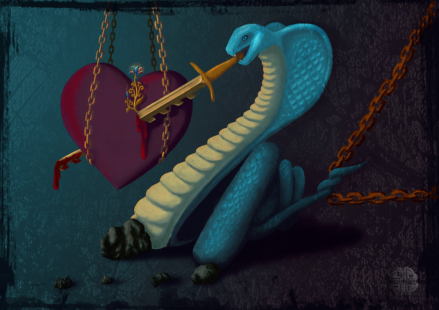
Digital Art_2019. Gordian knot
Hi my friends!
This is my most ambiguous picture.
I sketched back in '97, over twenty years ago
Don't let these dark colors scare you!
The fact is that not everything in this world is interconnected, as in the mythical Gordian knot.
And how sometimes someone hurts you to actually heal you.
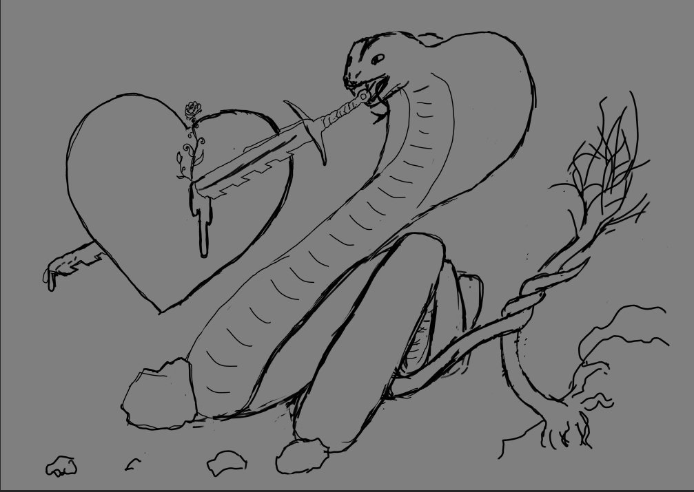
Sketch in Photoshop
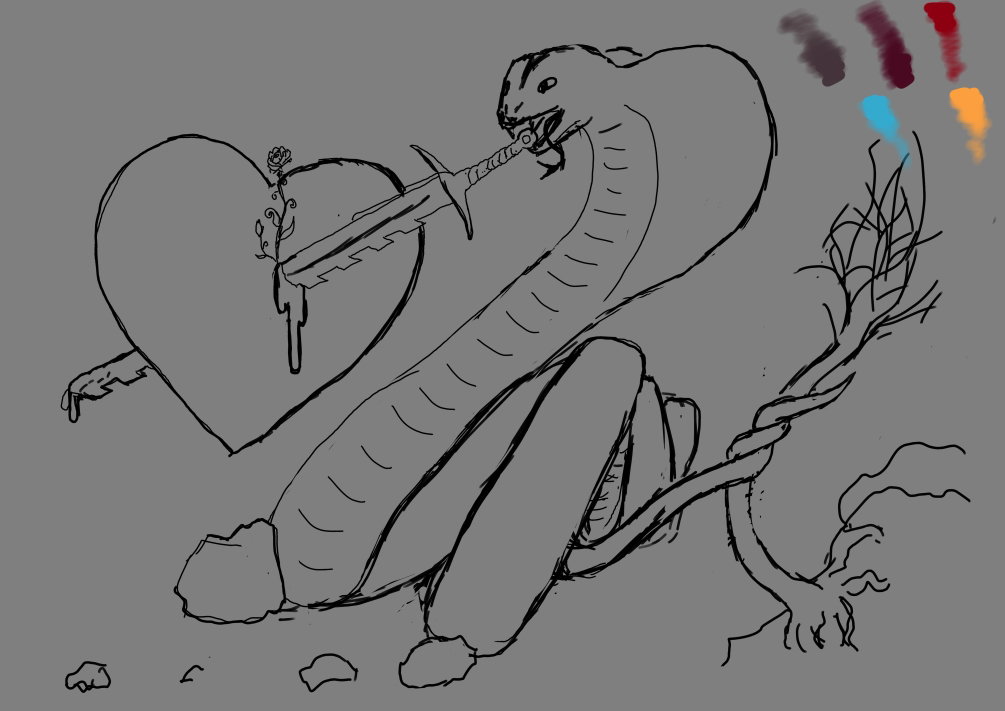
Yes, I chose a palette of colors that would show contrasts as irreconcilable contradictions
Adding primary color shades.
Golden sword... wow!
I like that!)))
Detalization & form correction
Add a scale texture
Then I decide I didn't like a tree behind snake
And I add other effect things
Some magic
Sword hilt seems to me very saturation - I make it darken.
Last steps: choosing a color background, adding a final texture, drop shadows
Still grange frame and some color correction
It's ready!
I hope that each of you will find in this picture that echo that is only yours.
With Love...
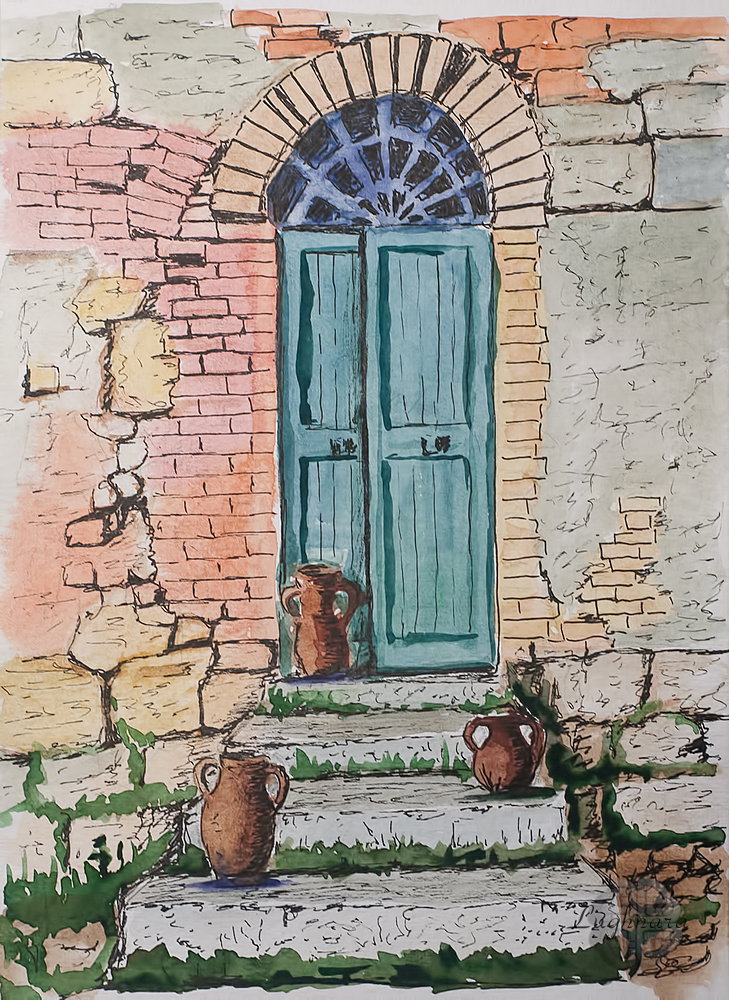
The Blue Door and a pots (mixed media painting)
Hi my friends!
Today I decided to try to make a drawing in mixed media. I like testing different art materials and seeing how they fit together.
Once I tried to draw with markers and pens. Now I 'll be experimenting with watercolors and gel pens.
I took this photo as the basis of my work https://www.pinterest.ru/pin/511369732700543181/
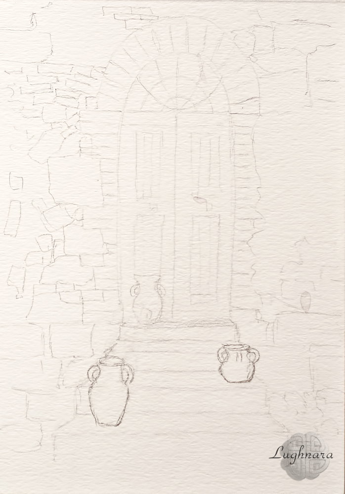
Sketch
I changed the picture a little, added clay pots on the steps - I know that in the Mediterranean countries the main entrances to the house are decorated like this
Yes, I used for my work watercolor set, synthetic brush and three Sakura's gel pens.
I start by making a sheet of paper wet. I have Fabriano brand paper, special for mix media artwork.
Then I mix some warm colors - cadmium orange, cadmium red, red ocher - to sketch the brick wall.
So that the red shades do not look too saturated, I add a lot of grassy green to them - the color becomes natural and pleasing to look.
In those areas where the plaster, I paint with a mix of yellow ocher and ultramarine - this combination gives natural shades of gray.
And I paint individual large stones with ocher and natural sienna
Next, I mix ultramarine and grass green to paint the door.
I paint a stained glass insert above it with a mixture of ultramarine and burnt sienna - this combination gives a very dark color.
With the same mixture I paint drop shadows from a pots
And for a pots on the stairs I use a mix of red ocher and natural sienna with a touch of ultramarine added to keep the color inconsistent.
When the paper is dry, I mix greens and yellows to paint moss on rocks and greens on the stairs.
Somewhere I add ultramarine again, somewhere red ocher
Now is the time to use Sakura pens
I take a pen with a 0.35 mm rod and draw the main lines - brickwork, gaps between stones, cracks on the stairs
So, use a pen with a 0.25 mm rod I draw a structure of the plastered wall, irregularities, scratches on stones, the wooden planks of the door and shadows on pots
And finally, with the thickest rod I draw deep cracks and shadows on the stones, especially in the lower part of the picture, under the stairs, I darken the glass on the stained glass insert, I also enhance the shadows between the door leaves and below
I'm trying to make it look like the left side of the door is half open.
I don't know if anyone lives there or if this house is abandoned... let everyone make up their own store)))
This is the picture I got!
With Love...
 @daring-celt