Sections

20 94
Avatar for Read.Cash
4 years ago

Today we're adding sections to read.cash and updating the main page.

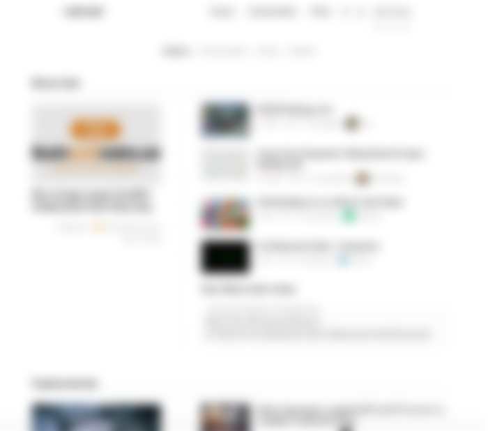
This is how the main page looked before:

The problem with this layout is that it seems that the only content read.cash has is cryptocurrency content. It even led some people to believe that "To be visible I have to talk about Bitcoin Cash". We need to change this.

So, we're introducing sections and the new layout for the main page:

At first sight it doesn't seem like much has changed, but that's only until you scroll a bit down:
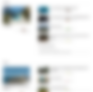
As you can see - some other sections are moving much slower than "Bitcoin Cash" or "Cryptocurrencies", so the articles in them will stay visible far longer now, getting a better exposure and not drowning in the crypto news.

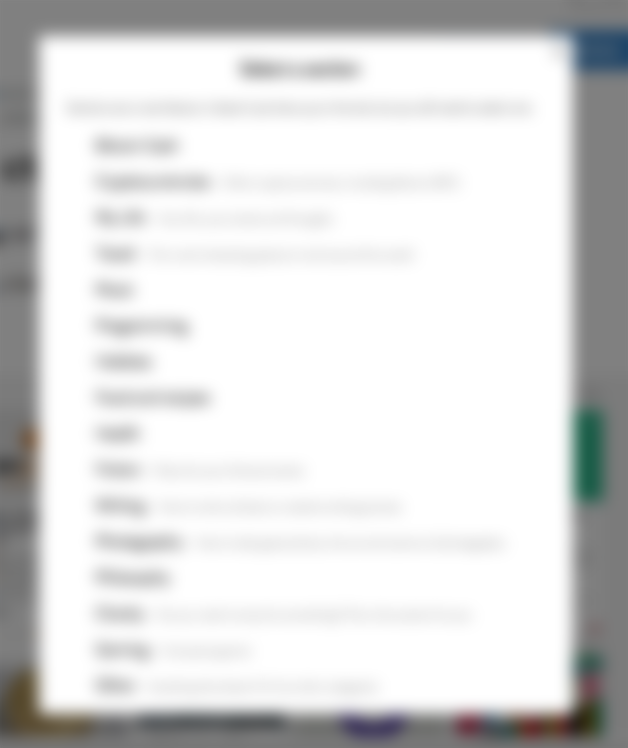
There are now sections like "My Life", where you publish stuff about how you live and what's going on with your life. "Travel" section is where you can find interesting places to visit (don't forget to click "New" to see the new posts in each section). You can find sections for Music, Programming, Hobbies, Health, Fiction, etc...

If you need a new section - publish a few posts and then post a request for a new section in read.cash forum.

There is one more step now before you can publish an article:

...it takes just a second.

We'll add a few more things to the new main page, so that the sections would adapt to your reading style, meaning that if you don't read Bitcoin Cash articles - that section will go lower than the sections you visit more often (though it's not done yet, just a plan).

Oh yeah, you might have noticed that the dollar amounts are gone from the main page, but not from the section page. It's an experiment - we think that an interesting article should not be judged by how much did it earn. We'll see how it works out, but frankly - number of comments and views seems like much more interesting measure of how interesting the article is. Disagree? Let us know in the comments.

Have fun!

6
$ 1.77
$ 0.50 from @Cain
$ 0.50 from @Morti
$ 0.50 from @nyusternie
+ 5
Sponsors of Read.Cash
empty
empty
Avatar for Read.Cash
4 years ago

Comments

I'd love to have a section (or community?) where one can see all the posts that specifically relate to your site's news.

Sort of like the news blog of the site itself.

$ 0.00
User's avatar btcfork
This user is who they claim to be.
We have manually verified this user via some other channel.
4 years ago

I'm not sure what you mean. Do you mean like things that relate to read.cash or things that we, as developers, done to the site? Because the second one is easy - just see @Read.Cash's profile :) the first part is tricky, since there aren't that much news about read.cash and people would send there all kinds of stuff assuming it'll be somehow more popular than any other section :) the same thing that happens to read.cash topic (https://read.cash/topics/readcash-318e8e371f) and read.cash development topic (https://read.cash/topics/readcash-development-240da4122a)

$ 0.00
4 years ago

things that we, as developers, done to the site

Yes, basically I can look through your profile, but it contains some posts not related to the site obv.

I mean tracking specifically only the site-related updates.

I guess I could always open a 'Read.cash Site News' topic and submit all the site updates news you post via your profile.

$ 0.00
User's avatar btcfork
This user is who they claim to be.
We have manually verified this user via some other channel.
4 years ago

Well, there are only two unrelated articles I think :) read.cash development topic was used specially for this, we do have to clean it up occasionally: https://read.cash/topics/readcash-development-240da4122a

$ 0.00
4 years ago

Yeah, that topic (did you just clean up? ;) is useful. Very much what I'm looking for.

Can't believe it's been 2 months since the " Size estimation of read.cash" post.

$ 0.00
User's avatar btcfork
This user is who they claim to be.
We have manually verified this user via some other channel.
4 years ago

did you just clean up? ;)

Yep :)

Can't believe it's been 2 months since the " Size estimation of read.cash" post.

Time flies. We're technically the same size as honest.cash now.

$ 0.00
4 years ago

Maybe it was just me and my lack of stopping by honest.cash often enough, but it never felt to me like they had so much activity going as read.cash has now.

$ 0.00
User's avatar btcfork
This user is who they claim to be.
We have manually verified this user via some other channel.
4 years ago

Yeah, especially during the IFP days. Though, nowadays it feels a bit empty in comparison :)

$ 0.00
4 years ago

Wow, I didn't know about all these diverse topics. Very cool!

$ 0.00
4 years ago

Good change I like sections choice. As I use only my mobile phone with read-cash the changes work wel for me.

$ 0.00
4 years ago

Personally, I didn't like the change. Is there a way to set up my account to keep the old order?

Anyway, I think it's great that you're experimenting with new things.

I hope this brings up some good things.

$ 0.00
4 years ago

All these links go to the old homepage: https://i.imgur.com/mQD6v11.png

$ 0.00
4 years ago

I personally feel the sections on the home page are a little uncomfortable. I used to go into read.cash and start reading the headlines.

Now I have the burden of first having to search for the type of content I want to read. I would prefer an option like "Set 'All New Articles' as main page".

I know you're not asking me. I'm not trying to be annoying. But I would leave the old page in place and add the "sections" link in the menu next to "Hot", "New", "Random", "Top", etc.

$ 0.00
4 years ago

Why don't you just use a bookmark? The problem is that 1) the more of these settings we have - the slower the development is, because we have to test every selector in every position against all the changes; 2) the more settings we have - the harder it is for a new guy to start: "What does this "Set 'All New Articles' as main page" do and why do I even need it?"...

$ 0.00
4 years ago

1) the more of these settings we have - the slower the development is, because we have to test every selector in every position against all the changes; 2) the more settings we have - the harder it is for a new guy to start: "What does this "Set 'All New Articles' as main page" do and why do I even need it?"

Okay. You're absolutely right about that part.

Anyway, I still think the previous arrangement was more comfortable.

That's just my opinion. Maybe it'll be clearer when other users give their feedback.

Why don't you just use a bookmark?

Keep in mind that in case more people think the new layout is confusing the best response would not be for them to create bookmarks.

I'm open to the fact that I might be in the minority anyway.


From my heart, best wishes for read.cash.

$ 0.50
4 years ago

We've noted your opinion - if we'll find a good way to add that preference - we'll do it.

$ 0.00
4 years ago

Okay. Anyway, I thought your argument that some things are not possible because of the need for simplicity to maintain efficiency and UX was valid.

For now, I will create a bookmark or simply click "All New Articles".

$ 0.00
4 years ago

I really like the change. At first sight, even I was confused that most of the articles are based on Bitcoin Cash and with this change this really will help everyone that has strong influence on other articles can earn good for his/her talent.

$ 0.35
4 years ago

What does happen with articles already published? How are they sorted out?

$ 0.00
4 years ago

We are slowly sorting them manually where we're sure where the article should go, you can also open your old articles and save them - you'll be presented with section selection dialog.

$ 0.00
4 years ago