 @Lixten
Graphic Design - Colors Appropriate color usage is one of the major challenges I'm facing in learning graphic designs. And I believe graphic designers at different levels experience this challenge as well. To overcome this challenge a bit, I've been learning about colors and I wish to share some details with you. Colors: meaning and usage Color is a core and important element in graphic design. Understanding the meaning, origin, and ways to use colors is an advantage to a designer. Here are 6 colors, their meanings, and their usage. **Red**

Stands for: action, emotions, energetic, romance, powerful, rage, lust... The color red is an intense color that releases a lot of emotions and feelings when used for design projects (love, anger, energy, etc). **Blue**
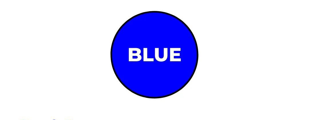
Stands for: trust, security, loyalty, friendliness, business, courage, calmness... The color blue portrays confidence, significance, and importance when used for a design project. **Yellow**

Stands for: Education, brightness, law, optimism, freshness, joy, clarity... The color yellow helps to activate the memory, enhances vision, and encourages communication. **White**

Stands for: purity, innocence, safety, goodness, brilliance, balance, serenity... The color white is often used to express purity, balance, or innocence. It provides light and gives a fresh feeling. **Orange**

Stands for: creativity, independence, fun, youthful, adventurous, optimistic, fresh... The color orange looks and feels fresh, and healthy and can stimulate appetite. It communicates activity and energy and encourages socialization. **Black**

Stands for: power, elegance, mystery, authority, strength, fear, and discipline. The color black basically indicates longevity as it is the absence of any color. It also symbolizes evil, mourning, sadness, and darkness. Color Gradients Gradients help make your design elements stand out and give your design a more realistic perception. Steal these 5 color gradients for your next design. **Cherry**
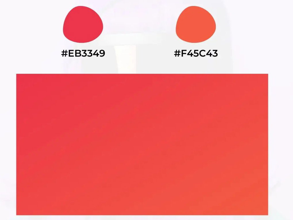
**Lush**
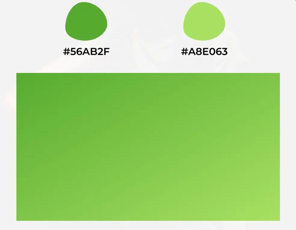
Green Beach
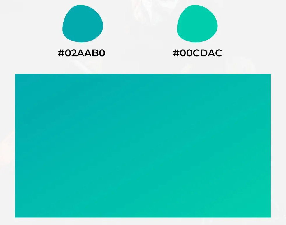
Frost
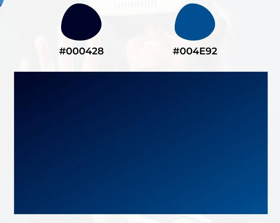
Aubergine
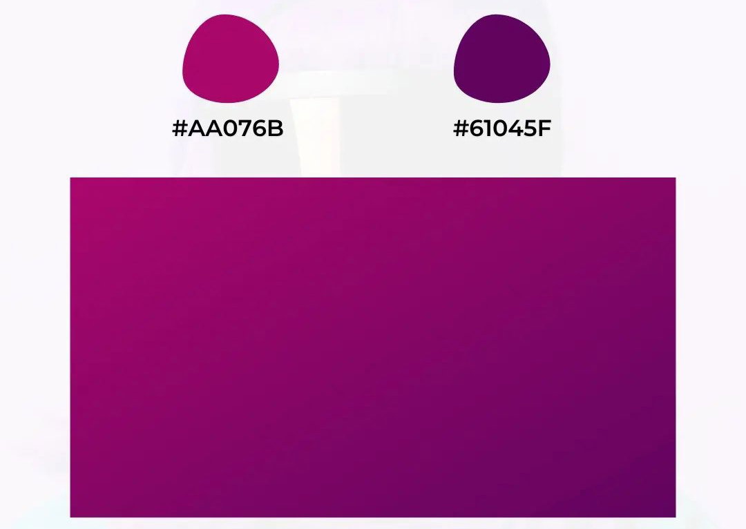
Color Palettes A color palette shows a combination of colors that helps you communicate more effectively using visuals. 5 cool color palettes you can try now. #1
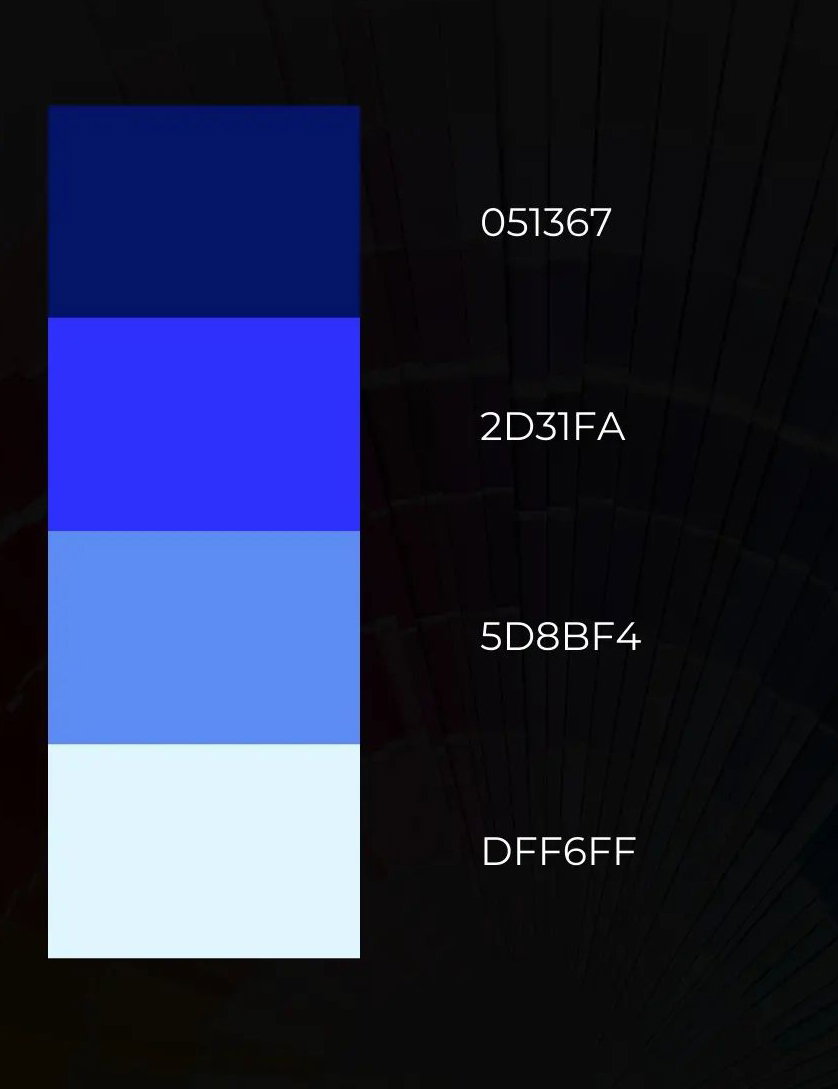
#2
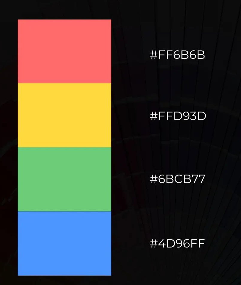
#3
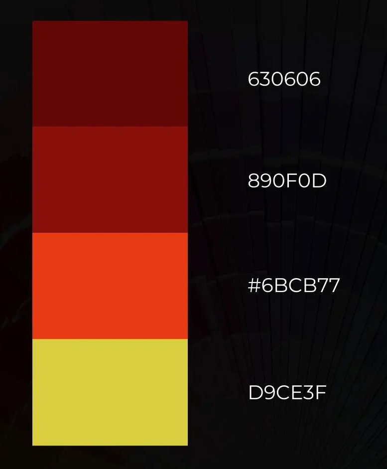
#4
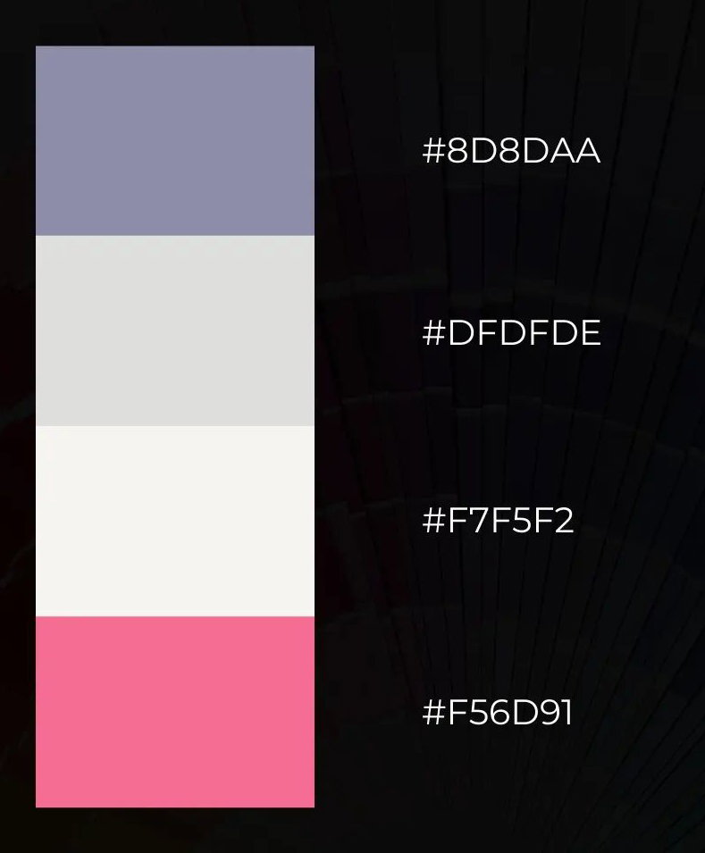
#5
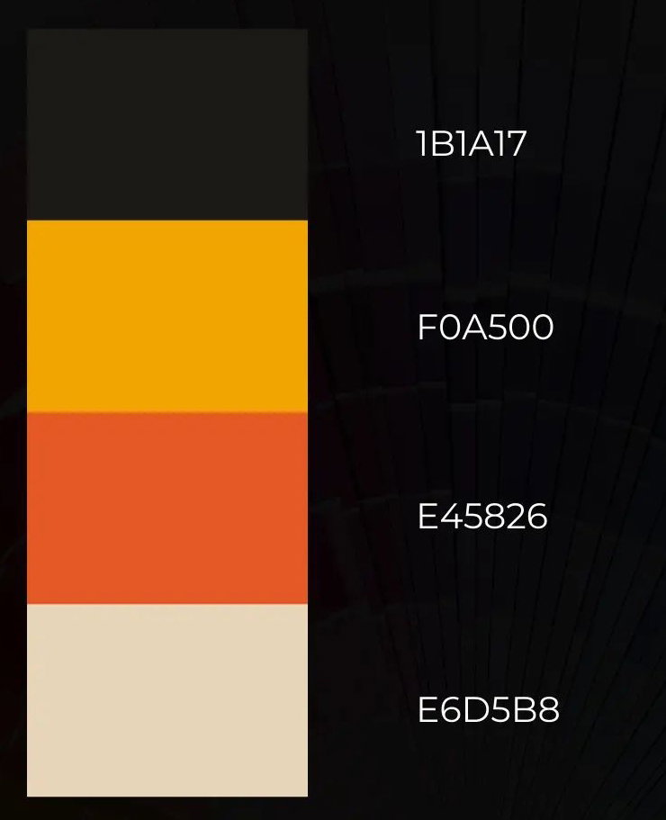
Colors have meanings and can trigger emotions. A good color combination is essential as it gives life to the design. The lead image was designed by Leolo212 on Pixabay. https://pixabay.com/photos/mountain-colors-paint-colorful-art-6538890/






6 comments
I just started learning graphic design. So your explanation on colours is really going to go a long way for me
Wow I didn't know the meaning of colours until now. I only know about red which means love and danger. Thanks for the information. You may also feed us with more meaning of colours and I'd really appreciate it
I learned that the colour purple, was a symbol of wealth, luxury, and royalty.
Well I guess that's the reason why I love the White and Black Color. Actually I love combining colors especially when I'm making my pour painting techniques.
Graphics designing is widened scope field. You have very well explain the means of colors. I am knowing it for the first time
Being a graphic designer must be challenging especially when it comes to color combinations because that one has the bigger impact per project..