From Contrast to Visual Hierarchy: 6 Basic Design Principles
Graphic design is a process of creative communication. If you’re looking to improve your skills or develop new ones, you should take time to understand the basic principles that make up that process. In this article, we'll cover the most important principles of graphic design and explain how they can help you create a great product.

Graphic design has become a very important element of modern marketing. Companies need to promote their brand and communicate ideas effectively through visual elements. The graphic designer plays a vital role in creating the right image for a company.
Graphic design isn’t just about pretty pictures, although they certainly play a part. Several disciplines go into designing an effective commercial project. Understanding these aspects will allow you to better understand why certain designs succeed and fail.
Graphic design principles are the building blocks of a successful design. Without them, you can't build a solid foundation for your work. These principles help shape the work of graphic designers across the world by setting the tone of their work and helping them convey their message effectively. These principles can be applied to any type of design—whether it's a website or an advertisement for your favorite product.
You can be a great designer by mastering these principles to create your own unique work of art.
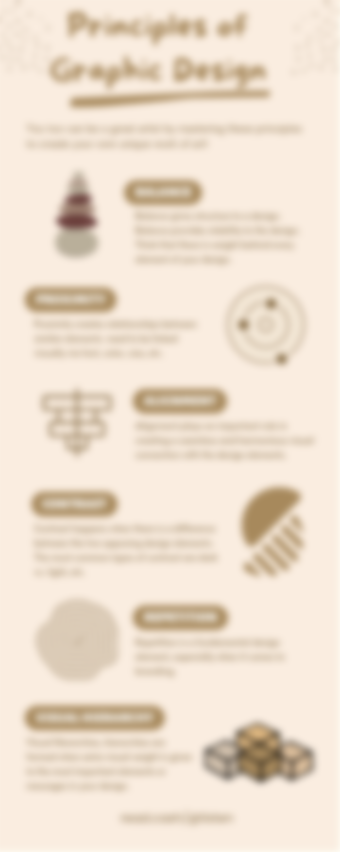
1. Balance
When we hear balance, we think about balancing the left side of the page with the right side of the page. However, balance can refer to how elements interact with each other. Also, balance can be achieved by using color theory and balancing the number of positive and negative spaces. A good balance creates a consistent visual experience across different devices, platforms, and browsers.
Balance, or the correct distribution of elements, is a fundamental principle in good design. Balance refers to maintaining equal distribution between two opposing forces, elements, or components. In graphic design, balance is achieved by making sure each element or group of elements have similar emphasis, weight, or significance in relation to the rest of the page. Without balance, the layout becomes chaotic and disorganized. A visual system should always have enough focus and interest, yet not too much, or they risk being unreadable.
The concept of balance is about achieving the perfect harmony between two opposing factors. In graphic design, we call these opposing factors positive and negative space. Positive space is defined as any area in the design where no matter what color or shape is placed, it always looks balanced. Negative space is everything else, which includes blank spaces, white space, and negative shapes. When using both positive and negative space, designers use colors, textures, and shapes to achieve a great balance.
Balance in the context of typography refers to how the text and its surrounding elements interact with each other visually. When designing a page, it's important to consider what kind of emphasis should go where. One way to achieve balance is to use some typefaces that contrast well with others, such as using bolder fonts on headlines and smaller ones for body copy. Another method is to place related content side-by-side rather than top-to-bottom or left-to-right.
2. Contrast
Contrast is a graphic design principle that is often overlooked and yet it is one of the most effective ways to create interest and attention. Contrast is achieved when two different things occur together. A good contrast creates emphasis, enhances visuals, and draws focus toward certain elements of the design.
This is the difference between the foreground and background of a design. It occurs when two different things appear together on a screen. Contrast in graphics may refer to either difference between colors, values, shapes, textures, etc. (i.e., a black-and-white photo versus a colorful one), or a contrast between two visual elements (such as text or background). Contrast helps users differentiate between items in a design.
If there is not enough contrast, then it becomes difficult to distinguish different objects and elements. Therefore, a good graphic designer uses these three aspects to create visual interest.
3. Alignment
Aligning text and graphics is used to keep things organized and visually pleasing. To create alignment, use guidelines, guides, rules, grids, and other systems to keep your design straight.
In graphic design, alignment refers to the placement of different components of a design. The alignment of text refers to how words flow together and align with each other. As a result, it helps readers understand what they’re reading faster and easier. Graphics designers use alignment to make sure that all parts of a design work together harmoniously. Good alignment helps viewers scan information easily by ensuring that blocks of text or images are aligned in logical places on the page. There are many ways to achieve alignment. One example would be centering text on a page.
4. Proximity
Proximity relates to how close two things are together. This principle is based on the fact that if something is closer to us then we have a stronger connection to it than if it was farther away. In graphics, proximity helps visually connect objects. We use proximity to group similar items together, making them easier to find and identify. If you overlap items, they appear closer than if they were farther away. Items close together have a stronger connection with the viewer, whereas those further apart don't seem as connected.
5. Repetition
Repetition refers to the occurrence of a certain pattern or idea over and over again throughout a piece of work. This principle is often used to create visual interest in a graphic. Repetition makes our eyes move across the design, giving us a feeling of progression or completion. When designing graphics, repetition gives a sense of order and organization.
For example, a repeating motif is seen when a company uses the same logo over and over again. A repeated shape, color scheme, or texture creates a consistent feel. With repetition comes balance. Too much of any one thing in a graphic will cause it to lose its meaning and become uninteresting. By balancing repetition with variations, you will avoid monotonous design.
6. Hierarchy
Visual hierarchy determines how content is arranged and presented to the viewer. Elements higher up on the page tend to get attention first, while lower down items receive less emphasis. Hierarchical structures organize information into categories, sections, or levels. They allow users to get a general overview of information at a glance.
Closing Thoughts
Graphic design is built on a simple foundation of principles – or rules if you will – that are the core of what makes it such an important discipline. These principles define and shape graphic design as we know it, and they serve as an invaluable guide for anyone who is looking to learn how to create great graphics.
By learning about the basics of visual design, you can really improve your skills and elevate the quality of your work. As you practice, experimentation is key – play around with different elements and see how they look together and what works best for your project.
Quick tips for beginners: Take a piece of paper, and write down a few words for each design principle above. Put it somewhere where you can see it every day. Work on incorporating one to three principles into your designs each day. After a week, review your progress and set new goals for the next week. These design principles should become habits in no time, which will yield fantastic results in your designs.

Good article! Most importantly, we need to practice non-stop to improve our design skills.