Member.cash Theme Dev with DEMO - Day 4

TLDR: Demo link is at the bottom.
Toady marks the fourth consecutive day of development on my custom fully responsive, member.cash theme. It's been hard work but worth the effort - It looks amazing!
The structure of member's HTML has been really challenging my limits in terms of styling and using attribute selectors, pseudo elements etc. But with every passing day I am picking up more and more momentum as the components start getting reused as much as possible. Below is the current SCSS file structure for the theme. As you can see it has grown a lot!

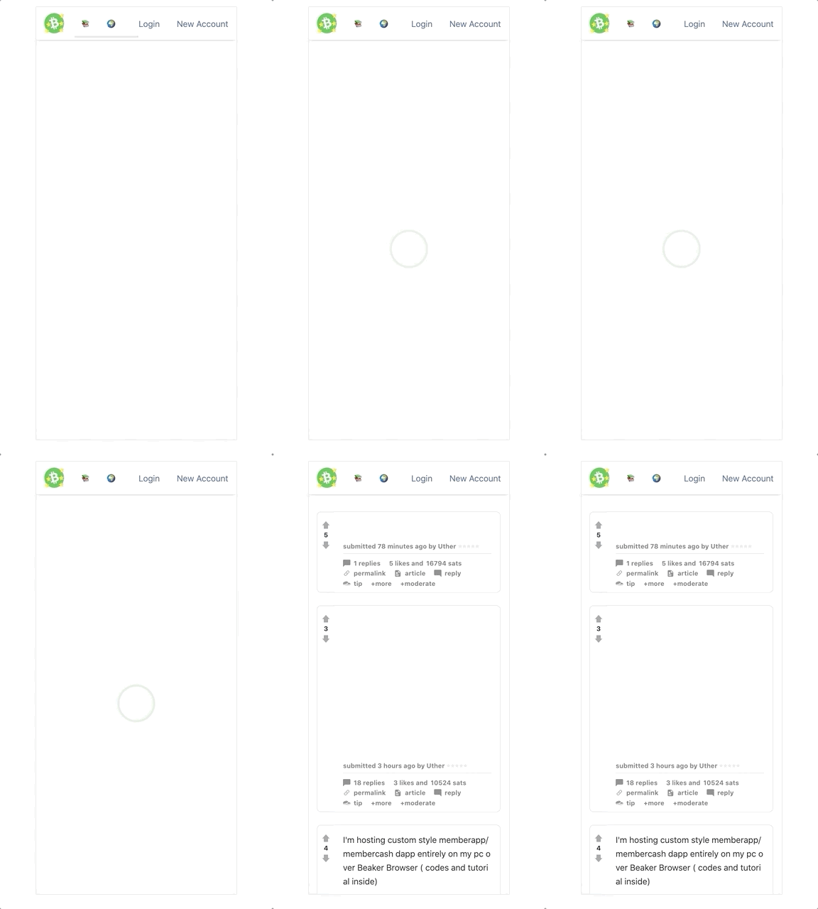
Check out this cool SVG only animated loader I added today:

What else got knocked off the todo list?
✅ Private messages page
✅ Tools page STYLES
✅Signup/ login page
✅ updated low funds message with QR code.
✅ General cleanup
What's left to do:
User profile page
More cleanup
Topiclist page
Try out the demo yourself and let me know what you think
👉👉👉 https://real-feels.github.io/memberapp.github.io/ 👈👈👈
🦟 Please report any bugs to me!


Very good exchange for the first time