Member.cash Theme Dev - Day 3
0
236

Here is todays progress
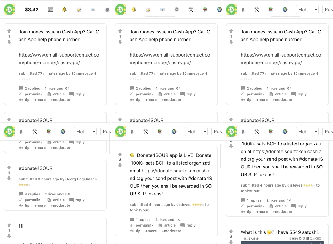
Mobile navigation
Deciding against hamburger menu for accessibility reasons. Decided to implement horizontal scroll menu instead.
NOTE: The Gif's processing below has removed the main grey background from the site
First attempt
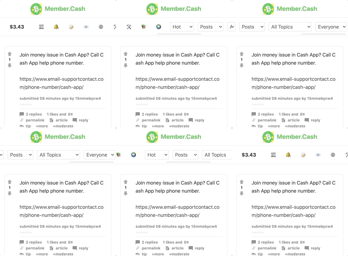
Revised attempt

Dektop navigation

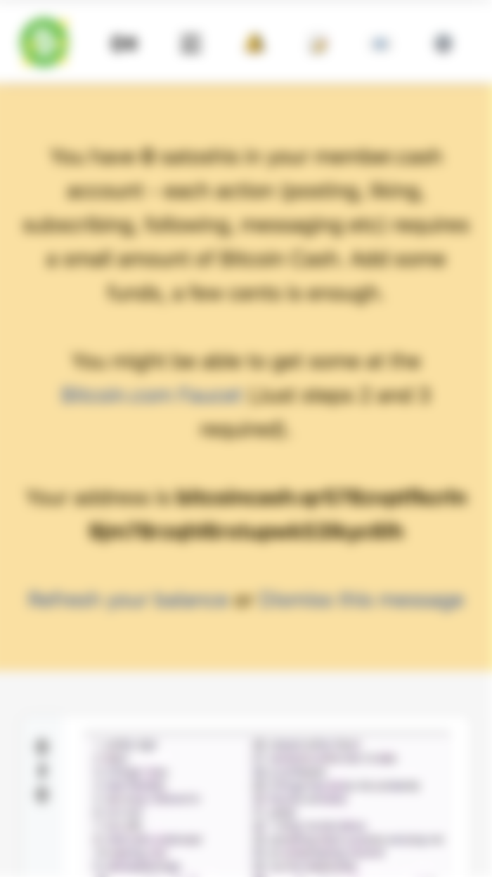
Low funds message


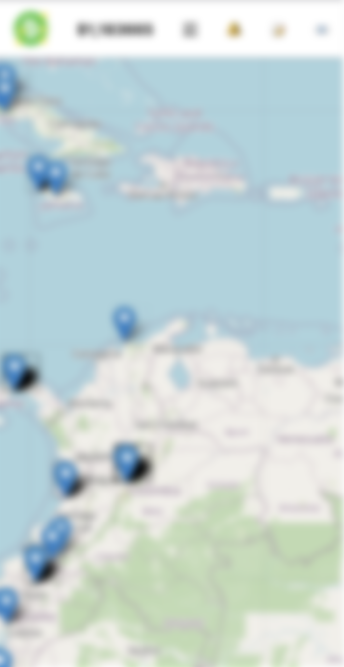
Map styles

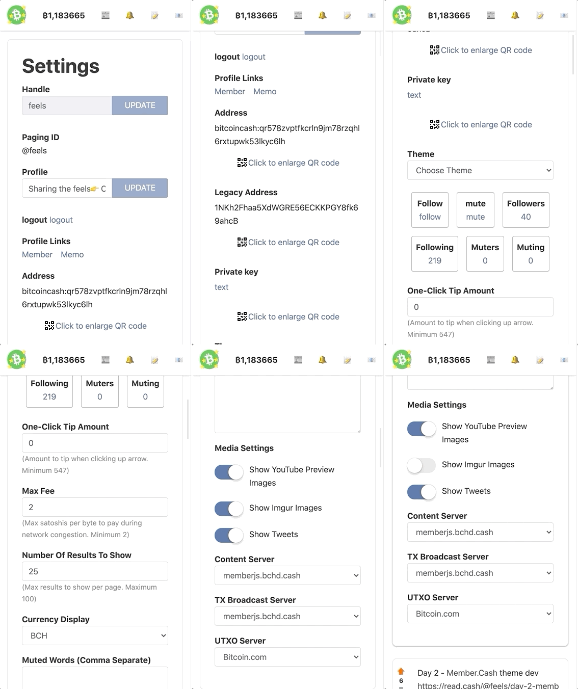
Whats left to style?
Private messages page
Topiclist page
Tools page.
Signup page
Login page
User profile page
General cleanup
+ 3
more contributions

