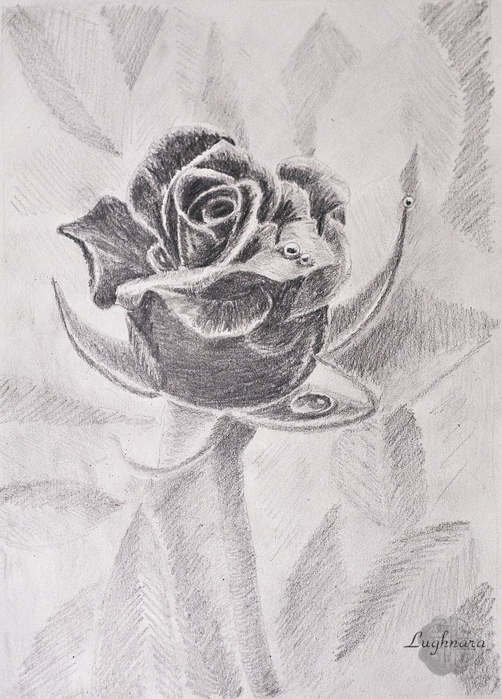
Black rose (pencil graphic)
Hi friends!
Black and white drawing is a special kind of graphics. Under it, you need to carefully select the plot so that it looks no less (and ideally more) advantageous than in color.
It was the task of the next competition - to make a black and white drawing with simple pencils
One day I saw in a magazine a black and white photo of an iris photographed in contrasting lighting. It was delicious!
I wanted to try to draw something like this
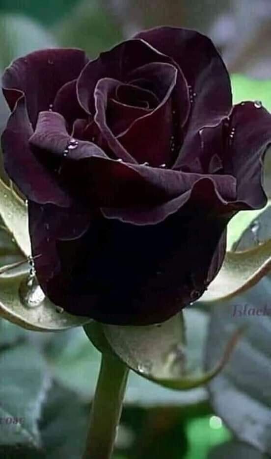
I found beautiful black rose on Pinterest as a ref. https://telegra.ph/file/f7a55d39b2e5b2433aa75.jpg
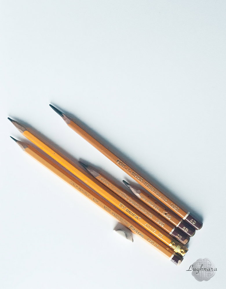
I used five pencils of varying degrees of softness in my work, a sharp-edged eraser and plain paper for sketching.
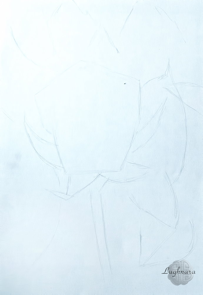
Sketch
With an HB pencil, I shade the entire finished sketch in an even layer in one direction.
This is a middle tone.
Leaves in the background.
Since the flower is the most contrasting and darkest element in the picture, the space surrounding it will be much lighter.
I stroke the leaves in different directions, with different efforts, trying to alternate darker and lighter areas so that the background does not look boring.
For this I use HB and 2B pencils.
For the flower, I left the softest pencils, giving a bold and dark stroke.
But I also started working from the lightest areas - from the sepals and from the illuminated areas of the petals. The stem of the rose is also quite dark compared to the background.
I also use different shading (with 2В and 5В pencils): I make the outer edges of the sepals with straight short strokes, the inner ones with arched ones to emphasize their concave shape.
The same with the petals. On the stem I try to show its cylindrical shape, I make one edge a little darker, I also darken the very top part, which goes under the flower.
Yes, the light comes from above
I start painting the flower from the core.
The structure of the rose is complex, the petals lie, bending over each other. Therefore, it is important here to apply tones on two adjoining planes so that they do not merge. At the central petals, I leave only a narrow strip at the top light, closer to the inside of the flower I shade strongly, almost to black.
The farther the petals are located from the core, the lighter they become closer to the outer edge.
I take this aspect into account in hatching, picking up one or the other pencil so that the transition from one tone to another is smooth.
Some of the petals bend very nicely, each such plane also needs to be hatched with different tones to show the shape of the bend. And do not forget that the lightest areas (glare) are at the fractures of the form, in rose petals this is an area from the edge.
Approximately in the same vein, I continue to work.
At the petals, they are in an unlit zone, within the boundaries of the lower petal, I show only a fragment of their upper part, and I take everything else to a black tone.
At the last stage, I wanted to complicate the background a little, and I made gradient extensions on individual leaves (and redrawn the left corner altogether).
Well, I decided to add some more few drops on the petals in order to focus more on the flower itself.
More or less like this
Yes, sometimes just draw in black and white, without color spots - this is a variety in painting
Have a nice and creative day!
With Love...
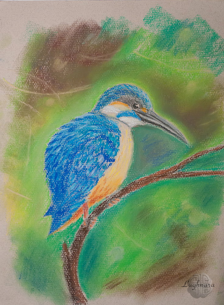
Kingfisher (soft pastel)
Hi my friends!
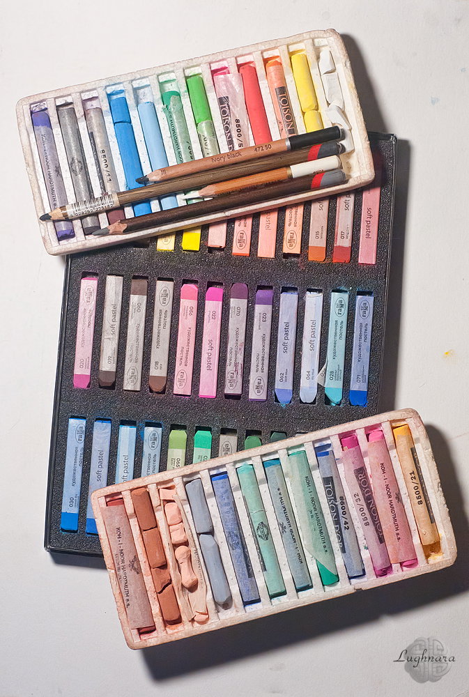
I like to work with pastel crayons and pencils more than other art materials.
I love how different colors mix on paper and create colorful new hues.
In my new drawing, I decided to do it in pastel crayons only and use pencils only for very small details.
This bird, photographed by my LiveJournal friend, became my main character https://ic.pics.livejournal.com/fotovivo/19078119/6593152/6593152_original.jpg
Materials
I was need two pastel set for this work to make rich shades
And this time I chose gray texture paper Canson Mi-Teintes for my work.
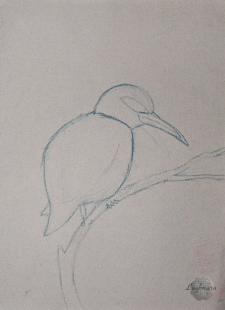
I decided to change a sketch so that the bird is fully visible and in another pose
With several shades of blue and yellow, I paint the plumage of a bird.
There are more shadows in the lower part of the body - I determined the direction of the light from the top right
It is important to do this at first step, so as not to confuse the light and shadow sides later.
To draw the bird's eye, the paws, the beak and individual colored feathers on the head, I took pastel pencils
Blending the first pastel layer
Now I paint individual feathers in different shades of blue, depending on the direction of the light.
I clearly highlight the near wing
At the same step, I select the color for the branch on which the bird sits, several shades of brown
And finally, the background.
I want to create a rainforest feel around the bird, with lots of greens and earth colors. And at the same time, I want to highlight the bird with color.
I shade pastel strokes near the bird
And on the background I draw a few thin light branches and also slightly shade
Finally, I slightly blend the colors on the branch where the kingfisher sits and put a few light highlights on a background, like the bokeh in the photo
Yes, that's probably what I wanted to see!
I'll very glad if someone likes my work))
With Love...
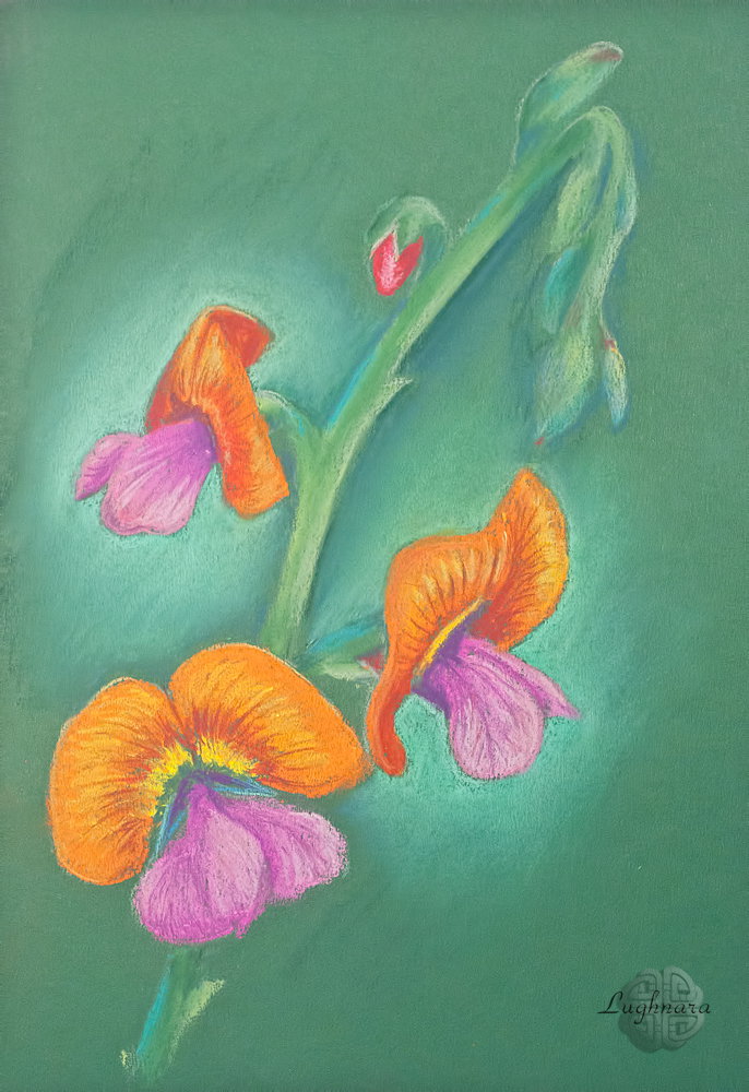
Australian flame pea (pastel painting)
Hi my friends!
Thinking about what can you draw on the eve of the onset of spring I didn't come up with anything better than exotic flowers.
This flower, for example, has a complicated name Chorizema cordatum (or Australian flame pea)
I liked it by colorful petals as butterfly
Reference from Pinterest
For the image of this flower, I took tinted dark green cardboard with a smooth surface and dry pastel in bright colors. https://i.pinimg.com/564x/05/1e/a4/051ea4296fa8888dd0dc2c8934d92f85.jpg
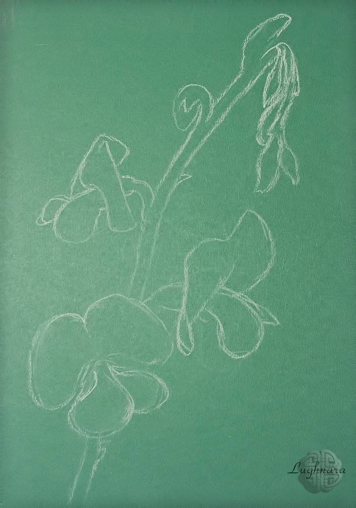
Sketch
Approximately this will be the color palette (in the process of work, I added a couple more contrasting colors - in particular, dark green and deep purple
I started the drawing with the stem of the flower.
To do this, I used two colors of green and warm yellow. Lighting is uneven due to large colors - presumably coming from somewhere to the right.
Somewhere on the shadow side I add touches of turquoise color
The flowers now.
The lower petals are pink-crimson, turning into a very dark one towards the middle (that's why I took a purple crayon)
The upper petals have a rich orange color (because of this, it is possible that the flower is called "flame pea"), but another side of it is darker, the unopened bud also has a dark color, I painted it in red
To show the smooth curve of the petal, I paint it with a dark terracotta color closer to the core and make a few yellow strokes closer to the edge, but not the very edge.
When all the flowers were drawn, I slightly feathered the strokes so that the individual flowers mixed up and created a smooth blending.
And I also decided to highlight the two central flowers with a contrasting green color
Closer to the edge of the leaf, this light green color will be shaded with dark green.
With this dark green color, I emphasize the flower stem from the illuminated side.
And I strongly shade the background green colors, fitting them into the color of the cardboard
So... last step for details.
I take some pastel pencils for it and draw a veins on the petals
Somewhere I refine the contours, somewhere, on the contrary, I smooth out too sharp strokes.
Yes, I think now my drawing is ready!
A flower in the end of winter... if you don't live somewhere in the tropics, you can draw it.
I'll be glade if my drawing like to someone
With Love...
Digital art_2020. On another Planet
Hi friends!
Today, on my new artwork I tried to imagine how the live world could be arranged on another planet.
And now such a strange and cute character came to my mind...
Sketch in **Paint Tool SAI 2**
Steps
Texture background
Base color of character
Magic flowers
I was inspired by ordinary earthy irises
Direction of light
Adding a details
The character was conceived in contrasting colors, it was necessary to find harmonious combinations
Eyes on the tail - sometimes it is convenient to examine an object from different angles...
On this step I decided to replace a color of background to more dark.
Then I opened my drawing in **Photoshop** and make some stars for wonderful mood.
and some beautiful color light (a few chaotic brush strokes on new layer in **Linear light** mode)
Finally color correction and so, our new fantasy world is ready!
I wish there is more magic in your life.
Don't be afraid to make it yourself
Maintain peace of mind and harmony no matter what!
With Love...
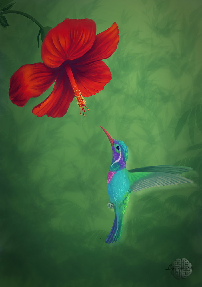
Digital art_2020. Hummingbird
Hi my friends!
In the frame of art challenge in April last year I drew some birds.
First in them was a little and beautiful tropical bird named **"Hummingbird"**
I find nice reference for my drawing, but I wanted to make another color of feathers of bird https://i.pinimg.com/564x/d1/f1/ca/d1f1cab4329c0134eea97bf6304d88d0.jpg
Then I opened my lovest program **Paint Tool SAI 2** and started...
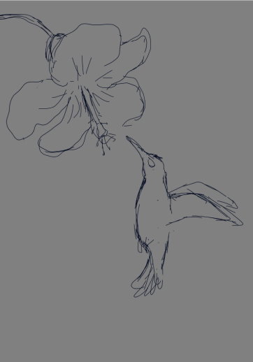
Sketch
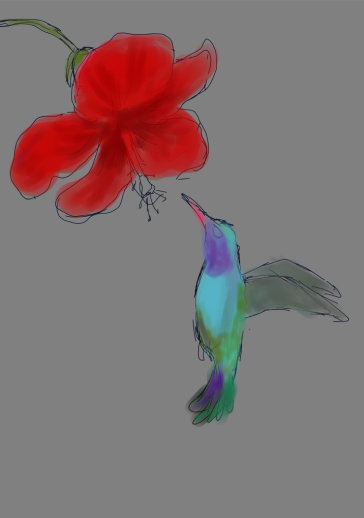
This time I decided to start painting with the main characters of the picture, they are so attractive
This time I decided to start painting with the main characters of the picture, they are so attractive.
At the same stage, I decide on the direction of lighting - bottom right
Searching a right forms with light
This will help show the depth of the heart of the flower and the wavy lines of the petals.
I draw my base brush **Oil Brist 2**
This brush can mix different colors well, and it is also convenient to apply short strokes with it, imitating bird feathers.
Highlights in the eye I drew with hard brush **Ink Pen**
Base picture is ready
Yes, had to line up the bird's wings
Now I want to make a background more textured
I open my drawing in **Photoshop** (*I wrote early to sorry SAI hasn't a custom forms brushes*) and drew a texture background as jungle in new layer
Then I reduced a volume of opacity for this layer and make color correction and dark vignette.
Ind I decided to make a glow of bird as a motion effect
And color correction a little
Artwork is ready!
I hope you enjoy my drawing and distract from sad thoughts.
I draw so that people look at beauty and be happy!
With Love...
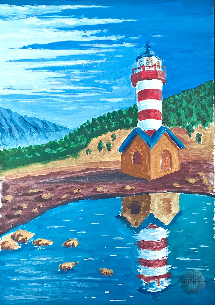
Grafton lighthouse (tempera painting)
Hi friends!
It was an artwork on art contest on Golos
The topic of the next round was **"On the Shore"**
Since I came up with this round myself, I already knew what I would draw https://golos.id/ru--konkursy/@gerdananeis/art-duel-itogi-tretego-raunda?invite=gerdananeis
I found very beautiful building on Pinterest
The landscape itself seemed to me not very interesting, so I replaced it in the process of work with another.
I wanted to save only the lighthouse and the reflection in the lake https://www.pinterest.ru/pin/511369732699800066/
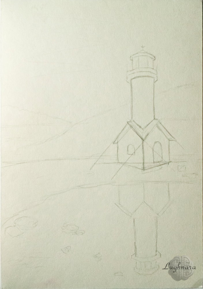
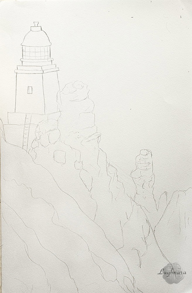
Sketch
I built the building very carefully so that it complies with the laws of perspective.
Behind outlined the silhouettes of the mountains
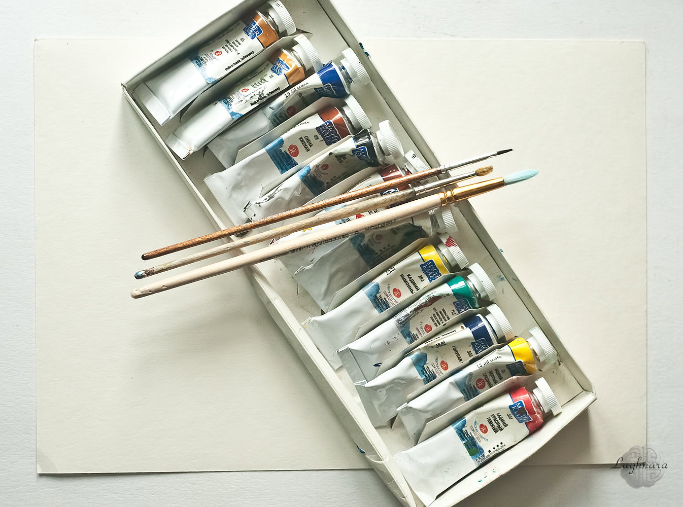
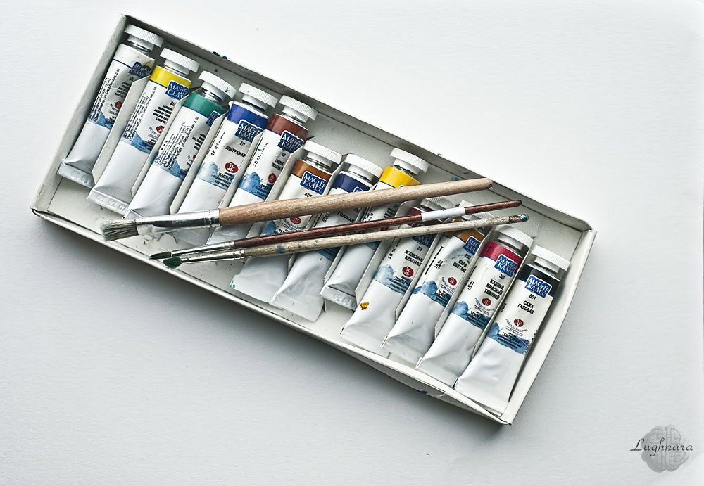
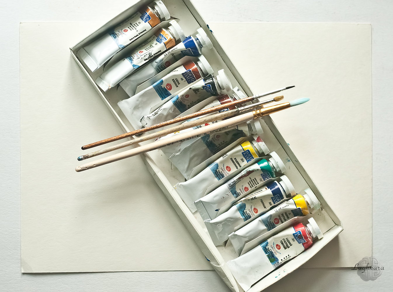
It's my art materials - set of tempera painting and three synthetic brushes
As usual, I start my landscape work by painting the sky.
For the sky I mix ultramarine and blue FC. Closer to the upper edge of the sheet, I apply the color thicker and richer, and closer to the horizon line, lighter, I add white to color mix.
On the left side, I decided to add a group of light cirrus clouds. To do this, I added a drop of a mix for the sky to the white and painted several thin "arrows" with such a soft blue tint, also observing the perspective (closer to the horizon - smaller and almost merging with the sky).
This is how the light source appeared by itself - on the right.
I'll adhere to it in all subsequent step.
Now the far shore.
According to the airy perspective, it should be less saturated and in cold tones. Therefore, I add emerald green and more white to the mix for the sky.
I am painting a mountain ridge, laying chiaroscuro with different shades of the mix.
Closer to the foot of the mountain, I highlight to create the effect of tonal perspective and separate the background from the middle.
I paint water with the same mix of ultramarine and blue FC, but with the addition of emerald green. Also, closer to the foreground, the colors are thicker and more saturated, and the farther from the viewer, they are lighter and more pastel.
I leave free space for individual stones protruding above the surface of the water.
Now the middle coast.
I decided to do the work in cloudy evening lighting, which means cold light and warm shadows.
I decided to paint the forest area with a mix of emerald and natural sienna, added a little iron red in the shadows, and more ocher in the highlights (it itself has a cold shade). Closer to the ground, the forest is dark almost everywhere.
The forest-free fragment of the mountain was partially painted with a mix of sienna and iron red (it is darker to the right of the lighthouse building than to the left), white and cadmium yellow are added in places to create texture with the difference in color strokes.
The foreground, along with the lighthouse, will have the most saturated color for me.
I made a little celestial mix (ultramarine and blue FC) with iron red, plus a little natural sienna - in the darkest places (shadow from the lighthouse, from individual stones and under the shore).
With the same mix I paint the shadows from the stones in the water, and the stones themselves - with ocher and white.
Well, the main character remained - the lighthouse.
To paint the shadow side of the house, I took natural sienna, and for the illuminated one - ocher. For the roof I used an unbleached mix of ultramarine and iron red (in the shade) and blue FC with ocher in the light, for the windows I used a mix of sienna and iron red with white.
At the same time I draw the reflection in the water - it will be darker and there will be more blue shades in it.
I paint the reflection with uneven horizontal strokes, without clear contours, to create the feeling of water ripples.
The brightest object, the lighthouse pillar, was painted in cadmium red with a mix of iron red and emerald green (in the shadows) and white (in the light).
On the white stripes on the shadow side, I put a light blue color, with which I painted the clouds.
He also made highlights on the upper roof and on the weather vane in the form of a ship.
The glasses of the upper dome, where signal lights are lit, are partly painted with a celestial mix (reflexes from the sky), partly mixed with neutral shades.
The reflection was painted in exactly the same way as the house.
Well, with the same light cloudy mixture, I made the finishing touches with a thin brush - separate highlights on the water.
And that's what I got
I hope you like my new drawing too
With Love...
Digital art_2019. Italian Street
Hi friends!
One of art contest on Steemit was a "color" theme.
I imagine is brightness & colorful houses of Mediterranean countries.
One of their I drew.
I wanted to make a drawing in a primitive and a bit grotesque style. https://steemit.com/art/@juliakponsford/art-explosion-week-62-theme-color-20-steem-in-prizesl
Sketch
Color palette
I choose for my drawing very saturated and almost acid paints.
Base colors
The foreground will be the most saturated, while the distant houses are more in pale pastel colors.
I add details - windows, passages to the courtyard, paving stones on the pavement, lanterns
Mediterranean streets differ from others in that they have a lot of greenery. Flowers are everywhere - both on the balconies and right at the front doors!
Final details - texture on the pavement, clouds on the pink sky and another exotic flower in the foreground
Yes, that's what I wanted to see!
I hope this colorful house will cheer you up!
After all, Spring is coming! ;)
With Love...
The Lighthouse of Cape Town (tempera painting)
Hi friends!
Today I want to tell & show you haw I created one of my lovest pictures **"The Lighthouse of Cape Town"**
I drew it on one art contest on Golos, but it was be interesting for my English-speaking friends
I saw him on one photo, and it seemed to me that this snow-white building, towering over the raging ocean, is worthy of being painted. https://golos.io/goldvoice/@gerdananeis/risuem-vmestemorskaya-tematika-keijptaunskiij-mayak
I choosing for picture set of tempera paints, watercolor paper (*yes, I love drawing with acrylic & tempera paints on watercolor paper*) and three synthetic brushes different sizes.
It's my sketch (*not from references, the composition was invented by me*)
I start drawing with painting the ocean waves.
For background I mixed two colors of paints - blue FC and emerald green. Foreground was painted with adding ultramarine and more emerald green.
The waves near a rocks I painted with the same colors, but diluted with water.
Splashes and foam of waves I painted with white color.
Then I painted the lighthouse.
One wall in a shadow was painted with mix of iron red, burnt sienna and one of mixes for ocean. A wall in the light I painted with mix of iron red & yellow cadmium. For shadows on the dome I chose mix of ocher yellow and ultramarine (highly diluted with water). And a side on sunlight I toned some with mix yellow cadmium and white. For glasses was great mix which I used to paint ocean.
And finally foreground - the rocks & big massiv of forests.
That parts on sunlight was painted with mix of yellow cadmium and burnt sienna, in some places with the addition of white. The shaded areas - with a mix of burnt sienna and iron red with addition of ultramarine somewhere, and somewhere with emerald green (reflexes from water).
I painted with mix of ocher, cadmium yellow and white to the lightest places.
A foreground, covered with vegetation, I painted with a mix of emerald green with different shades of yellow (more lighter to upper edge of rocks).
In this step I didn't like that dark wall was almost the same color as a rocks on the middle ground, and I maded a light wall more saturated with slightly diluted cadmium red.
Then I drew deep scratches in a walls of rocks with very dark color (a mix of blue FC, emerald green and iron red) and a staircase leading down from one of a walls of the lighthouse.
Here is a seascape from the southernmost point of the African continent, I got!
With Love...
Digital art_2020. Rich the Moon
Hi friends!
I was thinking: how in the year of the Tiger to do without a drawing of the Tiger? I have such a drawing, of course!
Some days ago I found in internet very nice picture with winter playing tiger. This excellent shot inspired me to create mystical story about night talking an animal and space. http://www.storytrender.com/wp-content/uploads/2018/11/2_CATERS_TIGERS_IN_SNOW_03-683x1024.jpg
Or ... maybe, the tiger decided to play with the moon like a ball?)))
Sketch in **Paint Tool SAI 2**
Then I started to paint with base colors.
I wanted to make a picture in cold shades with warm highlights.
Then I search a direction of light - it comes from above, from the Moon
I want to say I draw in **SAI 2** only some brushes with owner options:
**Sketch brush** (very hard, for sketches)
**Oil Rough** (for fill large areas)
**Oil Brist 2** (base drawing brush with changing blend option)
**Ink Pen** (for detalization)
and **Watercolor** (for blending colors)
So... I continue
At this step, I want to add depth to the space with clouds in the background, a ripples in the water and shining of the Moon.
And I begin to detail the foreground - the texture of the rocks and stripes on the skin of the tiger
I continue my work with a silhouette of tiger, add a realistic stains on Moon and highlight on a clouds
Yes, it's my cloud brush in SAI
I want my tiger to look like a real animal, so I carefully apply strip by strip to his skin.
I detail the muzzle very carefully, especially the eyes
and strong claws
It remains to add a blurry reflection of the clouds to the water surface.
Here's a fantasy scene I got!
Yes, finally I added some stars in the sky (*it's in* ***Photoshop***)
Thanks for your attention!
May the ruler of the year be favorable to you!
With Love...
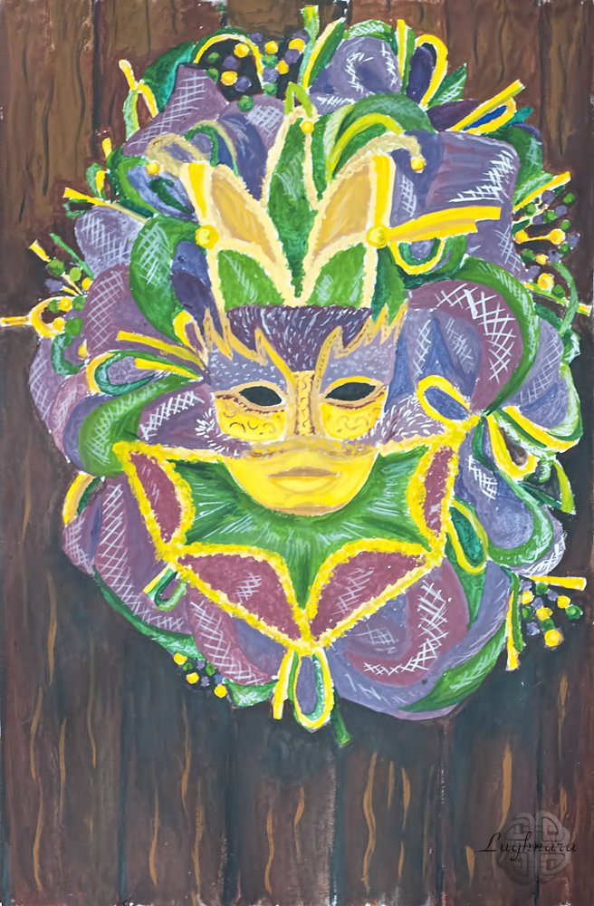
Mardy Gra's Wreath with Mask (tempera painting)
Hi friends!
I never see a MardyGra's Carnival in real life. All I know about this is articles in magazines and TV shows on Discovery Channal. The fact that for someone a part of life and cultural traditions, I imagine as mysterious exotic of a distant country... I like the colors of this holiday and the feeling of fun in connection with the arrival of spring... So today I painted such a colorful mask on Steemit art contest https://steemit.com/contest/@deemarshall/artstorm-contest-66-day-5-mardi-gras-week-theme-today-masks
Today I decided to draw with traditional art materials, namely paints of tempera.
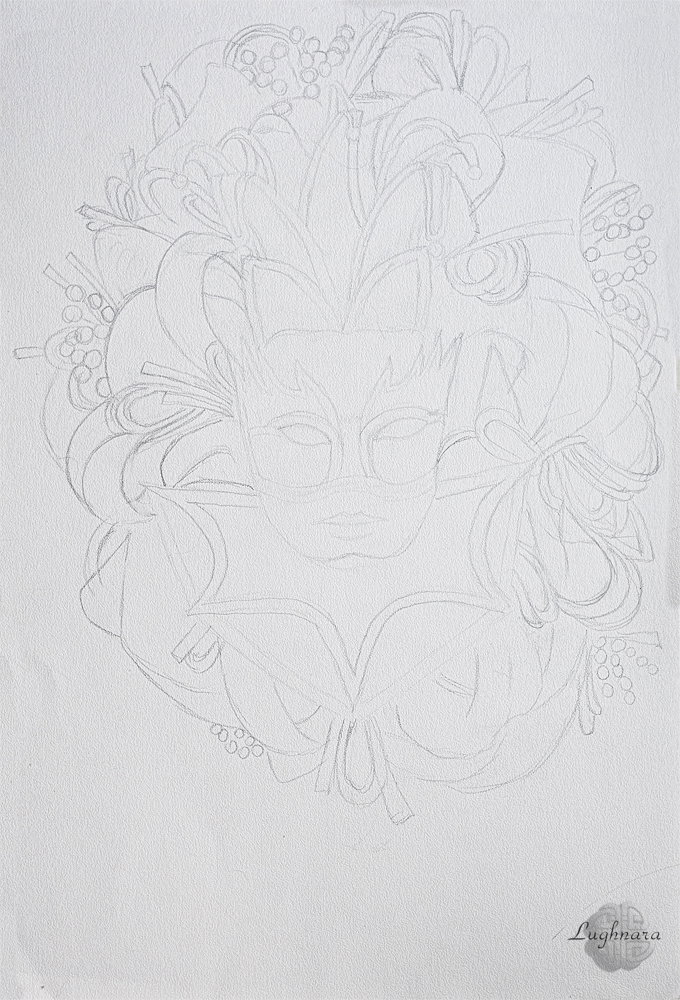
Sketch.
Usually I draw on watercolor paper high quality.
Steps.
For the yellow parts, I mixed cadmium yellow paint, burnt sienna and natural sienna. Highlights on metal areas of mask & beads I maked by lemon cadmium.
For the purple ribbons and beads I take white color, cadmium red & ultramarine. Shades should be cooler and darker than light parts. This will add relief to the loops of ribbons.
Then I painted a green fragments of the mask with emerald green, yellow cadmium and some white.
Finally I drew a background for mask. Real thing can't just hang in the air! Therefore I drew a wood door on which hangs a wreath with a mask. I needed burnt sienna, natural sienna and black paints/ Lower part of door should be darker than upper through drop shadow from wreath.
And the very last stroke!
With mixing white & ultramarine I add a highlights on a folds of ribbons to show what they from sparkling textile like organza.
I think I do good painting!
Have a nice and creative day!
With Love...
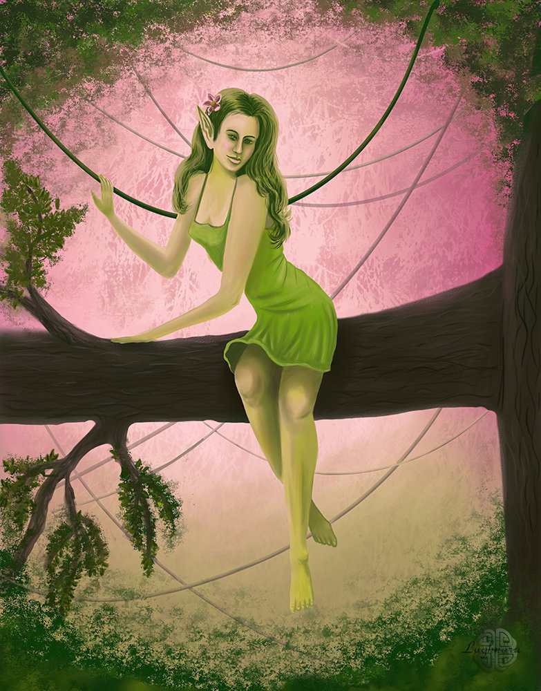
Digital Art_2019. Forest Nimph
Hi my friends!
One day when I was sitting without Internet for five days, I created a new drawing...
This is again a mystical creature, but this time a humanoid.
It's the Elf (or Forest Nimph).
I think now is the time for miracles and other magical phenomena)))
I imagined that she was just sitting on a branch among the foliage...
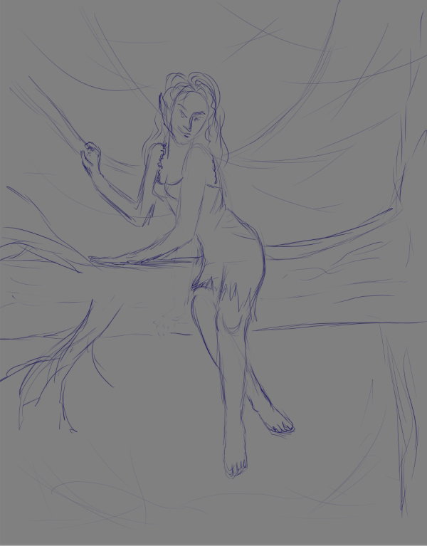
I looked at several photos of seated women and sketched something like this
And I chose an unusual contrast color palette
Base colors
(Yes, *I drew in* ***Paint Tool SAI 2***)
An environment - a leaves and a lianes
Drawing a main heroine
Then I replace a setting of foliage brush.
This is the better view!
And I drew a lianes with vector tools in **SAI.**
Details for a Nimph
Adding a background (far leaves)
Then I made a color correction to layer with Nimph - I wanted to add a nice warm shine to her body.
And adding a flowers in her hair.
Very nice lady!
Drawing a texture of tree and one more details of leaves
And finally color correction a little again!
Here is such a mystical forest lady turned out
I hope you'll like her too)
With Love
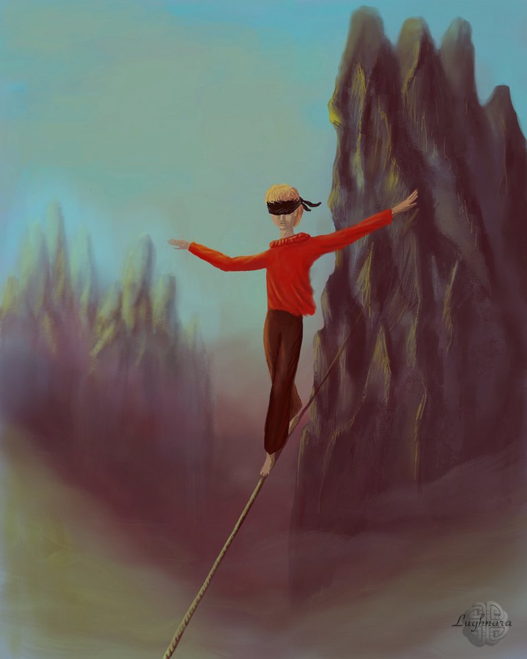
Digital Art_2019. Ropewalker
Hi friends!
I've another one great sponsor @Mictorrani . He writes informative articles on various topics and makes selections of articles from various interesting authors, if someone don't know
Thanks a lot to attention to my drawing tutorials!
So... It was one of the first drawings when I depicted a person
It was another artwork to art contest on Steemit. The theme called "Bold" https://steemit.com/contest/@makersplace/digital-art-contest-70-steem-contest-5
When I read the name of the topic I imagined the ropewalker going blindfolded over the precipice...
This requires extraordinary courage, is not it?
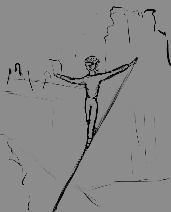
Sketch
I worked in **Krita** in this time.
I didn't know this graphics program very well, so every step of the drawing was an experiment for me.
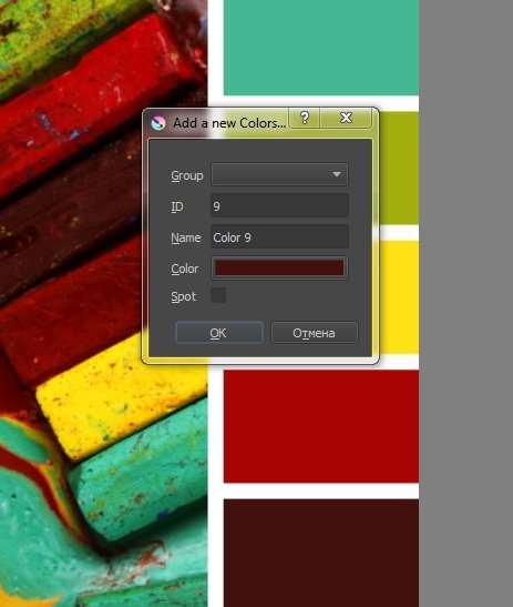
I wanted to choose a color palette with with anxious mood.
Creating new color palette
I started my work with background
I draw the mountains in the background
I can't say which brushes I used, because the program, as I said, was unfamiliar to me.
I determine the direction of lighting - to the left and start to work with character
Here I wanted to divide the distant mountains into two plans to enhance the depth of space, the closer to the viewer I detail more.
Detalization a character.
I wanted him to attract all the attention, so I made him a bright color for his clothes.
Likewise, I accentuate the foreground - the part of the rope that extends beyond the edge of the frame.
And in the last step, I added more fog over the abyss to enhance the feeling that there is an abyss under the feet of the daredevil
Finally color correction in **Photoshop**
It was not an easy job, but I did it!
I hope you'll like it too
Have a nice and creative day!
With Love...
Digital art_2019. Clouds creator
Hi friends!
Fantastic animals and fabulous characters - this is another my favorite topic for drawing
It was my art idea on amazing Steemit contest, dedicated by a beauty of Clouds https://steemit.com/lovetheclouds/@tobetada/welcome-to-the-love-the-clouds-contest-27-win-100-of-steem
I imagined a story where there is a certain magical entity that creates clouds and sends them float across the sky
Once upon a time I had in my papers an old sketch made a long time ago...
I have long wanted to portray my cat Nikita in the image of some unusual fairy-tale creature https://images.golos.today/0x0/https://steemitimages.com/0x0/https://ic.pics.livejournal.com/daring_celt/21759813/124437/124437_original.jpg
So I will implement it.
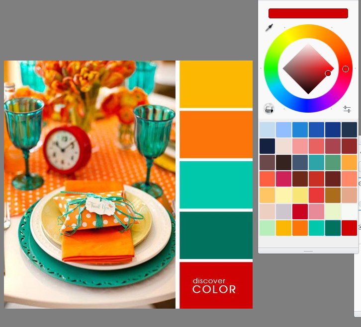
Choose a nice color palette which I want to use in my artwork
Yes, I decided to draw it in **Sketchbook Pro** again
The color palette in it is typed in this editor
I liked this color combination
I select a basic colors for the character and the foreground from a mixture of selected colors
Yes, I decided to change the turn of the cat's head, according to the story
Then I draw gradient background
I want the character to stand out from the background, but at the same time blend in with it.
At this step I sketch a silhouettes of clouds the space below
Detalization of the character and his creations
Work with background - add some color shades in a sky & details on ground
And this is how he creates clouds!
Painting rock's scratch
Adding the wings shadow & objects under clouds cover
The last detail is a magic amulet around the cat's neck to make it look like a real wizard
And a little romantic mood surrounded by the way I love
And finally color correction
Yes, I liked how it turned out!
And, most importantly, my cat is now captured in the picture, he-he!)))
I hope you'll like this story)
With Love...
Digital Art_2019. Circus Lion
Hi my friends!
My lovest sponsor @Ellen-he returned, I'm so happy!))) And I've new sponsor - @francis105d1 Thanks a lot for your great support my friends!
So... what i'm going to say today...
Do you know how I learn a new graphics program?
Very simple!
I open it and start painting in it!
Let's say a whole month! This time is usually enough to make friends with new software.
This is how two years ago I decided to learn the program **Sketchbook Pro**. This is a paid software, but I installed a trial version and drew in it for a whole month.
I liked the fact that it is easy for a computer to work with, it has a simple and intuitive interface, and the fact that you can create and customize any brushes in it
It was my first drawing in this program
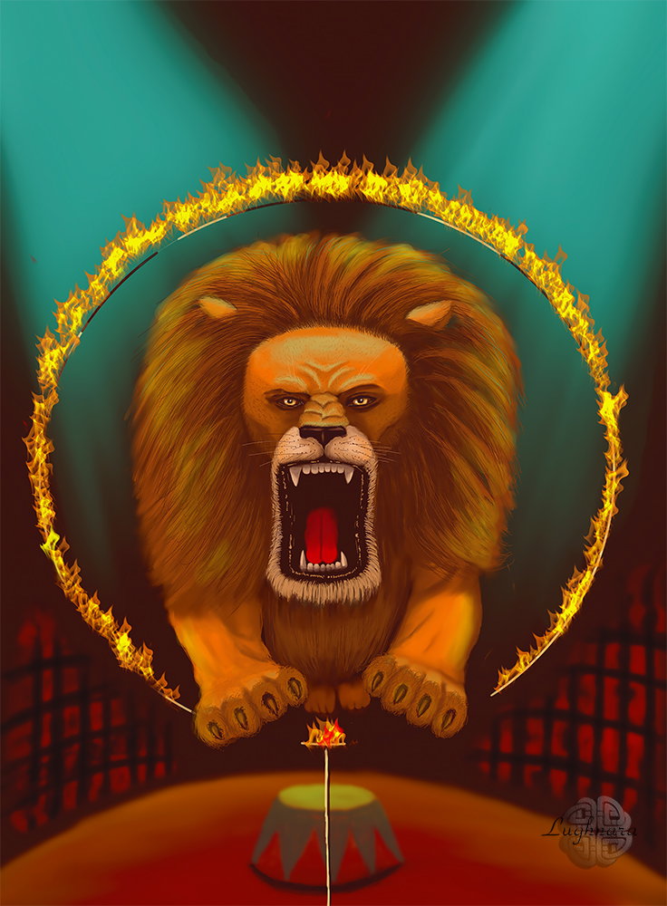
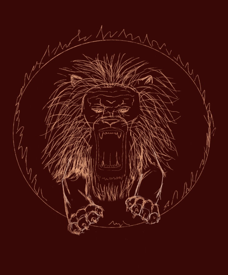
The topic of the assignment was "Circus", and I wanted to draw a lion doing a trick
Sketch
Yes, I immediately decided to set the background color - in the circus it is usually dark in the hall, only the arena with the artists is lit
Color palette (I took ready set)
Base color of main character. I can't to say now with which brushes I drew, because the programm was en unknown for my. I did an experiment
Yes, my lion roars and jumps through the fire hoop
Then I found great blender set to shade strokes
Here I have detailed the face of the lion and made the lighting from the overhead lamps. Added a few strokes of green reflexes to the animal
Yes, I worked especially carefully on the face of the lion. Of course, the lion turned out not to be realistic, but rather illustrative, but this is my style.
Well, the arena and the background remained - the cage behind which the auditorium is located. I did not draw this area, because it is not the main object
Yes, I was able to load brushes from Photoshop into the program in the form of flames. Therefore, the hoop burns like a real one!
And finally color correction for web publishing in Photoshop
This was my first close acquaintance with **Sketchbook Pro.**
If you are interested, I'll tell you what happened next when I show other drawings made in this program.
Thanks a lot for your attention to my drawing tutorials and your sponsorship!
With Love...
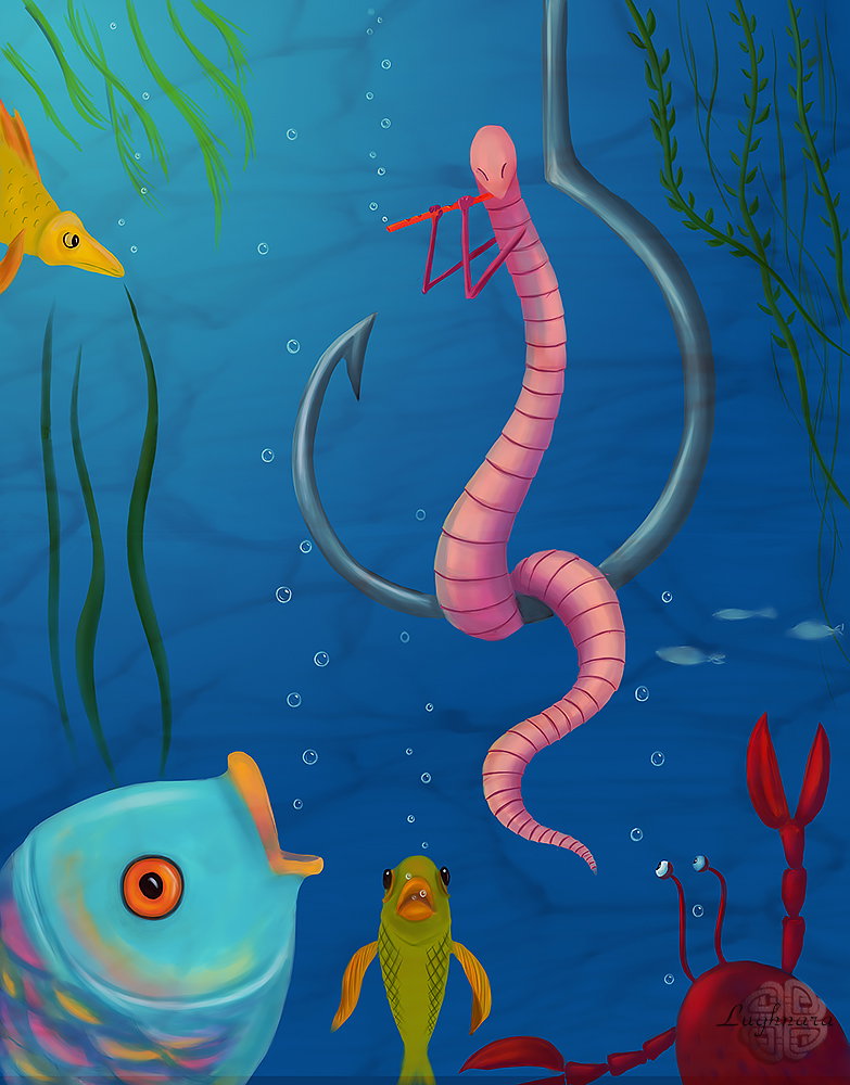
Digital art_2019. Fish-charmer
Hi friends!
I sometimes like to draw humorous scenes.
Sometimes a plot comes to my mind when I think about a new topic for a drawing.
So funny scene I imagined for one Steemit art contest, where a one bold worm sitting on the fishhook under water, but doesn't lose his presence of mind... https://steemit.com/contest/@deemarshall/artstorm-contest-94-day-7-creepy-crawly-week-theme-today-worms
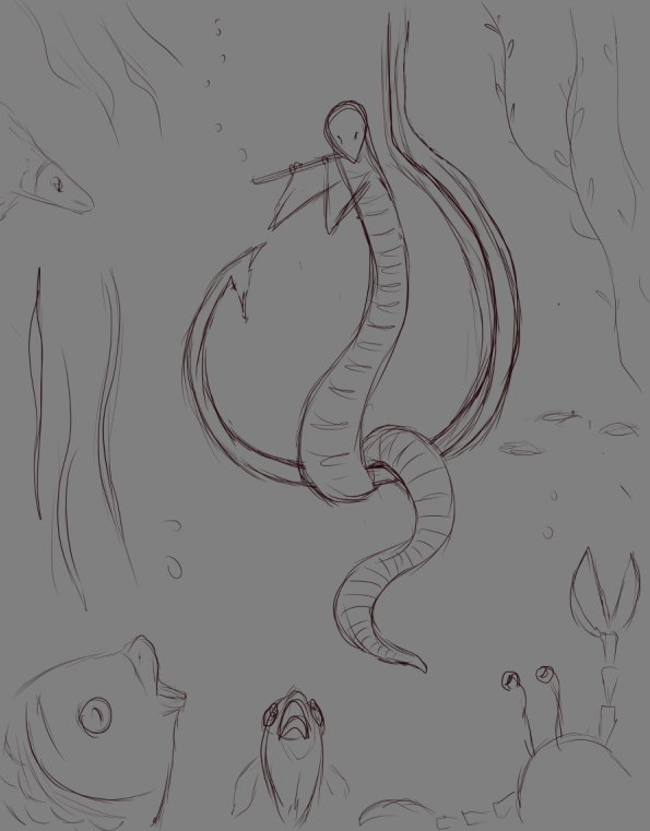
Sketch
Steps (*drawing in Paint Toil SAI*)
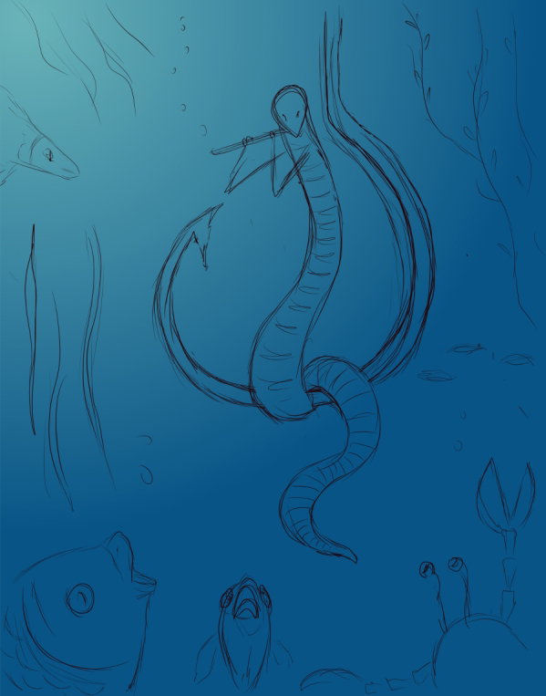
Base colors of background
Choosing colors for characters
I turn off the visibility of the sketch layer and start detailing the characters
Fishes
Сrab
Worm
Details of background - the seaweed and a school of small fish
Bubbles
I revitalize the aquatic environment
Then I added a water texture for realistic view
And color correction
It's ready!
I hope this picture will make you smile too. But in fact, the idea of my work is that in any most difficult situation, you can find a way out if you make a non-standard decision.
With Love...
Digital art_2020. Wyoming
Hi friends!
As I said, if I see friends a beautiful photo of those places where they live, I will definitely draw it)))
Today I show you how I drew one more landscape
I inspired of excellent shots maked my friendin from Whaleshares @viking-ventures when she travelled in Wyoming https://steempeak.com/photography/@viking-ventures/first-glimpse-of-the-tetons-wondrous-wyoming https://whaleshares.io/@viking-ventures
Sketch in **Paint Tool SAI 2**
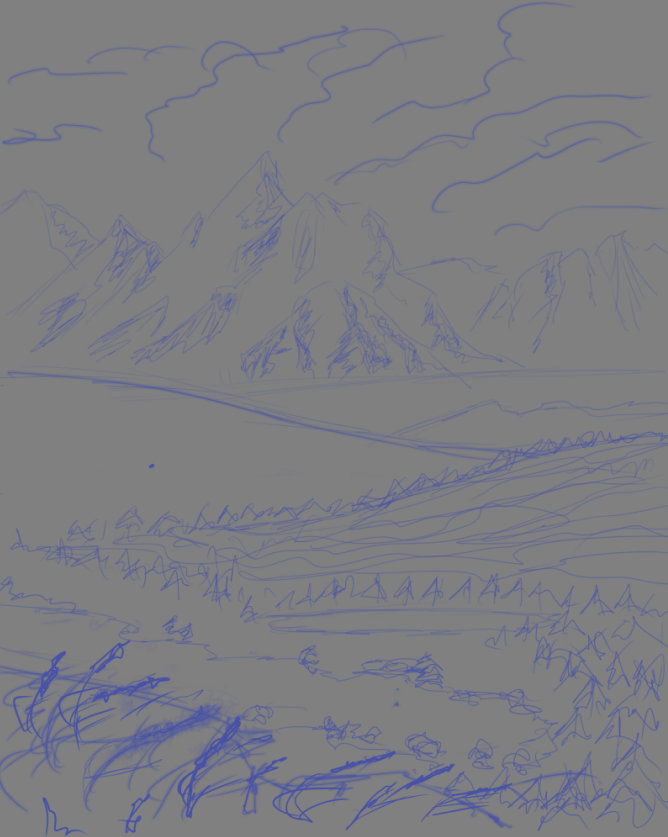
I sketched on the base layer something like this - with mountains in the background, with a forest in the middle.
And on the front, for greater expressiveness, I decided to add a willow-herb flowers
Create a new layer and paint the sky and clouds.
Yes, at this stage, it is advisable to immediately determine the source of light, so that later you do not get confused in the shadows and do not create a phantasmagoria from a nightmare instead of a realistic landscape)))). I decided that the sun will be on the left, which means that the light will "fall" on the earth from the upper left corner.
For the clouds, I specially created two brushes: one for the base shape of the cumulus clouds,
and the other for detailing and for thin feathery "lines"
Also on a new layer I sketch out the colors of the ridge in the background.
According to the law of tonal perspective, the further from us the object, the less saturated and visually colder its color will be.
I create a few more layers and on each of them draw a medium plan with forests and wastelands. The closer to the foreground, the "warmer" and more saturated the green color becomes.
To paint the sky and selected surfaces of the earth, I use a simple, hard **Oil Rough** brush, allowing strokes to overlap large areas.
Here and there I smooth out the transitions with the main working **Oil Brist 2**
At this stage, I am finally determined with the main light and shade, so turn off the layer with the sketch.
I add a lake to the center of the picture.
Next, I draw the shadows on the mountains deeper, more clearly - the edges of the clouds and determine how much area I will occupy the foreground.
It's so sorry to haven't a brushes with different form in **SAI** (only round brushes).
So I created a triangle brush in **Photoshop** and drew with it far forest in middle right hill.
I open **Photoshop**, create a new file there, approximately **300** pixels by **300** pixels in size. To create a new brush - just right!
Then select on the toolbar **"Polygon" (Poligonal Tool)**
Set this options
and draw a shape as fir-tree
Then I create new brush with **Edit - Define Brush**
Our new brush icon at the very end of the brush set
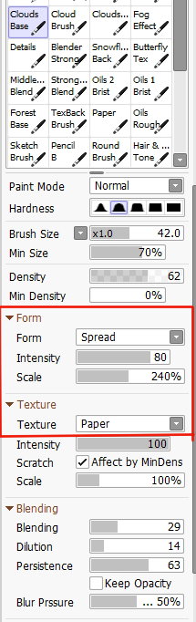
I set these options I need for my work
**Spacing**
**Shape Dynamics**
**Color Dynamics**
I choose the foreground and background colors from two shades of green.
I create two brushes to drawing a forest.
Second shape is that
Testing brushes
Well done!
I paint a distant forest with these new brushes
At this stage, I also finally detail the background and make the surface of the lake more realistic (glare from the sun and shadows from nearby trees in the water)
Next, I add falling shadows to the alone standing trees and start sketching (on a new layer) the foreground - the general array of grass and individual stems (with **Ink Pen**).
I also use a shadow to separate the two distant hills from the forest in the middle of the picture, to even more clearly distinguish the plans and show the uneven lighting from a large array of clouds in the sky.
Time for a willow-herb flowers in the foreground.
I choose the same hard **Ink Pen** and draw flowers, focusing on the light source in the picture: on the left there are lighter, lilac shades, on the right - darker and colder.
There are very small touches left, like patches of snow on the tops of the mountains and shadows in the front grass.
Using color correction in **Photoshop**, I even out the color palette and brighten the whole picture a little.
And now, the final of the work!
I hope my friends that you also like to look at beautiful natural landscapes, and it raises you mood
Thanks for your attention to my artworks!
With Love...
Digital art_2020. Toscana's oranges
Hi friends!
It was be another one my old sketch.
One time I wanted to draw a basket and scattered oranges...
On this my fantasy then ended and I left the drawing until better times.
This time has come now!
It was an old sketch's view
Start of drawing (in **Paint Tool SAI 2** of course)
Color palette is that
In first step I select a gradient to background.
It should be bluish green.
Choosing a base colors.
Fruit should, in my design, stand out from the background
Back landscape.
I wanted to draw ordinary view of Toscana (I saw it on some photos) - colorful hills and very many green.
In this time I choose a colors to flowering branch. Yes, and choose a direct of light, I immediately mark it on the fruit and the basket
I didn't like the usual color of the sky, changed it to a warmer one.
I also selected the texture of the foreground grass.
And I begin to detail the fruits that are closest to the viewer.
Some distant objects in the background are a farm, trees and roads.
I continue to work on a basket of fruits and flowers
Juicy fruits close-up
Also, a few final touches - flying flower petals, blades of grass, shadows under objects, color correction in Photoshop.
And so what happened!
Many thanks for your attention to my drawing tutorials!
I'll be very happy if you find something useful for your creativity in them!
With Love...
Digital art_2020. Tropical bird
Hi friends!
It was be my old sketch too.
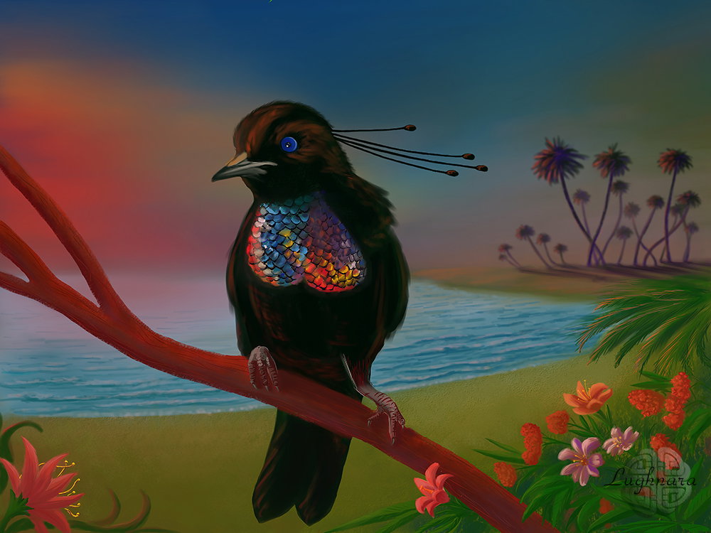
One time I looked in Internet this photo of bird called "Paradise Bird".
It inspired me to create this picture with tropical landscape, a palms and amazing flowers. https://avatars.mds.yandex.net/get-pdb/245485/4bf3756b-38f8-46d4-9826-877779144d30/s1200
Starting sketch (with **Paint Tool SAI 2** too)
I made it, but forgot about it, being distracted by new, more urgent projects
After a while, I still decided to return to the sketch and finish drawing it.
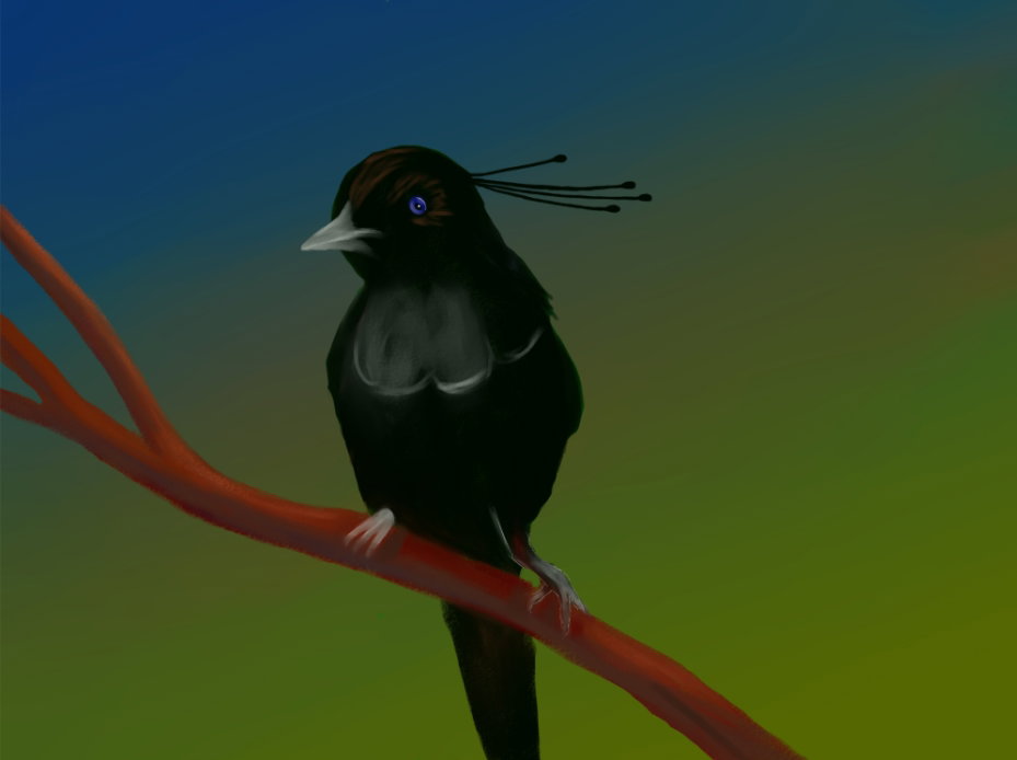
In first step I made a correction of bird's base form with my favorite brushes **Oil Brist 2**
Then I drew a plan with Pencil where will be a back landscape and foreground (on new layer).
At the same time, I created the base for the beautiful shiny feathers on the bird's chest.
Drawing colorful evening sky and a palms on a background.
As well as the reflection of feathers on a chest of the bird.
I paint the texture of the legs with **Ink Pen**
Now I decorate the foreground with a variety of tropical flowers.
I don't know what flowers grow in the tropics, I just fantasize, inventing fantastic shapes - after all, this is an unreal landscape!
At the same step, I add waves near the coast, drop shadows from palm trees and reflections of the sunset in their crowns.
And finally color correction for colorful view of warm tropical evening.
Than not a heavenly place?
Have a nice and creative day my friends!
With Love...
Digital art_2019. Flaming Evening
Hi friends!
You probably already noticed that most of all I love to draw beautiful landscapes (as well as fantastic creatures, yes)
Today I want to show how I drew one beautiful landscape.
I wanted to draw something with water, because an image of this element usually making a problem for me.
For reference I choose this photo
I liked color of clouds and their reflection in a pool. https://sun9-8.userapi.com/c855216/v855216380/ffcf8/RABFmkEdA9g.jpg
Sketch
Drawing in **Paint Tool SAI 2** as always.
Steps
I started my work with choosing a colors for sky.
Reflection
It should be darker than the sky because the color of the water is add in.
Details for a sky with **Oil Brist 2** and a water with **Pencil**
Drawing details an ice near far coast. I used hard brush **Ink Pen**
I never draw with photo one to one, so I added a foreground
with some wild flowers.
Do you saw a flowers in winter anywhere?
Why no, if it's unreal magic story...))
Finally color correction & some sharpen.
There is an opinion that the contemplation of beautiful views of nature has a beneficial effect on a person.
I hope that this also applies to painted landscapes.
Have a nice and creative day!
With Love...
Digital art_2020. Singing Forest
Hi friends!
First picture I wanted to draw was a continuation of my drawing series about **Singing Forest** and their magic animals.
Last time I met you with **Blue Owls**, do you remember?
Now I decided to draw a **Singing Forest** itself.
What do you think it might look like?
Something like this... https://read.cash/@daring-celt/digital-art-2020-blue-owls-in-the-singing-forest-200296d0
I saw a story of that drawing in the sky. One day I looked out the window and saw how a clouds had formed strangely.
I immediately made a sketch of this kind, so as not to forget.
I started my drawing in **Paint Tool SAI 2**, but sometime I used **Photoshop** when I needed a unusual form of brushes...
Made a strokes of base colors
Above there will be flashes like the northern lights.
I thought it would look magical
In first step I used my main working brush **Oil Brist 2**
Chose a dark color gradient for background as deep space with this options
Aurora Borealis is shining!
One of my lover Photoshop brushes I created myself.
I set this options for it
I created two layers, lower of them was bluring to make a soft glow
This is magic reflection from trees
A сolorful trees of **Singing Forest**.
I drew their leaves in an unusual spiral shape, with intertwined branches.
In this step I drew a cloudy environment around of trees.
These are also various bizarre forms. I used two kind of my brushes - some like a cloud with soft wet edges
and a basic round with scattering options.
Details.
Spiral tops of trees (with **Ink Pen**)
The I decided to resize my picture to make the composition more expressive.
and made a glow for trees (blurred copy of layer and set blending mode to **Screen**)
The I wanted a forest has more saturation color and replace a copy blurred layer above the original.
And change blend mode to **Linear Dodge (Add)**
I don't know what a star buildings they are - may be a Chrystal Castles from a space ice growing on the asteroids.
But it must be beautiful too!
And final element - a music from Universal falling to leaves of forest.
How can draw a music?
I think, as a delicate chains of stars...
And the space of the universe with stars and planets in the background (on new separate layer)
Reduce to value of opacity to **40%** for universal's layer
Duplicate layer of star buildings and music chains, blurred them and change blending more to **Lighten** for creation magic glow
This is how it is, **the Singing Forest**, growing somewhere in unknown outer space, able to hear and reproduce the music of the stellar spheres...
I hope you'll like a story of creation this picture.
Have a nice and creative day!
With Love...
Digital art_2020. Blue Owls in the Singing Forest
Hi friends!
Sometime very stranger images born into my head.
From them, then new drawings are obtained ... and even a series of drawings, if the idea captures me for a long time.
Once I came up with the Singing Forest, and I wanted to see what animals live there.
Probably they all love music?
Sketch in **Paint Tool SAI 2**
To create the characters, I looked at photographs of different breeds of owls and chose these birds.
For sketching, I usually use an **Ink Pen** with the appropriate settings.
Create a new layer, choose a regular brush with the following settings
The **"Blending"** parameter in this case is very important to make a soft gradient transition from color to color, even if they are contrasting, as in this case.
Also, the selected texture allows you to create a beautiful textured background.
Create three new layers, choose this brush for the tree
I paint it on one layer, and each of the owls is also on separate layers, but for them I use a brush called **Oil Brist 2**
At this stage of work, we get this picture.
At this stage, the sketch layer is no longer needed, so I turn off its visibility.
I continue to work on the silhouettes of owls using **Oil Brist 2,**
and at the same time I am looking for a color solution for the background that would suit me using the menu **Filter - Color Adjustment - Hue / Saturation**
I decided that the background was too saturated - it interferes with the perception of the main characters, while I returned everything back.
I draw the owls and add colored reflexes to their plumage.
For now, just general strokes to see how it will look.
Add some magic - on a new layer below the tree layer with **Oil Brist 2** brush I paint a golden highlight.
To make the glow soft, I blur it with the **Watercolor** brush.
I detail the birds - I draw eyes, feathers, beaks, legs
I paint feathers and reflexes with **Oil Brist 2** brush, and for the eyes, beak, paws - what requires a clear drawing - I take the same **Ink Pen**
So, the general view is almost ready.
On this step I opened a drawing in **Photoshop,** made a copy of color background layer and set a blend mood **"Overlay"** for copy.
The picture became rich color and took on a dramatic aspect.
Then, to draw the music of the Singing Forest, I drew chains of brushes in the form of stars on a new layer (*you can use ready-made chains, or you can adjust single stars*).
And the notes themselves were created using **Custom Shapes** tool
from the default set called **"Music"**
And I hang garlands on the branches
And a couple of finishing touches!
When all the notes are "hung" in their places, I combine them all into one layer, duplicate it and apply **Filter - Blur - Gaussian Blur** command to the lower take. I choose the blur parameters to my taste.
Change the blending mode to **Linear Dodge (Add),** then make a duplicate of the blurred layer and set the blending mode for it to **Linear light**
It turns out a very beautiful bright magical glow!
Some color correction and... here are the owls charmed by the singing trees!
I hope you'll like my another magic drawing story!
With Love...
Digital art_2020. A Keeper of the World
Hi friends!
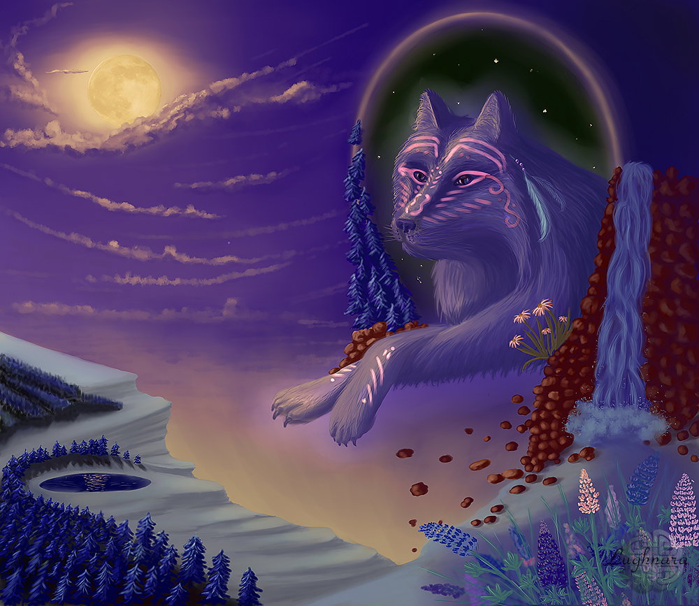
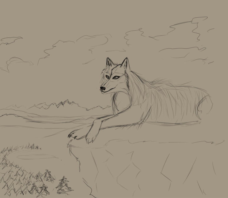
Once I caught the eye of another my old sketch. I drew a wolf.
I thought that he was worthy of creating a full-fledged art from it.
And so this story was invented - a magical animal looks at the world from a window of parallel space.
And nobody knows if it really exists or is it just an illusion ...
Old sketch
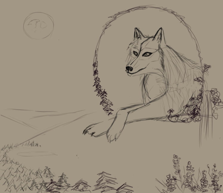
I decided to change the landscape a little, made it a little more non-standard and more mysterious
Initially, the sketch was made in **Photoshop**, I decided to continue working in a more convenient program for me - **Paint Tool SAI 2**
Color for sky and choosing a direct of light (from the Moon)
Base color for the ground
I want to create a picture in my favorite mystical cold colors, with separate contrasting shades
I add details of the environment around the wolf, as well as areas of the forest on the left.
Use my usual working brush **Oil Brist 2** and **Clouds**
I begin to work out the details - I draw an animal, I put light and shadow on trees and stones
At this stage, I didn't like the background of the landscape, and I came up with an option in which the Wolf seemed to float in the air, looking at the world from a dark portal
I smooth out the sky in the background, add highlights from the moonlight to the lake, and make the mystical patterns on the Wolf's face more realistic (by changing the layer blend mode)
Now you can work more on the appearance of the character. I paint wool with a hard brush **Ink Pen**
On a foreground I decided to draw a lupins.
According to the legends of the ancient Celts, these are flowers which are protected by the wolf.
This is what ready art looks like
Finally color correction & sharping in **Photoshop**
I hope you'll like another one my tutorial and the character
Have a nice and creative day!
With Love...
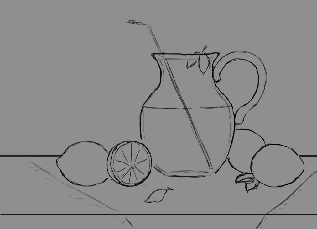
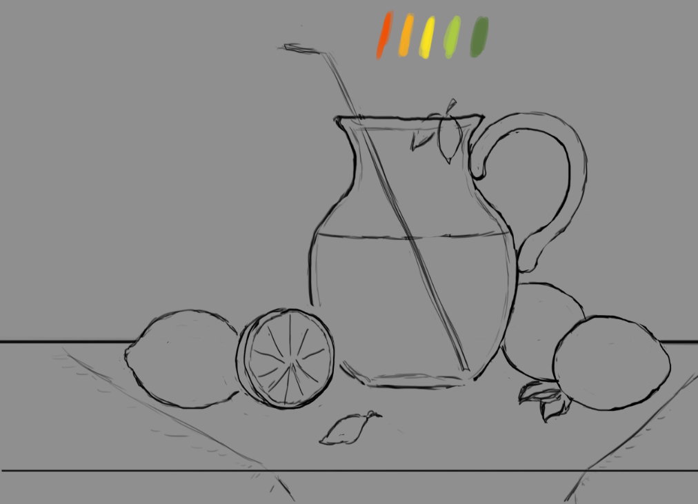
Digital art_2019. Lemonade
Hi friends!
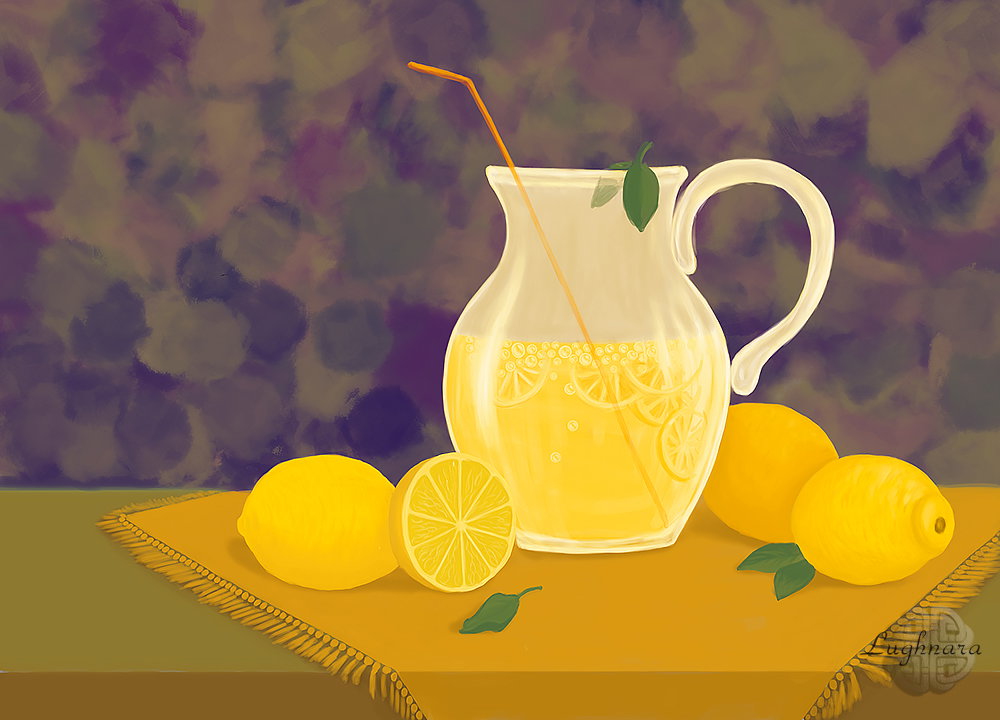
This is another one of my still life attempts.
The topic of the challenge was to draw something yellow.
And I came up with a picture of lemonade
Sketch in Photoshop
Color Palette
For the background, I chose a texture brush with jagged edges and **Color Dynamics** setting.
When the base colors were applied, I proceeded to the detailed rendering (another objects drawing on new layer)
I didn't like a background color & I chose other more contrast (with change duplicate layer blend mode to **Exclusion**)
At this step I added a few main details - the texture of the skin of the lemons and the highlights on the glass
Bubbles of lemonade
I decided to add a few slices of lemons to the lemonade for a realistic look.
And also decorated the napkin with a fringe
And drop shadows under objects, of cause!
Blured a background & shadows under objects.
And some finally color correction
Here is a very simple still life I got.
With pieces of summer heat in a jug!))
Thanks for your attention to ma pictures my friends! I hope that my drawings will help you create a good mood ;)
With Love...
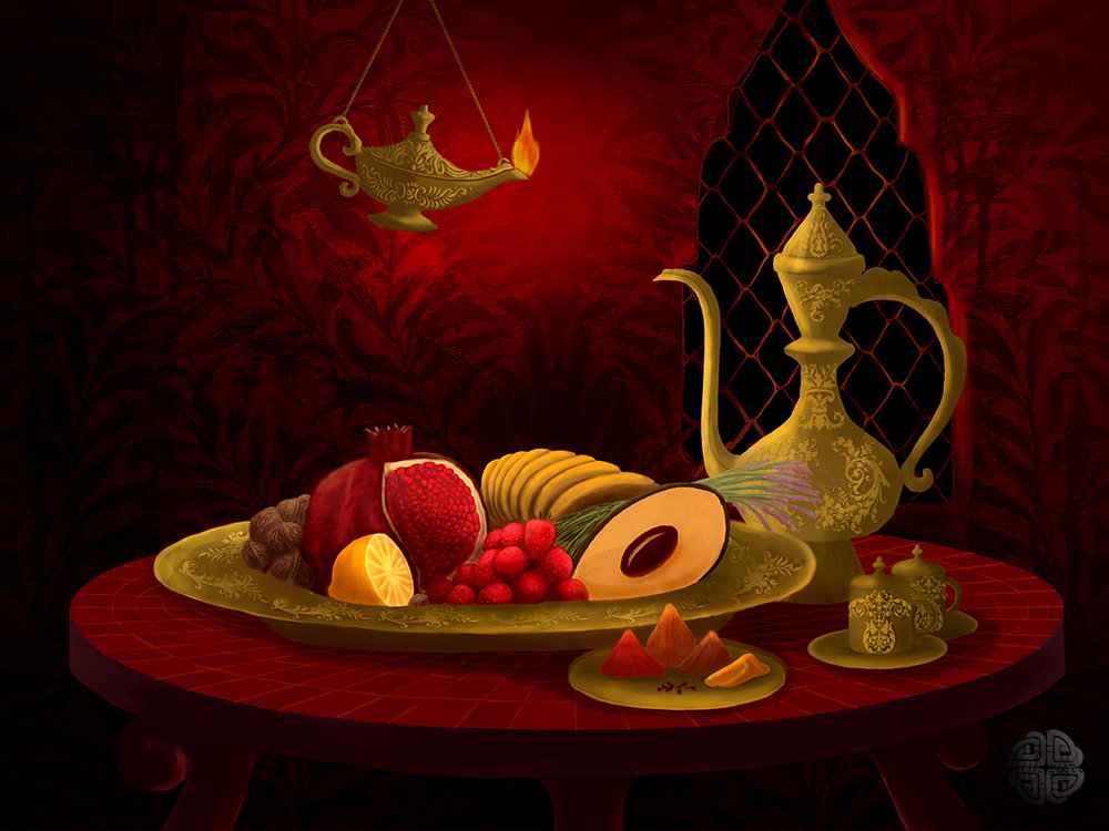
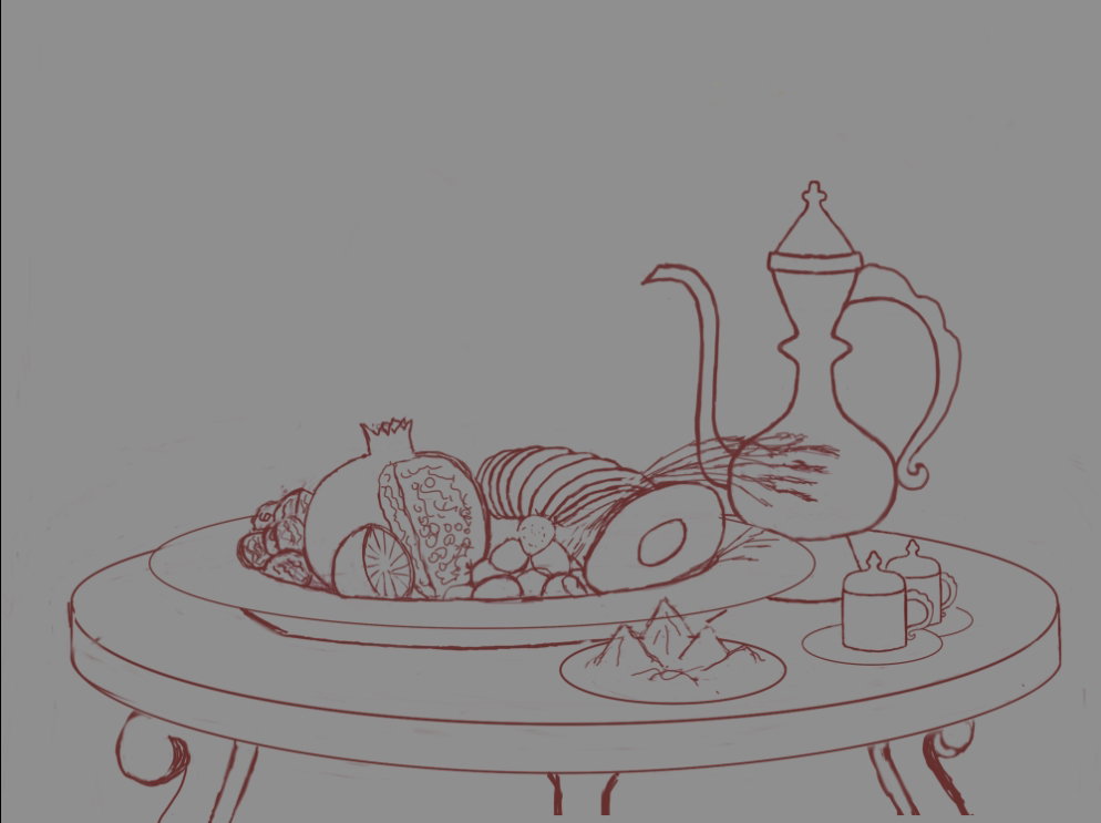
Digital art_2019. Orient Passion
Hi friends!
Still lifes are the most difficult genre of painting for me! But nevertheless, I undertook to draw them several times. Moreover, without references, based on my own imagination ...
It was one art contest too... The word "aphrodisiacs" created in my imagination the eastern interior, with coffee, fruits and spices.
This picture I tried to embody in my drawing.
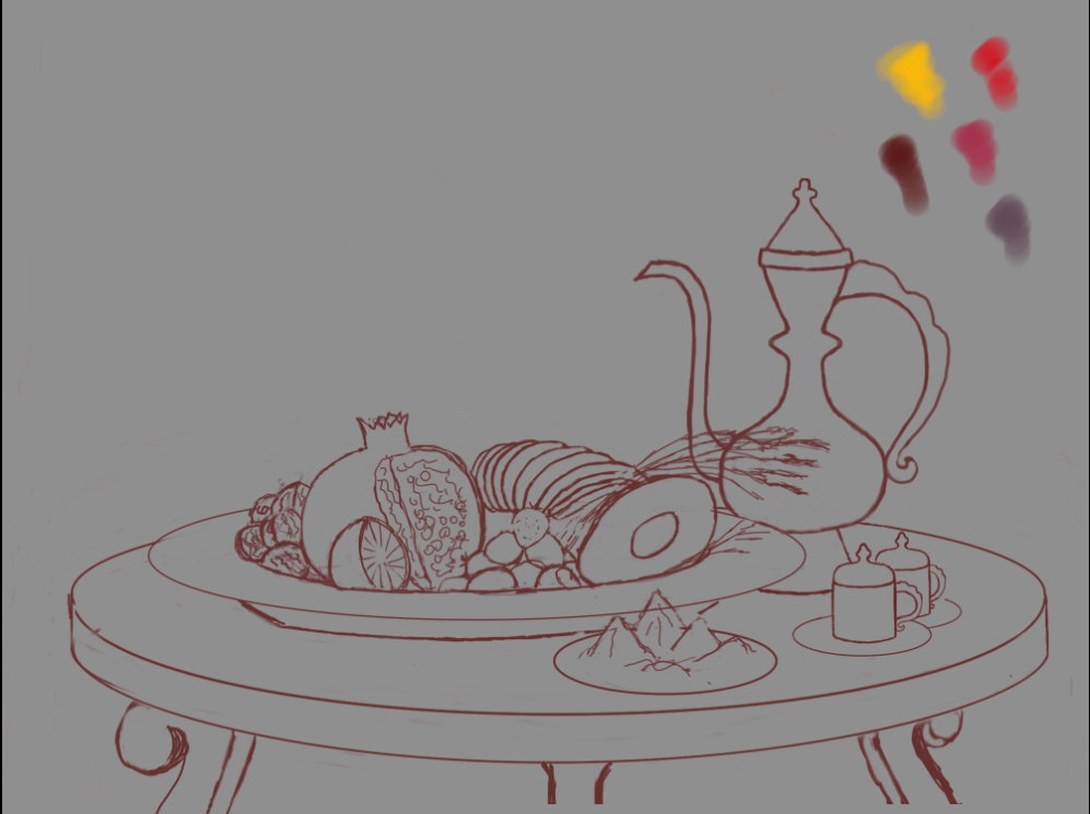
Sketch in Photoshop
For this idea, I also read everything that was on the Internet about aphrodisiacs, and tried to collect all these fruits and herbs into a single still life.
It turned out something in oriental style - with copper jugs and an oil lamp
Color palette
Base color sample
Yes, I decided that the interior would be in red colors, in the colors of passion.
On this step I decided to determine the direction of lighting - the light on objects will fall from an oil lamp hanging above the table
Yes, in progress the idea occurred to me to replace the modern coffee set with an oriental jug and copper mugs with lids
I also painted some fruit on the platter and some spices in the foreground.
And here is the source of light
Working with details
I wanted to make a beautiful chased pattern on metal objects
I used custom ornament brush and layer style option for it
And I drew some little elements by hand
There is a semi-erased texture on the table top, an imitation of mosaic tiles (I saw in the photo that tables were decorated like this in the east)
What will be the environment, then I had to think seriously.
The room should be dark, but at the same time I wanted to make it clear that this is a room, not a cave, ha-ha!
And then I decided to draw a window behind the jug to make it stand out from the background. And on the walls he applied a texture reminiscent of oriental silk, as if it were wallpaper
At the last stage, I slightly highlighted the metal bars of the lattice on the window, in some places I made the shadows darker
Well, the final color correction for the overall color balance
Almost an illustration to the fairy tale "Aladdin"!
Thanks for you visit and attention to my drawing!
With love...
Digital art_2021. The Portal
Hi friends!
I have the last lesson from a series of studying **Realistic Paint Studio.** One day I got an idea to try to combine it with other graphic programs - for example, **Paint Tool SAI**
In **Realistic Paint Studio** you can converting its file to .png.
This means you can work with it as a separate layer.
For the start, I will tell you how I organize my drawings inside the program.
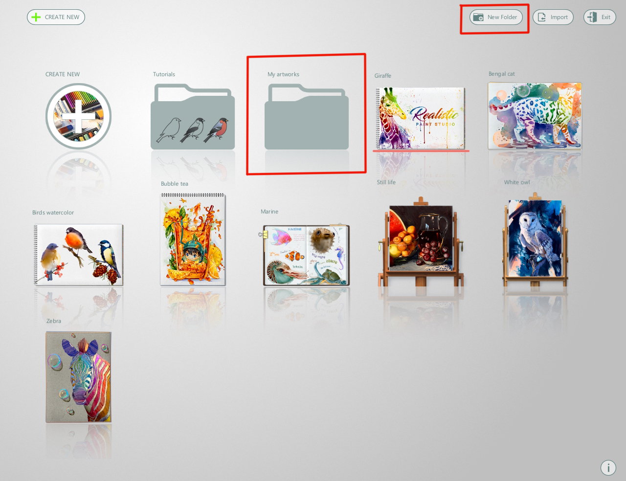
When I open the program, I see icons with base sample files and a folder with lessons. But over time, when there are a lot of drawings, can simply get confused in the icons.
To prevent this from happening, the program has the ability to create new folders for my own artwork.
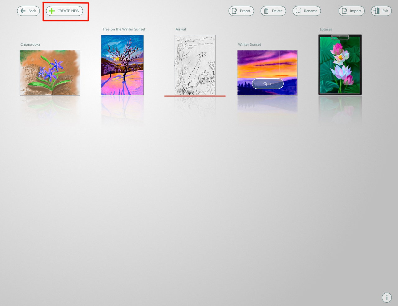
This is what's inside my works folder.
I create new file here (with red mark button)
Then I choose an art style - **"Drawing'**, because I want to draw with the same an exclusive tools as last tutorial https://read.cash/@daring-celt/digital-art-2021-chionodoxa-fa3031d2
As always I create a custom file
I also select a parameters as I need - in this case, I was guided by the reference
At the same step I give the file a name (below the window) https://i.pinimg.com/564x/b3/78/8f/b3788f478359b87467f8f4ef3c91b809.jpg
I select the box with the tools I need (using right-left arrows) - the exclusive tool box is last on the box's list.
For first sketch I choose a mechanical pencil
Make some strokes for a sample - yes, it does!
Sketch
Create a new layer, select **Fountain pen** (with a standard nib for writing) and stroke a pencil paths
Unnecessary strokes can be erased using an eraser from the standard sketch tool box
If a line that should be straight looks a jitter, can choose a special tool box (first icon marked with red).
Here you can select a ruler and work with it like a real tool
There are two blue round markers on the ruler.
Large center marker moves the tool across the canvas
And if I pull on the right small marker, to can expand the ruler vertically or diagonally, or as I want
And finally, all strokes are outlined.
So, I choose **Artistic brush** from exclusive tool box and drawing an areas between a stones
It turned out quite realistic, like traditional ink, right?
To create the wood texture, I use **Fountain pen** again.
Also, using **Fountain pen**, I add small details to the texture of the stones.
Now I want to tint a stones as if it were done with ink diluted by water
I create new layer below the ink outline layer.
Choose **Artistic brush** again. Interestingly, the first brush in a set of brushes applies a color tone...
and the third (right) brightens individual areas.
Then I choose suitable color and with the same brush and a little bit with **Fountain pen** I draw a tint of wooden fragments
In order to paint a grass and a moss on stones, I'll choose the following set of brushes named **Glass brush**
Select some shade of green, I draw it on new layer (above all layers)
Something like this is the picture.
Then I save a artwork as a .png
So, next step I open the saving file in **Paint Tool SAI**
Unfortunately, transparency in PNG is not supported when saving from **Realistic Paint Studio** ((
Use the **Magic Wand** and the **Eraser** I remove white area of a door.
Then I create new layer below layer with door and draw a space area
To make it feel like there is a really dark space behind the door, I add another layer below first layer and fill it with black.
Details
If you forgot, I paint in SAI with the same brushes - **Oil Brist 2**, **Watercolor**, **Ink Pen** and sometime as here, **Cloud brush**
Then I added a new layer and make a star texture with special brush
Not very realistic, but attractive view
In **SAI** I can create stars using vector layers and **Pen** and **Edit** tools
With **Select** and **Select Eraser** vector tools
And fill on new (raster) layer
I like it!
I create some star layers, resize with **Ctrl+T**
Then merge them in one layer (with red mark button)
Then I copy new layer and blur it with **Gaussian blur** to make a shine for stars
Finally color correction in **Photoshop**
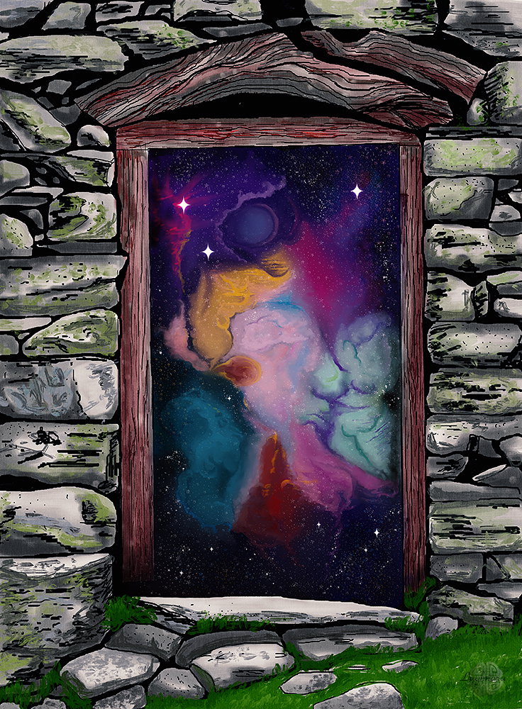
Artwork is ready!
Thanks a lot for your attention to my tutorials!
Have a nice and creative day!
With Love...
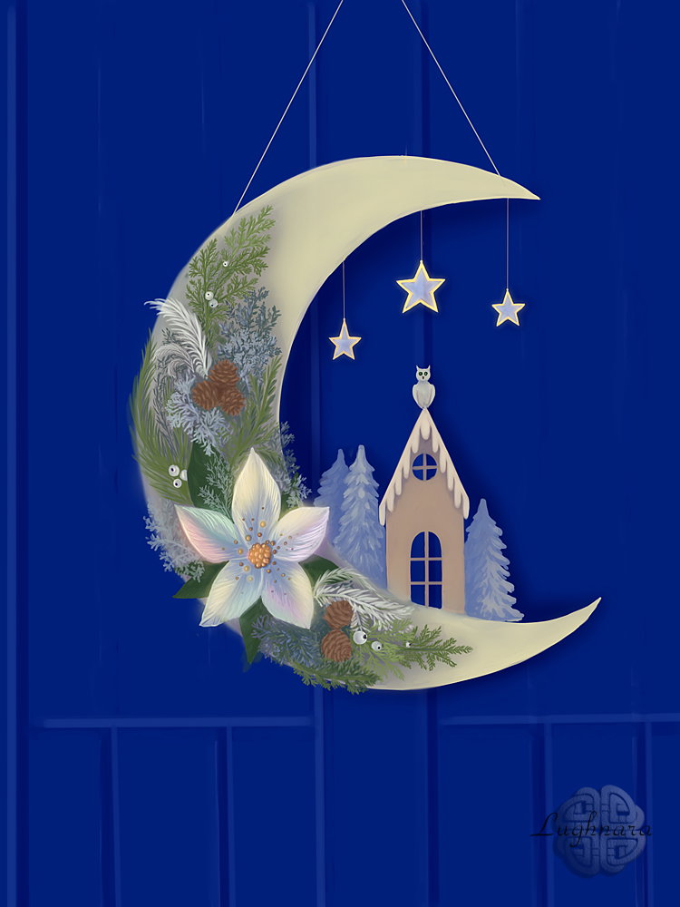
Digital art_2022. Half Moon Wreath
Hi friends!
I'm still inspired by Christmas themes - we still have a festive mood in the air and even Christmas trees are still standing in apartments. It was a task for an art contest - it was necessary to draw a **Winter Flower**.
And what flower is more wintery than poinsettia?
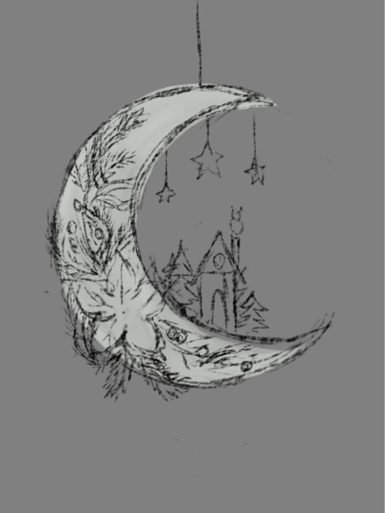
Sketch in **Paint Tool SAI 2**
I looked at many different types of Christmas wreaths and concluded that human imagination has no limits.
I chose from different photos a few elements that I liked.
For example, I liked the crescent-shaped wreath. As well as a house, Christmas trees, an owl and Christmas toys...
Something like this I will draw
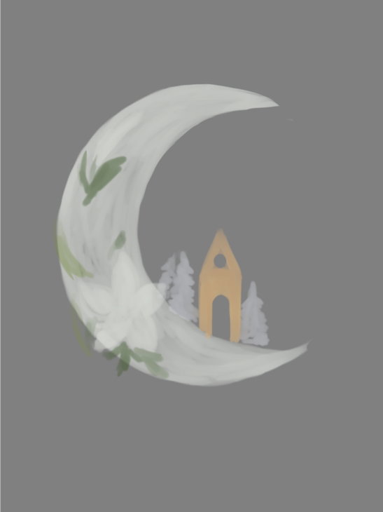
Choosing a base colors.
I decided that I won’t have saturated objects here, everything will be in pastel light colors and in many shades of white
Chose a tint color of half moon
I decided to draw a blue wood door as a background for the wreath
Decor of wreath - a house and a fir-trees
And now the hardest part - decorating the wreath.
Thuja branches and snowberry
My poinsettia will be light, but shimmer in different colors
I want to draw a purple shadows for green brunches (then I made it more transparent, on such an intense)
Adding another objects of decor: the owl in the roof and stars
Then I make a shining of stars (with blur of duplicate layer and change blend mode to **Dodge**) and drop shadow from wreath to the door (on new layer too with **Multiply** blend mode and 70% opacity)
It remains to make the poinsettia flower beautiful and recognizable
And hang a wreath on a ribbon
I also decided to increase the backlight of the flower to bring it to the fore.
I did it with some colorful brush strokes on new layer and set blend mode **Pin Light**
Yes, maybe someone with this decoration on the door celebrated Christmas
I hope you'll like my idea)
Thanks a lot for your attention to my drawing tutorials!
Have a nice and creative day to all!
With Love...
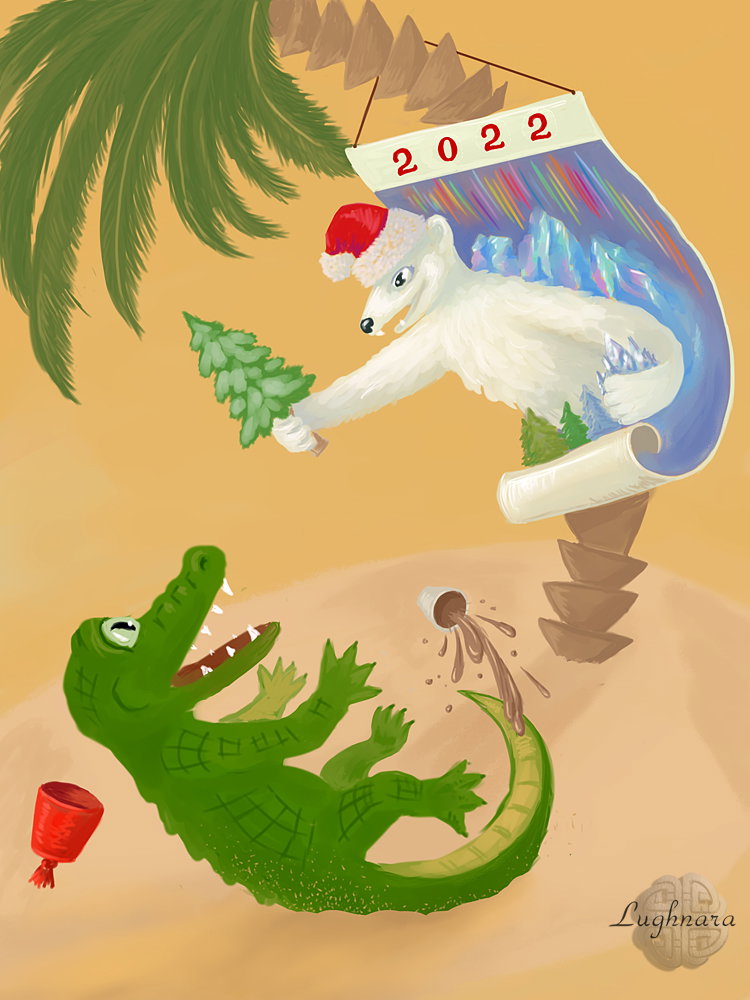
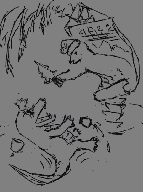
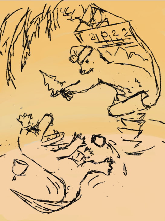
Digital art_2022. Oops!..
Hi friends!
I drew this funny picture for a contest in the Livejournal community. It was necessary to write a fairy tale or make a drawing according to given words. I got the words: calendar, crocodile, polar bear, sand, cocoa and palm tree.
From this set came such a funny story with a suddenly revived calendar!)))
Sketch in **Paint Tool SAI 2**
Сhose a color palette
I want the calendar bear to contrast in color with the crocodile's environment
I turn off the sketch layer and start drawing objects
Decided to change the position of the crocodile to make the composition more complete
Drawing a details
The Crocodile and a cocoa
The Polar bear from the calendar
Ready art
I hope you smile as you watch this funny scene.
Have a nice and positive winter day!
With Love...
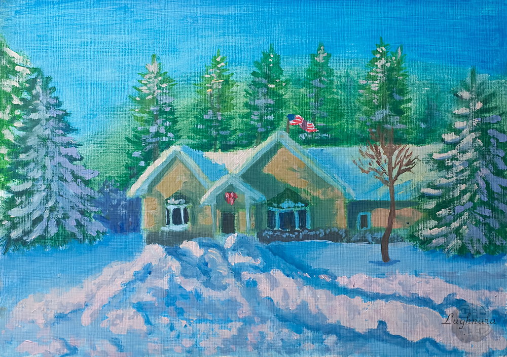
House in Wisconsin (oil painting)
Hi friends!
Today I decided to digress a little from the theme of magical flowers and return to the paintings of the present time.
And now winter is painting its fabulous landscapes on our streets.
Who are asking to pick up brushes)))
I've new sponsor - @ArteFM , it's very pleasant my drawing tutorial find their fans!
Even if a person doesn't draw himself, but simply appreciates art...
So...
This story was suggested to me by a photo of my Livejournal friendin living the USA. Snow-covered house surrounded by fir trees and pines... how to pass by and not draw? https://ic.pics.livejournal.com/marawarren/67905920/4599724/4599724_1000.jpg
It seemed to me that this is the most suitable reference - a minimum of colors and simple lighting.To begin with, I made an imprimatura.I have no canvas for oil painting, I paint on special paper for oil and acrylic.
These are my oil paints from Royal Talens and two synthetic brushes
For imprimatura, I took the colors ceruleum blue, ultramarine, grass green and titanium white
Making a sketch, placing a house on the sheet, front trees and large drifts of loose snow in the foreground
I start drawing from the background, from the fir-trees. I use a mix of herbal green and ceruleum blue on the lighted side, in the shade I add ultramarine and a little carmine.
For the house, I take the same mix for the shade, and for the illuminated areas I add yellow cadmium and more white
I paint the windows in the darkest color - a mix of ultramarine and burnt umber.
I decided to warm up the light that falls on the house.
To do this, I mixed cadmium yellow, ocher and scarlet red and strongly diluted all this with titanium white.
I painted snow on the roof with a mix of ceruleum blue and ultramarine (in the shade) and the same mix (cadmium yellow, scarlet red and whitewash) - on lighted areas.
I paint the bushes near the house with a mix of ultramarine pictures.
I also sketch out how the snowdrifts will lie.
And finally, snow.
I mix ceruleum blue, ultramarine, whitewash and carmine for a tree in the shade (and for distant trees that partially fall into the shade), somewhere I add more carmine, somewhere more ultramarine to show uneven lighting from behind the trees.
I paint all the illuminated snow with a mix of white, scarlet red and cadmium yellow. The shadows in a snowdrift are in some places it is a mix of ultramarine and ceruleum blue (the deepest shadows), and somewhere there is added cadmium and diluted with white.
Then the tree in the foreground - the shadow part is painted with burnt umber, and the illuminated part is a mixture of sienna and cadmium yellow.On the left, I shade a part of the forest behind the house with ultramarine and carmine, in order to more clearly highlight the illuminated side of the house.And the last bright accent of color is the Christmas wreath above the door.I paint the wreath itself with the same mix colors that I used to paint the windows, and the decor paint with scarlet red.And so that the wreath would not be lonely, I decided to add another colorful spot to the picture - an American flag on the roof.
Here is such a my winter house drawing!I hope you like it too, because I enjoyed painting!))
Have a nice and creative winter day!
With Love...
Digital art_2021. Crocus
Hi friends!
I decided that in the previous drawing lessons in **Realistic Paint Studio**, far from all of its impressive resources were revealed, so it is worth continuing to experiment with digging into the bowels of the program.
Today it will be an imitation of writing with oil paints using a palette knife.
In reality, such paintings look very picturesque, attract attention with their, at first glance, chaotic, "uncombed" strokes.
Well, a tryout of work with a reference and mixer palette ...
So, I open the program and go to the folder with my projects
There will be oil painting again today
Choosing a neutral canvas color
And size - by touching this button (*it simply rotates the selected canvas clockwise and displays the resulting parameters*)
Yes, let's get started
And first, let's add a reference layer to our work.
I found such a gorgeous crocus on **Pinterest** https://i.pinimg.com/564x/82/74/9d/82749d0f06f38acefa8afca58b27d2ae.jpg
In the layers palette, click on the gear icon
and from the drop-down list I select the line **"Add reference layer"**
When you load a photo into the program, a **Сaliper tool** immediately appears - a tool responsible for resizing the image
Since my canvas is large, and the photo from the Internet is small, I change a size so that it is convenient to work with it - I just pull the stylus on a corner markers.
And I click OK
This time, I decided to try, as in traditional painting, to do everything on one layer - both the imprimatura and the drawing of the main object.
Therefore, the sketch began to be done with a brush, the thinnest - **Fine Round Brush**
Like that.
Along the way, I tried different brushes, how they mix paint.
I settled on **Dirty Flat Brush** for the initial brush strokes on the canvas.
And in order to find the right shades (*unfortunately, the sample is not taken directly from the reference*), I temporarily switched from a set of paints to a palette, where you can do mixes (*button at the top left, above the palette*)
I apply chaotic strokes with a brush, according to the reference
And then I choose a palette knife **Palette knife 1026** from the toolbox, which creates a grunge texture - those very characteristic "uncombed" strokes.
Yes, it turns out very, very realistic!)))
In the same way, I move the reference to another corner (by calling the box with auxiliary tools and choosing a **Сaliper tool**)
and continue to work - first with a brush,
then with a palette knife
When the background is almost ready, I take another palette knife **Palette knife 1002**, creating long, even strokes
and apply some diagonal stripes for dynamics.
Using the same palette knife, I paint the crocus, choosing colors according to the reference.
Then with a textured **Dry Brush**
I even out a color transitions between the petals
And I'm finalizing with the same grunge palette knife **Palette knife 1026**
Here's my result!
And presentation, of cause!
Looks like a real painting, isn't it?
And another option, more magical - I very like digital effects (added in **Photoshop**)!
Thanks a lot if you visit and read my tutorial and you like my digital painting experiments!
Have a nice and creative day in these winter !
With Love
Chionodoxa, drawing tutorial in Realistic Paint Studio - https://read.cash/@daring-celt/digital-art-2021-chionodoxa-26412eaf
#art #digital #drawing #tutorial #readcash
 @daring-celt