Digital Art_2019. White Protea
Hi friends!
Yesterday I decided to draw the flower called protea (to one art contest).
Protea is a delightful flower, one of the symbols of South Africa, also called the African rose.
There are very many kinds of these flowers and they are many different colors.
I chose to image white protea.

To my great regret I live in the Northern hemisphere of Earth, therefore I can't to see this flower in live nature.
But it's great to that there is internet & Photograpies in Google.
So beautiful nature creature I choose for the reference.
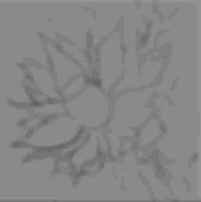
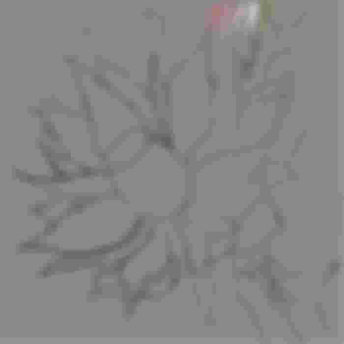
Sketch in Photoshop CC 2018

Color palette

I create several layers - for the background, for the flower itself and for additional details.
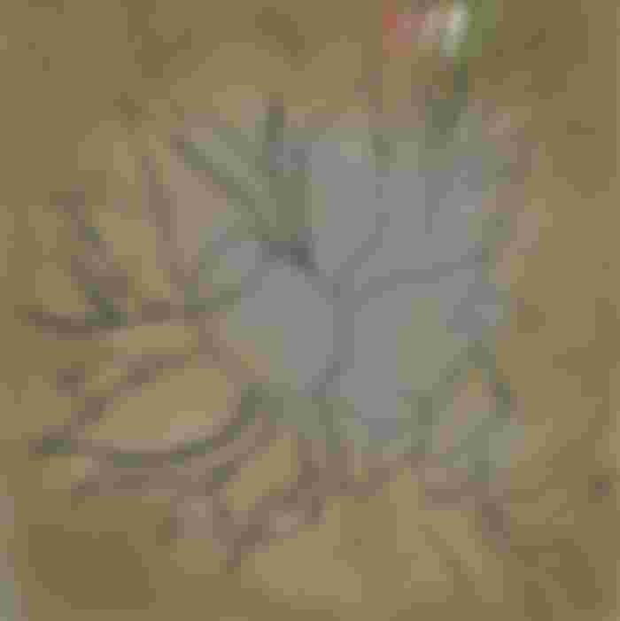
I choose a textured brush and paint over the background with a mixture of red and green colors.

Then, on a separate layer, I make an approximate spread in the colors of the protea petals.
Immediately I decide on the light source to give the flower volume (roughly on the top right).

I work mainly with two brushes - in the shape of a triangle (for final detail) and a regular hard one, in which, if you need to vary the opacity of a stroke, I turn on the Pressure for Opacity function.


When all the details of the picture are written, I turn off the layer with the sketch (I don't delete it yet, because I might still have to check it out) and continue working on the flower.
Periodically, I refine individual details with a triangular brush.
At this step, it seemed to me that the picture was too pale, and I made it more contrast and saturated with the help of an auxiliary adjustment layer Curves
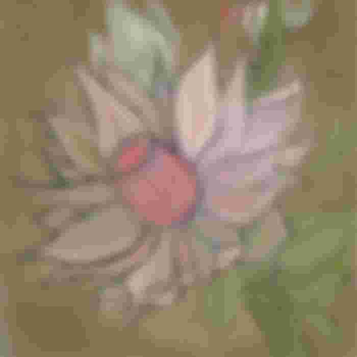
I continue to work on individual details - I make the bud in the background more blurred, as if it is out of focus, and on the contrary, I make the leaves clearer - I prescribe the fibers and refine the light and shade.
I detail the core, which consists of tightly collected fleecy petals, and along the way I apply a translucent texture to the petals with a brush for details in the form of separate longitudinal strokes.
I want to achieve the effect that the fragments of the protea petals that hit the light resemble rice paper.

Next, I pick shades of color from the original palette to paint the stamens.
Again on a separate layer.
I pick a color slightly darker than the tips of the stamens and, increasing the size of the main brush and lowering Flow value to 30%, on a separate layer, under the layer with the stamens, paint shadows.

Since the shadow layer is above the flower layer, I erase the part of the shadow that fell on the lower part of the core with an eraser.
Then I noticed that a base of the core slightly replaced in relation to the direction of the stem. I select part of the stem and correct the imprecision using Lasso Tool (Free selection), the function Free Transform and the built Liquify filter
Then I wanted to add more glow to the edges of the individual petals.
I do this by choosing the lightest color from the palette, on a separate layer with a brush for detailing.
Then I slightly blur this layer with a Gaussian Blur filter and change the layer's blending mode to Lighten Dodge (Add) with lowered opacity.
Finally, I made a duplicate of the background layer, changed the blending mode of the double to Multiply to make the white petals stand out more against the dark background.
I did the same with the shadow take under the stamens. I erased the excess with an eraser.

And the final color correction using a separate Color lookup adjustment layer (this function appeared in the CC 2014 version)
Preparing images for web publishing - merge all layers, reduce the size to 1000 pixels, sharpen with Smart Sharpen filter, insert my logo and save the image in .jpg format
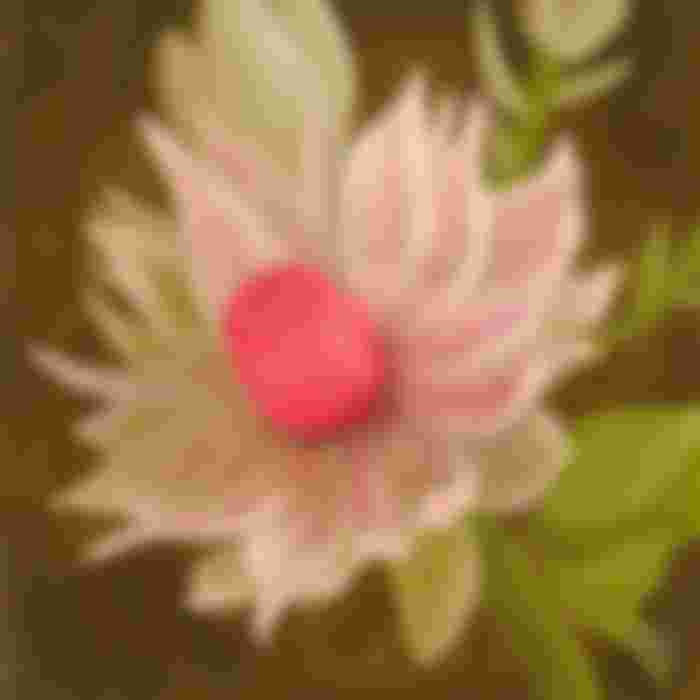
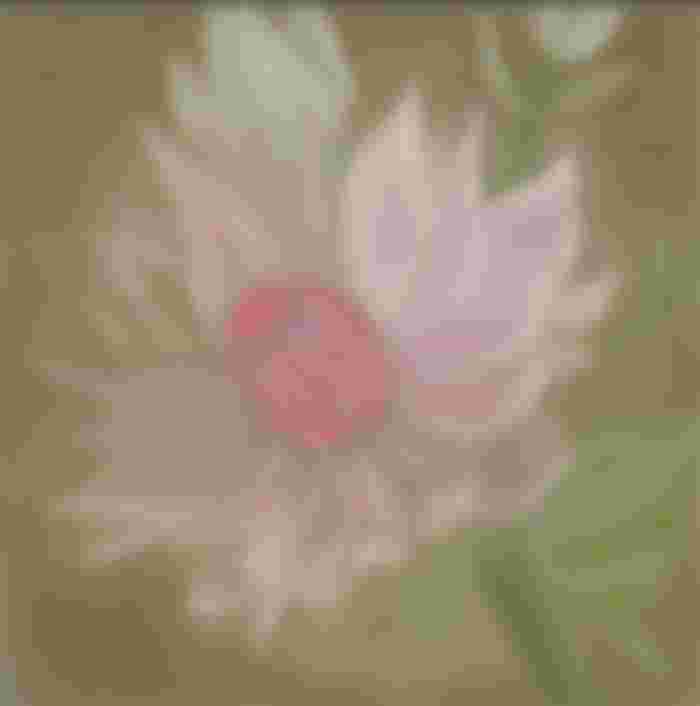
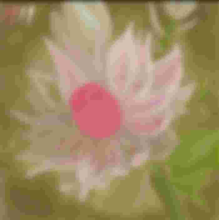
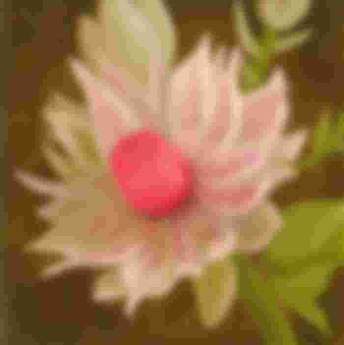
This is what the finished drawing looks like!

I hope you enjoyed my new lesson and had a wonderful and useful evening!
Many thanks for your attention!
Regards



I couldn't be more thrilled! What a beauty! I have never seen such an extraordinary beauty and did not even know that it is a sugarcane. Your lessons are priceless, you are a real talent👏