 @Mictorrani
edited
@Mictorrani
edited
Sepia, Grisaille & Verdaille: Monochrome Art... and how about Japan?
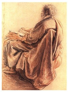
*What colour pigment was originally made from a substance secreted by cuttlefish? Now made synthetically, the colour is still called the same.* The answer is *sepia*. It is a secretion of the common cuttlefish, Sepia officinalis, a pigment containing melanin. (Melanin is the same pigment that colours human skin and hair.) A German painter and professor, Jacob Seydelmann (1750-1829), developed a method to get sepia more concentrated, which was essential for its use in art. Before that it was used mainly for writing. It is, however, a very sensitive pigment that will rapidly break down by exposure to light and oxygen. In a painting it will fade in just a few years. For the artist, an impression of sepia can be reached by mixing carbon black and red oxide, or (with a slightly different tone) by mixing ultramarine and raw umber with carbon black. With these pigments, the colour will last longer. In medicine, sepia is found mainly within homeopathy, where it is one of the polychrests. That is, substances with a very wide range of effects on the whole organism, one that can be used for many ailments. It is especially useful in the treatment of typically female problems related to the reproductive organs. But its use is not limited to that. Although known from Roman Antiquities, then used for writing, sepia did not have its great breakthrough in art until the Renaissance, and it is still used for the special atmosphere it conveys. Occasionally a photo or a film is artificially toned in sepia in order to create an impression of dreamlike timelessness. The image below shows a drawing in sepia by one of the greatest in European art history, Rembrandt van Rijn (1606-1669). The picture shows a man who is reading.
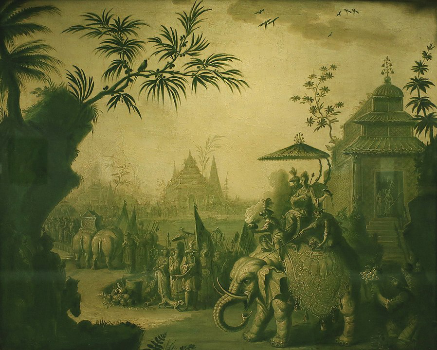
Grisaille, a word stemming from French “gris”, grey, became popular from the 14th century. Strictly a painting made “en grisaille”, is made only with different shades of grey, but more freely used, it came to include colours sepia and dark green. However, strictly, painting in shades of dark green is called “verdaille”. This is a painting made purely “en verdaille”: “A chinoiserie procession of figures riding on elephants with temples” by Jean-Baptiste Pillement (1728-1808).
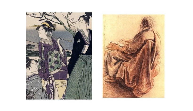
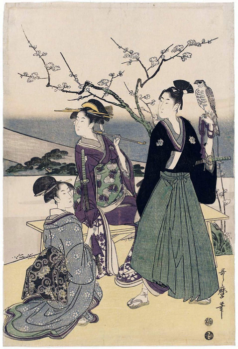
Monochrome art (monochrome means that it is made in different shades of only one colour) – or even art made in shades of only two or three colours - can be very expressive. We can see other examples in Japanese art. I have previously written about Aka-e (red pictures) in Aka-e – Japanese Colour Magic, and Aizuri-e (blue pictures) in Prussian Blue & Aizuri-e - Blue Pictures. But they had several special genres based on the limits in use of colour. Let's look at the Japanese art of woodblock prints in the style commonly called **ukiyo-e**. https://read.cash/@Mictorrani/aka-e-japanese-colour-magic-f89cf7e4 https://read.cash/@Mictorrani/prussian-blue-aizuri-e-blue-pictures-dc563ddd https://read.cash/@Mictorrani/emperor-shogun-the-edo-period-and-ukiyo-e-69239b66 The first Japanese woodcut prints were black and white. Colour, where it occurred, was added manually afterwards. In the beginning of the 17th century, one used mainly orange, and sometimes green or yellow. Those prints were called ***tan-e****.* In the 1720s, pink came into fashion, and the pinkish style that followed was called ***beni-e****.* Subsequently followed a style called ***urushi-e****;* a mixture of ink and animal glue resulted in a blank, lacquer-like surface. ***Benizuri-e****,* which peaked in the 1740s, were printed directly with colours, pink and green. Sometimes some other colour was added by hand. (Example here.) https://ukiyo-e-of-the-week.blogspot.com/search/label/Bijinga?updated-max=2016-09-10T10:00:00%2B01:00&max-results=20&start=20&by-date=false In the 1760s, at last, came the ***nishiki-e****,* the full colour print. The technique was developed by the great master **Haronubu**. He sometimes used a dozen woodblocks for a single print, one woodblock for each colour. https://read.cash/@Mictorrani/three-masters-of-bijinga-b707e205#harunobu ***Beni-girai-e*** literally translates to “picture hating red”. It was a style practised mainly in 1780s, where the artist avoids all use of red or reddish tones. It gives a very special colour effect. The style is often associated with Katsukawa Shunchō (active about 1783-1795). However, in my opinion Kubo Shunman (about 1757-1820) is a greater benigirai-e master. Yet, one of the very best benigirai-e was created by **Utamaro**. The image below shows his print *Three Lucky New Year Dreams: Fuji, Falcon, Eggplant* – from about 1800. https://read.cash/@Mictorrani/three-masters-of-bijinga-b707e205#utamaro
Tags: @whitecatascend @Theblackdoll @ThisisGrace21 Related articles: The Kreutzer Sonata: How Art Inspires to Art, which Inspires to Art... https://read.cash/@Mictorrani/the-kreutzer-sonata-how-art-inspires-to-art-which-inspires-to-art-3dced6f6 Pictures at an Exhibition https://read.cash/@Mictorrani/pictures-at-an-exhibition-48b5889b Aka-e – Japanese Colour Magic https://read.cash/@Mictorrani/aka-e-japanese-colour-magic-f89cf7e4 Prussian Blue & Aizuri-e - Blue Pictures https://read.cash/@Mictorrani/prussian-blue-aizuri-e-blue-pictures-dc563ddd Copyright © 2021 Meleonymica/Mictorrani. All Rights Reserved. (The images of this article are all in the Public Domain.) Here you can find my articles about History, and about Art, and here about Japanese art. https://read.cash/@Mictorrani/index-over-my-articles-at-read-cash-5f7c1e34#history https://read.cash/@Mictorrani/index-over-my-articles-at-read-cash-5f7c1e34#art https://read.cash/@Mictorrani/index-over-my-articles-at-read-cash-5f7c1e34#japanology Interested in history, legends and myths, join my community History, Myths, Legends & Mysteries (be45); or in Japanese art, join Japanese Art & Cultural History. https://read.cash/c/history-myths-legends-mysteries-be45 https://read.cash/c/japanese-art-cultural-history-7c1f You find all my writings on Read.Cash, sorted by topic, here. https://read.cash/@Mictorrani/index-over-my-articles-at-read-cash-5f7c1e34 *My 5 most recent articles:* *Pictures at an Exhibition* https://read.cash/@Mictorrani/pictures-at-an-exhibition-48b5889b *On the Genealogy of Script III - VIII* https://read.cash/@Mictorrani/on-the-genealogy-of-script-iii-viii-8372cf36 *On the Genealogy of Script I & II* https://read.cash/@Mictorrani/on-the-genealogy-of-script-i-ii-92b3e103 *Anagrams, Palindromes, Cryptarithms And Alphametics* https://read.cash/@Mictorrani/anagrams-palindromes-cryptarithms-and-alphametics-65dd6622 *Rhyme & Reason: Verse, Structure, & Memory* https://read.cash/@Mictorrani/rhyme-reason-verse-structure-memory-f6ba9e9c





7 comments
It's quite nice and I am curious if it's still exist now. I mean the melanin which is used on art works. I also know most arts and artist and it came from Japan as well. They're really into art making.
Melanin was in genuine sepia. Nowadays it is made synthetically. But synthetic sepia is used in art, especially in form of crayons.
Oh i see. When I will get a chance to buy art materials I should probably buy those types of crayons 😊
I love art, since I was a child I have admired the work of every artist, every detail, their thoughts when they work, behind an image there is a lot to admire.
Are you just a spectator, or do you create art yourself as well?
I can see sepia as vintage, usually if I search 'aesthetic design' this kind of color mostly is the result.
Yes, you are right, it can be seen as vintage. Especially when it is applied to photos.