My entry to Hive Infographic Contest
Hi Everyone,
I decided to enter into the great competition by the @coldbeetrootsoup guys to create a Hive infographic with a chance to win 1000 Hive! More details you can find here.
Well, with such a huge prize and being about Hive, I thought I should enter. I haven't really created any infographics before, but I figured, that it should be easy because I love Hive and can just write what I love about Hive and everybody else would love it too!
The main focus of my infographic I wanted to give the core messages that it is decentralized, it has a great community, many use cases and you have your own wallet and keys! This is possible because Hive is a social place where you can use and transact your crypto without huge gas fees and I was thinking how great this is and want to tell everyone about it!
Here are my steps toward creating my design which has taken approximately 2 days and many days to think about it.
First I read through the contest completely again to refresh myself as I last read it over 2 weeks ago or longer even. I also read important information about how to describe Hive and then decided what part of Hive I would like to do an infographic about. Two possibilities stuck out to me and that was the communities or ecosystem and I opted for the ecosystem in the end.
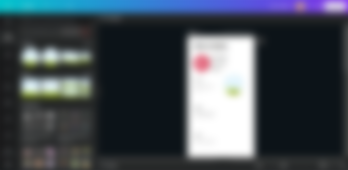
I then scoured the internet for some inspiration for some nice-looking infographics and have a check for what looked nice and what might be possible for me to create. I am using canva, so cannot create some of the nice effects that I would have liked to have done. This exercise did stretch me quite a bit though and I have learned some new things I didn't after researching things such as blending images and experimenting with shapes.
I added the Hive color palette that was given on the website and began to try and create something.. this was my first effort.
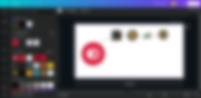
It was not as easy as I thought it might be. My first ideas were to create a horizontal design and I wanted to not fill it with too much information. My idea is to keep it quite high-level and grab people's attention, they don't want to read an essay.


I experimented with creating different shapes, backgrounds, and gradients.. I couldn't quite put it together.
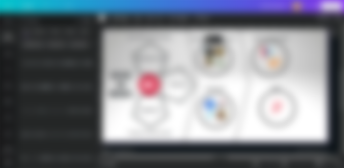
I started again but something just wasn't working for me here still.

I then opted for a vertical infographic and added some more text.
The main parts of the Hive ecosystem were available to see on the Hive.io website. I am familiar with all of them, so it was also no problem to know what they are and how you use them.
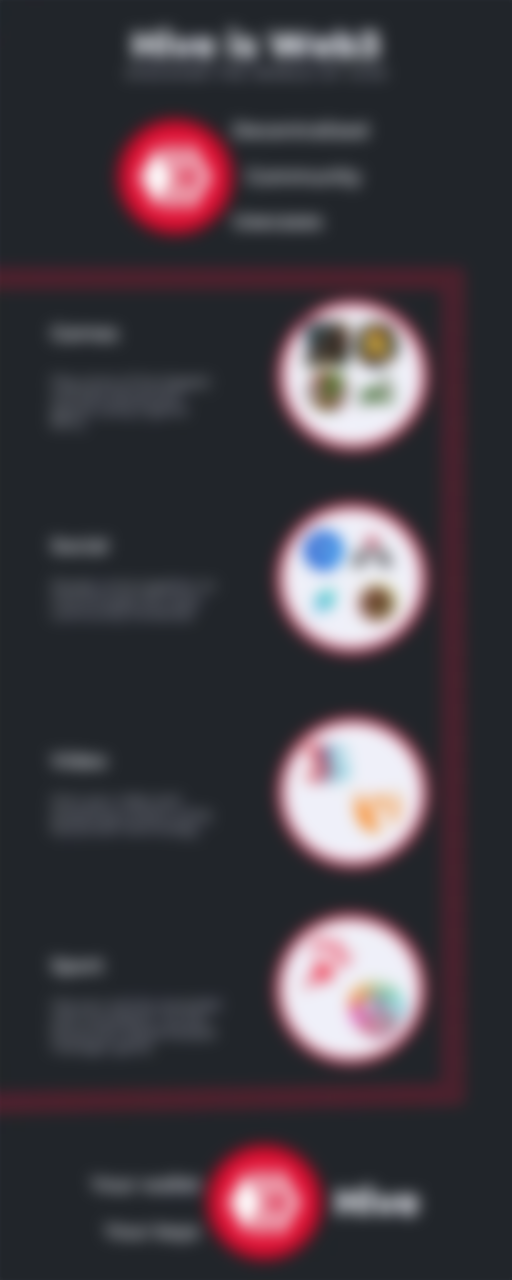
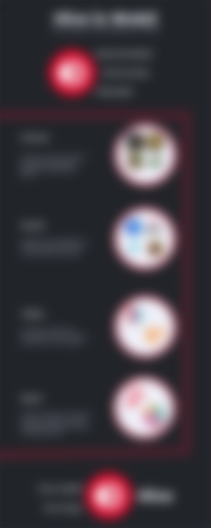
I decided then for a black background instead and was thinking of a list format but maybe this was too plain.
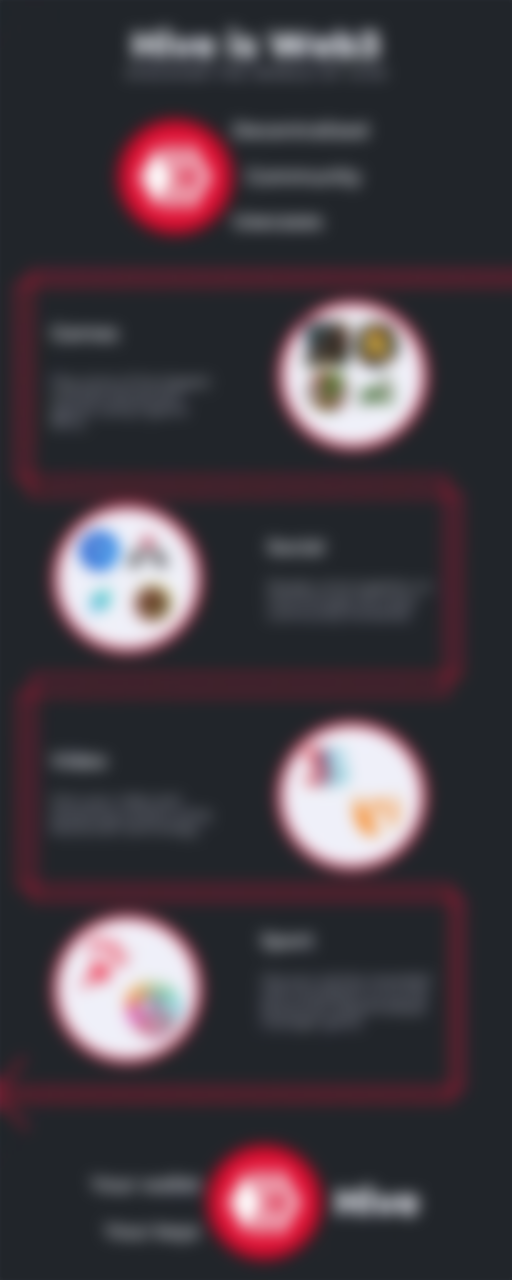
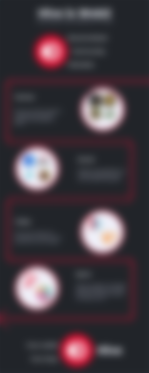
In my final design, I spruced it up a bit and weaved the red lines to give more flow to it.
Summary
It has been a challenge to produce this infographic but also good fun. I have learned some new things in canva that I hope will be helpful later on and improve my posts and graphics.
My Sponsors:


Credits:
The infographic was created by myself in canva.
The logos and color scheme were used from the the hive.io website. I do not own the copyright for them.
Let's connect : mypathtofire
Very nice done, looks awesome =) now I know who to turn to if I need graphics help ^^