3 Pokémon drawings that you must see before you die
I know, the title for this post may be a bit dramatic but it's just a way for me to capture your attention, and now I will present you three drawings about some of the Pokémon characters that I have done recently.
To tell you the truth I'm not a fan of the anime series or its video games but I recognize that their designs are very striking and more for the colors that have each of these, that's why I looked for the ones that attracted me the most to draw and color them with the resources I had at hand, and from there I have obtained these results that you will see below.
Let's start with the one I like the most of all, which is none other than:
Blastoise
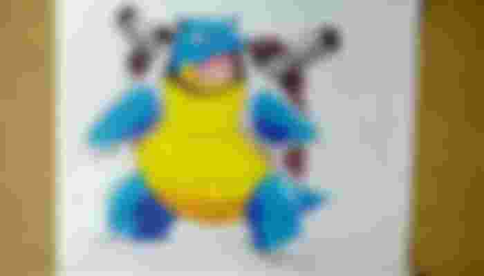
I suppose that it is the evolution of Squirstor because of the resemblance that both have as well as the base colors that they have.
What attracts me the most is the corpulent that is all its body as well as the cannons that it carries behind.
In coloring some areas I had to create them by combining some colors; for example, the cannons are the mixture between black and white to obtain the gray, the internal area of the mouth apply vinotint with the use of red plus black and yellow, in the tongue I used red with white to get the light pink, and the shaded areas in the front part was yellow with brown.
Squirstor

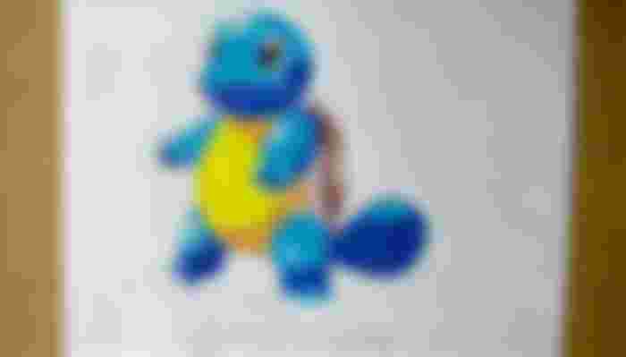
This is another character that I also liked to do because of how adorable he looks.
For the colors applied on the eyes was a mix between light blue with green, the rest is just blue, light blue for the light areas, brown for the shell, and white to give a shiny effect.
Chamastor
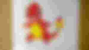
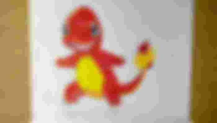
As for this one it is as simple as the previous one, but at the moment of coloring it I only had to use colors like orange, yellow and black; and only in what is the tongue and part of the eyes I had to combine as in the previous ones: gray (red with white) for the tongue, blue gray (light blue with black and white) for the lower part of the eyes. And on the tip of the tail I used the same colored pencils without highlighting them to create that flame effect, something that would have looked better if I had used pastel colored pencils, which I didn't have.
And the materials used to create all these drawings have been the following:
Recycled paper.
Black ink pens.
Crayola colors (12 colors).
Eraser.
Pencil sharpener.
Paintbrush.
2H pencil.
I hope you like these drawings and that you can also be encouraged to draw them, it is quite enjoyable to do it and color them because this makes us to be fully concentrated and with the end we appreciate what we have been able to achieve. And with nothing more to say I say goodbye until the next installment. I send you a big hug, and thank you for the support you can give me.
See you then.
Source of the images:
Images obtained with my Amazon Fire 7 tablet.
