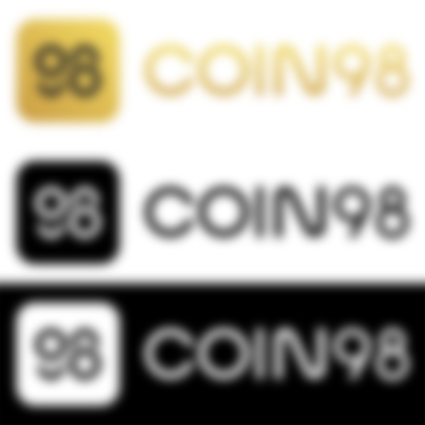

When I saw the Coin98 logo I knew right away this was a classy joint. The simple, streamlined letters displayed with a golden shine are very matter-of-fact. Even the name COIN98 is to the point, like a parent who names their third child Three. Compared to the embellishment and excitement coming from other crypto brands, Coin98's approach to their brand perception sets them up to be noticed. Join me in finding the complex and subjective meanings within this minimal design.
Color
Yellow is a color of confidence, friendliness, and warmth. It is associated with the Sun so it adopts the ideas of illumination and transparency, too. Utilizing a soft monochrome gradient imitates the shine of golden metal, allowing the brand to emit an aura of luxury and wealth. A gold logo communicates a certain superiority within an industry, as I've mentioned previously in a Binance brand tear down:
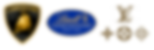
If you've ever wondered how influential a brand's color can be, then take look at gold logos from other industries like Lamborghini, Lindt, or Louis Vuitton. The argument can be made that each of the aforementioned brands make superior products, and while it may be true that they each utilize high quality materials, at the end of the day chocolate is chocolate, a car is a car, and a bag is a bag. An oversimplification, perhaps, yet we pay more for this perceived quality.

We all strive for financial security but more than a few of us desire to put our wealth on display to show that we belong to an elite club of early retirees with passive and expendable income. Any company that uses a gold logo exploits those desires.
Type
This is a modern sans serif typeface reminiscent of the streamlined, geometric letter forms used post-WWII. The era of Art Deco/Art Moderne was a transition from the beautifully complex craftsmanship of Victorian designs to minimal straight lines, geometric shapes, and rounded curves. This modernization was seen in everything from architecture to furniture to jewelry and the typefaces adopted a contemporary style to match. The trend even made its way into science fiction becoming synonymous with the Atomic Age, and it's in these futuristic illustrations that we see the sharp corners of many letter forms transform into rounded and geometric glyphs.


Likewise, we can glean a similar air of no-nonsense modernization – or 'futurisation' - in Coin98's typeface.
Web/UI/UX
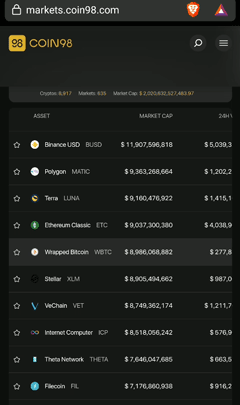
The dark mode theme reigns supreme. Dark modes are commonly used within the crypto industry. A dark background allows for a wide range of contrasting colors to direct the eye to important data. The Coin98 website makes prolific use of their signature gold to imitate glowing, ambient light in a dark space.
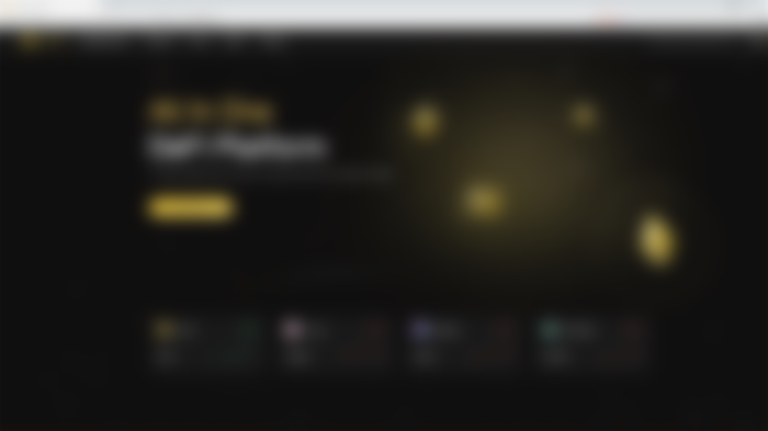
The layout of the exchange app and market charts comply with the standard layouts seen among the myriad financial apps that exist. I find it more than a little peculiar that they chose to break from the standard green/red candlesticks for gold/white. Using gold and white is not a 'problem' in the sense that a fix needs to be applied. In fact, this makes the charts more cohesive with their brand, but it can be a point of confusion especially when looking at a sideways trend. The majority of users will be familiar with how to read this chart no matter the colors, but by shifting from that standard they slow down our ability to read it quickly. We first have to identify which color represents the increase or decrease, then we can decipher the data. It doesn't help that the white candlesticks become black when switching to light mode, either. As much as I like their decision to stay within the brand, for the uninitiated enthusiast or uneducated 'investor' this can make an already confusing chart frustrating.

For mobile devices, the website and app respond well. Although nothing technically 'breaks' on mobile screens, the columns 'Market Cap', '24H Volume', and 'Circulating Supply' invade the 'Asset' column. This is likely a non-issue for most, but the web designer in me demands perfection.
Aside from these minor imperfections the experience is luxurious and futuristic, and it reinforces the opulence seen in the logo, name, and color.
Concept
Coin98 is giving us a sneak peek of the future as they envision it. A short perusal of the website reveals several minimalist illustrations: cryptonauts interacting with ethereal structures in space, cryptocurrency planetary bodies orbiting portals, streamlined craft zipping through space, even a mountain goat hanging out next to a rocket launch, as though all of these things are a part of everyday life. These images borrow similar design trends and emotions from vintage futurist advertisements and artwork.


After the “War To End All Wars” came to a halt, the new discoveries that emerged from the splitting of the atom started a wave of future-thinking. A techno-utopia powered by nuclear technology became an ideological possibility that seemed within arm's reach.


Similarly, the age we currently live in – whether you want to call it the Glass Age, the Innovation Age, or the Experience Age – has provided us a new technology that is opening many eyes and minds to the possibilities that exist now, and those that have yet to come. Coin98's brand identity sows the seeds of this 'Cryptonic Age' by convincing us that a better, brighter future can be ours today. It is a superbly successful identity that stands far apart from the typical swap mascots and video game exchanges of other brands and as an idealist I buy into it.
So that's my take on Coin98. As always, the concepts and ideas here are subjective. The only people who know the exact reasons behind these design choices are the devs and designers, but that doesn't mean we can't add some of our own.
-fizzlstout