
During my self-educating research into the dizzying world of blockchain technology and decentralization one name pops up repeatedly. Binance is reported to be the largest exchange, servicing on an international scale. So naturally, the designer in me wants to know if their brand identity says the same. Lets check it out.
Color
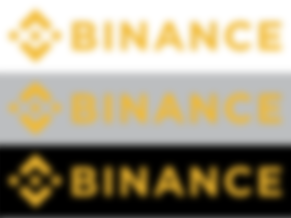
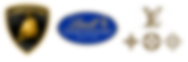
Binance uses a golden yellow, most frequently placed on a black or dark gray background. Obviously they are communicating the wealth and luxury of the brand. If you've ever wondered how influential a brand's color can be, then take look at gold logos from other industries like Lamborghini, Lindt, or Louis Vuitton. The argument can be made that each of the aforementioned brands make superior products, and while it may be true that they each utilize high quality materials, at the end of the day chocolate is chocolate, a car is a car, and a bag is a bag. An oversimplification, perhaps, yet we pay more for this perceived quality.

Binance recognized this from the start and has spent the last 4 years imprinting this perception of superior quality onto all of us. Compare Binance's icon to any other exchange's logo and you will very quickly intuit this for yourself. If Binance is “Lamborghini” then by comparison Coinbase feels like Ford, Uniswap feels like Kia, and 88mph feels like DeLorean. Each brand communicates their own important color coded message to their consumer base, but if given equal choice to pick one, most of us would take the Lamborghini.
Type
Binance is using the modern sans serif Helvetica. Not a big surprise to designers, but if you aren't in the know then be aware that Helvetica is used everywhere. It is so prolific that it received its own documentary. It is so abundant that some designers absolutely refuse to use it. The letter forms are well balanced and consistent and they have a unique ability to fit almost any industry, a major factor that contributes to its ubiquity.
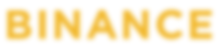

Binance's global presence absolutely feels worthy of this imposing design choice. Binance successfully announced the arrival of its brand with a heavy type weight and screaming capital letters. I use the word “successfully” because getting Helvetica to communicate anything other than “Helvetica” can be challenging, especially in the wrong hands. Binance's design team handled it well.
Web/UI/UX
Binance doesn't disappoint with their landing page (in the U.S.). We are inundated with luxurious gold-on-black clickables. The containers are neatly organized and respond well on mobile; standard responsive website. There is one issue I noticed while rummaging, though.
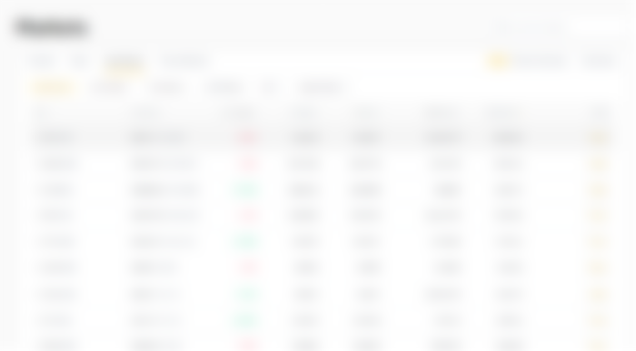
Binance, and most exchanges, have a lot of information to promulgate and many services to provide so it is paramount that visitors are able to distinguish one interface from the other. Because Binance utilizes only yellow - black, white, and gray are "free" - they begin to run out of color combinations to differentiate containers and buttons from interface to interface. And that's what happened on their Markets page. The Trade button uses small, yellow type outlined in a faint gray stroke. It doesn't have a hover state which I find to be a strange decision, since so many other buttons have hover states. The info cards are highlighted in gray when you hover, but not even this allows the Trade button stand out. It's good enough, but it could be improved.
Of course, only the dinosaurs use desktop. The UI/UX of the mobile app stays within the brand identity. The issue on their Markets web page shows up again when using the app in white mode but is easily fixed by switching to dark mode. Why not just default to dark mode? Because they want you to think it is your choice!
Iconography/Symbolism
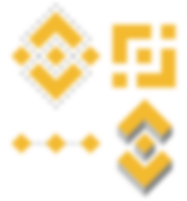
Binance's geometric icon is my favorite part. Geometric shapes aren't anything new in the tech industry, but they are becoming their own little design trend within the pocket universe of cryptocurrency and Binance makes astounding use of the square.
The square is inherently stable and represents strong foundations. Binance repeatedly presents us with implied and solid squares. Repetition is an important memory tool. That's why we remember precious nuggets such as “Location. Location. Location” and “Umbrella-ella-ella”. Binance wants us to remember them as the most stable foundation.
But notice we're looking at a diamond? A few things happen when we view a square delicately perched on a corner. Our minds like to complete patterns and frequently show us things that aren't there, so a square on its corner can very easily be imagined as the "top" of a cube. This was precisely the concept used when the Binance launched Binance Chain and BinanceDEX.

Another interesting effect happens when the stability of the square is balanced on a corner. Suddenly it gets movement, like blocks on a factory conveyor line (here's an animate gif to illustrate what I mean). Diagonal lines always lend motion to a design. A very clever way to communicate blockchain technology!
As always with consumers and design, there exists a paradox. Did we, as consumers, make Binance the largest exchange because we decided? Or did Binance make us perceive a higher quality? Design elements aren't always quantifiable because they rely on emotion and intuition - and are always subjective - but they undoubtedly have an impact on all of us!
-fizzlstout