I am a great, big nerd when it comes to collectible card games. I have collected and played Magic: The Gathering, Middle-Earth, Pokemon, Yu-Gi-Oh, Star Wars CCG, Lord of the Rings CCG, Hearthstone, and so many, many more. When I'd first heard of a collectible card game called Splinterlands my curiosity was piqued. It took about a week for me to fall in love with the game, but from day one I've had problems with the Splinterlands logo. So I'm going to tear open this brand like a pack of cards and hope that I pull something worthwhile.

Color
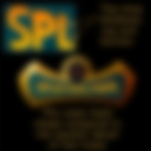
I think the most important color to pay attention to here is the yellow and orange gradient applied to the text. Although the teal background is a compliment to orange I don't believe it is a permanent part of the Splinterlands brand. I could be wrong, but I'll explain later.
Yellow is a fun and happy color, probably because of its universal association with the Sun. Orange has the inviting warmth of a campfire and the exciting enthusiasm of autumn leaves. These two colors come together to create a sense of thrilling and playful adventure.
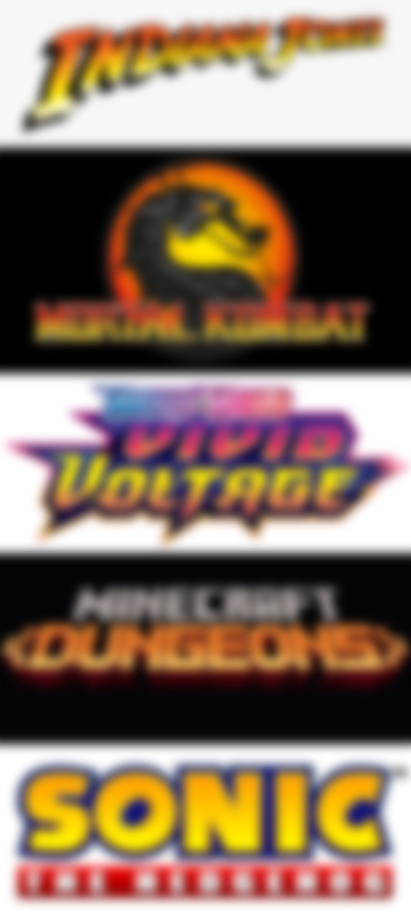
Take a look at some titles which make use of similarly colored gradients. Though each has a different tone, the common denominator among them is “adventure”.
Type
The Splinterlands wordmark is a crude handwritten typeface. The letter forms have the appearance of a pen or brush stroke, which aids in making them look and feel human and perhaps even somewhat tribal. I love that the letters have imperfections but the obvious re-use of the letters S, L, and N diminish the humanism and change the wordmark into a manufactured stamp.


Utilizing capital letters for your game is a good call. Capitals grab attention; they get right in the faces of your consumers, ensuring your name won't be forgotten. Splinterlands' capitals provide some prominence, but not enough as I'll explain later.


The squeeze in the middle adds a playful personality to the wordmark allowing this customized font to embody every bit the playful personality of comic book onomatopoeia, a clear indication of the demographic Splinterlands is intent on attracting.
The Splinterlands wordmark loses a lot of its strength, however, when placed inside the frame.
Web/UI/UX
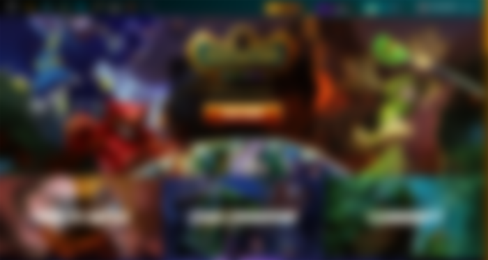
Splinterlands' web app is absolutely exciting, but there is quite a lot to unpack here and I won't be able to go through all of it without turning this into a doctoral thesis. So, this will be a quick, general sweep.

Though I don't really care for the teal and gold frame in the logo, I do appreciate that they used those colors for the header, footer, and scroll bars. The simple act of recalling the color palette is immensely important for strengthening the brand.
The web design makes laborious use of containers and lists to keep hundreds of links, icons, tables, and information cards organized and coherent. It is responsive, but elements begin to break around 1280px.
Splinterlands has a ton of information to divulge which ultimately clutters the interface. Fortunately, they make excellent use of drop-down boxes, buttons, toggles, search fields, and tool tips to easily organize and navigate the multitude of data.
The experience is wonderfully engaging. Every page feels like a Saturday morning cartoon, displaying unique landscapes, fascinating creatures, or icons and images that are undoubtedly tied to a world lore yet to be explored.
All said, the website works supremely well for all the complexities contained within. The remaining issues I have are minor design flaws.
Concept


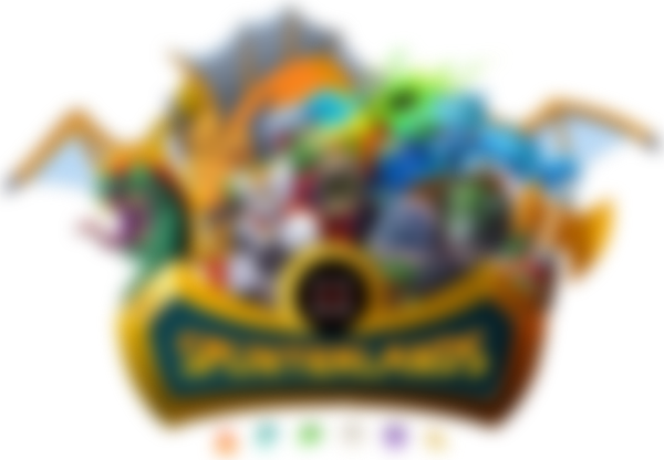
The Splinterlands logo superbly communicates its adventurous and competitive spirit with fiery letters, bared fangs, an array of faction icons, and an eye-catching frame. Gamers and non-gamers alike can easily discern the playful personality of the brand, but there are several elements that could be improved. I have an issue with the gold and teal frame, as mentioned before, so let's start there.
I found myself wasting a lot of time trying to figure out what, exactly, this frame is suppose to be. An axe head? An odd-shaped road sign? Wings? Frames are intended to create a visual hierarchy; in other words, a frame tells us to pay attention to whatever is inside its borders. Splinterlands, however, has made an interesting choice to make the frame the most important part. Notice how small the wordmark appears inside the frame. Despite having bright colors, the sheer size and detail of the frame subdues the grandiosity of the name. Also note how the wordmark follows the contour of the frame. “SPLINTERLANDS” is squeezed in the middle as though caught in the grip of a powerful creature. In my opinion, this makes the wordmark submissive to the frame thereby giving the frame utmost importance - a decision I believe to be backwards.

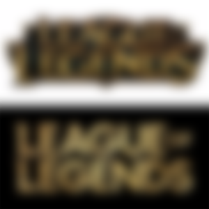
Take a look at the evolution of the League of Legends logo as an example. The original logo had a large, beveled wordmark that escaped its frame, rather than be contained by it. Ten years later the frame was dropped, the wordmark was made heavier, and an emblem was added: the letter “L” over a circle frame. I believe, eventually, someone in Splinterlands' art department will realize the wordmark needs to be bigger, and when that happens a decision will be made to either remove, reduce, or alter the frame.

Closer inspection of the wordmark reveals an attempt to give the letters a three-dimensional aspect by way of a drop shadow. This unfortunately conflicts with the brush-like appearance of the letter forms. When has anything you've written ever leapt off the page to create a shadow? Adding a drop shadow to text is a way of giving importance to words, making them pop out and grab attention. The drop shadow behind the Splinterlands wordmark is nearly imperceptible, though, and I find it to be an especially peculiar element of the logo considering there are actually two drop shadows applied. It feels like a last ditch effort to make the name more important than the frame – an effort that failed.


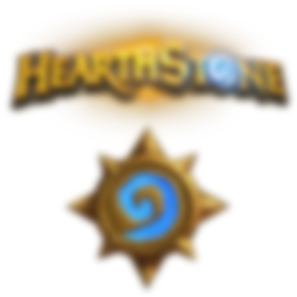
I want to bring attention to the fangs. The icon is featured prominently throughout the website and on many of the assets found in-game - loading screens, potions, badges, maintenance signage. This is, arguably, the most important part of the Splinterlands logo. The connection these fangs have to the brand seems to be based on lore, much in the same way that the spiral in the Hearthstone logo is connected to the lore of World of Warcraft, and I think it is entirely possible for this emblem to become a well-known, well-established brandmark for the Splinterlands game.

Splinterlands is roughly three years old and has already undergone a name change (it was Steem Monsters until April 2019). Although there will be plenty of time to build, tweak, and adjust the brand identity I genuinely wish Splinterlands would invest in a professional, cohesive brand strategy to rival the likes of Wizards of the Coast's 30-year veteran Magic: The Gathering. As it sits currently, the logo falls very short of gaining the notoriety needed to topple other established card game giants, but the potential is there and I truly hope it doesn't go to waste because I greatly enjoy playing this game.
Well, this is as far as I can take the Splinterlands brand analysis. As I've mentioned, there is far too much to cover to keep this a short read, but I think I've hit upon the most important parts. As usual, this critical analysis of the brand is entirely subjective. With three years of brand familiarity under their belt many gamers will have become accustomed to the current brand and will likely disagree with my assessments. And that, in my opinion, is the strength of design because disagreement opens the door for discussion, and discussion, in turn, breeds new ideas. This is the way. #MTGKiller
-fizzlstout