Review and Feedback on the new HiveStats UI
Hive Stats is one of my favorite applications on Hive and I have that window always open in my browser. The main reason is that the stats displayed there gets very handy. I would like to take this post as an opportunity to review the website and describe the experience I have had so far with the website.
To start with, I like the light and dark theme flavoring. Most of the recent applications now have two different themes for their website. It has now become a standard for some of the websites and tools. This is a good thing because people can choose whichever mode they like. I personally like dark themes as I feel it is pleasant to my eyes especially when I'm working late at night.

I liked the new slider that shows us the voting power. The design that was available earlier was also looking good and this one is also looking good. The different colors used in this particular information are very good. It is more like a profile card with all my basic information available.
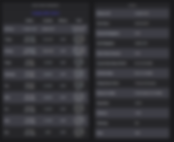
Next is this part where the rewards are displayed. To be very honest, I thought the previous layout was good but later I thought this is also good because I can see two additional values too which are weekly data and monthly data. It took me some time to understand what changes they have made. In the previous layout, the section was displaying only the last 7 days' data but this one now displays a total of the weekly data and monthly data as well. Previously we had to move to the graph section to check this data. The stats section on the right was all good and I did not find anything amusing there. But just one thing, they could have shown the total number of posts and a total number of comments separately.
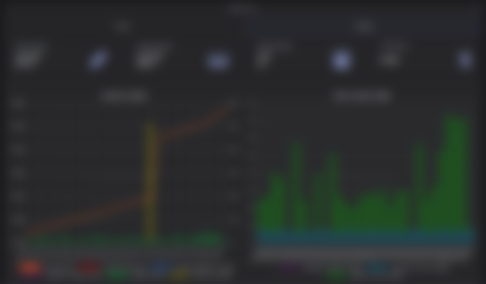
I should say that the above graph was the coolest part of the website design. Previously the graph was only pretty basic, now the graph looks a lot better with so many different filters. It is more like people if they don't want to see their witness rewards, they can deselect it and it will be struck out and taken out of the graph. This graph is one place to observe the growth of our account based on the last 7 days' data or the last 30 days' data.

To talk about the above part, It is kind of misleading for me. I don't understand what rewards these actually are. Is it only the LEO rewards or all the tribe token rewards combined together? Maybe hint there in the UI would have been better.

The above section is the next most interesting thing for me. I frequently come here and check what my top Hive Engine coins are. But I used to feel that it would have been great if this section had shown the total as well. That would give some idea as to how much worth our Hive Engine assets are.
Otherwise over the restructuring of the UI looks pretty cool and I'm expecting to see more features in the future. Maybe some features like more visibility and filtering of our data would be super cool. Let's see what the next version brings us. So far great work from the dev team. The design is pretty good and attractive.
If you like what I'm doing on Hive, you can vote me as a witness with the links below.
Vote @balaz as a Hive Witness
Vote @kanibot as a Hive Engine Witness
Posted Using LeoFinance Beta

That page has been recommended to me a lot but honestly I don't think it's for me, however I'm going to study it