Here are the Flowee Headquarters, also known as my home, we believe that Bitcoin Cash is the future for most payments and it is not for nothing that our motto is to accelerate the world towards a Bitcoin Cash economy.
Thinking hard about this one thing stood out. The people should have a better payment application. Most wallets today trade good user experience for a permissioned model where the wallet is not open source and you never know if the next update takes away your rights.
This is the background where Flowee Pay was started with. To built a great user experience on top of known open source sourcecode directly linked to Satoshi wrote so many years ago. And slowly we add all the features that are needed to make a great wallet for a large public.


So, what is new in the December release?
In this release we re-did the send-screen. The background is that there is now a Payment data object that takes care of all the details and it allows one to specify all the details about that payment.

What is noteworthy is that we now allow users to add multiple Destinations, which means you can create one payment that pays any number of people.
This can save on fees, but probably more important it allows more advanced usages like being able to pay all employees in one payment.
~~~~~~~~

A second addition is that specific coins (sometimes called inputs) can be selected for this payment in a "Coin Selector". Also part of the payment.
Both these additions are rather for more adept users and people that have more advanced usage in mind than just simple payments.
~~~~~~~~~
A very strong design requirement is that those more advanced usage should not have any effect on simple usage. The established work-flow of standard payments has thus not been changed. There is an extra button to "Add Destination" and not much more.
A future version will likely experiment with more payment details. We have ideas ranging from having payment templates, to adding smart-contracts as outputs.
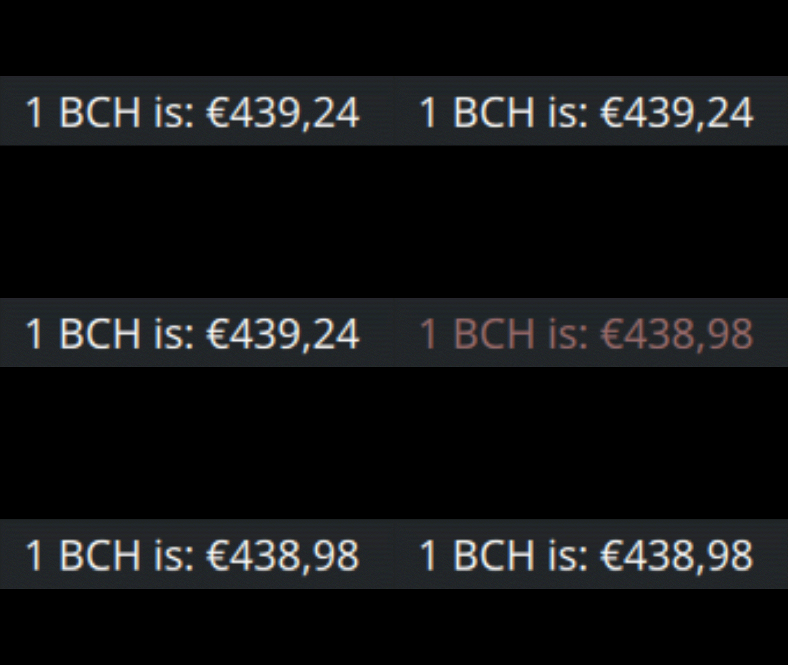
Small usability features are always being added and a wallet needs thousands to become a good one. One such addition is highlighted here, the price is fetched from a seed every now and then, and displayed on the left side of the app. What we added is a small animation to draw the eye to the change of the text.
To close the list, here is a screencast of the application today.
Form factor
An often asked question is if this runs on mobile, as many people do not use a Linux desktop. Flowee Pay is working hard to add all the features needed for a wallet and we consider a mobile as well as a tablet version part of this.
Our plan for the future is that all the hard work is done for the desktop and then a new user-interface can be added quite easy for a different form-factor like mobile. A separate UI makes sense as the number of features wanted on mobile will certainly be less than on desktop. Our choice of QML (based on Javascript) makes adding a new UI fun and not too hard. Please consider helping out!
Where can you find us:




Something worth keeping an eye on for sure. Had not heard of it before now. Keep us posted.