Lead image

5 95
Avatar for Read.Cash
4 years ago

Finally, you have an ability to select an image that will be displayed on the main and topic pages. Actually you even have to select one now. Luckily it's pretty easy with Unsplash integration - just search for some nice image and be done with it.

Yeah, it's called "lead image", because someday we'll give you the ability to have a nice big header image as a background or something like that. But for now it's used only as a thumbnail for the main/topic pages.

You can also select one of the images in your article as the "lead image".
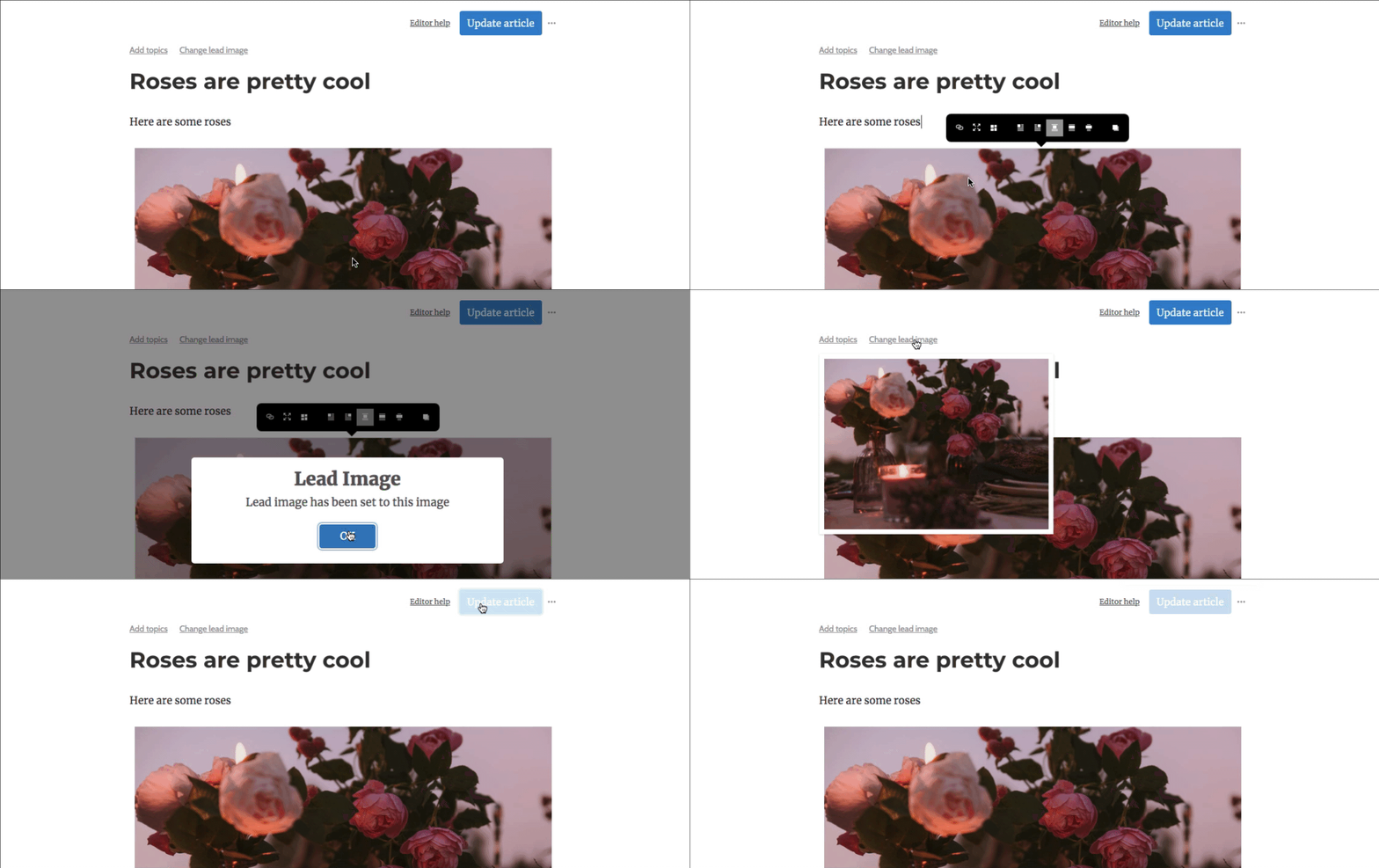
This should definitely improve the situation with the big number of black and white images on the main page.

UPDATE: It seems to be working well, homepage looks much better now:

1
$ 2.05
$ 1.00 from @btcfork
$ 1.00 from @Morti
$ 0.05 from @elrikpiro
Sponsors of Read.Cash
empty
empty
Avatar for Read.Cash
4 years ago

Comments

I was eager for this feature, thank you!

$ 0.00
4 years ago

OPINION; I liked it better without these images as thumbnails on home site... feels so busy & overwhelming & more about hit pieces than quality content. I fancied the feng shui of the site without the lead image at the home page. I would love to somehow run a poll to see what users think, but I don't have that kind of reach

***EDIT; Just saw the new toggles in the top right as well! The picture thumbnails can be turned off by changing to list view. Fantastic. Thanks!

$ 0.10
4 years ago

Yes, you're not the first one to voice that opinion :) Actually, so far "tiles" to "list" is about 7:11 (7 strongly prefer "list" after trying the switcher at least once, 11 strongly prefer "tiles").

$ 0.00
4 years ago

Oh neat! Gotta love some good data insights. I'm glad to see I'm not the only one

$ 0.00
4 years ago

Well, we hope to share more of our data insights about read.cash on our 2-month anniversary on 18th of December :) Stay tuned!

$ 0.00
4 years ago