Splinterlands art contest week #248 (Lemell Refugee)
For this week's Splinterlands art contest Entry i drew a character card named "Lamell Refugee"
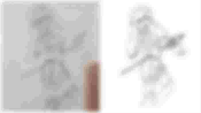
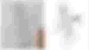
So first step that i do i look at my refrence and sketch it in my style .Now for that you have to look at the accessories and the detail of shapes that defined the character and draw it but in your own style . The rough sketch had the arrow but it looked a bit bent . So i corrected it when i converted the sketch into a refined lineart digitally.
I used an app called Medibang paint pro to paint digitally.
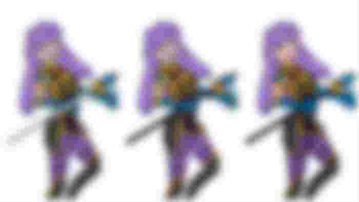
After converting my sketch into a lineart i started filling the flat colors . After this you can see a bit of definition to the character how ever to enhance it more i added some shadow to each layer with a water color wet brush . This technique creates a subtle shadow to give our 2d image a more defined look
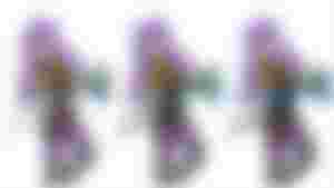
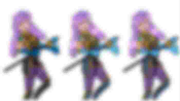
Shadows aren't the only thing that enhance your illustration u need highlights to and every part needs an different highlight texture like for the hair i used a pen sharp brush and drew lighter strands so the hair look lilac colored if i used more darker purple it would look as purple pink hair this is a technique i use when painting lighter hair .
I also added some more highlights with a water color wet brush and smudged it so it looks like the hair have shine and glow to them and i set the opacity of this layer a bit low .
Same way i added highlights to the armor and to the diamond on the armor . Every material has different shading you gotta practice drawing them to know this .
After this i colored the eyes too so Our character has Heterochromia so her one pupil is yellow and the other is blue i painted those and added details to the spear . Now i also painted the Golden details on the armor as u can see now it looks more shiny i used 2 different shades of yellow here .
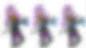
Next i colored the line art too according to ever parts color just a bit darker . This makes the illustration very soft and makes it pop . another thing i did was i made those writings on the spear glowy .
For this i duplicated the writing and guassian blurred it and on the previous layer i made it less saturated this gave it a more glowy effect .
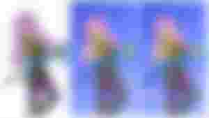
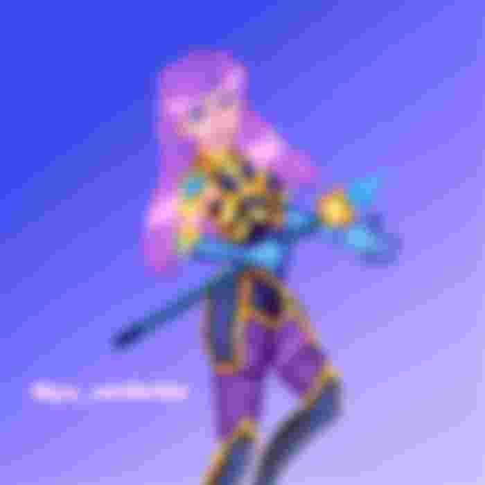
Lastly i just added a blue purple gradient to all of it and set it on saturation and here we have the final result

Thank you for your precious time and support ❤️
