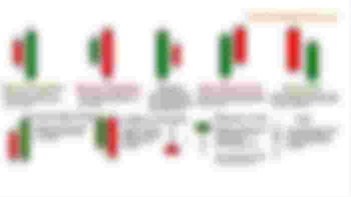
As a continuation of our Forex article series, let’s understand another important set of symbols. A long vertical line with a very short horizontal line (the very shortened candle body) is called a “Doji” It means that the opening price of a currency is the same as the price when it got closed.
Dojis are actually shown as a typical plus sign, a plus sign with an extremely long vertical line, and a “T” with a rather long bottom. It is also called a “Dragonfly Doji.”
There is also the “Gravestone Doji” which can be seen as an inverted T or the reverse of a Dragonfly Doji. When a candlestick looks like that, it means that the price of a currency opens and closes at the low point or very near it, and has a long topping tail. When a chart shows a Gravestone Doji, it would mean that trading at this point isn’t a good thing. You have to wait for a while before the situation improves.
The lengthening and shortening of a candlestick could be due to people hearing about an economy or financial news, or a major event within a certain country’s monetary status. It could also mean an increase or decrease in a country’s tourism revenues.
But for a typical trader like you and me, the reasons could just be irrelevant. What we will just be focusing on is the simple fact that a currency’s value is high enough and that we should take advantage of it.
There is also the “Spinning Top Doji” – one that looks like a plus sign but with a vertical line that becomes fat, very fat, and goes back to being thin again. From an emotional perspective of the currency buyers, there is almost no emotion depicted on the buying habits that are represented by spinning tops. It means that prices are not moving up or down significantly. It generally represents indecision to either buy currencies or sell them.
"When a real candle is long, it means it has the burning power to stay longer of course.” The same is true with candlesticks in a chart. If the “wick of a candle” grows long, it means the value of the currency it represents is rising too. It also means that there are lots of emotions in it too – people are buying and selling efficiently within the real world which boosted a country’s economy. Such kinds of candles are also referred to as “expanded range candles.”
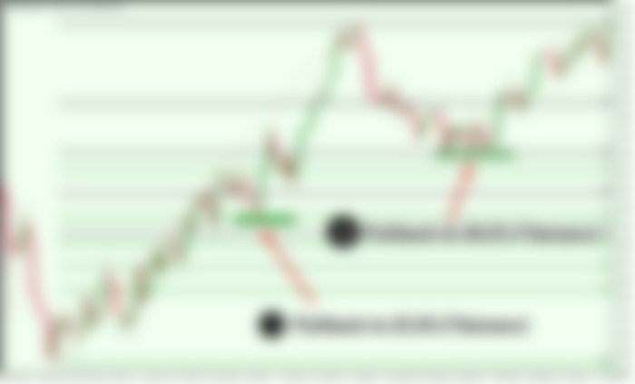
When looking at a chart as you formulate your analysis, one of the major factors you have to highly take note of is when a sudden lowering of prices happens. When it rises again higher than the previous high point, it is called a pullback, and it could be a sign that the currency can still rise higher.
Recurring pullbacks are actually beneficial to a long-term trading strategy because it represents a currency’s consistent increase throughout a certain duration. Such a set of events within a Forex chart can just be regarded as a 3-point action, the rise of the value, the sudden lowering of it, and the rising which is way higher than the previous high point.
As long as you take notice of those 3, and if they are higher than the previous sets, then it means the currency is performing so well. By looking at the exact point of the pullback, you can think of it as your “support level.” It means that you should hope that the next low point in the direction of the chart shouldn’t go lower than that.
The opposite of that point is called the “resistance level.” It is the next indicator that the next low shouldn’t be lower than that too. If it does go lower than that, then the currency could be in a bad scenario. Another way of determining if the value is going desirably higher is that the current support level should be higher than the previous one, and so on and so forth.
If they continue to be displayed with that pattern, it means that the currency at hand is in an “uptrend,” and that many traders are enjoying the benefits it gives. By consistently looking into that, you can really do some little tradings, or big tradings, depending on what your gut is telling you.
If you see that the current support level is lower than the one before it, then we have to expect that the currency is now on a downtrend, which means that there are more sellers than buyers.
The best way to deal with that gut feeling is to remember the “don’t get greedy advice” from the previous pages. Little profits accumulated over time would result in big profits. It is so much better than expecting a big win but attain a big loss as well in just a single stroke.

Here’s one crucial fact that you really need to bear in mind, no matter how good you become in analyzing candlestick charts, there is no guarantee that the analysis you can derive from them will always work at all times. Here’s the truth about Forex charts, or any other trading chart for that matter: they’re not really 100% accurate.
The rise and fall of those green and red candles are just representations of what could be possibly taking place, they’re not actual-real time data that truly represent what’s actually happening within the financial setting of a certain country.
While trading charts are created using the most sophisticated software and hardware technologies there are, they can’t really predict human behavior and choices that are taking place in various global markets every hour or every day.
The most productive treasure-hunters don’t just rely on a hunch or luck to locate and dig up buried treasure chests. They need maps and homing instruments to find what they’re looking for. As a Forex trader, candlestick charts are your maps and compasses – treat them with the utmost importance, and success in trading will surely await you in the very near future.