Hello, this is part two ‘the after’ of my series about things we can do to make our Read presence more recognizable. In case you have not read the first part yet, you can find it here.
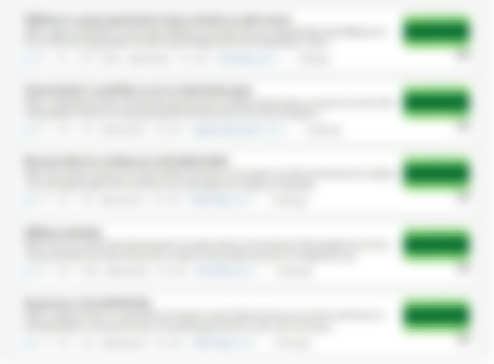
In the image below you can see how my content looks in my profile right now, while I write this article. You can see how it was before in the first part.
To be honest, the final result is not exactly what I had in my mind, and I think that there are a few negatives in the approach that I am about to follow (I will mention these a little later in this article) but for now, it is what it is. LOL
Now I will analyze a few things on my new image template, in order to explain to you why I did what I did in this image. And to make things a little easier for you, here is a bigger image of my new lead image template.
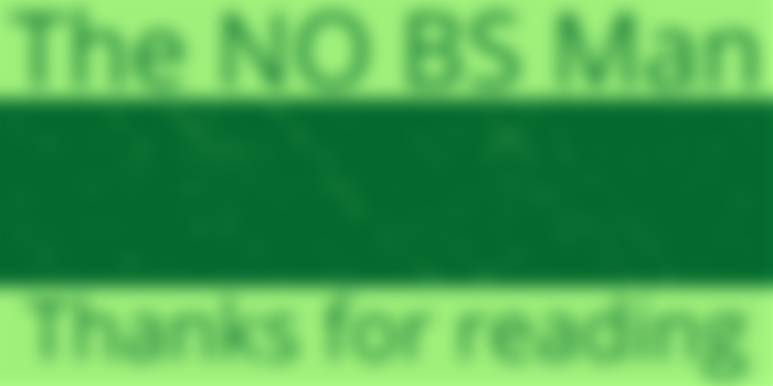

Let’s start with the colors, which are basically two tones of green, a light one, and a dark one. These are basically the colors of my logo as ‘The NO BS Man’. This is a thing that you can keep in mind if you want. Colors are a very important component when it comes to branding, so if you have a brand, it would be a good idea to use the colors of your logo in other things as well.
As you can see, I use the dark green color in the center of the image, because I wanted my titles to look nice and clear when someone is inside the article and read it. If the image is bright, the white letters of the title will not look very good. Below is an image from my Skillshare article, to show you what I mean.


Also, I have used a modern effect in the image, in order for it to look better. It’s these strange shapes that look like someone did throws paint into a wall or something, haha. I like it!
The upper and the lower part of the image is light green and I have used these places to also show two things. The first is the name of my brand “The NO BS Man’ since I think that it could possibly help and make me more recognizable, and the other is just a thank you to the people that read what I write. You know, to show my gratitude for this.
A small but smart detail is that the color that I use in the text is the same dark green that I use in the center of the image. However, I have to admit that I have mixed feelings about the text since it’s sure very big. I have tried to make it smaller but it was not looked very good in the small image (as it seems in the very first image above).
The negatives of this approach
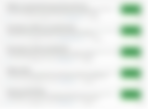
One thing that I don’t like is the fact that all my images are exactly the same now. At some point, I thought that I could change a few details in the images, in order to make them look slightly different, like to use different colors in some parts of the image, or to add a different modern effect on the dark green space to each image, but I eventually decided to not do it, at least for now.
The other thing that I don’t really like, is the fact that my lead image, as it is now, can not really attract people, based on the subject of my articles. For example, if I write an article about the jungle, and instead of my image I use an image of a jungle, someone could easily understand that this article is about the jungle, without to even read the title.
Oh well, I guess we cannot have everything. LOL
But enough from me, what do you think about my new lead image and the whole concept around it. Do you like it? Do you Hate it? Are you somewhere in between? Do you have something to suggest maybe? I am always open to feedback!
By the way, if you would like to read more from me, besides here in Read (and also in Noise) you can check out my newsletter, where I write about my journey in the make money online world. What I like, what I do, what I think, etc.
Check it out here if you want. Also, if you liked my content, please remember to subscribe.
Thanks a lot for reading, I wish you have a really great day!
The NO BS Man