Hello, lately I was looking at my profile here in Read, and I think that I have found a way to make it more recognizable for everyone who would like to read my articles.
I am thinking about it again and again and I believe that I will probably implement it soon, so I thought to also make an article about it because it could also help others to do the same. Maybe even you, if you like this idea.
What am I talking about? I am talking about images, and more specifically about the lead image, the small image that appears on the right side of each one of our articles.
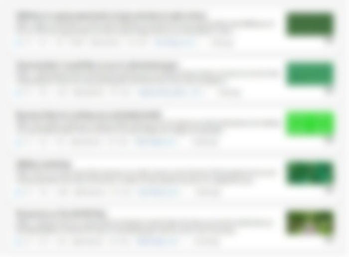
Here is how my content looks in my profile while I write this article.

A quick fun fact. I am calling it profile, but I am not really sure if this is the right term. I mean, is it 'profile' or is it 'blog'? Or it is 'channel' or something else? If you happen to know, please write it in the comments below. I would really want to know how to call it if it actually has a name. Thanks in advance!
Back on our topic. What I am planning to do is to create an image template that I am going to use for all my articles from now on. Basically, not only for my future articles but also for the articles that I have already published.
This image template will be made specifically to look good when someone looks at it as is in the image above (on the right side of the image), and it will also look good when someone reads the article. A combination that in my experience so far, is not always easy to achieve.
I will use the same design in all my lead images for all my articles, the same font (the images will also have some text), and I will probably use the colors that I already use in my brand logo 'The NO BS Man' but I am not sure yet. Maybe I instead use similar colors, or maybe even something different. And this image will basically be a part of my branding from now on.
Right now, as you can also see in the image above, all my images are different, and the only thing that they have in common is that they are all green. Not always the same green, but still always green. LOL
This is no coincidence, I like this color and this is why I also use it on my logo.
So, as you have probably understood, this is part one article of this series, or else 'the before'. I will soon publish part two, which will be 'the after’.
And who knows, there may be more parts in the future (I have some ideas in mind).
That’s all for now my friend, if you have anything that you would like to suggest, feel free to write in the comments below.
By the way, if you would like to read more from me, besides here in Read (and also in Noise) you can check out my newsletter, where I write about my journey in the make money online world. What I like, what I do, what I think, etc.
Check it out here if you want. Also, if you liked my content, please remember to subscribe.
Thanks a lot for reading, I wish you have a really great day!
The NO BS Man
