 @technicallyproduct
more from that month
@technicallyproduct
more from that month
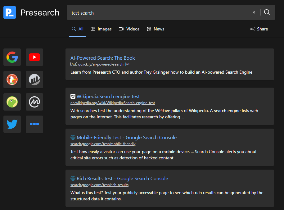
I see Presearch has had a revamp! I like the big, bold search icons on the left, but I am unconvinced about the way the search results are displayed. It feels like they take up too much space. I would prefer them to be a little more compact so that more results could be seen without scrolling. What do you think? #Cryptocurrency
3 comments
Totally in agreement here. It just feels wrong somehow. Could be we're just too much google formatted, though. The old format was more mirror-like that it appeared or felt, perhaps.
I stopped using it Too much time to withdraw the tokens
That makes me wanna login to my laptop and check it out