Why Greenland Looks Larger than Australia
The photo below is a photo of a world map. If you look closer, you will notice that I have marked both Greenland and Australia. In particular, I would like you to take note of which landmass is larger.
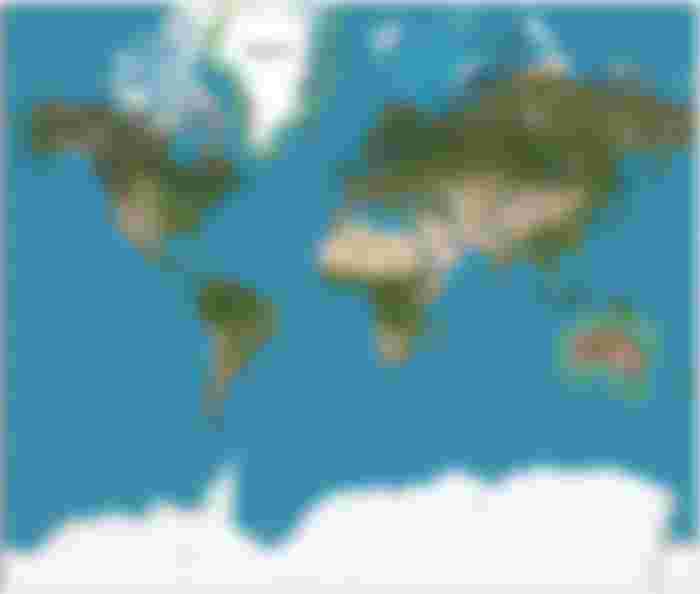

"Mercator projection (82°S and 82°N.)" by Strebe is licensed under CC BY-SA 3.0 / Modified from Original
You can clearly see from the map that Greenland appears to be larger than Australia. However, you may ask if this is actually true. After all, Australia is a continent and Greenland is just an island. Now, let's take a look at their land area. According to Wikipedia, these are the land area for the two landmasses.
Greenland - 2,166,086 km2
Australia - 7,692,024 km2
According to their respective land area, Australia has way larger land area than Greenland, almost 3 times the land area of Greenland. Does this mean that our maps are wrong? Why do our maps show that Greenland is larger than Australia?
As it turns out, the answer lies on the map itself! You see, most of the maps we use today use map projection methods. The purpose of map projection is to lay the spherical surface of the Earth on a flat surface. The map that I posted above uses the Mercator projection. What it basically does is that the areas near the poles are stretched as compared to the areas near the equator, which are stretched lesser compared to the areas near the poles. This is why Greenland, which is closer to the poles, looks larger than Australia, which is closer to the equator. If you want a better grasp of this idea, take a look at the picture below. I hope you learned something new by reading this post.
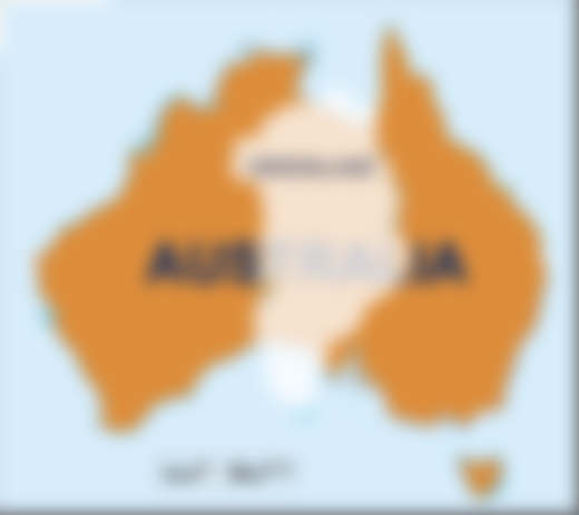
"Australia-Greenland Overlay" by JoannaSerah is licensed under CC BY-SA 3.0