
Typography is the art and technique of designing, setting, and arranging type. It is used to some degree in all written communication. As I described in my last blog post, graphic design is visual communication that uses design elements to convey print or electronic forms of information. The majority of this information comes from words. Therefore, typography is the most basic form of graphic design and perhaps the most important tool of a graphic designer.
Typography can be a very complicated topic but understanding some simple concepts and rules can result in solid typography and help make a good graphic design great.
Measure
Measure refers to the horizontal length of a column of type. The length of a line affects readability because readers' eyes become fatigued if it has to repeatedly read long lines of type. This is why newspapers and magazines are often split up into columns of text. A good measure for a single column of type is 40-50 characters (including spaces). For multiple columns, a good measure is 45-75 characters with 66 characters being ideal.
Serif Or Sans Serif?
Serifs are the small lines or hooks on the ends of characters in fonts such as Times, Garamond or Georgia. Sans serif fonts such as Arial, Helvetica or Futura do not have serifs. Generally, serif fonts are used for large bodies of text. It is thought that the serifs help make the letters more distinctive, recognizable and readable than sans serif. There has been an exception to this rule on the web because small serif fonts don’t display as well at low screen resolutions. Sans serifs fonts are always a good choice for small amounts of text such as logos, headlines and captions.
Size
Font size is the height of typeface that measures from the top of the tallest ascender (such as the top of a “b”) to the bottom of the longest descender (such as the bottom of a “p”). The good font size for body copy is 9-12 points, depending on the audience. An older audience will likely prefer larger fonts due to the deteriorating sight that usually comes with age. It should be noted that two different fonts at the same font size don’t necessarily appear the same size. A font will appear smaller if it has a smaller x-height (the height of a letter without ascenders and descenders).
Tracking And Kerning

Tracking (or letter spacing) is the adjustment of the horizontal space between a group of letters in a block of type. Tracking may need to be adjusted depending on the length of the lines of type. Loose tracking is preferred for wide columns whereas tight tracking is better for narrow columns. Exaggerated tracking in short amounts of text is also used to give typography logo style.
Kerning is the adjustment of the horizontal space between a pair of characters. Tracking puts the same amount of space between a group of characters but certain letter combinations may appear too close or too far apart (such as Il, VA, or AY). Kerning is required to fix these problems to give the appearance of consistent letter spacing. This is particularly important for small amounts of type at large font sizes (such as logo design and headlines).
Leading
Leading (or line height) is the amount of vertical space between lines of type. The default leading in page layout programs is usually sufficient but there are a few factors that may require it to be adjusted. A font may have long ascenders and descenders that touch each other between lines of type, causing a distraction. If a font has a high x-height, it reduces the negative space between lines of type that gives the illusion of tight leading. Tight leading makes it difficult for the reader to find the start of the following line of type which is particularly noticeable in long lines of type. Therefore, for wide columns of type, a generous line-height results in better readability. For body copy, I usually set the leading so that the height of capital letters fits perfectly between lines of type, which is around 1.5 times the font size.
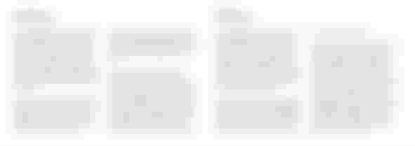
Alignment


Alignment refers to how multiple lines of text are aligned. The four basic typographic alignments are flush left, flush right, full justification and center aligned (see above illustration). At first glance, full justification may appear to be the best choice because of the straight edges of text on both sides. However, to achieve full justification, the words are automatically spaced to make every line the same length. This often results in gaps between letters and words and “rivers” throughout the paragraphs. I personally prefer flush or centered because the consistent tracking helps create an overall consistency of the typeface.
Hyphenation
Hyphenation breaks up words that cannot fully fit at the end of a line of type. Word processors and page layout programs don’t always place hyphens in the best place. Hyphens should only be placed between consonants. To avoid awkward word fragments, there should be at least two letters left on a line and at least three on the following line. Hyphens should be kept to a minimum, never used on names, and never used on two consecutive lines.
Paragraphs
A paragraph is a sentence or group of sentences about a common topic. Indents and/or line breaks are the most common methods of separating them. Subheadings are often added to briefly describe what the paragraph is about. This helps break up the content into digestible segments that can be easily scanned by the reader. Regardless of the method used, it is good practice to have concise paragraphs averaging four to six sentences long.
Orphans And Widows

An orphan is a single word or short line left at the end of a paragraph, resulting in excessive white space between paragraphs. A widow is a single word or short line at the beginning or end of a column, separating it from the rest of the paragraph. Both affect readability and can be avoided by adjusting the measure, tracking, leading or adding extra line breaks.
Emphasis
The emphasis in typography refers to changing the style of certain words in order to emphasize them from the rest of the text. Examples are bold, caps, small caps, size, color, and italics – which is considered to be the best method of emphasis. Underlining is not recommended. Regardless of what method you use, overusing or combining any of them is frowned upon in typography because it overemphasizes and disrupts the flow of type.
Color
A color is a useful tool in typography. It can attract attention, emphasize, organize content, create a mood and help readability. Type is most readable in black on white but other colors can be used provided there is enough contrast with type and background. Also, fonts with thin strokes and/or serifs are harder to read when reversed out.
Hierarchy
Hierarchy in typography refers to the levels of importance given to information. This is accomplished by using different fonts, sizes, tracking, color, weight, or style. This is mostly used to differentiate levels of headings and subheadings. For example, on the web, there is a system of headings such as H1, H2, H3, and so on. Common practice is to use the typographic scale that was developed in the sixteenth century. We are all familiar with this in the word processing software.