 @kli4d
more from that month
@kli4d
more from that month
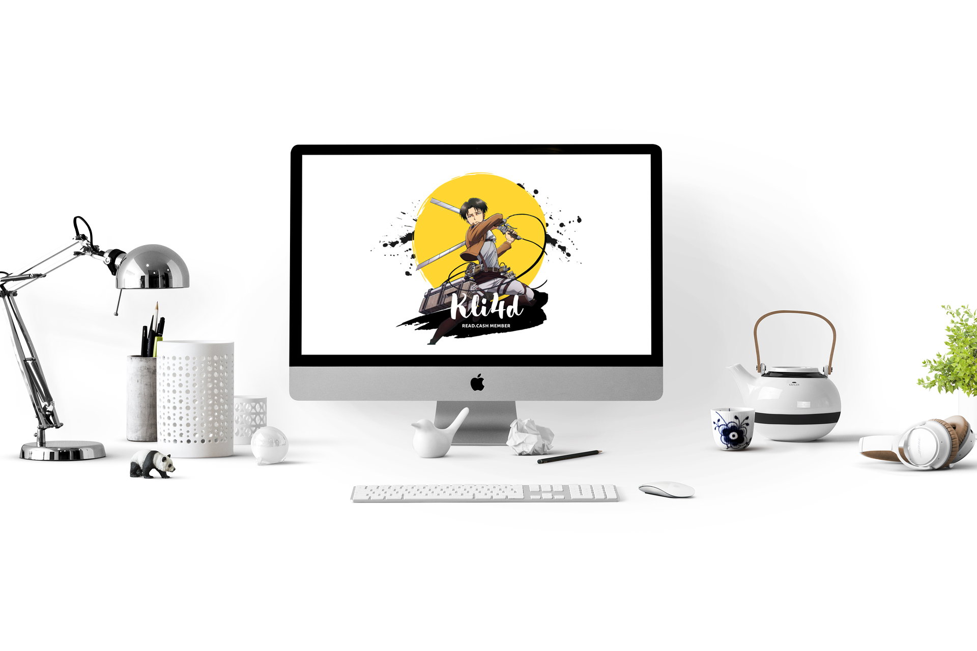
Final design of my logo Hello sorry for being inactive these past few days. I am too busy working on my school stuff. But despite that, I tried my really best to enhance my entry to @Dolores logo making event. I am also thankful that I have read the latest update about the contest despite my busy schedule. I also want to thanks all people who voted for my entry :))

I noticed that the text below is not that readable so I put a dark background to make it more visible to the eyes. I also put some black splatter at the back of the yellow circle to make it more 'cool'. I also believe that yellow goes well with black.
I have some school works that need to be finished so see you around in the comment section.

8 comments
Yeah. It looks very cool I like it more 😍😎 Good job. ❤️ You've got my vote again. Yieeeeh. 😁
Thank you so much! This melts my heart knowing that someone really loves my work :))
Yeah I like it more than my own logo hahahahaha
Oi oi, good luck sa ating lahat 👍
Much precise and clear Captain
This is the best logo. Goodluck! I have seen your recent logos, and this one is the best I think.
Congratulations! You are the winner❤️
Thank you @Dolores 😭