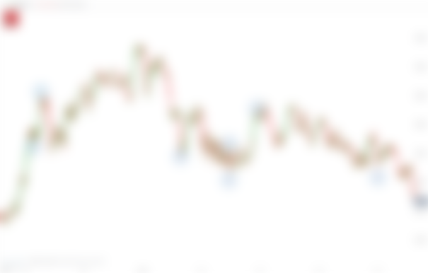
During the last crypto crash many investors experienced a big dump in their portfolio. Some people sold while some people hold on to their investment. It became a meme of “buy high and sell low”. But then at the lowest of points the market suddenly turned around and it began the next bull market. It sounds like a normal crypto cycle but is there something behind it, maybe manipulation? This sounds like a crazy conspiracy theory but what if I told you that this can be a real possibility? In this article we will take a look at the Wyckoff method and try to understand what happened back in May.
Some Basics
To understand this method we need to be familiar with some basics of the technical analysis trading. A Red candle means that the price goes down and the green ones means that the price went up. The wicks on each candle show the highest and lowest traded during a time period according to the time frame. As a rule of thumb, a long wick at the of a candle means a lot of people sold and a long wick at the bottom of a candle means, a lot of people bought the dip. The body of the candle shows where most of the trading happened during that time frame.

Some price patterns are reoccurring because these patterns reflect the human emotion, namely fear and greed. While there are hundreds of these patterns some of the most common are Triangles, Wedges and Flags. Almost all of these patterns are drawn by using support lines. These lines are drawn by using one of two ways. First is to use the highest and lowest prices across a certain time period or by looking at where price is clustered in the past. If the graph drops below a support line, this line becomes a new line of resistance and vice versa.


For this article we need some further indicators. These are the trading volume and the moving averages. The first one is used by traders to confirm whether a price pump or drop is legit or not and like price the size of each candle stick tells you how much volume was traded during that time period. Moving average indicators show us the average price of that crypto over three different time periods. You can think of these moving averages as more mathematical versions of support and resistance lines.
The Wyckoff Method and Patterns
Now that we have a rough overview over some basics, lets ask the question: What happens if every trader is relying on the same patterns and indicators? The short answer would be that it makes it very profitable for someone to come in and disrupt the market by pushing the price above or below where most people expect it to go. This was already done over 100 years ago on Wall Street where big institutions used their “whale power” to scare investors out of their stocks and commodities. While this is a pretty big accusation it can be said that big institutions just playing the game with the set amount of rules. If they see that a certain stock is overleveraged it is easy to bring the price back down so that they can buy it up for a discount. It can also go the other way which is called shot squeeze and we saw this happening with the Gamestop stock in the summer.
Because it requires a big amount of money to manipulate the market in this way it can be very easy to detect in the price charts. They could be found in every tradable market since this method was defined about 100 years ago. These are accumulation, distribution, re-accumulation and re-distribution. All of them are playing a role in the Wyckoff price cycle.
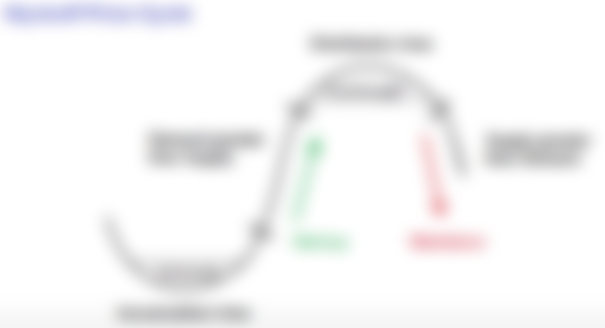

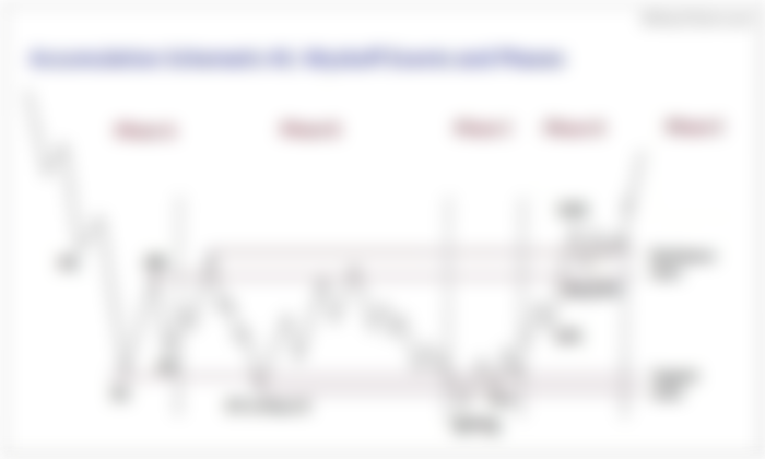
Starting with Accumulation, we have a preliminary support in Phase A. You can think of this as being a pit stop on an otherwise aggressive price drop. At the bottom of that downtrend you will usually see a selling climax. Here, the price often goes so low that it scares a lot of people into selling. The SC is often far below a key zone of price support. Because the selling climax is caused by very strong short-term price manipulation the re-bound from this SC zone is often strong and results in an Automatic Rally (AR). Given that the average investor is still fearful, it is very common that the price will drop again for a Secondary Test (ST).
In Phase B of the Accumulation Pattern, prices tend to move sideways within the trading range defined by the automatic rally and secondary test. Since this is where the institutions are buying the asset the price will sometimes bounce outside of this trading range to keep retail investors uncertain about re-entering the market.
In Phase C, it is common to see a down trend ending with a Spring. This is a massive manipulated dip that scoops up any retail assets the institutions did not get earlier. In Phase D, the price finally starts to rebounce and will sometimes correct in a Last Point of Support (LPS). The difference between LPS and ST is that, LPS will have a much lower sell volume which proves that the selling is not serious. Before exiting the Accumulation pattern in Phase E there will be a sign of Strength (SOS). This serves as confirmation that the price is likely to keep moving up. Here the SOS will have much more buying volume than any Automatic Rally which is confirming that the move upwards is genuine. The whole purpose of this Pattern is for institutions to buy as much as possible of the asset in a zone where the average investor is paralyzed with fear.

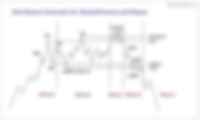
The next pattern is the Distribution Pattern. This pattern is as complex as the previous one but it is just as simple when you break it down step by step. Usually, Phase A begins at the tail end of Phase E of the previous pattern. The first peak is the Preliminary Supply (PSY). Here, some retail traders start to sell. This PSY point is marked by relatively low selling volume. Around this time inexperienced investors start to come in and this causes the buying climax (BC) shortly after. This is where the institutions starting to sell their assets to the new comers which results in the Automatic Reaction (AR).
Phase B starts of with the Secondary Test (ST) which is usually below the BC. Here the institutions are gradually selling off their assets to new and existing retail investors. As with Phase B of the previous pattern, institutions will occasionally push up the price to keep retail interest and confidence high while they secretly sell.
In Phase C we see the Uptrust after Distribution (UTAD). This is supposed to bring as many retail investors into the market as possible through the FOMO Causes. Institutions start to aggressively sell to these investors causing the price to fall. This price collapse continues into Phase D. Phase E then goes into Phase A of the next accumulation cycle.

Conclusion
In my opinion we could see these cycles play out over the past year. Back in May when everything crashed we could see the beginning of the Accumulation Phase. And recently we are probably seeing the Distribution Phase which brought a lot of Retail Investors back into Crypto. The real question now is: Will we see the next cycle soon? With regulators around the world making it possible for big institutions to accumulate BTC it could be a possibility that we soon will see another Accumulation Phase which would drop BTC again. In this phase it will be very important not to be paralyzed by the institutions but to buy more in and use the manipulation to our advantage. Like we saw in this article this phase will follow by the distribution phase and this will shoot up BTC to next price level.
What do you think? Are we about to see the next phase in the Wyckoff Cycle or is this just a regular Bull-Run?
Published by ga38jem on
Publish0x|LeoFinance|Steemit|read.cash
On 7th November 2021
Sources:
https://school.stockcharts.com/doku.php?id=market_analysis%3Athe_wyckoff_method
https://academy.binance.com/en/articles/the-wyckoff-method-explained
https://stockcharts.com/articles/wyckoff/2018/01/reaccumulation-review.html
I talked about market manipulation a few days ago in some other platform. This is so true in crypto. Your writing and graphs will help many to understand it and invest wisely.