Cardano was the very first cryptocurrency that I had FOMO'd into based purely on its logo. Sure, I'd read plenty of articles and listened to podcast after podcast in an attempt to understand what I'd just spent my money on after I'd spent it. But my design-y sense just seemed to tingle every time I looked at this logo, so I knew there was something more happening here than an echo chamber of crypto buzzwords. While I do not suggest using the 'Judge-A-Book-By-Its-Cover' investment strategy, I do think it's important to break down the brand and understand how and why Cardano gained my trust.

I don't want to linger on this as I've analyzed several crypto brands that utilize blue, including Luna Yield, and I'm running out of ways to repeat this information. Blue is universally associated with calm and relaxation, likely due to our natural associations with water and sky. Brands that make use of blue take advantage of this serenity to portray a trustworthy identity. If you are relaxed when making an important decision then you will make that decision in a well thought-out manner.
There is a secondary color, a pink hue, that appears only on the Cardano website which I will discuss alongside the web design.
Type
Cardano is using a sans serif font which makes it look and feel modern. Observe how the 'O' appears like a bloated square. It gives this round letter the illusion of stability.
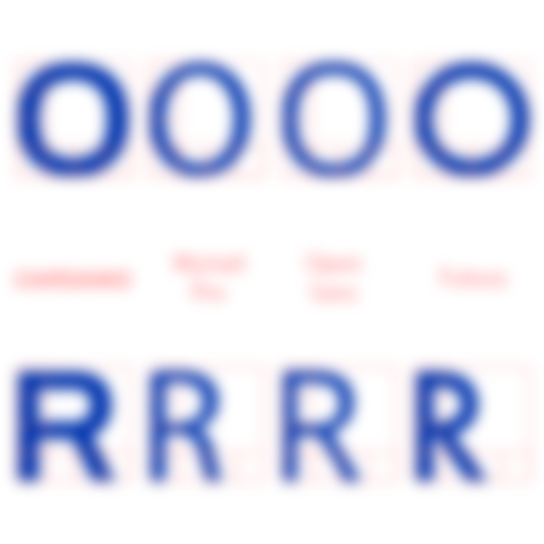

Another illusion occurs in the 'R'. The bowl and counter are stretched horizontally making it feel short, stable. I use the word 'illusion' because in spite of these letter forms being taller than they are wide, they feel short. It's extremely subtle, but very effective and it communicates the brand's desire to stay in the industry.
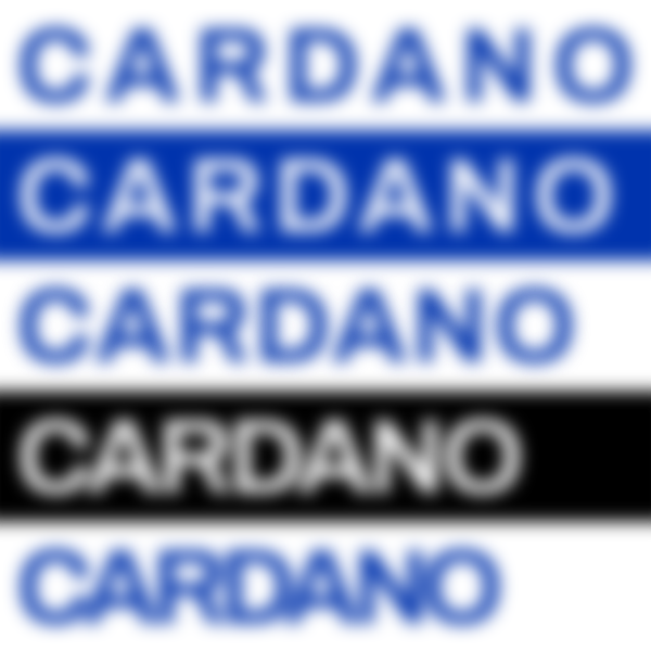
Using all capital letters is a way of displaying strength and is yet another cornerstone in the foundational staying power of the Cardano brand. Capital letters grab attention like a shout, but are generally much more difficult to read and can be hard on the eyes, like shouting is to the ears.
This is where kerning comes into play, that is adjusting the space between the letters. Wide kerning allows for breathing room between the letters and, when done correctly, can emanate an aura of relaxation. This is also a subtle way of reinforcing Cardano's stable presence by taking up space. Look at some altered forms and judge how you feel with each one.
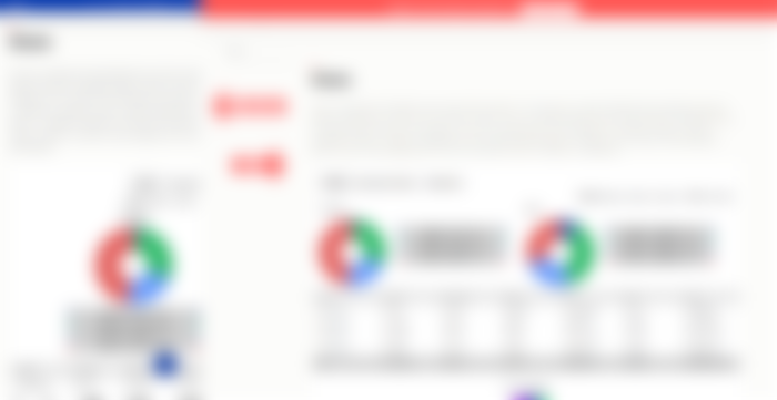
This website is gorgeous! Cardano greets us with their on-brand, dominant blue but adds a pastel peach or salmon tone. This red hue isn't included with their official brand assets, but that's okay. Although this color appears out of thin air, it stays consistent throughout the web design. It is an exciting addition to the brand, and they use it to that effect. Areas of interest, sub titles, illustrations, and quotes are all colored with this high frequency, energetic hue and it makes for a wonderfully balanced experience.
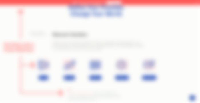
There are a few graphics that incorporate an Instagram-style sunset gradient which, in my opinion, diverge from the brand. While I absolutely adore the vibrancy of vaporwave sunsets, it is a trendy design fad and in some cases it can feel a lot like the man behind the curtain distracting me from what he's really doing.

I have an issue with the thin type weight used for the sub-navigation. The text is very light and it becomes difficult to read. I would like to see a heavier typeweight here. I see no reason why this can't be changed to match the main nav at the top.
Aside from these small, minor, personal issues the Cardano web site and experience adhere supremely well to the brand.
Concept


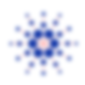
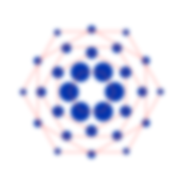
The most noticeable elements of the Cardano star burst are simplicity, symmetry, and repetition. The application of these elements are important components when designing a memorable logo for the long term. If a child can replicate the logo then the brand is off to a great start.
Repetition etches events, catch phrases, and locations onto our memory like a chisel to stone. It's the reason for commercials repeating phone numbers, why songs replay in our heads, and the basis to forming good and bad habits. How many times did you have to repeat your 24 word seed phrase before you memorized it?
Mandalic symmetry isa visual way of communicating balance, order, and harmony – concepts that strengthen the stability of the Cardano brand, not just in the crypto industry but in our minds as well. Symmetry combined with leading lines - the imaginary lines that the brain automatically connects - draws the eye to the center of this explosion. And who do you suppose is the central catalyst for this excitement? The brand is.
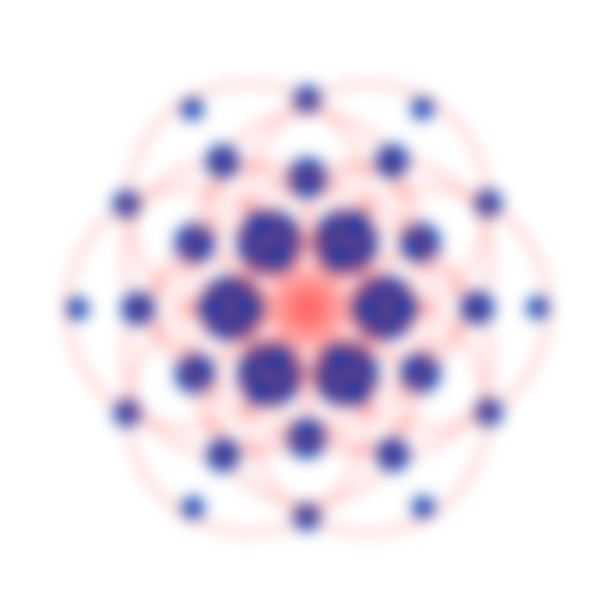
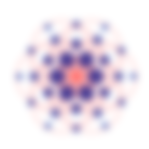
The hexagonal arrangement of the star burst is a symbol of efficiency. We all know that honey bees use hexagons to make efficient use of space, as do cellular companies when planning a region's cell tower placements. It maximizes the space within a boundary while minimizing the perimeter needed to make that boundary
It is also the closest we can get to a circle without sacrificing stability and torque, as seen with hex nuts and pipe joints.

And we mustn't ignore the importance of the name Cardano. It is in no way accidental nor trivial that Cardano has assumed the names of mathematician Geralomo Cardano and the first computer programmer Ada Lovelace. Even the Cardano roadmap has been divided into eras named for historical figures who continue to influence our society: Lord Byron, Percy Shelley, Joseph Goguen, Matsuo Basho, and Voltaire. Although this wasn't a deciding factor in my decision, it's an indication of the impression Cardano wants their brand identity to make: Influential.

Cardano has undoubtedly spent a lot of time and energy to ensure their brand will be noticed, and stay noticed, within an industry where everyone is trying to be the “the first” to solve a problem or improve a solution. The design choices feel thought out and intentional. In my opinion, this is a brand that has the potential to become the Pepsi Cola of crypto. Is that good or bad? You decide, because either way Cardano is here and we know the name!
As usual, these concepts are subjective and just because I proclaim myself to be a professional designer doesn't mean these observations are infallible. The beauty of design is seeing it through the eyes of our neighbors! This is the way.
-fizzlstout