I was genuinely surprised to find Ethereum had a branding guide. I had assumed all blockchain developers were satisfied with using WIN95 era icons, but Ethereum is taking its brand identity seriously. If you're unfamiliar with a brand guide, it's a document (usually a handful of pages) that explains the reasons for using fonts, colors, shapes, or any other important symbolism. It also provides specific rules and guidelines on how to use and display a company's identity. Every major corporation has one of these important documents, so let's open up Ethereum's brand.
Colors
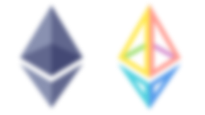
Ethereum's main icon is a gray octahedron. Gray is typically not very exciting, nor bold, nor adventurous, a design decision that almost every altcoin intentionally avoids. It is, however, a very patient and intelligent color, and because it is situated between black and white we perceive a sense of neutrality and balance. To drive this point even further the brand guide requires that the transparent version of the logo be placed on white or a light gray background. Alternate black-and-white versions were made but only for special circumstances.


There is one more color to consider in the Ethereum brand and it is light brown. I'm going to refer to this color as bronze, you'll see why. This color is used in the “Powered by Ethereum” affiliation logo, and is reserved for technologies that rely heavily on Ethereum. Brown (and bronze) is a color of earth, and therefore brings to mind simplicity, stability, and practicality. Bronze is a mix of copper and tin. It was a major innovation in mankind's development, that we named an entire age after it. So it shouldn't be too difficult to understand the color choice here: it says foundation, growth, and maturity. Ethereum wants its affiliates to view themselves as the “bronze age” tools that will carry humankind into a futuristic age.
Now, I do want to point out that Ethereum's website has two more color versions listed under "brand" assets that aren't laid out in it's 2015 branding guide, but they are likely for special events and collaborations.
Type
Roboto is the chosen typeface, “selected to be open, legible, smart, and professional”. Roboto is a favorite go-to font for web and UX/UI design for precisely those reasons. Rounded letter forms are always inviting and friendly. Just ask your social extrovert friend for a handwriting sample, it's probably extremely rounded and bubbly. Thin letter forms are light enough to be blown away and generally make us think of “air”, which symbolically represents intelligence.
Usually, a serif indicates professionalism but it also exudes a serious, no-nonsense attitude like a rich grandparent that won't let you jump on their antique Victorian sofa. Serifs call to mind centralized institutions, so the decision to combine a modern sans-serif with a light typeweight serves as an excellent solution for communicating professionalism and openness.


The decision to use lower case shifts our attention away from the text to the much more important icon. The wide kerning does create a sense of taking up a lot of space but the farther spaced the letters become the slower we read. Both of these choices, however trivial they may seem, reduce the importance of the name. When we think of Ethereum we're meant to recall the icon
Additional Concepts
There's another dynamic element I want to talk about which stays uniform among almost all of Ethereum's brands, and that is separation. The separating space at the center of Ethereum's implied 3D form forces us to contemplate the movement that is happening; it is both separation and assembly. It happens again in the logos for Solidity, Swarm, and Whisper; opening and closing; separating and re-joining; building and deconstructing. It reinforces the message to build with Ethereum. I use "almost" because the Vyper icon missed this important concept.


Lastly, I want to share the symbolism of the octahedron because although minor, I genuinely believe it was chosen for a purpose. The octahedron is associated with the element of air, and air is associated with logic, thought, and communication. Our words flow through the air, our thoughts exist in æther, knowledge is received from "nothing"; I think this concept helps reinforce the brand's intelligence.
So, that was a lot! And I still didn't get to talk about all I wanted to, but I think the point has been made. Some serious thought went into Ethereum's identity, and we just may have invested because of it.
-fizzlstout
Nice article! Ethereum was one of my subjects this week as well!