Was Bitcoin's Logo Designed to Make Us Buy?
Believe it or not, there are some very important details etched into Bitcoin's brand that influence how you perceive it. Let's take a look at some of the decisions that went into this design.
Color
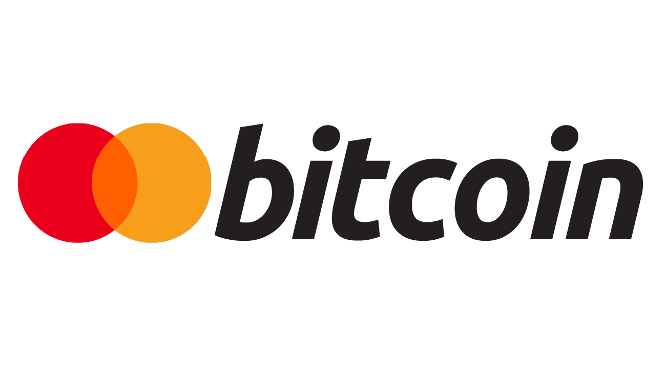
The original concepts of the Bitcoin logo revolved around a gold coin, and the orange emblem in its current design could be interpreted as a gold coin. However, the designer revealed that they had looked to the Mastercard brand for inspiration, and admitted that the power of consumer perception was far more important then their own disdain for the financial giant. So let's take a look at Mastercard real fast.
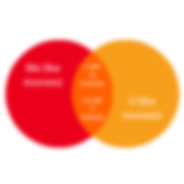
Mastercard's bold red and golden yellow circles demand to be seen. The Mastercard logo seems to make a Venn diagram that says, "We like money, you like money, so let's give each other money". In the world of sales and advertisements red can be a very powerful color to separate you from your money, and yellow very easily communicates a happy and positive experience, so the orange is trying to ease us into a sense of trustworthy buying. "Buy this now! It'll make you happy! Just put it on your Mastercard"! If we stay with this metaphor and look at Bitcoin's emblem, then it would appear that Bitcoin has fully merged its red and yellow circles into a single orange circle of its own trustworthy buying power.

The gray word mark is an important design decision, as well. Black on white, or vice-versa, has the highest possible contrast and is the ideal combination for reading text. On large text like a heading or a title such high contrast selfishly grabs the eye's attention. The decision to use gray reduces the importance of the word and re-focuses attention on the most important part of this logo, the orange emblem.
Type
First, let's analyze the bhat symbol within the coin emblem. The use of a serif almost always says "serious" but using a slab-serif adds weight, staying power, and foundation, as though looking at the cornerstone of a massive idea about to come into existence. A well used serif can make any logo look and feel like a professional institution, but giving the bhat a jaunted tilt attaches an "aloof" and immature personality.


Bitcoin's wordmark uses the Ubuntu font. It is exceptionally crisp and modern, and there is exceptional dynamism in it's presentation. A bold word mark carries a lot of weight and easily cements the brand name in our minds. This choice also coordinates the message of foundational staying power, despite its gray shading. Italicizing creates speed and movement and the effect here is incredibly subtle but powerful. When added to a bold presentation, it tells us that an unstoppable brand is accelerating.
Conclusion
Was Bitcoin's design influential in its meteoric rise? The answer is (and always will be) subjective. There will always be the paradoxical chicken-or-egg question when it comes to design and consumer demand because one always creates the other. But with 10+ years of brand identity, the argument can most assuredly be made that all good design has a much greater (and sometimes imperceptible and un-quantifiable) influence on all of us.
There are so many alt coins, each with their own designs and brands. I plan to geek out over the designs of several of them, so stay tuned!
-fizzlstout