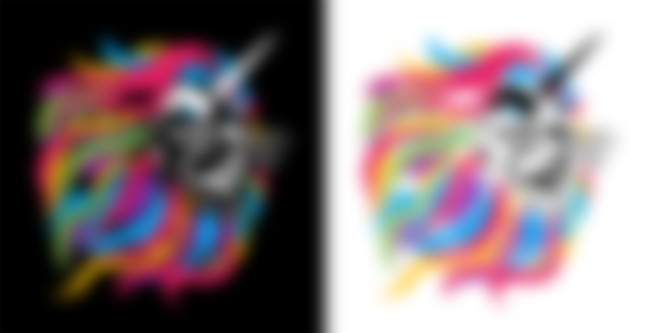
The “leonicorn” of Leonicorn Swap is really an awesome graphic! His colorful mane draws a lot of attention and his horn is a peculiar if acceptable addition. They just may have invented a new cryptoid. But with all of this eye-catching detail, how is Leonicorn Swap communicating their brand identity to us? What does it say? Let's see if Leonicorn Swap can be King of the Decentralized Jungle.
Color
Multi-colored logos always communicate a message of diversity because colors have universal, cultural, and personal associations. The colors of the leonicorn's mane have been saturated making his locks vivid and exciting. The details of his face recreate the monster light effect from old Hollywood horror. Although it's cool it only works one way, as switching to black-on-white doesn't have quite the same effect. Not having a version that suits a white background seems short-sighted.
Type
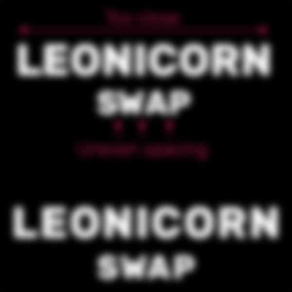

This is a very heavy type weight, and its intent is to sit like a monolithic foundation in our minds. Observe the size of the word “swap” compared to “leonicorn”. They want to be known by their full name, but the name and visage of this new cryptoid carries more importance than their swap protocol. It's a short and simple message, communicated succinctly.
I'm a perfectionist and I need to point out the poorly kerned space. It is a small, yet important detail.
Web/UI/UX
The Leonicorn Swap website uses the very familiar dark mode common among DEXs. Note the absence of the rainbow on the website. For as colorful as the icon is, there is a marked lack of diverse color on the website. Magenta is the predominant color and there exist several missed opportunities to reflect the same range of colors observed in the mane, most notably in the allocation pie chart.


There are a few elements that feel a little forced, as well. Namely the glowing frames that surround the team member's portraits. This design, however suitable to the gestalt of the website, has no anchor to anything else within the brand identity. The frames are the only elements designed with a glow, which means they are there to grab our attention. And attention they do get, because the portraits have the exact same cell shaded art style seen with GTA: Vice City.


This is the most exciting part of the website. This is where they want our attention, not on the white paper or road map, but on their team members.
There are a few minor issues with oddly placed containers and grouped buttons that don't share hover states, nevertheless, as a functional and responsive website the design is good enough.
Concept
Using an animal icon allows the Leonicorn Swap brand to absorb the symbolism that comes with this animal. We all know the lion to be king, and the mane his symbolic crown. This representation spans the annals of mankind. From ancient oral traditions to religious texts to modern fiction, the lion is a benevolent and authoritative ruler often wielding a “magic” or “power” in one form or another.
Pay attention to the perspective we've been given. We are forced to see this lion from a low position. We have to look up at him reinforcing his kingly authority. His reign doesn't appear very benevolent, either. Instead, he snarls aggressively and looks ready to fend off a threat.
The unicorn is represented by the horn, but the lion isn't taking on the characteristics of the peaceful unicorn. Instead, the horn appears to have been planted atop his forehead like a trophy. It's interesting to observe immense detail in the lion's facial features, yet a distinct lack of detail in the horn. Instead of a spiraled or ridged horn we see an elongated cone that feels two-dimensional or “cut-and-paste”. The statement here is one of ambition, “The unicorns are dead. Long live Leonicorn”!


The leonicorn imagery is abundantly imaginative and surreal. It unequivocally works as a rock band t-shirt or a wall poster, but not as a logo. For me this signals a failure of foresight and forethought. They desperately need an alternate version for their $LEO token because the facial details are lost when shrunk and they must have a version that works on a white background. Until that happens, the only “concept” I can intuit right now is a mission to entice as many as possible with bright, candy graphics.
Bear in mind that these perceptions are subjective, though. SushiSwap had a less than appealing logo when they launched in September 2020, and they are now a familiar brand name. Perhaps with time, Leonicorn Swap can accomplish the same.
-fizzlstout