Tezos Made A Huge Decision and It Will Change the Crypto Landscape
Tezos recently announced that Huge has brought their branding and marketing expertise to the platform. Huge, Inc. has major names like Spotify, Verizon, Nike, and so many more under their belt. This means Tezos is taking off the gloves so let's look at Tezos' current identity before they start making too many changes.
Color
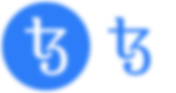

Tezos is using a sky blue hue and everybody knows blue to be tranquil and relaxing, but desaturating it adds a light and airy quality to the icon; a quality that strengthens when viewing the white-on-blue version. This is a meditative color and as such communicates a calm and intelligent approach in problem-solving which, in turn, translates to trustworthiness and reliability.
I didn't know Tezos had added purple to their brand identity until I visited their web site. Since the color is only present on web, I'll discuss it while dissecting the site.
Web Design
With Huge, Inc. managing Tezos' brand and the website being one of the first points of contact, it must make a good impression.


Gradients are a very popular design trend especially in web and UX/UI design. They are extremely useful in drawing attention to clickables or directing the eye around a page. Tezos is using a soft blue-purple gradient in their background and various elements throughout, and I think it was applied well.
Purple is a color of luxury, nobility, and wealth and when combined with patient and reliable blue we can discern a feeling of trustworthy governance. This gradient is smooth and easy, and it helps to reinforce the idea of hassel-free transitions with Tezos' regular protocol upgrades and "ever-evolving technological vision". The gradient here is well executed and makes for a very pleasant introduction.


There were a handful of elements in their web design which I thought didn't 100% tie into the gestalt of the main page. But since they're undergoing transformation, we'll wait until they're finished to pick it apart.
Text

I am fascinated with the "tz" glyph. I think this is a wonderful way to set themselves apart from other platforms. Although they use a serious serif, they chose to combine the two letter forms into a single abstract image that also says "playful". But there's another message here, so listen up.
Any individual who is familiar with western letterforms will easily recognize these as the letters T and Z, but if they don't then this becomes an indecipherable glyph. There is also a sense of exclusivity in this glyph, like being in-the-know, because you "recognize" the glyph. This is a point I am intimately familiar with. As a typographer and calligrapher I regularly find myself hypnotized by beautiful foreign calligraphy that I can't understand, and it definitely leaves me feeling like I missed a concept. What a clever implementation of cryptography within the icon! In my opinion, this is one of the better logos in the industry.
Ultimately, I'm very excited to see how "Huge" Tezos will become with the marketing giant in its corner. This is a clear indication that Tezos is seriously investing in itself and this could just be the kind of power move that gives them a stable foundation and a "taproot" in the industry.
-fizzlstout