Given the recent sudden rise of Solana I poked my head in on their website and, lo and behold, their web design changed! Considering the awkward format and voice of my first Solana article, I thought now might be a good time to revisit the brand. Let's investigate how the Solana cultists awakened this Old God.
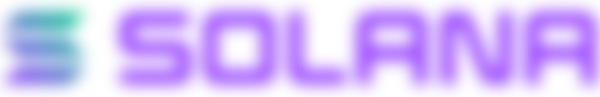
Color
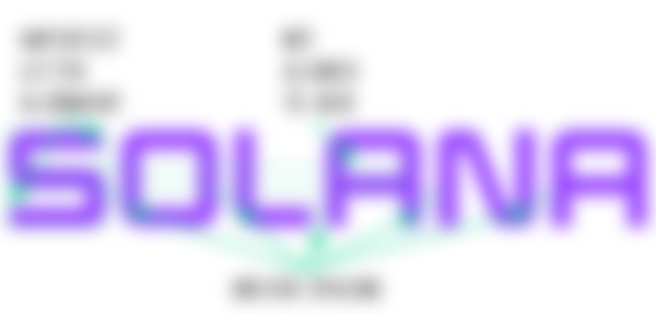
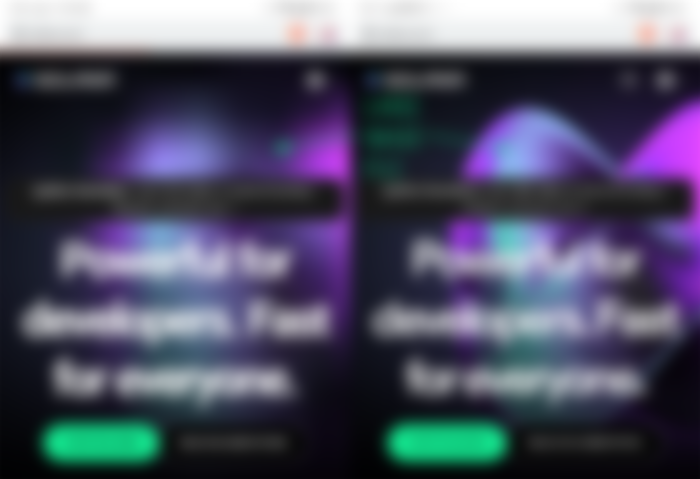
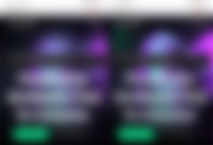
Previously, I had declared these colors to be magenta and spring green. It appears Solana tightened up their brand colors, however. While the refreshing green still holds true, the magenta color has disappeared making way for a much softer lavender hue. These low frequency pastels are tremendously soft and the gradient contributes a soothing 'creaminess', but they can also feel cold, distant, and depressing.
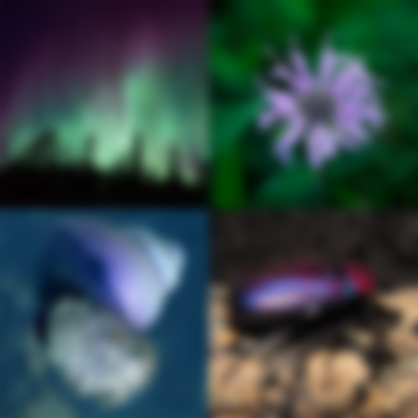

Although green and purple can be found together in nature, the combination of the two cultivates an otherworldly experience, especially among the weird biology and natural phenomena found on Earth.
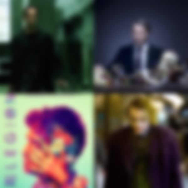
I can easily run down the list of emotions each individual color evokes – purple: royal and mysterious, green: health and wealth - but the actual psychological effect of this union is greater than the sum of its parts. The best examples of this can be found in film. The Matrix made heavy use of the color green to convey a sick world, and in the series Hannibal and Legion the color purple is used in scenes where abnormal and psychotic behaviors are on display. What colors do you associate with The Joker?
This 'Lovecraftian' gradient is clearly cosmic, and I believe it to conveys an all-encompassing, galactic presence. Keep this in mind.
Type
Solana uses a cubist typeface, the letter forms of which adhere to a grid. Utilizing a geometric grid creates uniformity among the letters and exhibits the structured accuracy of the Solana brand. Except the Solana wordmark doesn't fully comply to a grid, an imperfection that adds a humanistic component.
Block letter forms almost universally say 'technology' and they mimic the glyphs of 80's- and 90's-era liquid crystal displays and digital electronics, two defining periods in the advancements of technology and communication. When block letters adopt rounded corners they become streamlined and efficient, an effect that 'futurizes' the Solana brand.
Web/UI/UX
Solana's web site has had a major overhaul since I last looked in on them. The design still keeps to the dark mode standard, but the experience has migrated from a 'retro arcade' aura to a more serious and innovative attitude. Electric magenta makes a return cameo as a secondary color used for a handful of graphical elements.
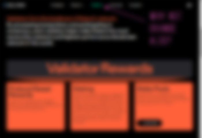
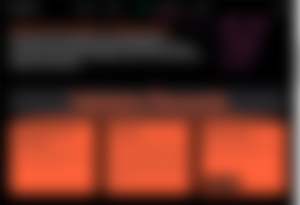
A light orange hue is debuted on the Validators page, a choice I find to be a little off brand. Although it is a vibrant, eye-catching tone Solana could have easily used their signature mint, re-used magenta, or even extracted a blue from within the gradient to call attention here. This may be an indication of future products or services, though. In which case we may just need to wait and see how Solana utilizes these colors to differentiate those products.
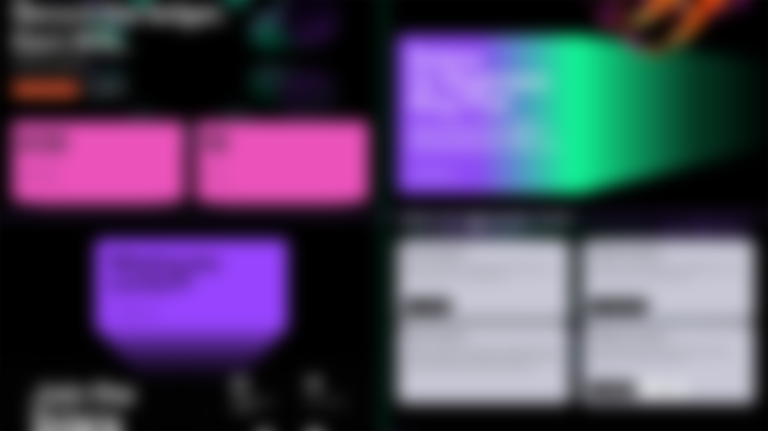

Perusing, the design immediately gives way to some inconsistencies. The information cards appear to have been abruptly truncated, but this confusing design is obviously meant to be a three-dimensional pop-out. Across the website these cards have varied angles and random depths without a vanishing point to anchor or unify them. This 3D effect is applied to some boxes and not others, and is arbitrarily assigned to a title text, yet no other title or subtitle adopts it. Thus, it looks and feels disorganized.
The website is responsive but it's plain as Sol this is not a mobile first design. All of my mobile devices required almost 40 seconds to load massive animations, and another 20-30 seconds before the mobile nav would respond to touch. That delayed response resulted in navigating away from the landing page before I was ready – a frustrating occurrence for anyone. With 'futurism' being a half-recurring theme I expected a mobile first approach, especially during a mobile first era.
Overall, the Solana website holds to the brand, but just barely. There are several design elements that appear somewhat 'cheap' or lazy, and I think Ian Malcolm said it best when he said, “...[they] were so preoccupied with whether or not they could, they didn't stop to think if they should.”
Concept
Solana's alternating parallelograms have a kinetic dynamism. Their proximity to each other creates an accordion-like expansion or compression, an activity which undoubtedly communicates scalability. However, using an altered letter form as an emblem generates conflict when paired with a wordmark that looks different from the emblem, particularly when using the horizontal lock-up.
The word “Solana” has multiple definitions but the common denominator among them is “Sol”, the Sun. Note the lack of warm and exciting reds and yellows. It's this contradiction - the absence of natural sunny colors in a word that means “Sun” - which forms the basis of my opinion that the brand is 'alien'. Disconnecting the colors and the word leaves a gap for the imagination to fill and my experiences with design have filled that gap with an awakening Old God – alien, galactic, all-encompassing, omnipresent.
If it seems like my observations are randomly plucked from the sky, that's because they are. I don't perceive a single, cohesive concept here. Solana makes use of many different design effects which, individually, are capable of communicating their ideas and concepts appropriately: colors that typically convey luxury, a soft gradient to soothe, a futuristic font for technology, and flashy animations just because. When we pay attention to the gestalt of the whole brand, these designs come together to create an entirely different 'movie'; something greater than the sum of its parts.
As of now, it's my opinion that Solana is associating its brand with a retro sci-fi, cosmic horror, alien future, but I believe this may be accidental. If this is intentional, then they just need a little more grace in bridging these ideas together.
Well, that's all for this one. Bear in mind that I approach the analyses of crypto logos from a traditional design background. With a world altering industry such as blockchain and crypto comes alterations to a plethora of traditional playbooks, and what was once unacceptable just might become a new normal. This is the way.
-fizzlstout