While doing some personal research on Monero, I came across an interesting sticker they sell on their website and curiosity had me the designer in me wondering if their brand identity says the same. Let's look.

Color
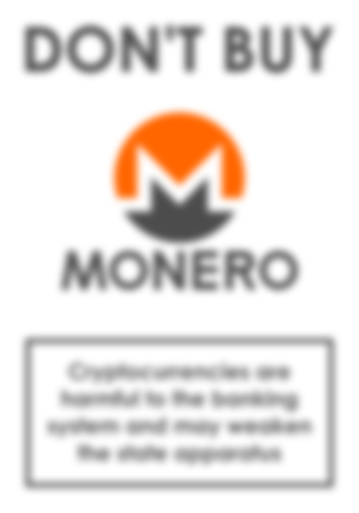
Monero's primary color is a bright orange. Orange combines the stimulating energy of red and the socializing cheerfulness of yellow into an uplifting optimism. In the worlds of finance, marketing, and advertising, orange becomes a color of trustworthiness and this is Monero's primary message.
Generally speaking, white and gray are “free” colors when designing a brand but the manner in which they are used in Monero's logo is important, so I will discuss these color representations while dissecting the concept.
Type
Monero uses something akin to Century Gothic, which I find a little amusing. Gothic typefaces were named such because they marked a movement away from the standard roman serif type, an analogy inspired by the Goths' direct opposition to Roman mistreatment and mistrust; literal "barbarians" at the gate. The decision to use a dark gray word mark – instead of the much higher contrast black - diminishes the importance of the name, but using all caps and a bold type weight creates importance. This "here-but-not-here" combination may seem paradoxical, however this is how Monero boasts their ability to “hide in plain sight”. Monero is communicating a massive, yet untouchable presence that stands in direct opposition to traditional fiat.


Concept
The white stroke through the emblem clearly implies the letter "M". White reflects every color of the spectrum thereby representing purity, integrity, and unobstructed clarity, so having this element run from one side to the other is designed by intention.
Gray is the in between and can be likened to a “diplomant”, or an unbiased party, to black and white. It's placement at the bottom is intentional as this gives the icon weight, like strong, dependable foundation stones.
It's the symmetry, however, that ties the concept together. Diagonals always lend movement to a design and movement, in turn, activates the imagination. The symmetrical design means we don't perceive a start- or end-point to the white stroke. So our imaginations can perceive this central point almost as a “handshake”; two open ended points that connect via trusted, unbiased means to participate in an unobstructed and dependable transaction.


Monero has an interesting design, and I think it is conceptually sound. It communicates their message successfully and with seven years of brand recognition under their belt already, it could be disastrous to make any major changes to their identity. Under normal circumstances, I would question the longevity of the design as I cannot see it being relevant in ten more years. But the fact is we now live in a world in which currencies are represented by more than just an ASCII symbol, they get full-color icons and emblems. This is a new design arena and anything goes while us designers learn how to speak to all you crypto consumers!
-fizzlstout