The Uniswap logo was a riddle to me when I first saw it. The pink unicorn is so adorable and she reminds me of the original My Little Pony dolls released in the 1980's. But aside from the pleasant alliteration the “uni-” prefix provides, I had a very difficult time trying to understand how this unicorn fits within the crypto arena. Let's see if Uniswap's brand is magic.
Color


Uniswap is using a soft, lovely pink. For western culture pink is generally seen as feminine but across the globe it is agreed that pink has a very powerful effect, especially on prisoners. The euphemism “to see through rose-colored glasses” suggests a certain naiveté about reality, thus pink becomes a color of innocence and childhood.
Pink is also the color of a new romance and a mother's soothing, unconditional love; and we assume a calm and friendly attitude from a rosy-cheeked individual, so pink carries both feelings of excitement and tranquility. In this case, pink is being used to express an inclusive environment.
Type
This one threw me off. Uniswap's wordmark is a serif which is a very serious typeface. This is the font used for traditional law practices or financial institutions, but casting it in bubblegum says, “Our CEO really loves pink”. And using all capital letters makes this name – and the pink color - very important. The whimsicality of the pink and the solemnity of the serif make for an almost comical contradiction – meme-like, even – and I had to consider the possibility that the decision was made to intentionally troll the financial sector.

However, it feels disconnected; like trying to bridge two ideas by haphazardly slapping together random bits that are “good enough”, which is essentially what a meme is. I'm not convinced using a serif is the best choice, and it seems the web/UI design folks weren't convinced either.
Web/UI/UX
The Uniswap logo mark here is black, and they have swapped out the annoying pink serif for a more sensible sans-serif. In my honest opinion, this is the typeface that should replace the official wordmark.
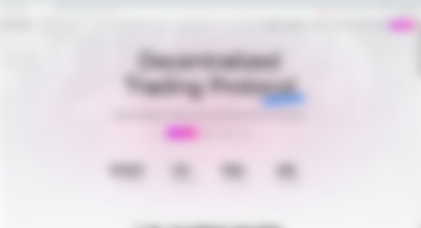
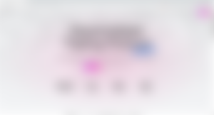
For the most part the web site stays cohesive between pages, and the app is fairly uniform in its presentation. The analytics page suddenly adopts a dark mode entirely different from the rest of the pages. This has become a standard within apps in general, but it is especially prolific with dapps, and it has a fascinating psychological effect. A UI/UX with glowing neon elements over dark ground presents itself more as a game, than as important financial data. Consider the demographic being targeted; a massive majority will have grown up during the early days of computing and video games. From the archaic Commodore 64 to the instantly gratifying Playstation 5 we've had almost 50 years to perfect digital visual stimulation, therefore presenting market data in a “gamified” way seems to be the natural progression, although it can also be argued that it misrepresents the sometimes sobering risks involved.
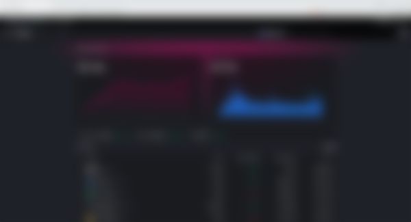
Dark mode can be toggled on for the rest of the website – an excellent decision since too much pink actually negates its own initial calming effect – but doing so removes the brand's signature pink from just about everywhere, and that can become a problem. It's a very simple and easy-to-use web design and interface, but it can always be improved.
Concept
In making use of an animal logo Uniswap embodies the totemic representations that come with the unicorn, being mainly uniqueness, unification, and universality. The sparkles and swirls are an attempt at giving her a personality - and they do succeed - but these details are so small that they get lost when the icon shrinks. As a result, Uniswap is forced to remove those fine details and use an alternate version for their $UNI token. Notice the lifelessness in the token compared to the logo icon.
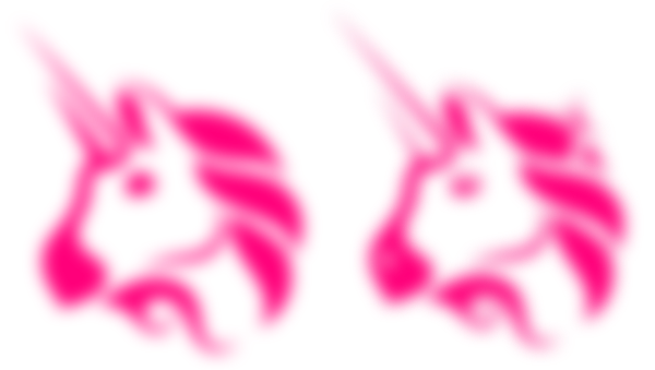
If we take the logo out of context, the cartoon style and color choice appears to be aimed at the 10-22 year-old female demographic. This is a logo we would expect to see on a line of toys or baby products. When we put it back into the context of cryptocurrency, the inclusiveness of the pink and the universality of the unicorn combine to communicate an ease-of-use and a low barrier to entry.
Uniswap has taken a very unique approach to their brand identity, one that distinguishes them from the flashy design trends prevalent among their competitors. Rather than enrapturing us with vibrating gradients and flashy neon elements they have chosen to welcome us with a friendly mascot and I believe this gives Uniswap's brand staying power and, despite my personal reservations on the serif, the potential to become a recognizable household name.
-fizzlstout