Aeternity is a blockchain platform which I know nothing about. But if you've read any of my previous brand analyses then you know that I approach this industry from the perspective of a brand strategist, and I see some serious focus emanating off of the Aeternity brand. They have a full-fledged, professional brand guide. If you are unfamiliar with a brand guide, it is an incredibly important document that outlines in very specific detail appropriate use of the brand logo and colors, and even inappropriate use of the brand identity. Every big name brand has one: Coca-Cola, Bank of America, McDonald's, British Petroleum, Twitter. Name a big corporation, they have a brand guide. The rarity of the brand guide in the cryptoverse is such that my attention is drawn to any organization that possesses one of these documents. So let's see if Aeternity has the chops to be Alpha and Omega.


Color
Aeternity's two primary colors are rose pink and dark purple, and the brand guide provides a single adjective to explain the use of each: dramatic and exciting.

This shade of pink is more than dramatic. It grabs attention thanks to its proximity to red, and the level of saturation gives it an exciting 'buzz'.

It is very close in appearance to process magenta – a printing ink devoid of all green. Magenta is equal parts red and blue, bearing a healthy balance between excitement and calm; outrageous and innovative; emotion and logic; hot and cold; high and low frequencies. This union of equal parts inspires teamwork, compassion, support, and tolerance.
Purple is a color of mystery and imagination, likely due to it's rarity within nature. Because it is so rare only the wealthy could afford purple pigments, a reality that lasted long enough for purple to become a color of modern day of royalty. Purple carries the same insouciance of the luxuriously wealthy and, just like the tantrums of the rich and spoiled, it can be overly dramatic.
Purple normally isn't associated with excitement, being composed of blue more than red. It is also very dark, a characteristic that subdues any excitement.
I think Aeternity's use of these two colors is appropriate to the brand, but pink should be the exciting color and purple should be dramatic. Either way, each color has an inherent spirituality. Magenta and purple aren't on the visible light spectrum, meaning that they only exist as a combination of red and blue wavelengths mixed together by our brains. These are colors of creativity and innovation.
Type
Aeternity makes full use of the Roboto typeface. It possesses a fairly generous x-height – that middle part where most lowercase letters sit – allowing for easy legibility. A wordmark using all lowercase letters exhibits a child-like innovation when used appropriately, but can also come across as childish. In the case for Aeternity the use of Roboto Bold lends more than enough weight to mature the name, yet it appears to strip Aeternity of that starry-eyed wonderment. These thick letterforms feel like crude bludgeons, in my opinion, and I question why Roboto Light or Regular wasn't used instead. Lighter type weights communicate intelligence and fall more in line with the ideas of innovation and creativity.


The Aeternity brand guide requires that a different logo be used when displayed at 15 pixels or smaller. Naturally, I went beyond this point. The smaller the pixel size the more difficult it becomes to read any word, but Aeternity's bold weight and large x-height smoosh the letters together and almost change the brand name to “ætemity”.

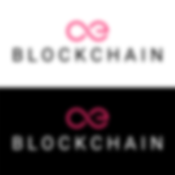
Aeternity uses the slogan “BLOCKCHAIN” to describe what they do. But notice the slogan is very small, thin, and unimportant. These capital letters, unfortunately, feel like trying to shout with laryngitis. Using lowercase for one word and uppercase for another - not to mention the different type weights - creates imbalance in this wordmark.


Nike's logo evolved by dropping the company name and using just the slogan and brandmark. Observe the way your perception of the Aeternity logo changes when their slogan is treated in a similar fashion. The frail and uncertain slogan now becomes a forceful reminder of the "One True Blockchain".

I'm of the opinion that the wordmark could use some reworking, if only to incorporate the same sense of balance seen in the brandmark.
Web/UI/UX
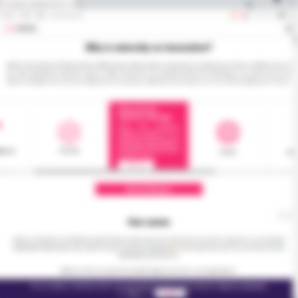
Aeternity's web design conforms to their brand guide religiously. Colors are used appropriately for exciting calls-to-action and dramatic backgrounds. The graphics and layout are minimal and efficient.
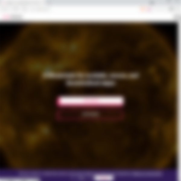
I am not a fan of the large flashing animation on the landing page, though. It's composed of multiple cut scenes with random space phenomena, generic glitch effects, and time lapsed explosions, but it's presented to us through a dark filter, diminishing the thrilling effects of the visuals. Obviously, this was done to ensure that the title text and calls-to-action have the highest visibility. But if you want your information to be visible, why place such an exciting graphic behind it?
This is a mobile first web design and it responds well to mobile devices. Information cards are displayed in an intuitive swiping slider, but the website is a really long scroll and I think they could have made more use of the slider or distributed some information onto separate pages.
The experience is rather bland. Aeternity uses a lot of white and I believe there were more than a few missed opportunities to embrace the concept of eternity.
Concept


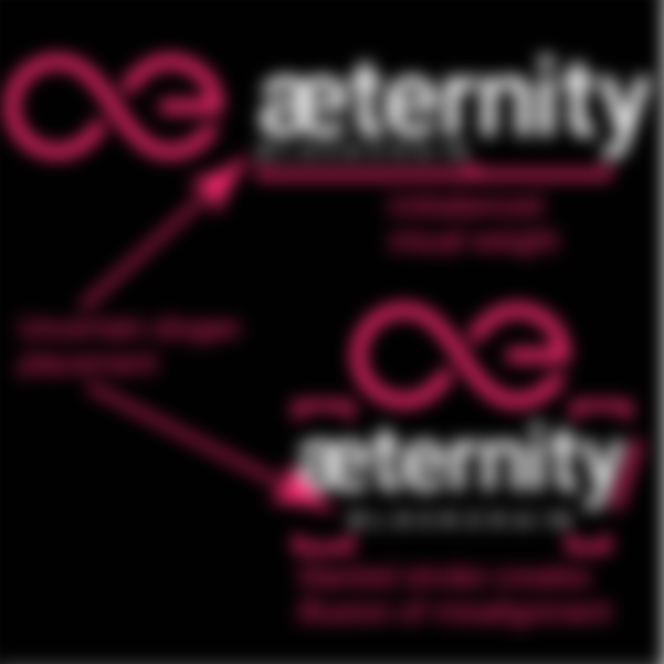
Infinity - the idea and the symbol - pervades the blockchain universe. With the crypto industry touting the persistent presence of this new technology, 'infinity' is an appropriate concept to adopt. The mirror symmetry symbolizes two equal and opposite forces that unite at a common intersection, and the ability to trace this simple icon forever unequivocally communicates "forever".
Using the 'æ' ligature to form infinity is brilliantly creative. In spite of being disconnected, the icon maintains the idea of an infinite loop while managing to align with the unique spelling of eternity.
Needless to say, the name and symbol compliment each other beautifully. The consistent symbolism and color representation truly fortify Aeternity's aspiration to become eternal.
I want to take a moment here to talk about a trend occurring within the crypto sector that bothers me: rocket ships. This industry is rife with talk of “blasting off to the moon” and although a rocket ship is the best way to communicate this, far too many brands are implementing random and generic rockets into their web designs and even their logos. Aeternity actually uses two different rockets on the website, and neither one communicates 'infinity' or 'eternity'. While I understand that space is infinite – and we currently require primitive rockets to get us there – a rocket in itself carries no notion of innovation, creativity, infinity, or eternity. Indeed, it conveys quite the opposite: unimaginative, unoriginal, limited, perishable.
As I continue to examine and analyze the brand identities floating around the crypto space, I am reminded of the excessively over used web design trends of the early 90's and I become ever more wary of the warning signals heralded by the promiscuous rocket. My personal belief is that most brands prominently exhibiting this primitive imagery will disappear from the industry and the remaining few will quickly abandon this trendy fad.
In all, Aeternity has one of the most beautiful logos in the industry. They communicate their intentions well and, despite some minor gestalt fails, I am eager to see how their brand will weather the eventual erosion and consolidation of blockchain platforms.


As usual, these observations are flavored by my lengthy steep in the waters of design. Any organization investing in their brand identity is also investing in us. You may have different opinions on what makes a good or bad logo, and your opinions are the most important. Regardless, designs will have an influential effect on all of us and I encourage you to add that intuition to your diligent research. This is the way.
-fizzlstout