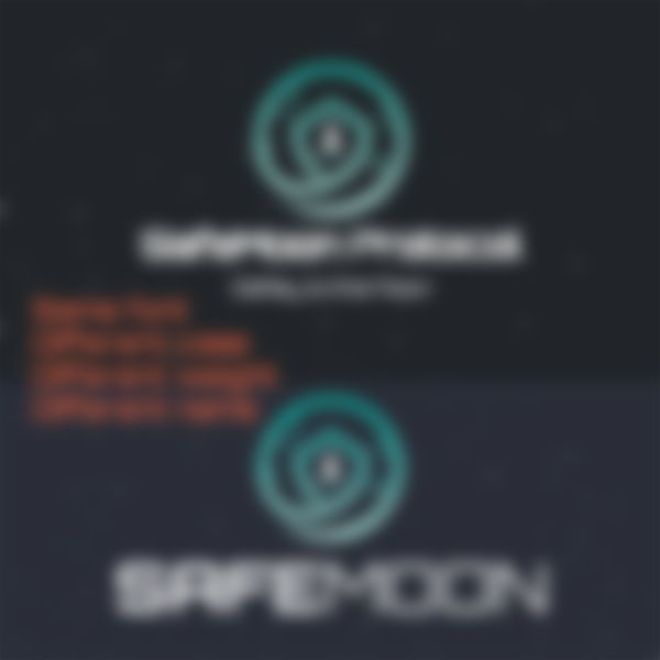
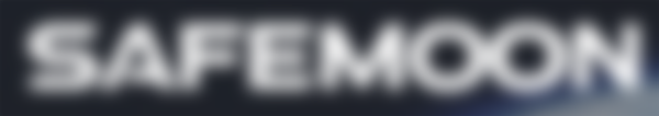
Taking a hard look at the SafeMoon Protocol logo. I personally never familiarized myself with SafeMoon despite hearing the name all around the crypto space. It's name alone was enough to make me re-enact the Drake meme. The combination of two common buzzwords seemed a little shady to me. After all, would you seriously consider placing a bet on a sports team named Best Team, or would you open an account at Money Bags Bank, or entrust your money with brokers at Super Stonks, LLC.? Perhaps, but probably not. Yet so many are investing not just money, but time and energy into this project.
Buckle up for this one. Seriously, this will be a little longer than my usual posts because there's so much vomit in this space suit. It's even in the creases.
Color
Teal is a cool, minty hue that comfortably sits between blue and green, and adopts the best psychologies of both. Blue is the color of life-giving water and crystal clear skies, and so elicits feelings of calm - gently blowing our worries away. Green is the color of fertile, life-sustaining earth and can easily be associated with safety and good health.
Teal, therefore, allows us the privilege of careful consideration in a relaxed and stress-free environment and this, in turn, translates to trust and reliability.
A good start, so far.
Type
Things get really murky here because I find the use of four different sans serif fonts, two of which are exhibited two different ways.
Firstly, a web search reveals a decent looking wordmark flaunting all-caps, with geometric letter forms, and the word 'safe' in bold. If this font – called Orbitron - is their official wordmark, then the idea of this being a safe protocol is what's most important to them. The thin typeweight used for 'moon' lends some delicate intelligence, reinforcing the suggestion of a fragile, yet well planned 'ride' to the moon. The difference in type weight separates the two words, and implies that SafeMoon wants us to consider each word separately; as an adjective that describes a verb. While I couldn't find this typeface within their official brand assets, I did find it used again on their merch page. This time, though, it had a different typeweight and used title case.

Secondly, a font named Atmospheric showcases the SafeMoon brand with wide and squat geometric shapes. Taking up that much horizontal space is like laying a foundation. It's a way for a brand to communicate their staying power, to tell us that they can weather any storm and avoid being toppled. Using all capital letters fortifies their strength like a shout. And the simple act of altering the letter strokes allows for a bit of an 'edgy' personality to come through. This SafeMoon, with its uniformity, is more of a destination, a noun, like the name of a space station.

Thirdly, a font that looks similar to Atmospheric is used for some official stickers that can be purchased from their shop. When I found this all I could see was trollface. I became so frustrated that I stopped trying to analyze the typeface because it felt like a waste of time.
Fourthly, the Google font Montserrat only shows up on mobile. This is more of a UX problem than a typeface issue, and although it's obvious this is being used as a quick fix, I mention it because it does add another layer of confusion to the brand.
I need to mention that there is no official wordmark among their brand assets, just the emblem. In my opinion, SafeMoon is struggling themselves with who they are and how they want to be perceived.
Web/UI/UX
As far as web design and responsiveness are concerned, elements here are fairly straight forward. It's not a very fancy website and there aren't a lot of bells and whistles, but that is okay because the design functions as intended. The experience, however, is extremely muddled.
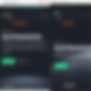
I mentioned the Montserrat typeface being a UX problem because on the PC landing page SafeMoon uses the logo icon as the return link. When we reduce the browser window, or view it on mobile, the icon is swapped with the brand name – an odd redundancy considering 'SAFEMOON' is already clearly visible. It would have been a better decision to keep the icon. In fact, it wasn't a problem on the merch page, so why switch the icon to a wordmark on the home page? From my personal experiences with logo and web design, I would have to guess that the designer failed to account for how small the icon would need to be to fit comfortably on mobile screens. Once they realized they didn't have an asset that worked, the choice to use a Google font was forced upon them.

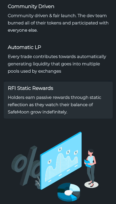
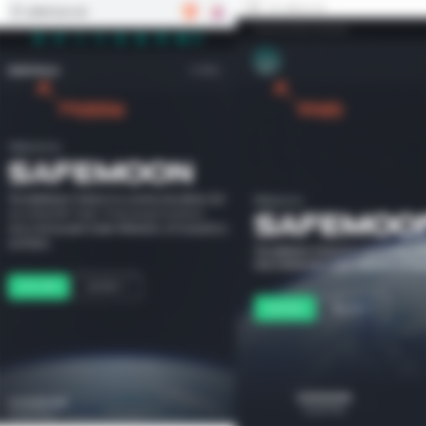
Scrolling further down unveils some simple, minimal illustrations. They are pleasantly animated and they communicate their concepts well, but they don't exactly fit the SafeMoon brand. The web site has images of earth, the moon, and rockets, and even makes use of background star particles, but these illustrations are very generic and almost feel like Microsoft clip art.
Scrolling further still, an orange color suddenly jumps out of nowhere. I scoured this website hoping, praying, wishing that this orange was somewhere else. Maybe a hover state, or a call-to-action? Instead, I found it being used as alert text on the Buy Now page, but no other icons or images make use of this orange color nor is it listed as an official brand color.
There's quite a bit of color inconsistency, as well. The call-to-action 'Live Chart' is closer to green than teal, and is used again on the Products page for the wallet beta signup. Anyone can plainly see this color doesn't match with the on-brand social media icons at the top. Returning to the Buy Now page we also see two buttons designed with off-brand gradients, which are peculiar since the Markets page uses the correct brand color for the 'Start Trading' button.

This interface is purely functional. The brand gets so muddled that their identity struggles to emerge.
Concept
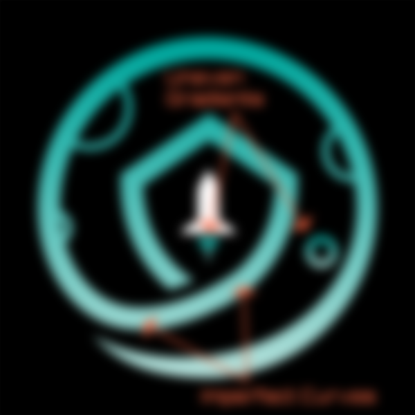
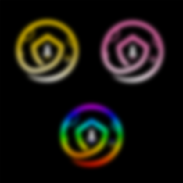
SafeMoon is, unfortunately, absent of a cohesive concept. They have a wonderfully clever logo – a rocket that slingshots around the moon and becomes the keyhole to a locked shield. Visually, it could use some sprucing up as the small details become down-right molecular when reduced to the size of a standard icon. And while I appreciate the attempt to make use of the 'Golden Spiral', my perfectionism really wants the curve of that rocket trail to be made smoother. But beyond the adherence of the name to the logo to each other, their overall brand identity cracks and breaks.
One last thing I want to point out: SafeMoon has 3 official alternate color icons that, without a doubt, attempt to associate themselves with Curve, Uniswap, and Binance. Maybe I'm old fashioned, or perhaps it's my narcissistic nature, but if I am building something from the ground up I want it done with my logo and not on the coattails of another brand.
Changing the color of your logo emblem isn't a big deal, if you're a well established brand. This is why social media companies are able to incorporate multiple alternate colors without confusion. They have millions of users engaging with their platforms daily, being inundated with their brands. If your brand is trying to hatch into a new industry rife with scams, the worst thing you can possibly do to your consumers is give them five different fonts, four different icons, and a claim that your bucket of bolts can make the Kessel Run in less than 12 parsecs.
Of course, we have seen plenty of logos in the crypto space evolve into much more serious brands and that possibility is still on the table for SafeMoon. With this being their first rebrand, though, I'll keep my money and wish “bon voyage” to anyone brave enough buy a ticket. Maybe I'll catch the next one.
Well, those are my opinions on the SafeMoon brand identity, or lack thereof. As usual, these are subjective observations, but don't let that dissuade you from making your own because design affects us all. This is the way.
-fizzlstout