From time to time you'll get people in the crypto space making wild and unfathomable Bitcoin price predictions. Probably the most notable and outrageous price prediction was made by John McAfee who said that Bitcoin's price would be worth $1,000,000/coin by the end of 2020 back in November 2017. Not only did he make this call, but he also said that he'd put his "manhood" on the line. You can check out the tweet here. Talk about a ballsy move (pun intended).
As everyone knows that Bitcoin's price is ultra volatile, it's not uncommon to see memes or pictures posted on the internet as such when the price of it stays somewhat stagnant.


But all kidding aside though, have you ever wondered where these predictions or calls come from? Wouldn't it be great if there were some sort of way to better see or show just where Bitcoin's price is headed? From my research, I've come across two models that I think are worth paying attention to. The first one is the "Bitcoin Rainbow Price Chart" and the other is the more well known "stock to flow" model. Let's take a look at both of these.
Bitcoin Rainbow Price Chart
When you go to their website, you'll be brought to a page that looks like this:
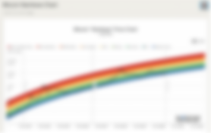

Although the website is in another language, it doesn't matter as the chart legend is in English. Essentially the way that this chart works is that the creator took the price of Bitcoin and put it in logarithmic scale. The creator then overlaid nine different colours (hence the name "rainbow") on top of it to represent possible actions to take. So for example, according to the chart, the price of Bitcoin is currently in the dark green strip of the rainbow. If you look at the legend, it represents "BUY!"
The chart is somewhat interactive in the sense that you can look at Bitcoin's price history on any given day. You can even look at what the chart suggests to do at certain prices on certain days in the future. The creator of the chart did put a disclaimer though to not take the chart as financial advice, so don't base your decisions solely on this chart. It's always best to do your own research before buying or selling.
Here's a video I made about the Bitcoin rainbow price chart for those who like YouTube.
Stock to Flow Model
This model was created by a person who goes by the name of "Plan B". In Plan B's analysis, he took what he knew from his day job working in the finance sector and applied the stock to flow model, which is commonly well known in the gold industry, to Bitcoin as he states in an interview with Anthony Pompliano. You can listen to the interview here. When you go to the website, you'll be presented with the model that looks like this:
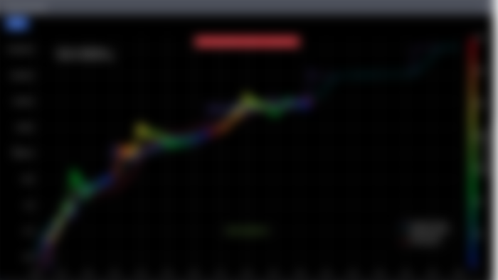

From the model, you can see that Bitcoin's price is plotted on the graph but is in different colours. These colours represent the number of days until the next halving event. However, the more important parts of the model are the purple and light blue lines that are running across the x-axis which are the stock to flow of Bitcoin for the past 10 days, and the stock to flow of Bitcoin for the past 365 days respectively. Here's what the stock to flow is. I've taken this image directly from the website.


As you can see from the model, the price of Bitcoin has closely followed both the purple and light blue lines. Sometimes the price is above it, but sometimes the price is below it. However, we can more or less see that the price returns back to the lines though. Based on the stock to flow model at the time of writing this blog post, it looks like Bitcoin's price is set to explode to the upside soon though.
In terms of the math behind the model, I'm not exactly sure of how it works but this is the formula for you math people out there which is also taken directly from the website. If any of you understand it, I would love to read your take on it.


Even though I'm not sure of the math behind the model, I still think that this model is worth following or checking out from time to time as a lot of people in the crypto space have talked about this model before. If the model didn't have much validity to it, I don't think that it would be as popular as it is currently. I think that it'd be nice to check back from time to time to see just how accurate this model is and if the price of Bitcoin is actually following what Plan B had forecasted.
Here's a video I made about the Bitcoin stock to flow model for those who like YouTube.
Hopefully these models or price charts help give you a better idea of where the price of Bitcoin is headed in the longer term and how some of these price predications are made. Again, I do want to say that you shouldn't just blindly follow these models. Do your own research first and find what works best for you. The two I just wrote about are models and charts that I've taken a personal interest in.
So what are your thoughts on these models? Are there any other models or charts that you've come across worth checking out or worth looking at? If you have, I'd love to know more about them so let me know in the comments down below.
If you liked this article, please give it a thumbs up or share it with others! You can check out my other posts here: https://www.publish0x.com/@Cryptoforcanadians. Like what you see? Consider signing up with my link: https://www.publish0x.com?a=Mvbm9jpbYA.
If you have any questions or comments, please feel free to leave them down below as I will respond. You can also contact me at crypto4canadians@gmail.com. You can also message me on Telegram @cryptoforcanadians or feel free to join my Telegram group where we talk crypto: https://t.me/crypto4canadians.