With the long-term holders slowing down their selling sharply, the price of Bitcoin continued to be above 50,000 US dollars, and new holders also appeared.
Overview of Bitcoin Market
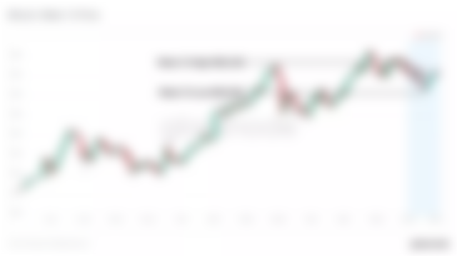
Bitcoin dropped from the highest point of US$ 58,328 to the lowest point of US$ 50,929 in the day. Despite this, long-term holders have greatly slowed down their selling, and long-term holders have begun to mature. The continuous outflow of exchanges indicates that the accumulation has not slowed down.
This week, we saw the signal that the currency is mature in the chain, because the currency that entered out of circulation earlier in this bull market has accumulated for a long time. Many people are on the way to be classified as LTH coins. These are the first signs of a new generation of holders, who entered in 2020 and 2021.

New holder
This week, we saw a continuous increase in currency between 1 month and 6 months. These represent the maturity of the coins accumulated in the whole bull market. Once the age of a bitcoin exceeds 5-6 months, it is more and more likely to remain dormant, and once the life span exceeds 155 days, it will be reclassified as long-term holder (LTH) currency.
This makes the age between 3 months and 6 months very important when looking for the strength and growth of new holders.
Some price background, because the bitcoin market is changing very fast.
1.The price six months ago was $18,000 (less than $20,000 ATH).
2.The price three months ago was $26,600 (before the first big correction).
3.The price one month ago was $47,700 (the bottom of the second major correction).
(Note: Can you believe that the price six months ago was 18,000! )
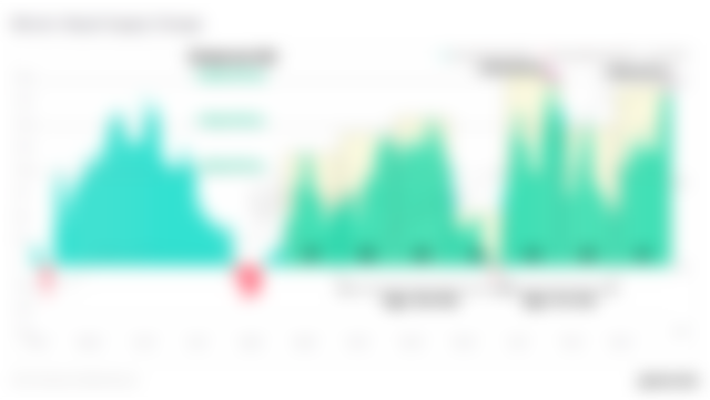
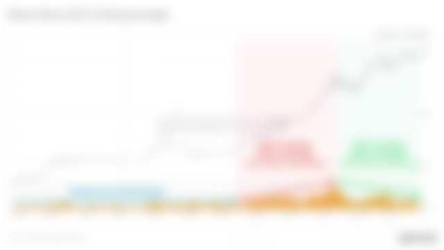
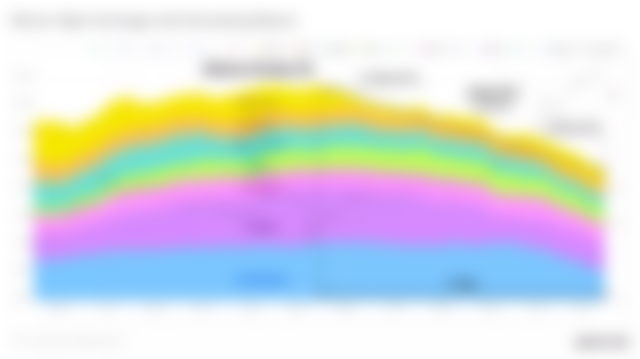
The holding wave chart below shows that the turnover of coins with a life span between 1 month and 6 months has exceeded 9.51% of the supply, and has obviously accelerated since three months ago. Currency purchases with prices between 10,800 and 58,800 currently account for 25.43% of the total supply, and there is no sign of slowing down
(holding band trend is upward).
This shows that buying from the top has been normalized. In fact, the overall shape of the wave held by these combinations looks exactly the same as the price chart, only moving to the right for one month. The message here is that investors and traders keep buying BTC in the whole bull market.


Hold a wave chart
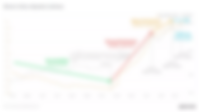
The following figure shows the currency maturity of these two age groups. Coins of 1 -3 months age group (accumulated in orange area) increased by+830,000 BTC, while bitcoins of 3 -6 months age group (accumulated in blue area) increased by+3.945 million BTC.


Comparison chart of dynamic supply from one million to six million
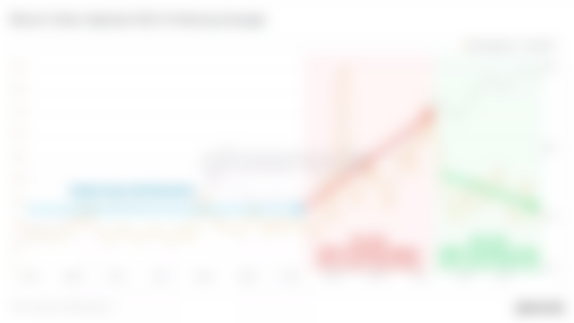
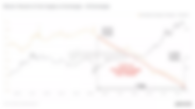
One of our most powerful indicators is the illiquid supply change, which shows the 30-day supply change from the circulating state (easy to trade) to the illiquid state. This may be due to the accumulation of holders, but more importantly, coins mature with the increase of their life.
The green bar means that the currency in circulation turns into holding status (accumulation).
The red bar indicates that the currency held is in circulation (sold).
This figure shows the monthly change, so we need to compare the histogram (change rate) with the price range of the previous 30 days to see where the holder's strength is enhanced.
We can observe the balance between supply and demand in the past six months as follows.
The cumulative rate exceeds+130,000 BTC/ month, which has been maintained in the whole bull market.
Currency holders were nervous in the rebound from $12,000 to $18,000 and sold some coins.
As the price broke through the ATH of the previous cycle, a large number of currencies matured/held (+207k BTC/ month), as indicated by the big green bar in box #3 (related to the price in box #4).
The maturity and holding increase of coins continue today, with the change rate reaching +195k BTC/ month this week.


Real-time diagram of circulation supply change

CDD diagram
We can also see this behavior in CDD indicator, which measures whether the currency trading volume is greater than or less than the long-term average level. Here, we apply the 7-day moving average, which shows that there is a trend below the average level in the past three months, indicating that LTHs is holding more and selling less.

CDD real-time graph
Finally, let's take a look at livelinearity, which is an indicator of macro activities in the chain. It compares the cumulative chain activity with the cumulative lifetime of the protocol. The most important observation related to livelinearity is the current trend direction.
Downtrend (green): The accumulated bitcoin days are more than those sold, which means that the holding behavior is dominant.
A steep upward trend (red). The number of days sold is obviously more than the cumulative number of days. This means that long-term holders are selling in large quantities.
Mild upward trend (orange): Bitcoin sold for more days than accumulated. This means that long-term holders are spending, but are in no hurry to quit.
Horizontal (blue): This means that long-term currency holders are spending, but are not in a hurry to quit. The balance between accumulated and held days shows that holding is increasing, especially compared with the previous upward trend.

Since the first drop from $42,000 to $29,000, we have seen a significant slowdown in LTH expenditure. This, together with the strong accumulation signal, shows the balance between supply and demand, which is different from any bull market cycle we have seen before.
Just when you think the supply dynamics are not exciting enough ... Let's study the exchange balance in depth.
Weekly topic: exchange balance research
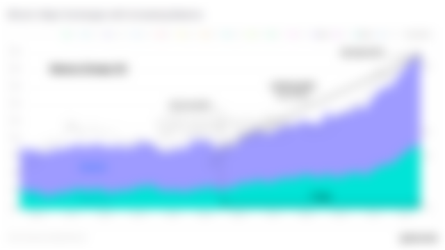
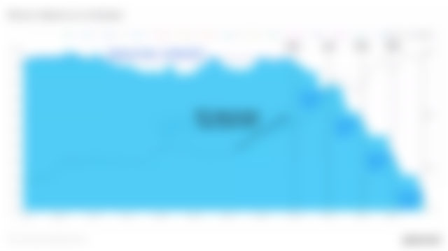
It is no secret that as more and more currencies are accumulated and transferred to long-term storage, the exchange balance has been in a continuous downward trend. In the past 12 months alone, more than 3.27% of the circulating BTC supply moved out of the exchange and entered the third part of the wallet.
Some currencies will be held by the holders themselves, while other currencies will be held by professional custodians.
Real-time chart of exchange rate balance to supply ratio

In the past year, only two major exchanges have experienced cumulative positive inflow (balance increase), namely Binance and Gemini. The two exchanges have attracted more than 270,000 BTC capital inflows, and their proportion in the total balance has greatly increased. A considerable part of Gemini inflow will also be related to Gemini's institutional hosting solution, which further increases the supply of long-term storage.

Exchange rate balance (overlay) real-time chart
Meanwhile, in the past year, the total outflow of other major exchanges exceeded 616,000 BTC. Only between Coinbase and Huobi, the total outflow was about 400,000 BTC, which completely offset the positive inflow of Gemini and Binance.
This shows the extent to which the exchange balance has shrunk since March 2020.

Exchange rate balance (overlay) real-time chart
Particularly noteworthy is the currency balance on Coinbase, which is the preferred place for American institutions to accumulate currencies. The following figure shows the BTC balance on Coinbase in the past year.
We can see that in December 2020, the game changed. As the price of BTC approached $20,000 of ATH in the previous cycle, market confidence increased and institutions began to accumulate. It began with the withdrawal of the 37.4k BTC in December.
In the following months, an incredible step-by-step "whale cost averaging" model appeared, because tens of thousands of coins were accumulated every month. The consistency, frequency and scale of this balance change are shocking in the chain data, which truly reflects the positive accumulation of institutions this year.

Exchange rate balance (overlay) real-time chart
Observing the supply and demand dynamics in the chain is a fascinating process. Through the life of coins, considering the age, consumption behavior and exchange balance, we can build an overall flow model of coins in the whole network.
It is important to remember that monitoring the inflow and outflow of exchanges is a dynamic system with imperfect data.The key is to treat all these indicators as indicative and to consider them in a broader macro trend and context.At glassnode, our goal is to present as high quality and accurate data as possible, and to use publications like this to help us with the context of our indicators.
The data and analysis in your article gave me access to some of the data. I achieved my goal in line with these data. Thanks