Aside from the Inktober post, it's been quite a while since I posted any art on read.cash. Well actually, it's been a while since I even made any serious sketches - just some multiple sketches which I'm using to know how best to depict the human form.
So yesterday, I got bored and decided to do something. I've once posted a work on the Japanese Samurai, but that was digital art, which is honestly way easier than the painstaking process involved in using real, physical artistic media.
But I wanted to get my hands dirty, and as I mentioned in my first post, I'm quite obsessed with anime and manga, especially those centered around samurai and swordsmen. The grace, the fast moves, the sleek, angular, and curved line art in the characters always made it look so perfect.
So I decided to come up with something of my own.
However, I am a lazy artist - I really don't have the patience for inking and coloring- which is why even when I created little mangas in high school, I always had a colorist do the job of inking and coloring. Now that all the excuses are pout of the way, let's see how I finished off the work.
Sketching.
I miss using the layers on my Medibang and Autodesk applications 😭😭😢
I used two characters from one of the first mangas I made; that time, men wrapped in bandages was still so awesome and made them look so strong and mysterious, especially when one eye was closed off. Take Makoto Shishio for example.

Do you see the elegance? That's what I was trying to duplicate.
Since I didn't have layers, I decided to do it the old-fashioned way: using a pencil and then tracing with a pen. So this was my little pencil sketch:

I knew I had a lot of work to do with their facial expressions, but it was good to go with just a few edits. My eraser didn't have too much to do lol.
Line Art
There's not much to the line art since I only had to trace what I'd already drawn with my pencil. In this way, this method is actually a bit better than digital art, or at least that's my personal opinion.
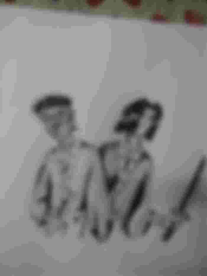
Anyway, this is what I got:
I totally forgot about the design on the kimono of Mr. Side Bangs on the right. He's the guy from the digital art post too.
Highlights and Shading
Well, technically this is just shading since there is just black. There wasn't going to be much use for highlights.
One thing I like best about this work is that I tried to render it as close as possible to how it would have looked when I was making this comic about seven years ago when I was in the second grade. Both the art and the shading.
Back then, I really didn't know how shade worked. All I knew was to add darker colors here and there, and the work would look more realistic. I did try to use some physics there, like knowing how shadows were cast, but in the end, I just went with the flow.
I ended up creating art that was surreal, yet realistic at the same time. It was like, the Picasso artwork... of anime (if I'm not overhyping it 😂😂😂), but it was my style, and even now, I try it out every now and then.
So, this was the final masterpiece:
As is usual with most of my work, this one's unfinished. Apart from the rest of their bodies, can you locate anywhere else I 'missed a spot'? 😂😂😂😂
Thanks for Reading!

Amazing artwork dear. This is really good