 @OverThinker
2nd Round-BMP Logo Design (3rd Concept Variation ) Good Day Sir @AskTheBMP ! https://read.cash/@AskTheBMP So I've made revisions from the first concept logo I made from the first round. This will be the 3rd Variation for the concept logo.

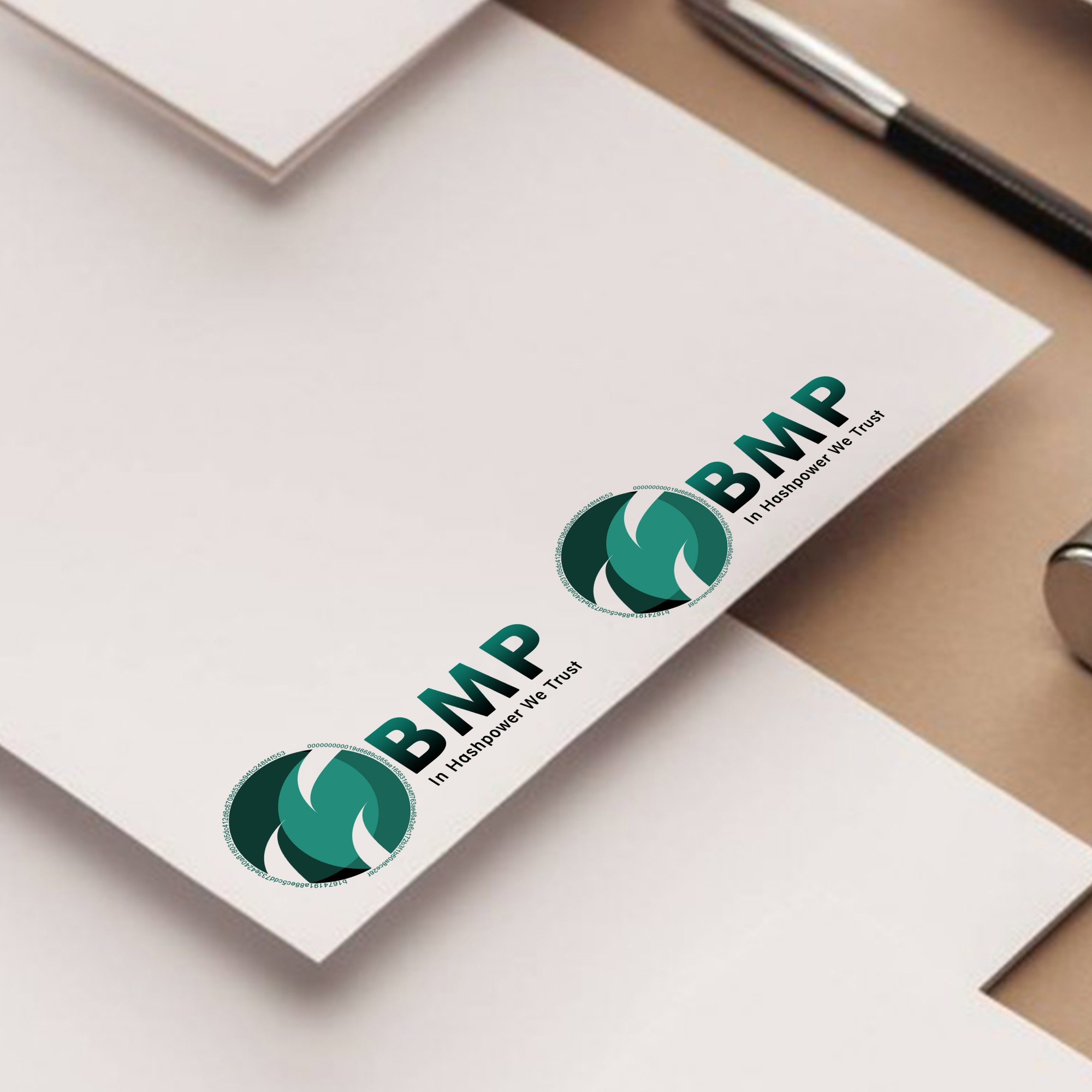
If you'd be asking me regarding the meaning of the details of the logo, here it is: -The circular shape of the logo symbolizes global adoption -The colors (in four shades) indicates neutrality, consensus, non-violence and voluntarism -The details of the logo which makes it look like the letter "M" indicates mining. -The text shown indicates electronic cash -And the overall completeness of the logo symbolizes to the company itself. Hope you like it! Here are the links directing to the downloadable PNG and SVG file: PNG: https://drive.google.com/file/d/1fltCKBJ3u0xGXi_aclSHAH1eyzNoXOfJ/view?usp=sharing SVG: https://drive.google.com/file/d/1VrXR2RdJnqQ_i52vGTd38HV7727m93yH/view?usp=sharing
14 comments
Please sir, what exactly is BMP
BMP or also known as "The Bitcoin Mining Parliament" is an on-chain Bitcoin Cash governance protocol that enables miners to coordinate their actions, and thus bring greater certainty to the BCH ecosystem. If you wanna learn more about BMP, kindly direct to this link: https://read.cash/@JavierGonzalez/why-bitcoin-cash-need-the-bmp-1a6ab975
Oh, I see, thank you!
Hello, I believe that you just marked my comment as spam. I don't find any hints of spam on my comment.
You marked mine spam too, and I did not see anything wrong with my comment which you would have found spam, I got upset when you marked my comment as spam because I just finished a penalty on spam, I was muted for 48hrs, unable to post or comment and I logged in this morning only for you to mark my comment as spam again. Please don't just move people's comments to spam except if you find it irrelevant to his/her post. No offense, I'm just acting out of anger
And when did I marked you as spam?
This morning, I commented on your article with "Nice one" because I feel the article was still related to the BMP stuff
And which article is it? I may have mistakenly clicked on the button.
Congratssss princess papieee anlaki pala ng price, maachieve mo na pinagiipunan mo nyaaannn❤❤❤
Hahahahha. Grabe may pacongrats agad😂 I’m not raising my expectations but I am still wishing hahahahahah
Oo na yaaann claim it😁😁😁
Yes hahhahaha. Matagal ko na naclaim😂
Yaan that's the spirit😁😁
I love it