In this post, we are back to discussing the crypto markets. This time, we are going to start the journey into technical analysis, with the very basics, the price candles. These seem like something that is easy at the surface, but once you actually start digging a little deeper, these red and green blocks can tell you a lot of detail at a glance.
For the usual disclosure, I am not a financial advisor, I don’t even work in finance at all. My day job is as a telecommunications software engineer. Treat everything you read here as some educational resources and not financial advise. Some of the links you find on here will also be affiliate links, so using them will benefit the both of us.
Pre Ramble
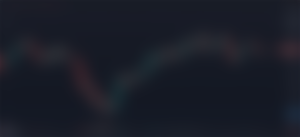
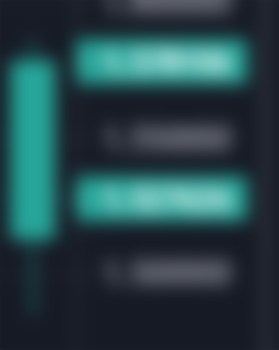
Before we get into the meat of this post, this is the first of what is a planned series. As such, I’ll be starting with a nice fresh view on Trading View which we will, over time take from something that looks like this:
And will over time add more to it so it looks more like what my view over in Binance looks like:
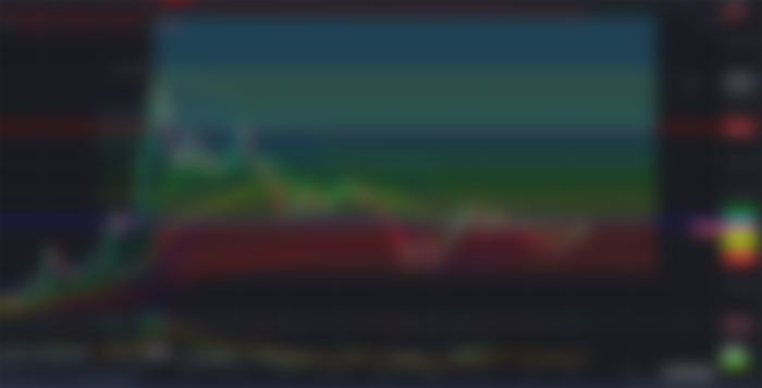
I know, that second one looks like a lot. But it’s not, most of those indicators all point to the same thing, you just use a combination of them to confirm suspicions and make good educated guesses as to what the market “should” do. If you want to see all the layers we add in to get from point A to point B, make sure you keep an eye on my blog.
What Are Price Candles?


The price candle was invented in the 18th century with credit going to Munehisa Homma. They were invented to track the price of rice, and have since evolved to be used the world over to track the price of anything where the price fluctuates. They are an invaluable tool and the first step in market technical analysis.
Price candles tell us the movement of price in a given session. A session is simply a length of time that you have chosen to have each candle represent. There are two main parts of a candle, and they both give us invaluable information of the price action.
How Do Price Candles Work?
The large chunky bit of the candle is called the body. It shows the difference between the open and closing price for the session. A green candle tells us the price went up in the session, so the very bottom of the body of the candle would be the price at the open of the session. The top of the body shows us the closing price for the session. This means the body gives us a good indicator of a strong change in price.
You may have noticed the little bits sticking out the top and bottom of the candle. I’ve heard these referred to as both wicks and shadows, but I prefer the term wick as it fits the whole candlestick theme.
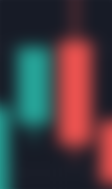
The wicks show you the highest and lowest price that were hit within the session. Lets take this candle for an example:

This candle tells us that the price opened at about $1.513262 and closed at $1.578106. It also tells us that during the session, the price had reached a high of $1.587605 and a low of $1.485646.
As a bonus fact, if you highlight over a given candle stick on the chart, that data in the top right corner will give you the data spelled out for you:


We can see right there all the hard numbers that the candle stick tells us, just not in a pretty candle stick format.
Price Trending
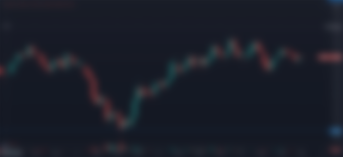
So now we know what the candles tell us, how can we use them? Well, on their own, one candle doesn’t tell us much, but combined, we can start to work out trends. Take this example
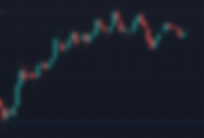
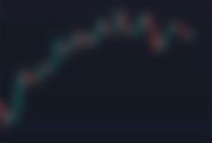
What we can see here is a lot of nice big green candles, and then some smaller red ones happening during pull backs as the market reacts to reaching new higher points. But overall, the trend of this seems to be going up, with a little bit of a pull back happening at the end of it. But if we start adding in some trend lines here between the highs and lows:
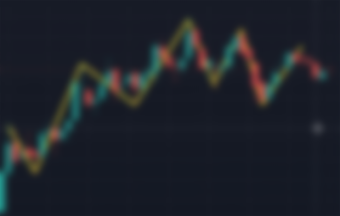
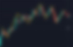
What we can see here when we plot the highs and lows, is higher highs and higher lows. This would indicate an upward trend in the market. It can be a little arbitrary where the exact low point is and hard to see, but we’ll be adding in more indicators later that help see this more clearly on the fly.
Types Of Candles
There are plenty of types of candles that tell us various things about how the market is reacting to different price points. I could write a whole post just on the different types of candles, and I likely will at some point, but here are a few of the major ones that I have been using quite often.

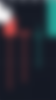
An engulfing candle. This is where the candle has reversed direction from the previous one, and has pushed further in the other direction. This example is a bearish engulfing candle, because its a push downwards. If it were reversed and the green candle was pushing up higher than the previous one, it would be a bullish engulfing candle. These show a significant change in the temperature of the market and can often times signal a change to the other direction.


A hammer candle. These are when there was a serious push upwards in price, but ended down. We can see in this example, buyers tried to push the price quite a bit up in that session, but sellers quickly knocked the price back down, and it forms a little hammer shape. This can often times be a signal that the price is about to start a downward trend.
The opposite of a hammer candle is a shooting star candle and will often time signal that the price is about to start pushing upwards again;

The last time of candle I am going to cover in this post is called a doji. These are where there are long wicks on either side of a tiny body of a candle. In this picture, the red one is not a doji, it’s a shooting star, but the one after it is. What a doji signifies is uncertainty in the market. Buyers and sellers both tried to push the price around, but it ended up back where it started, and can signify a change in momentum.
The thing about dojis, not every candle that looks like that is one, and the more candles you see on a particular chart that does look like that, the least likely that they are actual dojis. Where a true doji lies is when it’s a rare occurance for the price to hang in the balance like that for a session. When the price is steadily moving one way or the other with some minor pullbacks, and you suddenly see what looks like a doji, that’s when to take notice.
Conclusion
I hope this introduction to technical analysis and price candles helps you understand the price charts more. In future posts, we’ll start looking more into reading chart patterns and adding on additional indicators to help us see what the price data is telling us more clearly.
If you enjoyed this content, come back every Monday through Thursday for fresh Crypto content. If you have any comments or questions, feel free to email me a ninjawingnutcrypto@gmail.com, use the Contact form, or hit me up on Twitter or Facebook.
Missed some of the earlier posts, here are some related ones I think you’d enjoy:
Getting Some Free Starter Crypto
Crypto Wallet: How To Pick One
Blockchain: What’s A Blockchain?
Reposted From My Website: https://ninjawingnut.xyz/2021/05/25/price-candles/