In this post, I am going to pick up where I left off in Price Candles: An Introduction to Technical Analysis and add some very useful indicators to our chart – moving averages. These are very simple indicators, but they offer us a very easy way to get an idea of how short term price movements look compared with other timeframes.
For the usual disclosure, I am not a financial advisor, I don’t even work in finance at all. My day job is as a telecommunications software engineer. Treat everything you read here as some educational resources and not financial advise. Some of the links you find on here will also be affiliate links, so using them will benefit the both of us.
What Are Moving Averages?
A moving average is simply a line drawn on the price chart that averages the price at present with the prices for previous sessions. How many sessions is actually variable, and you can set them as low or as high as you want. For example, I use 20, 50, and 200 for my price charts. This would mean every session, each of my indicators would take the current price, add it up with all the sessions behind it up to the required number, and then getting the average and plotting it.
There are also two types of moving averages to be aware of, normal ones and exponential. I find the exponential ones to give a better feel for the market, as they tend to be a little smoother in their plotting, but you should experiment with both and different lengths of time, to find what works best for you.
Adding The Indicators
To add the indicators works pretty much the same on any good price tracking platform. For our example, we’ll be using the chart over on Trading View.
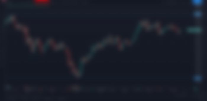
First, we bring up the chart of whatever fancy pair we are looking to plot on, in our case ADA/UDST, and we hit the Indicators button:

In the window the pops up we are going to type EMA in the search box, and click on the Moving Average Exponential indicator from the list three times.


We can see that the 3 of them have been added in the upper left hand corner of our view and we can close out of the add indicators window:


Now we want to open up each of the moving average indicators that we added by clicking on the setup button that appears when we mouse over each of the lines:


On the inputs tab, the only thing I really change is the length, and that is where you set how many sessions you want to use to generate the average. For ours we will use 20 for this first one:


And on the style tab, I set this one to green and I like the lines to be nice and visible, so I also change the thickness to maximum:
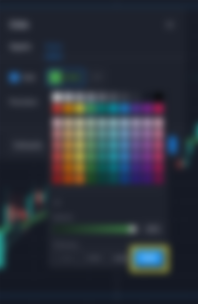

After that, you just click the Ok button and save the changes and then setup the other two bars the same way, except I set the middle one to use a yellow color, and length of 50, and then for the last one I use a red color with length of red. In the end, you should have three lines that all twist around each other over time. Something similar to this:

Using Moving Averages
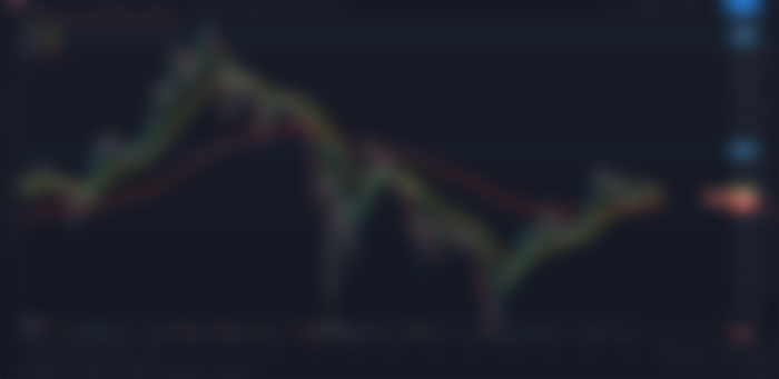
The way I find it best to read these charts is to compare the lines to each other at first. If the 20 EMA (green) is pulling off the 50 and 200 like it is here, than the price action at that time is higher than it has been recently. If it’s falling below it, the price action is drawing it down. The shorter the period of time the moving average indicator is monitoring, the quicker it is to respond to current events in the price.
After you get the overall feel for how the price is running using the lines just compared to each other, you can then start looking for points where they cross over. When a shorter term moving average pulls through a longer term one from below, it can indicate a period where the price is going to enter an upward trend. Conversely, when a shorter term one plunges through a longer term one from above, it can indicate a period where the price is going to trend down.
Lets look at that same chart from before, but lets draw some points on it:

Here we can see places where it crosses over both from below and above and we can see the price trend afterwards. The crossover is obviously not the first indicator of the momentum shift, the moving averages will tend to show you it, but a few candles after it really happens because it has to have time to react. But it does help reinforce when you feel a trend has been broken.
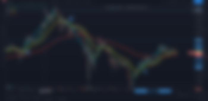
And clearly its also not fool proof, and it can quickly drop down after plunging up. Take a look at the elephant in the room right in the center of the chart we are looking at:
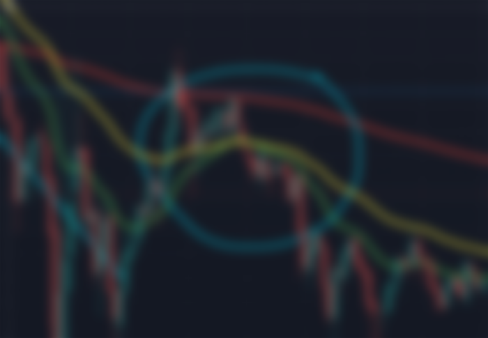

If we were watching this happen in real time, we would see the green line start to pull back up and approach the yellow line. The shorter term moving average moving up towards the longer term. And we might get excited as it starts to cross over. And then it quickly changes direction and plunges back down again.
Natural Areas Of Support And Resistance
The moving average lines also tend to create natural lines of support and resistance. Often times when a price is moving towards one of these lines, they will bounce off it, or dance around it. The price candles themselves pushing through or plunging below one of these lines are also good indicators of moves.
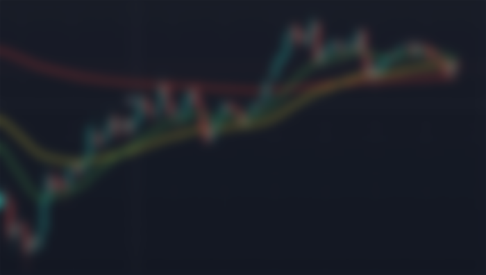

If we take a look at this part of the chart, we started way down, below all the lines, and the 20 moving average was below the 50, which was below the 200. Worst situation to be in. And then it happened, first we got the long green candle that came all the way up, and grabbed ahold of the moving average line. The price then bounced around a bit between the two moving average lines again while the bulls caught their breath from that massive push.
A few candles later we can see the breach of the 50 moving average followed by the 20 crossing the 50. This was followed by a period of some good upward price trending until we slammed head first into the 200 moving average and that became a resistance point and we bounced around a bit again between it and the lower length lines,
After that we see the bulls make another big run and breached through the 200 and pulled the 20 up with it and the went on a nice run until they ran out of steam, and now price is consolidating around the moving averages again. Trying to build up a little more steam to make another move.
And of course if you see the opposite sort of situation developing, it can be indicative of a downward trend in the market. All of these theories work both directions, it all depends on where the lines are in relation to the price and each other, and how they are reacting to current changes in the price.
Will it shoot up again? Will it plummet down? Nobody knows for certain, but I sure like the way those exponential moving average lines are looking from here.
Conclusion
As you can see, moving averages are a very useful tool to give us a good indicator of the current trend of the market, and can help reinforce when trends are shifting. They also provide good spots for the price to bounce, or pause and catch it’s breath on a long trend up or down.
I hope this post helps you understand these very useful technical indicators, and help you along your way of learning to do your own research and making those sweet crypto gains.
If you enjoyed this content, come back every Monday through Thursday for fresh Crypto content. If you have any comments or questions, feel free to email me a ninjawingnutcrypto@gmail.com, use the Contact form, or hit me up on Twitter or Facebook.
You can also sign up for my weekly newsletter to receive fresh new crypto content to your inbox every Friday!
Missed some of the earlier posts, here are some related ones I think you’d enjoy:
Getting Some Free Starter Crypto
Price Candles: An Introduction to Technical Analysis
Exchanges: Centralized vs Decentralized
Reposted From My Website: https://ninjawingnut.xyz/2021/05/27/moving-averages/