However, many do not think so and not only do not attach special importance to the design of their sites, but it can be said that they push the boundaries of the complete absence of a sense of beauty. Here is a list of sites that look so bad you will have to try to find worse than them.
1. Designz23
Believe it or not, this site disaster is a "showcase" of a site design company. We can't imagine who would decide for this company to make an internet presentation for them, but it is very possible that the creative geniuses from the company Designz23 are responsible for some of the works that you will see below.

2. The World’s worst website ever!
Just one look at this masterpiece is enough to agree with the name of the site. This really looks like the worst or ugliest site of all time. All the elements are there: combinations of different fonts led by comic sans, flashy colors, glittering banners that damage the eyesight, the look of Google ads from the last century and unloaded plug-ins. The encouraging news is that this site was deliberately made to look like this.

3. 007museum
James Bond's popularity around the world has lasted for decades, and in Sweden, secret agent 007 is so popular that he has his own museum. Also, the museum located in the town of Nibro has its own web presentation that looks like everything that does not in the least reflect the personality of James Bond. The site literally looks like a flea market with randomly inserted pictures, videos and newspaper clippings that are lined up without any meaning. And it's all on a single page. Enjoy while scrolling to the bottom for half an hour.

4. Arngren.net
If the James Bond site is a flea market, then we can call this a designer waste warehouse. You enter at your own risk.

5. Yale University School of Art
If you were wondering if Yale University Art School has anything to do with the famous Yale, one of the world's most famous and prestigious educational universities, the answer is yes. How is it possible for someone to allow the official website of an art institution belonging to a renowned university to look like a mockery even by the standards of those who have nothing to do with web design remains to be seen.

6. Drudge report
You probably think that this site is the first attempt of an extremely untalented person to make a simple site that no one will ever visit. You are greatly mistaken. The Drudge report, the American right-wing news aggregator, is one of the thousand most visited sites in the world, with over 30 million visits per day. Nothing is clear to you? Not to us either.

7. Ryder Ripps
Behind this name is a 32-year-old conceptual artist and owner of a design agency from New York. For his personal internet presentation, he chose a site that is actually one page written in the Notepad program.

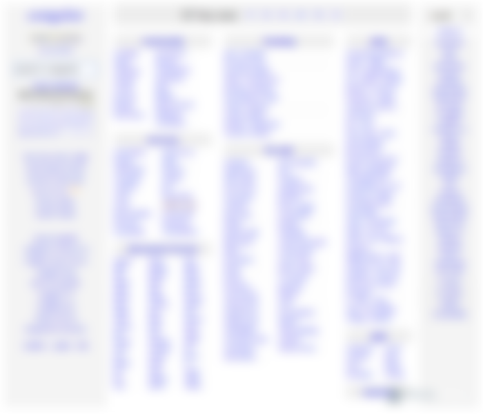
8. Craiglist
Behind this site, which looks like a sheet of paper with notes written in a ballpoint pen, is the American company Craiglist, which earns 700 million dollars a year. It's actually a business directory for the San Francisco area. According to their success, we can conclude that people obviously appreciate a simple design that consists only of links in one color.


