Resolution: The biggest hurdle of designing a pixel art card game.
Size is the first and often the most important aspect of graphic design, and for a pixel art style card, how big or rather small you pick your card's size in pixels, dictates how the card and its art looks.
There are two major forces pulling your resolution in the opposite directions:
Art drags down: When it comes to pixel art, the smaller the size, the less pixel there is to manipulate, and the less time it takes to draw. I consider 16x16 the minimum size that I can fit enough details in, to keep the art coherent, and 128x128 the maximum size before pixel art converges into drawn art.
Text pulls up: There is a minimum amount of pixels that a letter needs to remain readable, somewhere around 3x5 pixels is when your letters turn into a blob that can't be read anymore. While designing my own font, I've settled on 4x8 for the smallest I would consider reliable. When you crunch the numbers, you'll realize that at sizes around 64x64, you'll struggle to fit the card's name on it, not to mention the card's info.
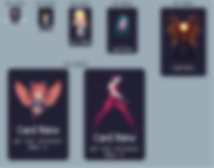
Let's do a visual experiment.

As you can see, fitting two small words on the cards only becomes possible after we pass the 32 widths that I consider the sweet spot for art, and having additional info on the card is only viable at 128x128 and above, which has 15x more pixels and takes something like 10 times to draw.
You might ask: Why not use smaller art on a bigger card?
The answer is:
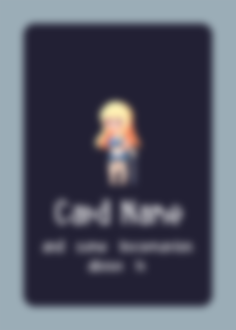
Looks empty doesn't it? It gets even worse when we consider the fact that, this card size is still too small for the amount of text most cards need.
Solution?
I would call it a compromise rather than a solution, but there is a way around this issue when it comes to printing the cards.
Since printing a pixel art card at the original size would yield a card that fits on the tip of a finger, we have to scale up the card to much higher resolutions, if we add the text after scaling, we can have high-resolution text instead of pixel fonts.
Since printing a pixel art card at the original size would yield a card that fits on the tip of a finger, we have to scale up the card to much higher resolutions, if we add the text after scaling, we can have high-resolution text instead of pixel fonts.
For a digital game, we can swap in and out the art, the name, and the info. and we can use a tool-tip if necessary.
What about Liquid shadows?
As you can see, for my TCG, I've settled on a 96x96 art size, and designed the card around that. It's a bit higher resolution than I prefer, but I can still draw it at a reasonable pace. And I've re-designed the card to open some space for the print text. Here's the result:

Next will be: Tackling the information a card must convey and how to implement and position them best, in a limited pixel size.
