Statistics: Frequency Charts
Not as frightening as they make them seem
Ever had a great amount of values dispersed in a test questions or inventory and suddenly they ask you to tell which one is bigger/smaller, how It grows or how It decreases? Well, you surely wouldn't be able to do It by just sight, so different methods might be needed to accomplish the task at hand. One of these are the diagrams known as frequency charts, a table with a set of items that can help you categorize a series of different responses in a particular sample of a population or configuration of values due to their frequency, with items such as the absolute frequency, the accumulative absolute frequency, the relative frequency, relative percentual frequency and the relative percentual accumulated frequency. Now let's begin by showcasing what exactly a frequency chart Is:
What a Frequency Chart is?
Knowing that frequency is the particular amount of times an specific value occurs or repeat Itself, we can discern that frequency charts are tables designed to arrange different values or variables in ascending order according to magnitude to highlight the frequency with which they have occurred and compare their values.
At the same time, depending on if we work with pretty large data sets or not, we can use to approaches to frequency charts: One, through grouped frequency charts and the other through non grouped frequency charts.
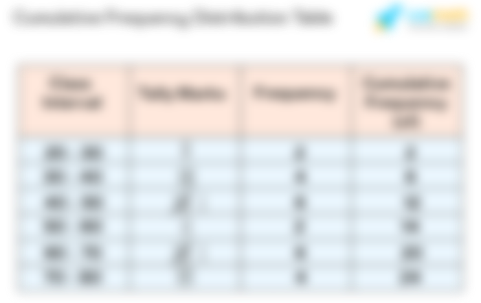
Grouped frequency charts are used when we handle continous values, meaning those that occupate values that are encompassed between intervals, making them more difficult to track If they were analyzed from an specific number standpoint, so reducing the amount of data to a set of intervals, known as class intervals, can help much more without sacrificing the original information. One example of this might be If we were given a total poblational sample of 85 people, where there's a lot of ages that might vary from 10 years old to 89 years old. If you count all the ages of the people sampled you will find yourself with a pretty long frequency chart, so one alternative to this is to simply create class intervals with ages that range in 10 year intervals (Also increasing in 10), letting us identify with a shorter and more understandable chart all the data presented.
Non grouped Frequency Charts are applied to situations where discrete values are presented, meaning this that the information is looked at through the means of whole numbers in a more reduced and regular capacity, letting us distribute the information through increasing magnitudes that are not too further one from each other. For example, If we have a poblational sample of kids that range from 1 to 5 years, we can discern much more easily the amount of kids that are subjected to a certain action through the use of data rows (X) that can identify the amount of kids of 1, 2, 3, 4 and 5 years affected.
However, knowing what a frequency chart is and what types of them we can find does not gives enough information about how to make one, so now we'll explain the different sections of a complete frequency chart.
Frequency (Or Absolute Frequency)
Here we put the number of times the particular studied variable repeats Itself, applying this to all the possible magnitudes represented.
Cumulative Frequency
Almost the same as the absolute frequency, though It varies in one particular aspect: That It increases in frequency with every set of data studied. It basically applies an additive operation to every one of Its iterations, adding the previous acumulated frequency to the absolute frequency of the present value. One way to verify if this is correctly approached is to look at the last value. If It makes for the total amount of samples taken, you can be sure that It has been done correctly.
Relative Frequency
As Its name indicates, It dictates us the frequency of the value in respect to the total amount of the sample. It follows the next formula:


With Fan being the absolute frequency of the analyzed value and N the total amount of values in the sample.
Percentage Relative Frequency
With a little twist to the relative frequency formula we can represent the frequency of a value when compared with the total sample in terms of percentage, using:


Cumulative Relative Frequency and Percentage Frequency
With the same properties as the accumulative absolute frequency. It adds the previous relative/percentual value with the present one, increasing till It gets to the full percentage of samples. To know If It has been applied correctly, we just have to look at If the final value is 1 (or 0.99, due to rounding certain values) in the case of the relative frequency, and 100 (or 99,9) for the relative percentage frequency.
I hope that with the presented information you can gather more knowledge about statistics, their simplicity and the many applications It has through one of Its main tools, frequency charts, letting you distribute and classify great amounts of data through an efficient system. Thank you for your support and I wish you the best of luck!
Thanks with these knowledge it's so valuable to learn about statistics