A Midsummer Night’s Dream – 05-04-22

Urgency
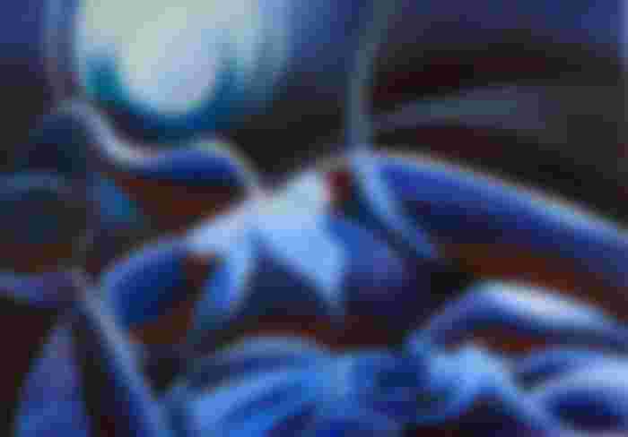
This oil painting ‘A Midsummer Night’s Dream’ is born out of some kind of felt urgency. Never before in my life I longed for Spring and Summer in particular than this year. Post corona and now with the war blazing in the Ukraine the entire planet can use warmth, literaly and figuratively. Hence, the creation of this dream of a lush sultry summer night. Scrolling through my drawings ‘Roundism – 12-10-15’ logically caught my eye. From the hundreds I made throughout the years this one must have been selected by my subconsciousness. Only when it’s hot you can stay under the blue pale moonlight in the nude.
Third Time Around
That referential drawing met my artistic expectations back then and it still does. The second one, the pastel, was an attempted elaboration of the graphite one. Even though I found a nice color scheme the nigthly impression was lost a bit. That is why in the back of my head doing an oil on the subject still kept lingering on. Next was what color scheme I should use this time. It was certain to me I had to use lots of blueish colors.
Pride and Prejudice
At the same time I remembered a movie I saw a couple of years ago. There was this incredible scene in Pride and Prejudice where Keira Knigthley as Ms Bennett is standing outside, covered in pale blue light. It must have been the moment where she is on a balcony at the grand party. I remembered I always wanted to do such a scene but didn’t want to lower myself to mere copying a screen still. Another aspect is the fascination with the effect of certain exposures of the skin. I always like when so-called ‘normal’ skin hues are altered, subtlely or radically. It can turn totally blue but in this particular case there were still hints of brownish reds and pinks visible. Even though the theme is totally different from the movie, the lighting was heavily inspired by the aforementioned scene.
Two Other Reasons for Blue
It is the second one after Rusalka within a short period of time I used blue as a dominant color. I like it and so I intented myself to do another one in the next future. To me blue is such an easy color to use. Therefor I do concur with Willink that you can use it endlessly. The final stage of the painting was influenced by my visit to ‘Rondom Mondriaan’ in the Kunstmuseum last Sunday. There I read in his luministic period Mondriaan was heavily influenced by Von Goethe’s color theory. One of the aspects of his vision of colors was the effect of light hitting a solid plain. On the outer edge one can spot color shifts. Probably it’s the same reaction of the eye and brain to direct sunlight.
The Universe Speaks
Sometimes the universe speaks. Lo and behold. Sunday evening I took a photo of my work in progress and it showed some kind of pleasing lens flare. That was the trigger I needed. I put some Old Holland’s turquoise and Schmincke’s Caesar purple to the left of the chin. It was a perfect match of the colors in my photo. From there I felt confident to do more and counterbalance the hefty blues with unsaturated reds like Schmincke’s pozzuoli earth. Creating is art is all about experimenting in great uncertainty.
Click here to see this art work on display at Gallery Ludens, Voorburg, Netherlands.
Oil on linen (70 x 100 cm)
Artist: Corné Akkers
