'The wizard of Oz' starts out in black and white and then transitions to color. This sudden introduction of color has many implications, but all of those who debate the shift view color as important. Magazines feature the glossy picture of celebrities and advertisements-- all in color.


In art, color is arguably one of the most important features of a piece of artwork. An artists' choice of color can change everything about a piece, including mood and emphasis. Color is one of the most significant features in a piece of artwork for me. As an artist, I spend a lot of time planning a composition. I consider subject of the piece, the angle of viewing the subject, and the meaning I want to create with the piece. I look at how color creates meaning in my piece. I look at how color creates in my piece. One specific color placement can change everything.
I first got into art during middle school. I took an art class because I didn't want to take music, and it stuck with me. The great thing about art is there are no rules to it. You can paint violently, splashing globs of oil paint onto the canvas or smearing pastels all over the page. You can draw neatly with graphite to create a pristine picture. You can choose any of a variety of colors. All your emotions can be poured out into a piece. I find art to be almost therapeutic:you can throw your whole soul into your painting and it will reflect everything going on in your mind.
As an artist, color reflects what I'm feeling when I paint the piece. For example, while going through a recent breakup, I started an oil painting with violent reds and brilliant blues. The colors clash. There are great dabs of oil on the painting. The vivacity of the colors creates a hectic piece. The contrasting colors reflect my own internal debates and conflicting feelings of anger, confusion, sadness and guilt.
Colors are significant in artwork to reflect things that aren't really there. In 'Pocahontas', one song describes painting the colors of the wind. If I tried to create warm, light breeze, I would sketch light reds and oranges across a piece. The lines would be faint and blended together into light blurs of breeze. Alternatively, 'frozen' featured a town with cold, harsh winter winds across it. In the movie, the town is depicted with blues and purples, creating the colder feel. The lines of the wind are more defined, making it seem sharper like the harsh winds, which were present.
Color is just one way of how we express our emotions. Stop someone on the street who is feeling down and ask them how they feel? They might respond "blue", signifying sad. They might feel the "blackness" of hopelessness or desperation. People in a fight might say that they "saw red". Red is anger and passion.
Magazines use color to create moods. Bright colors create positive feelings towards the products on the pages. A restaurant advertisement might use red to induce appetite. similarly, a photographer must carefully consider placement of color in their pictures. While at my uncle's wedding, my family and I took pictures, and I organized it so we were standing on a red bridge with green teas all around. The red showed the love felt at the occasion. The green of the trees were blurred, creating a neutral background for the splendidly colorful filipino outfits my family wore. It was a light green, contributing to an overall tone of lightness and happiness.
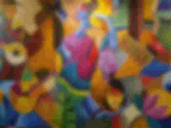
On one of my recent pieces of artwork, I blended colors together to create an image of a sunset through a bridge. The dark blues, purples, and blacks in the water created to a calmer feeling while the darker purples and reds created a loving feel to the piece. I wanted viewers to feel nostalgic amd remember the romantic memories of their past. Another piece I did was of a tree on a bright autumn day. The bright red and orange leaves left an upbeat tone. The light colors made the piece feel free, as if the viewer was standing under the tree with their toes in the grass, feeling the warmth of the sunlight and wind in their hair.
As shown with the 'The wizard of oz', perhaps equally as important as color is the lack of color. This can be done when an artist uses grayscale instead of the color wheel to complete their piece. In photography, low light can make a piece darker and seem moody. One of my photography friends, when creating a piece that dwells on memories of childhood, took a picture of a bench and darkened the piece when developing the film. This created a more distant, fuzzy image to reflect his current state of remembering the significance of the bench in his childhood, even though no one was sitting at the bench or playing around it at the time the photograph was taken.


The lack of color can make the eye focus more; instead of being attacked by vivid colors, the viewer can look deeper into the piece and see more details. Black and white can be more subtle and somber because it doesn't have quite as much energy as a color piece. However, using grayscale in a piece can still assault one's eyes with the juxtaposition of dark black and light gray or white. I created a piece describing an oil spill in 2010. In the piece, I used dark black contrasting with the white background of the page to create the numbers 2010. Above the numbers, a circle had very little contrast in colors, reflecting the murkiness of the water caused by the oil. The turtles, birds, and fish trapped in the layering of shading reflected the capturing of them in the oil spill. The darkness of the overall piece sil reflected my negative feelings on the subject: I'm very into environmental friendliness; oil spills aren't exactly kind to nature. Instead of ranting and raving about the injustices of big oil companies, I created a piece that could act as a political statement against the companies. It was a healthy way to vent my disgust on the spills, through it may not have created any sort of action towards making the problem better.
Absence of color can also be used to create contrast between color and grayscale, making certain objects stand out. One classmate painted a woman on a boat with her back to the viewer. He used grayscale for everything except for red for the jacket and body of the woman. This highlighted the turmoil in his mind: at the time he created the piece, he and his girlfriend were on rocky terms. In the past, I have used black and white to blur motion at a traffic light. I used a collage of white tissue paper overlaid on a black background to create distinct shapes which confuse the viewer and create the effect of fog. My goal was to draw attention to the bright colors and create a blurred, abstract piece to reflect the confusion of the scene. The only colors are the lights: car headlights, street lights and traffic lights. This makes the rest of the picture, the cars and buildings, fade into the background and creates a layering of colors. It simulated driving at night, where the bright lights are easy to see and the streets and buildings fade into the background. However, there was also a more subconscious feel to my piece. I conceived my piece after a fight with a friend. My mind was muddled and confused: much like the abstract nature of the piece. Creating an insane piece reflected the insanity in my mind.
The strongest of emotions make for great pieces of artwork. I created a tree out of greens and yellows. I dabbed the piece with color using palette paint. Everything was light and bright. When I was painting, I was outside, enjoying fresh air and nature. The piece reflects the pure joy of the outdoors. Once, I was feeling lonely, so I used chalk pastel to draw a frog in the moonlight. My choice of a dark green paper, dark colors, sole light source in the painting (the moon), and murky water reflected the loneliness. The lack of anything in the piece save a sole frog on a dark lily pad created a depressing image. However, after I created the piece and blurred the colors into a muddled state, I felt like there was a weight off my chest. Some people find that writing helps sort through their emotions. Others like to talk to their friends. For me, I privately toil over a piece of artwork, pouring my heart into it until everything becomes clear to me.

It isn't often that we paint the colors of the wind, but color is fundamental to create emotions and abstract qualities that we can't capture with a realistic depiction of the world. Sometimes words are simply not enough. Through color, artists sift through emotions and tell their stories.
Thank you for reading my Article.
Kulayan ko buhay mo haha. Humanap talaga ako ng tissue para dito🤣😂